

Atalanta's 2026/27 Third kit reinterprets the club’s history It features a crest from 1964
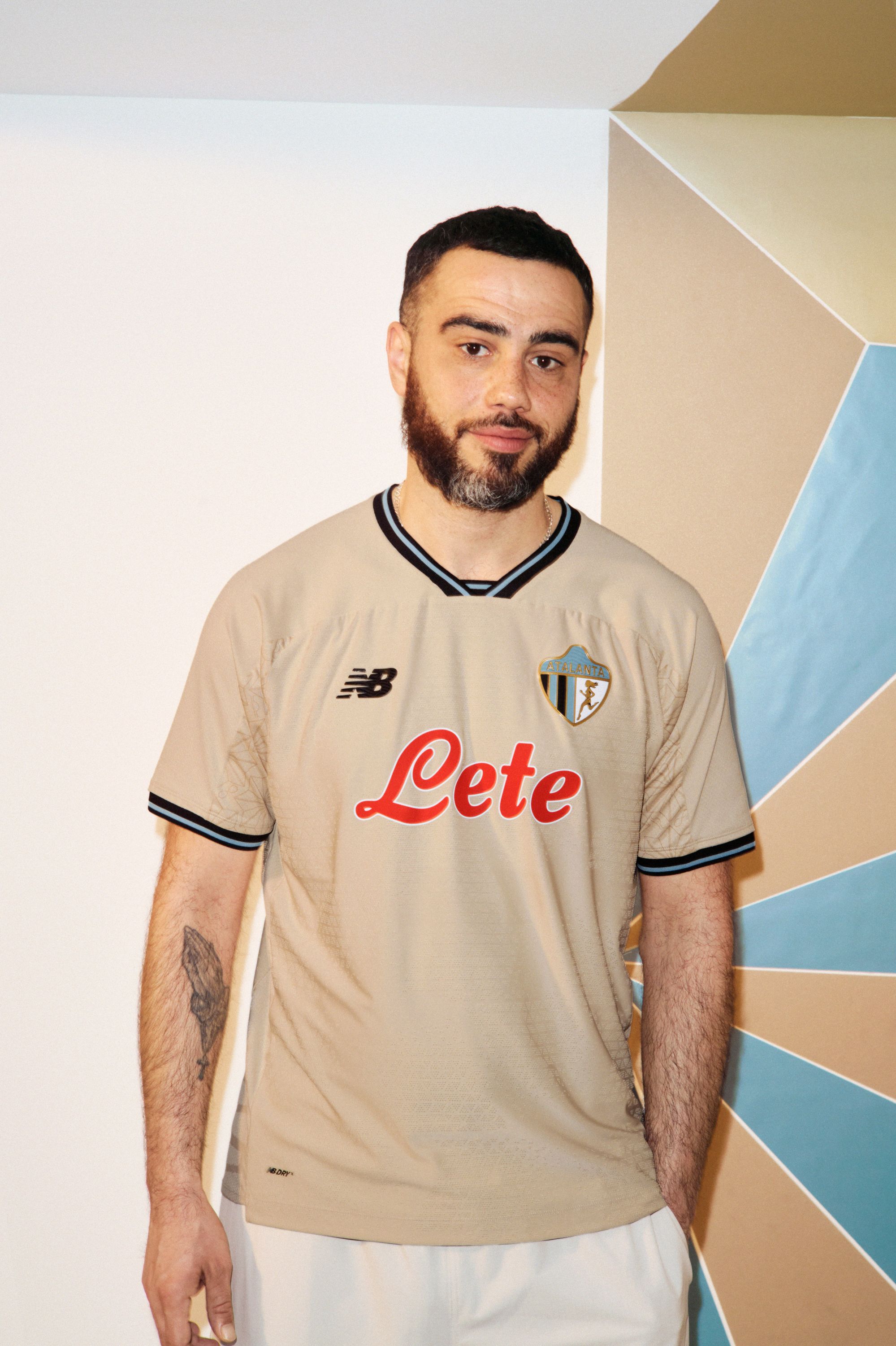
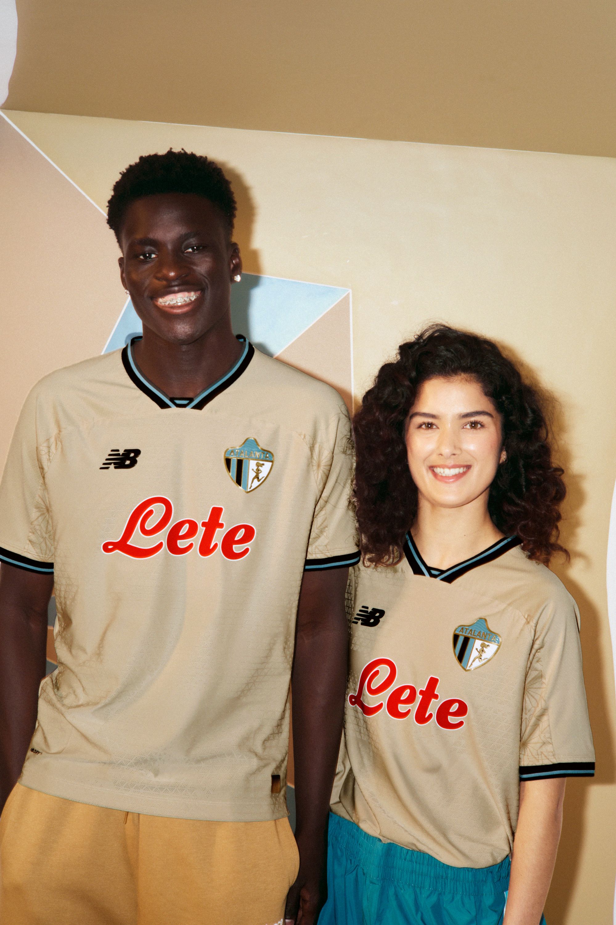
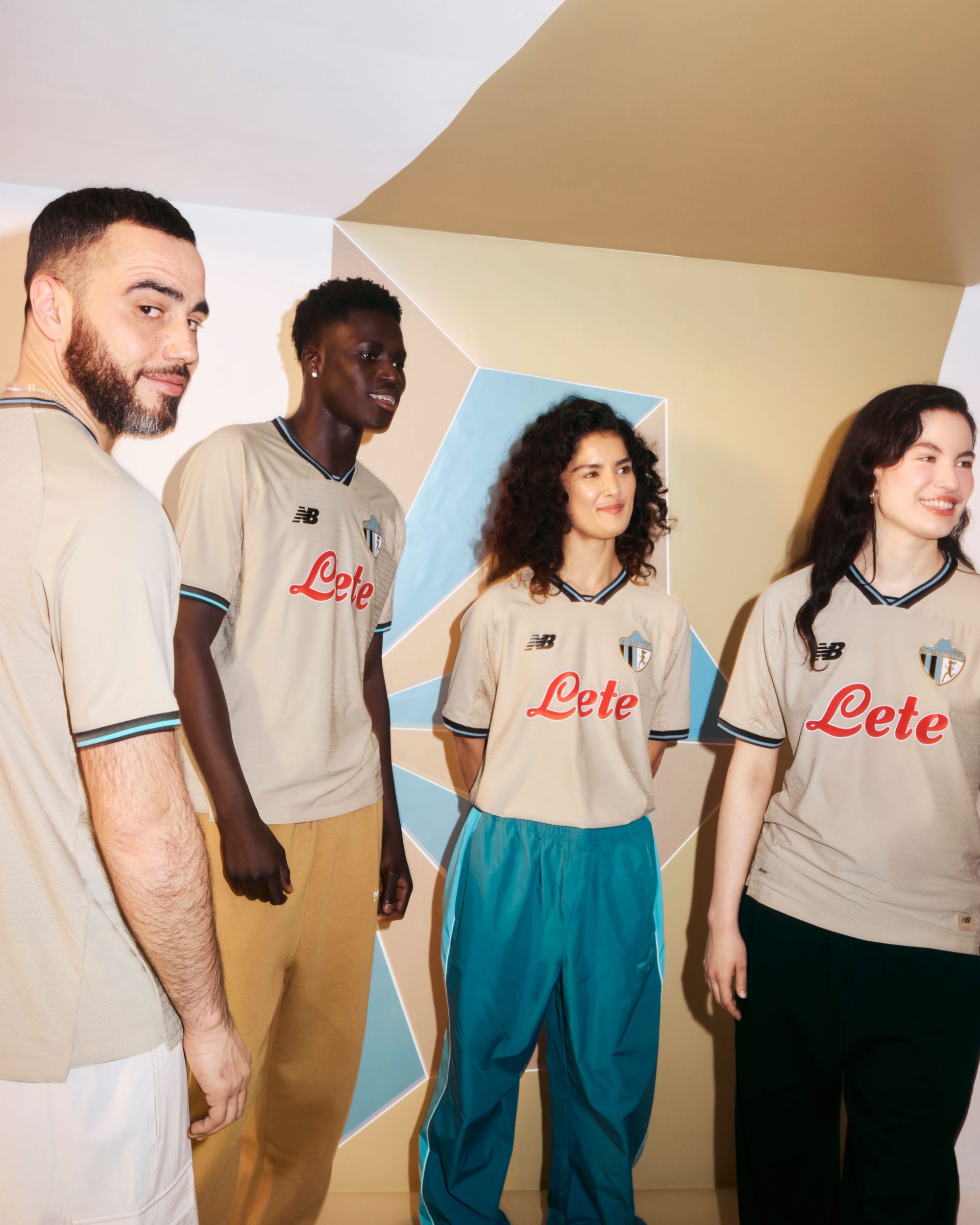
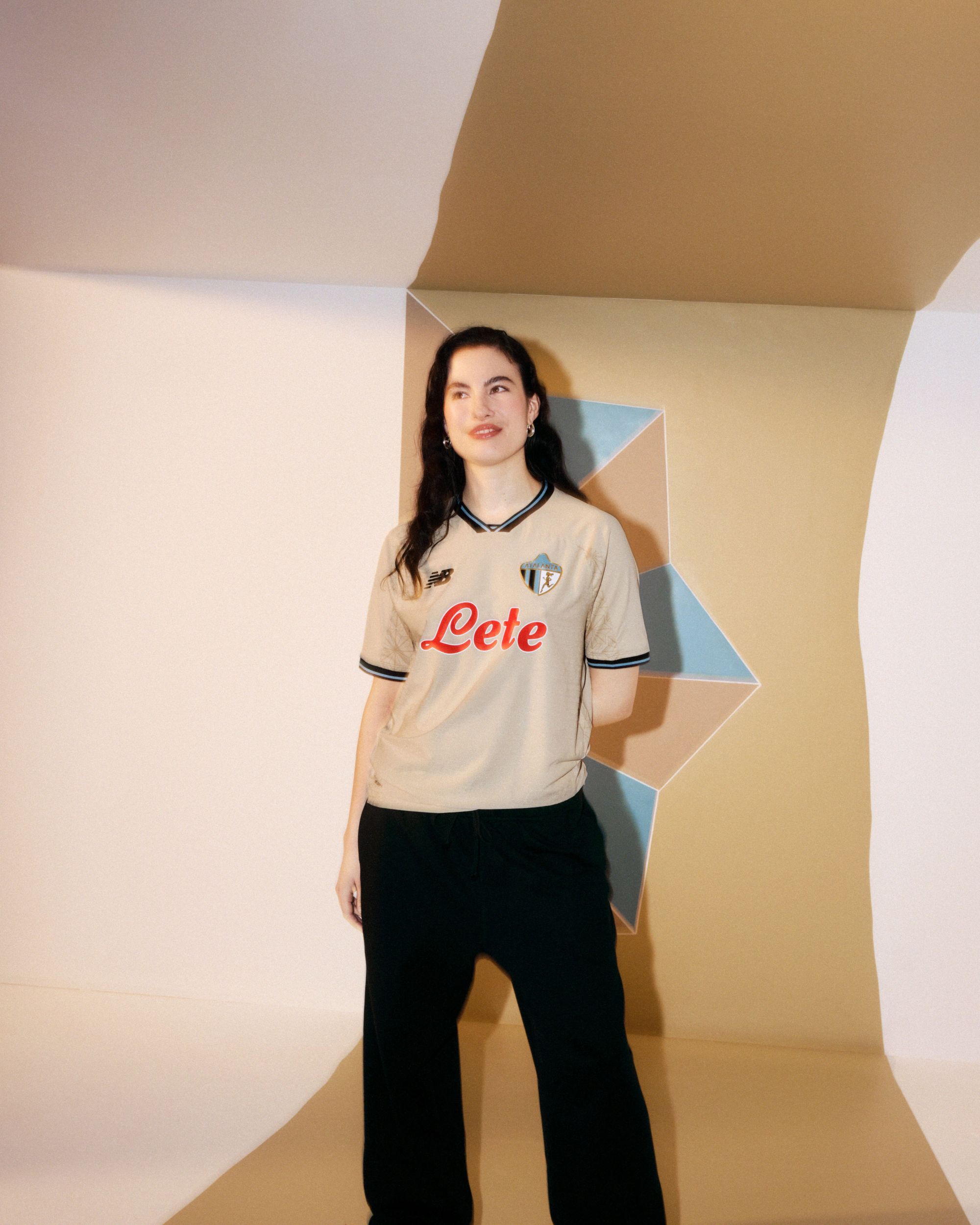

For Atalanta, history is not something to be kept behind glass, but something to be reinterpreted. This idea is at the heart of the 2026/27 Third kit, developed together with New Balance around some of the most recognisable symbols of the club’s identity and translated into a new idea of elegance. The first element to catch the eye is the colour. Instead of the club’s more traditional shades, the new jersey opts for a refined gold tone, immediately changing the perception of the kit and giving it a more sophisticated character. A tonal pattern then develops across the golden base, almost hidden at first glance.
The clearest reference to the past, however, comes from the 1964 crest, reintroduced by New Balance as one of the jersey’s key graphic elements. It is a particularly significant logo in Atalanta’s history, as it was the first to feature the goddess Atalanta, turning the mythological figure into one of the defining symbols of the club’s identity.
In both its original version and the one featured on the new Third kit, the crest brings two distinct elements together. On one side is the full-length figure of the goddess Atalanta; on the other are the iconic black and blue vertical stripes, one of the visual codes most immediately associated with the club. A contrast that captures the direction behind the jersey: looking back to create something new. The result is a kit that does not attempt to replicate the past, but instead reinterprets its symbols through a contemporary aesthetic. The gold, the tonal pattern and the 1963 crest create a visual language that moves away from Atalanta’s more familiar colour palette while remaining deeply connected to its history.