Napoli will wear a special font for the 2026/27 Champions League They will will swap Serie A’s standard typeface for a custom
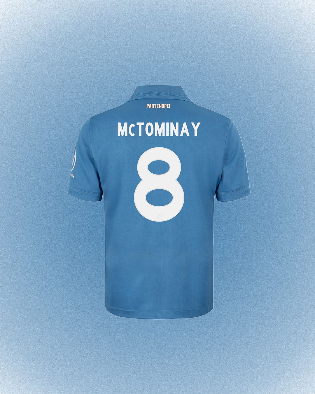
Once again this season, Napoli will be the only Serie A side to feature a custom font in the Champions League. Ahead of their home debut at the Maradona Stadium against Arsenal, the club unveiled its official kits for the 2026/27 European campaign. From an aesthetic standpoint, the Home and Away jerseys remain exactly the same as the versions worn in domestic competition. The only change comes in the typeface used for player names and shirt numbers, as Moustaches, the font adopted by Serie A since the 2020/21 season, will not feature in Europe.
Why Napoli Are Using a Special Font in the Champions League
Napoli has introduced a font with soft, rounded lines that revisits the aesthetic of the 1980s, echoing the same era referenced by the playing shirts. It is a clear nod to the era of Diego Armando Maradona, a central figure in the celebrations surrounding the club’s centenary. The font appears in white with a subtle silver outline on the Home shirt, while the Away version features it in blue with a border in a slightly darker shade. The red Third kit is currently not available on the club store in a European version, potentially hinting at the arrival of a dedicated Champions League kit in the coming weeks.
From Napoli to Barcelona: When Fonts Become Brand Identity
Last season, Napoli also introduced a custom font for its Champions League campaign, although its more brutalist character stood in contrast to the softer shapes of the 2026/27 version. More broadly, Napoli is following in the footsteps of many of Europe’s biggest clubs, particularly those in the Premier League and La Liga, where clubs are required to use a federation-mandated typeface in domestic competition, while European tournaments give them the freedom to develop their own. Barcelona, for example, will use Modernista, a font inspired by the work of Salvador Dalí. A choice that allows clubs to bring their own brand identity onto the pitch in a setting as globally relevant as the Champions League.
Unique fonts are a powerful tool for making any league instantly recognisable the moment you tune into a match. The Champions League, however, does not need its own typeface. It is the most followed football competition in the world and already has a highly distinctive visual identity, built over the years through recognisable symbols, colours and visual codes. Instead, it gives 36 clubs every season a stage on which to showcase their own personality, allowing individual teams to contribute to the overall aesthetic of the competition through their jerseys and numbers.
UEFA’s Rules for Shirt Numbers and Fonts
As mentioned, the Champions League does not impose a single typeface, but UEFA still sets specific requirements for the dimensions, proportions and characteristics of shirt personalisation. Numbers must be between 25 and 35 centimetres high in men’s competitions and between 20 and 35 centimetres in women’s competitions, with a stroke width ranging from 2 to 5 centimetres. They must also be positioned centrally on the back of the shirt.
Colour contrast is equally important. Governed by the Delta L principle, it must ensure that numbers remain clearly legible even when a jersey features complex graphics, patterns or stripes. This is why some designs require a solid-colour panel on the back. Creativity within the numbers is also subject to certain limitations: sponsors, logos and decorative elements are not permitted, while a small club crest can be incorporated, up to a maximum area of 5 cm². Even technical details are subject to specific parameters: ventilation holes or lines within the numbers are permitted, provided they do not exceed 2 millimetres in width.
What to read next
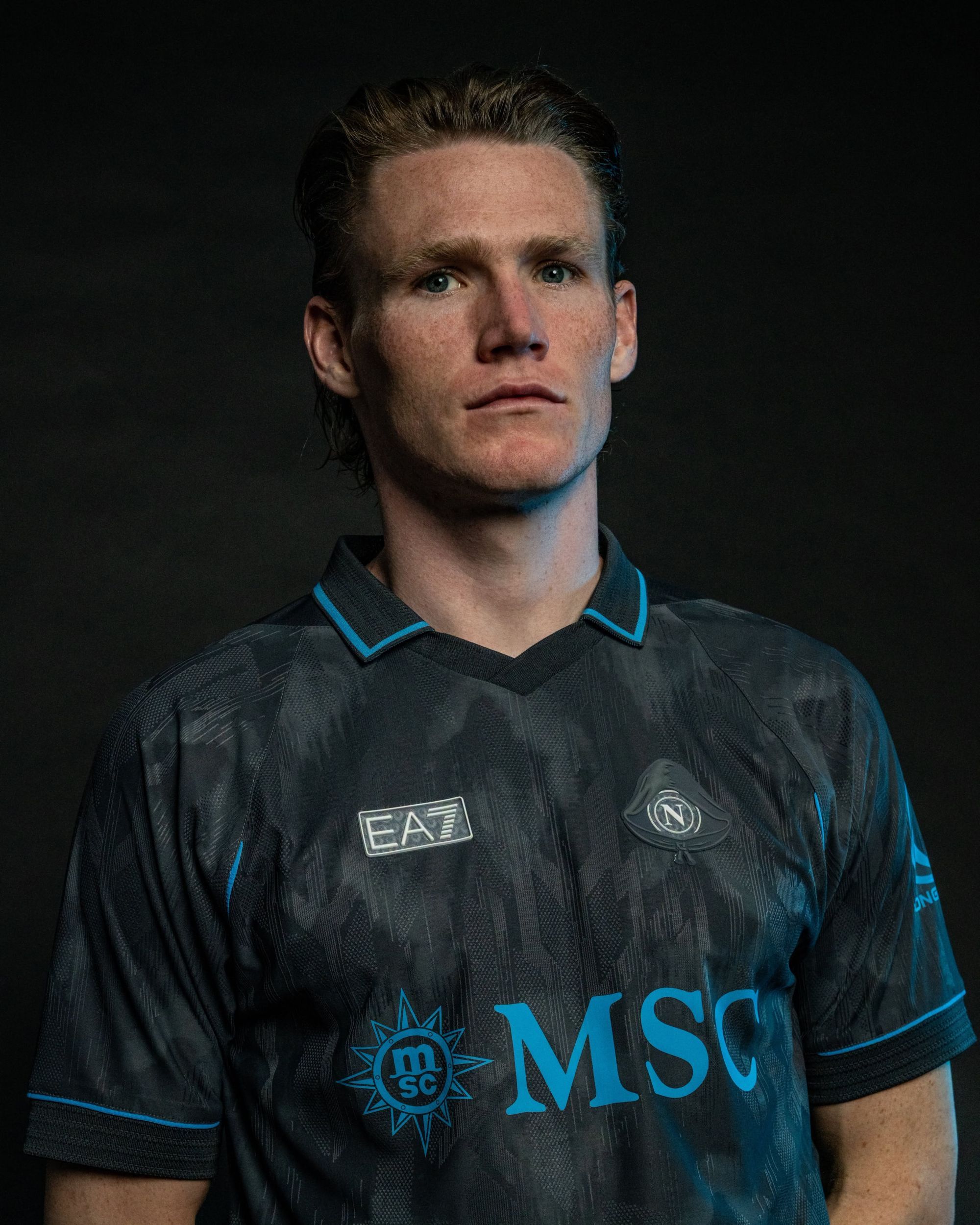
Napoli unveil their new Halloween 2026/27 kit
It's total black and inspired by the Munaciello
The Champions League was all about elegance last night
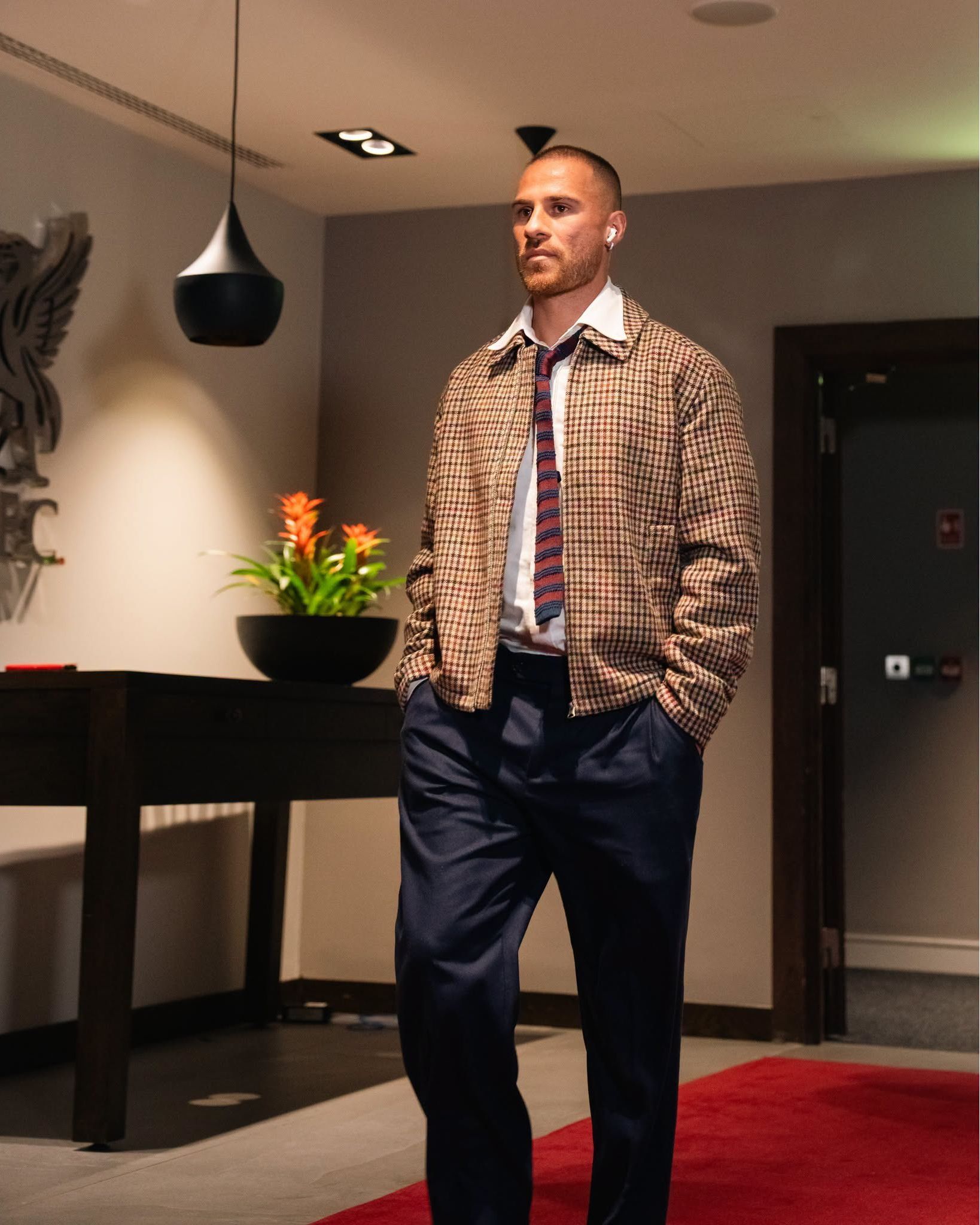
Liverpool and PSG debuted their Tommy Hilfiger and Dior looks
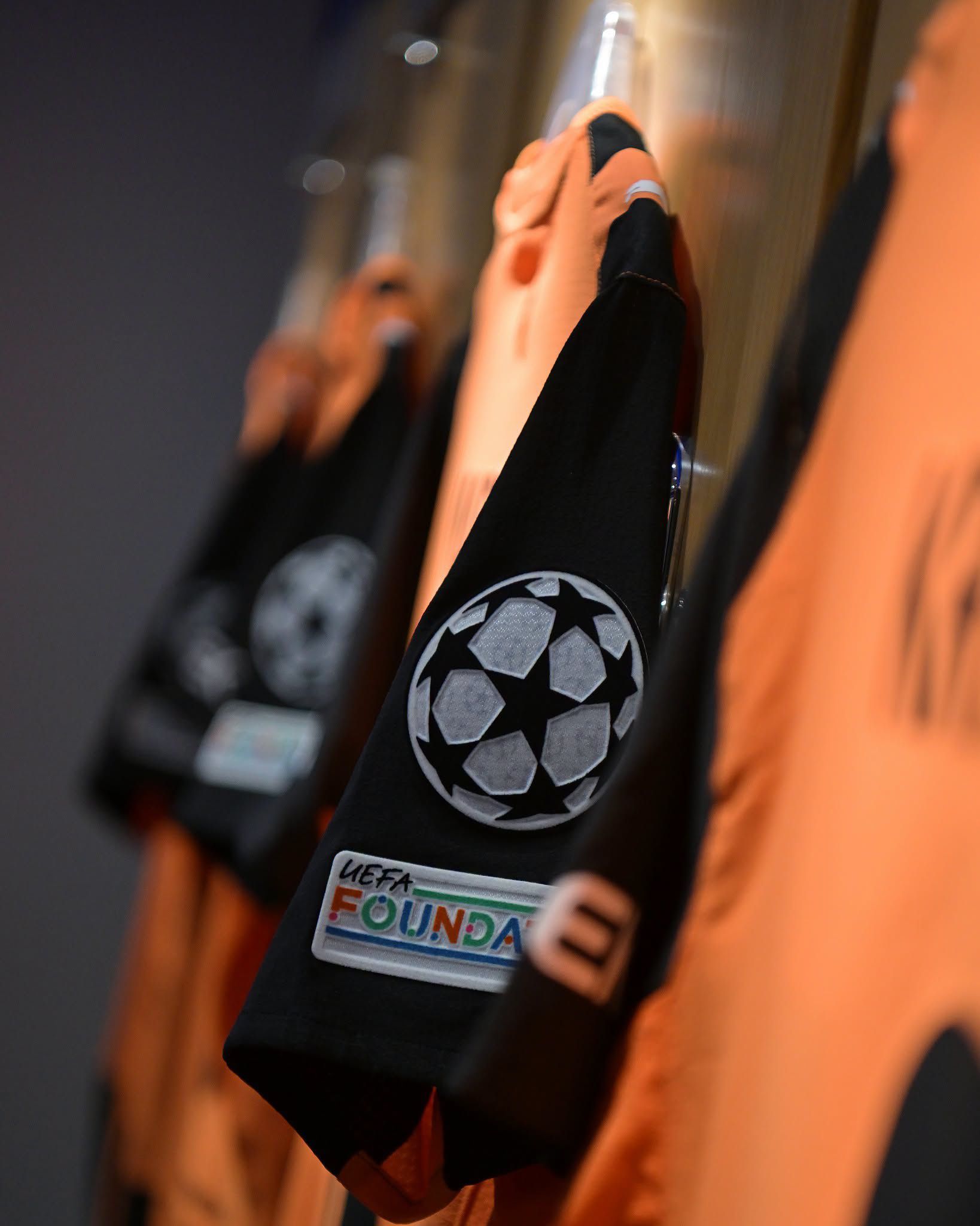
Why are Shakhtar Donetsk playing their Champions League games at Stamford Bridge?
They have been forced into footballing exile by Russia’s invasion of Ukraine