Inter will introduce a special Champions League font It will be only used with the 2026/27 Third kit
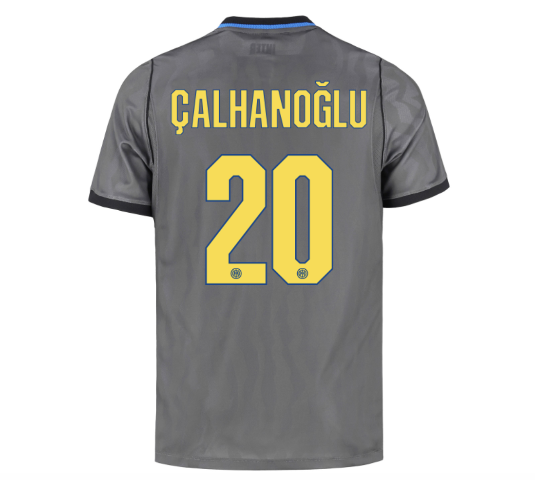
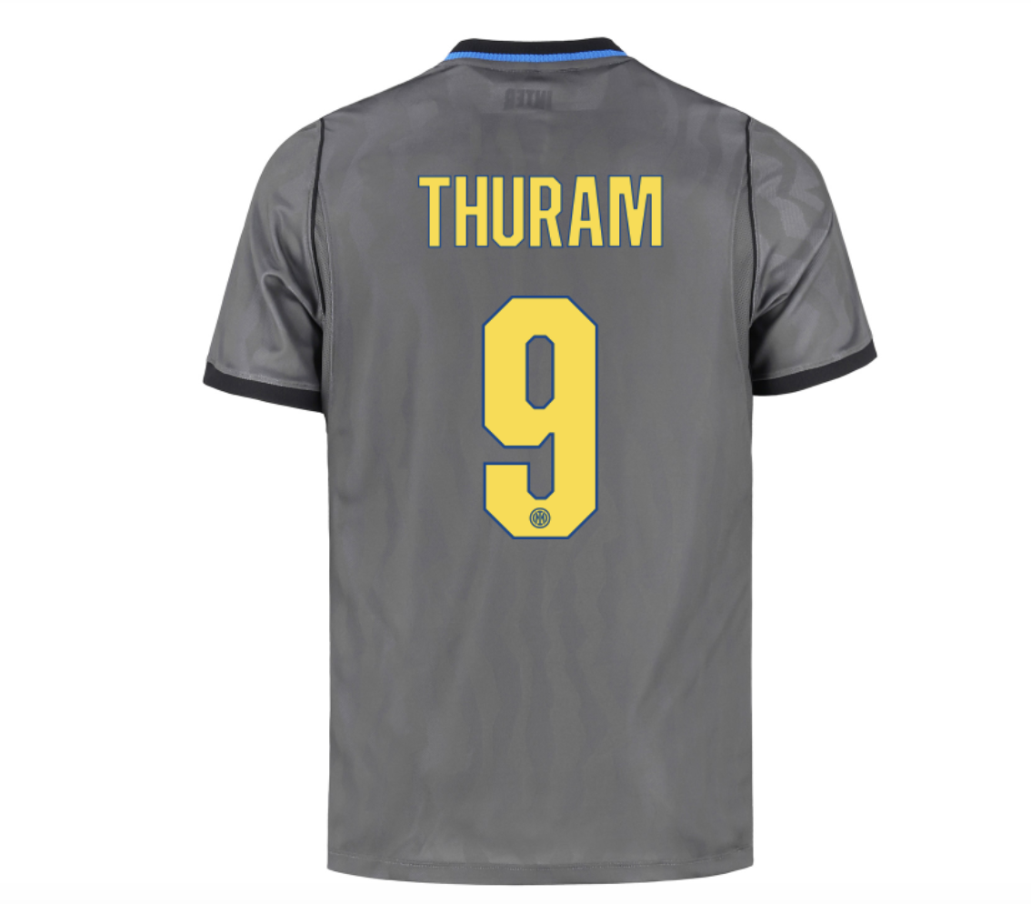
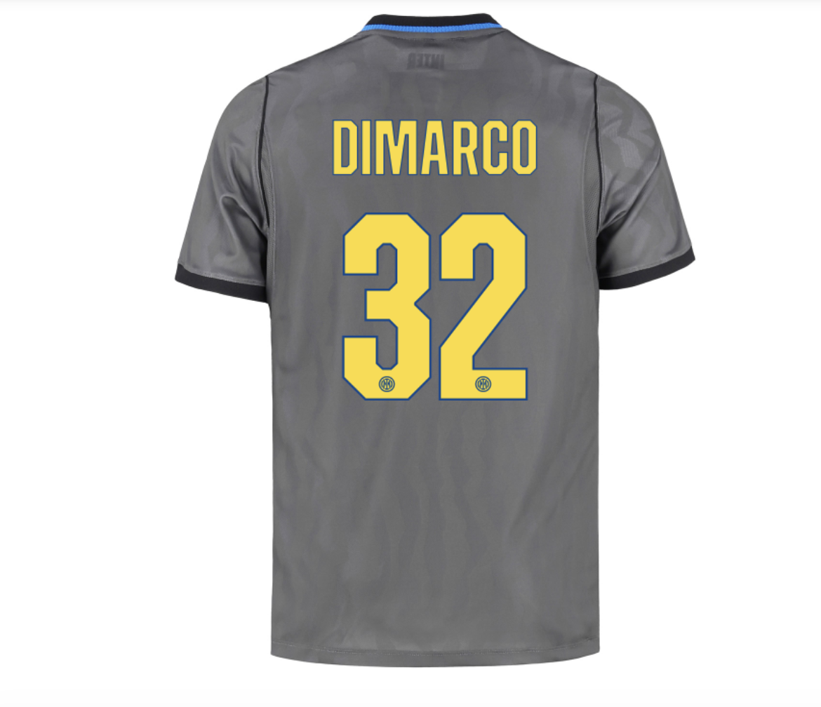
For their Champions League match against Feyenoord, Inter will take to the pitch with something new. Cristian Chivu's side will be wearing a special font, a unique typeface designed specifically for their 2026/27 Third kit. They are the third Serie A side to wear a different font in European competition from the one used in the domestic league, following Napoli, who introduced an eighties-inspired typeface across all their kits, and AC Milan, who unveiled a special gold font for their Away jersey, first seen in the Europa League against Bournemouth.
What Inter's new font will look like
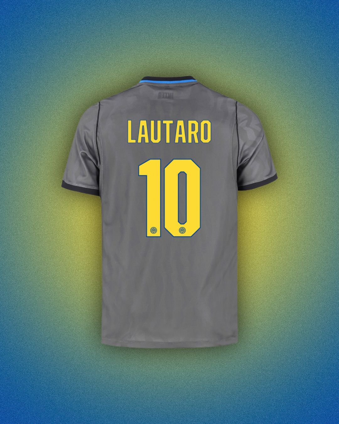
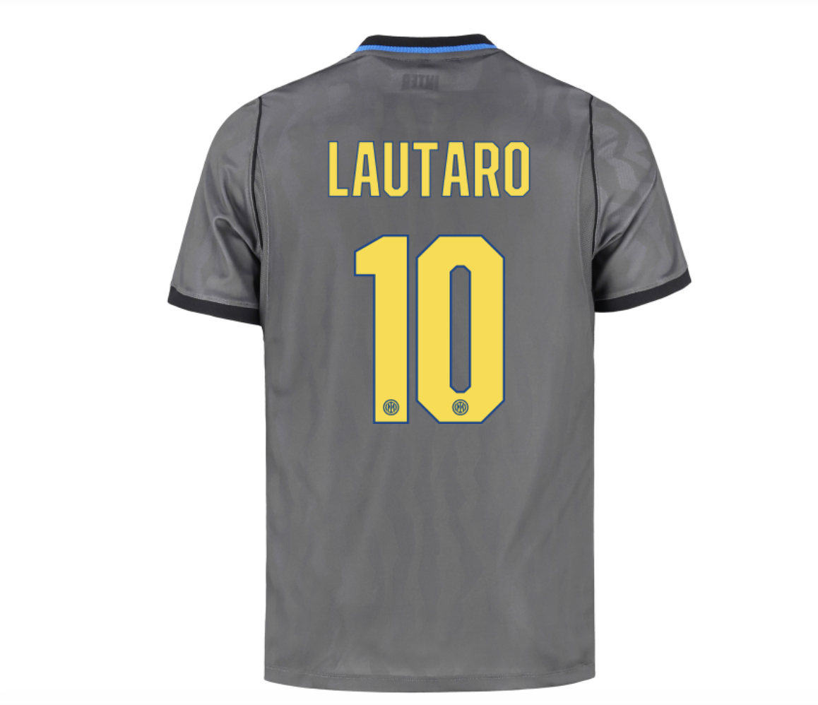
The font was developed by Nike, the Nerazzurri's long-standing technical sponsor. The main difference compared to Serie A's standard font is the almost complete absence of curved lines. The shapes are much more geometric, almost brutalist in some cases, combining long straight lines with considerably shorter segments to create the angles and complete the outlines of the numbers and letters.
The font will appear in yellow with blue outlines, in keeping with the nineties-inspired aesthetic of Inter's Third jersey. It is already available on the club's official online store and can be applied to the third shirt. The special typeface will not be available for personalisation on the Home or Away jerseys, while it remains unclear whether it will also feature on the club's goalkeeper kits.
The font will not be the only aesthetic difference compared to Serie A matches. As was already the case for Inter's first away fixture against Real Madrid, the Nerazzurri will not be allowed to display the Betsson.Sport logo on the front of their shirt due to the regulations on gambling advertising currently in force in the Netherlands.
What do UEFA regulations say about fonts?
As has been pointed out on several occasions, UEFA does not require teams competing in the Champions League to use a standardised font. At the same time, the UEFA Equipment Regulations set out a number of specific requirements. The fundamental principle is legibility: numbers and names must be clearly distinguishable by the refereeing team, commentators, spectators and television viewers, both in daylight and under floodlights, from a distance of at least 50 metres. Numbers on the back of shirts must meet specific requirements regarding visibility, colour contrast and dimensions, while those appearing on shorts must be between 10 and 15 centimetres high.
Players' names, positioned above the number on the back of the shirt, must also comply with precise guidelines: they can only be written using the Latin alphabet, with letters no taller than 7.5 centimetres and in a single colour. The regulations allow for some creative freedom, including outlines, three-dimensional effects and small graphic elements, provided they do not compromise legibility. References to sponsors, manufacturer identifiers and purely decorative elements are, however, prohibited within numbers and names.
What to read next
Nobody in the Premier League enjoys celebrating like Thierno Barry
The only reason to tune in to an Everton match
Is the world of sport boycotting influencers?
What recent measures introduced by clubs and major events tell us