


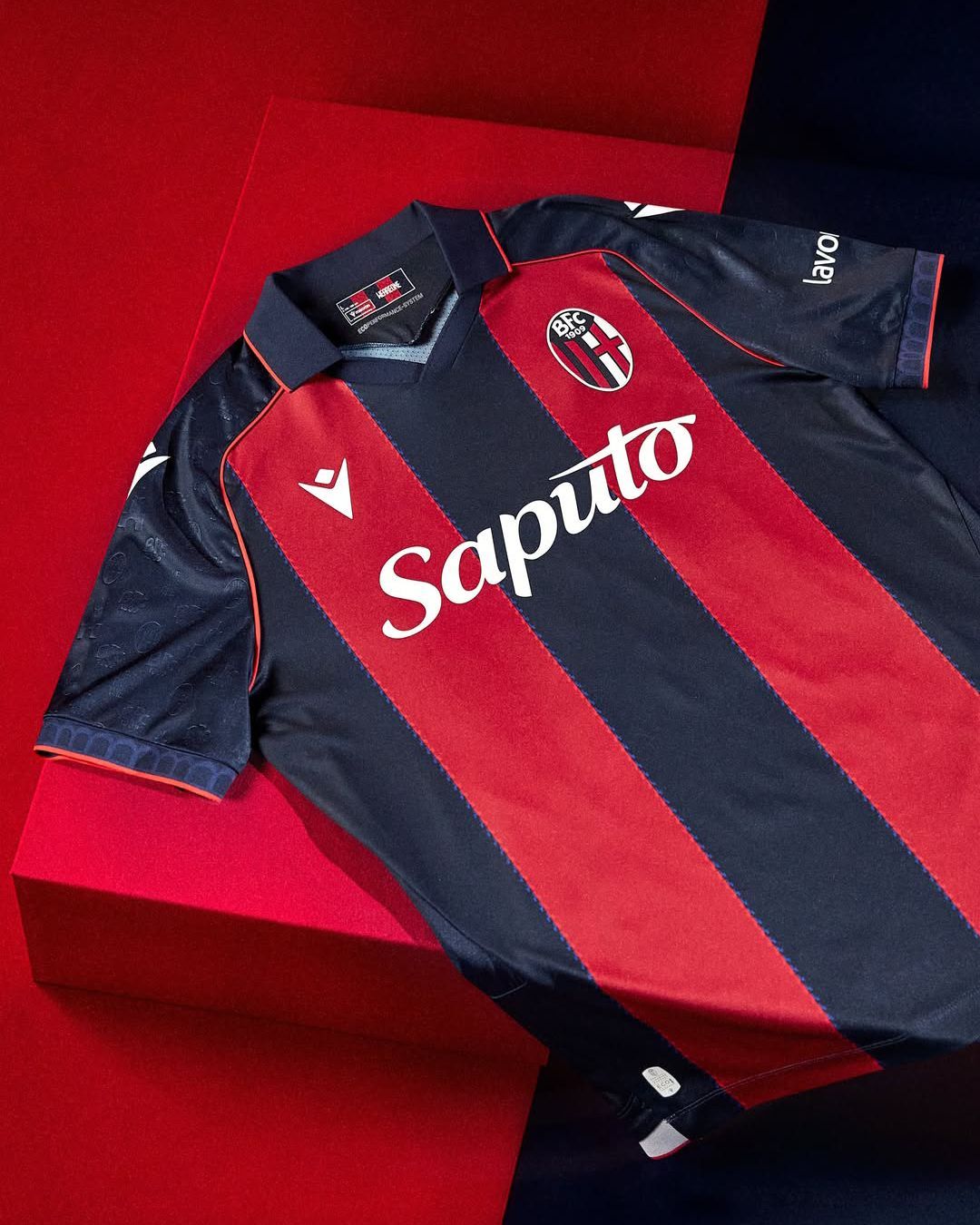

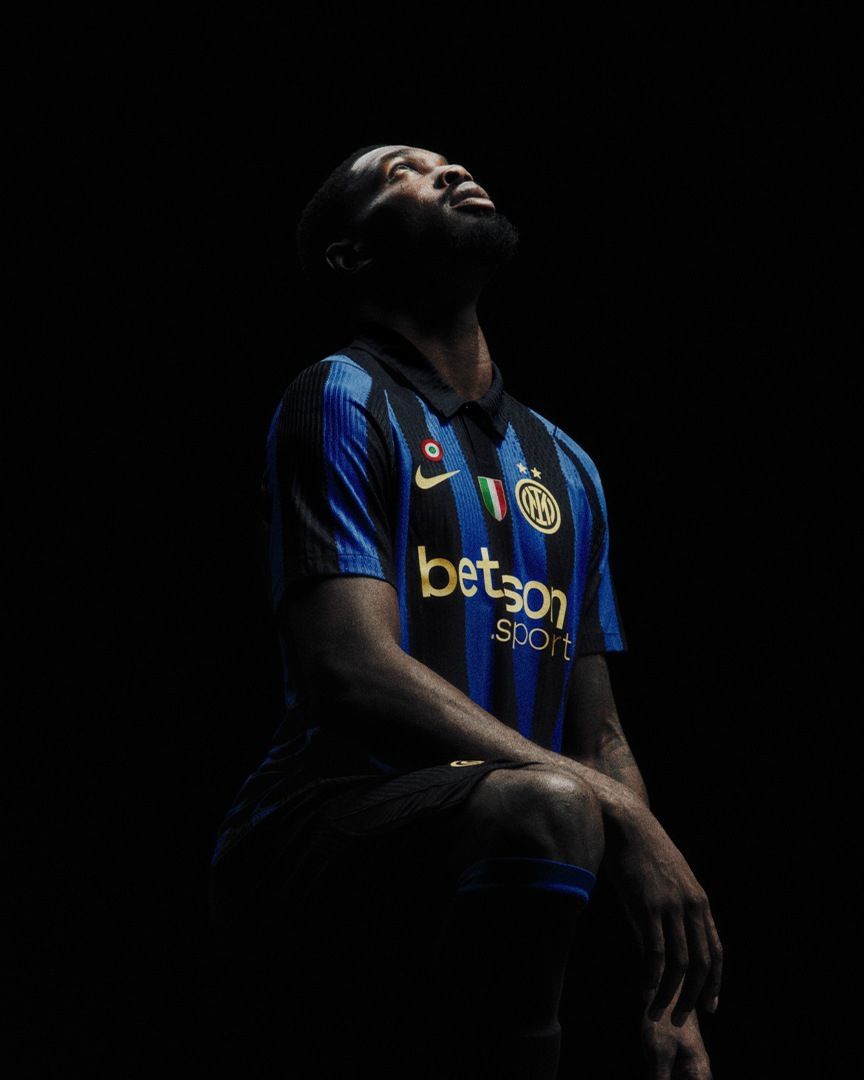
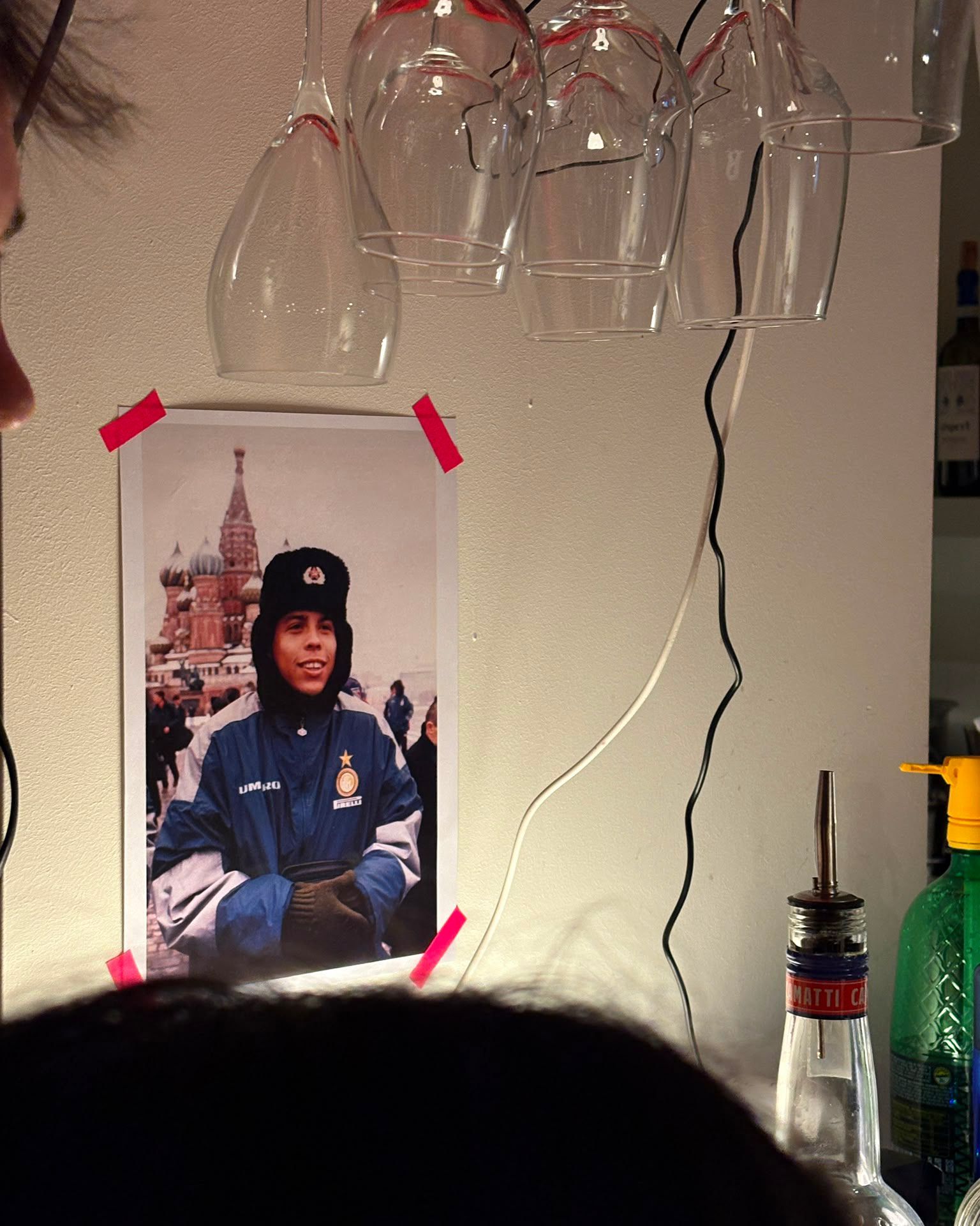


Stripes always change on Inter's jerseys And it's not necessarily bad
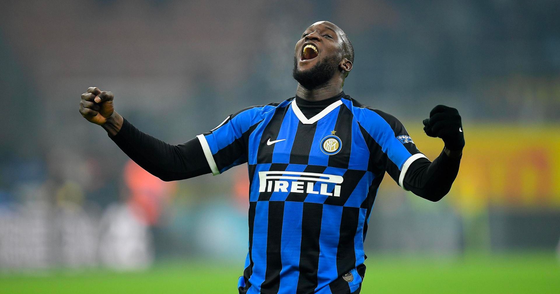

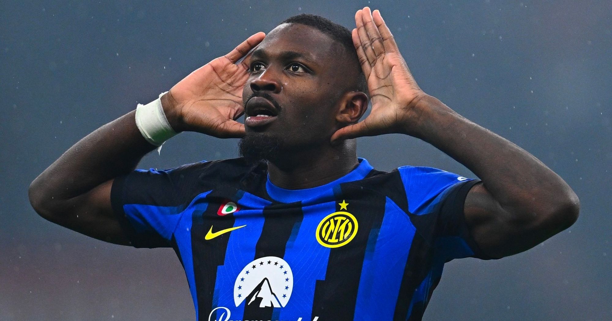
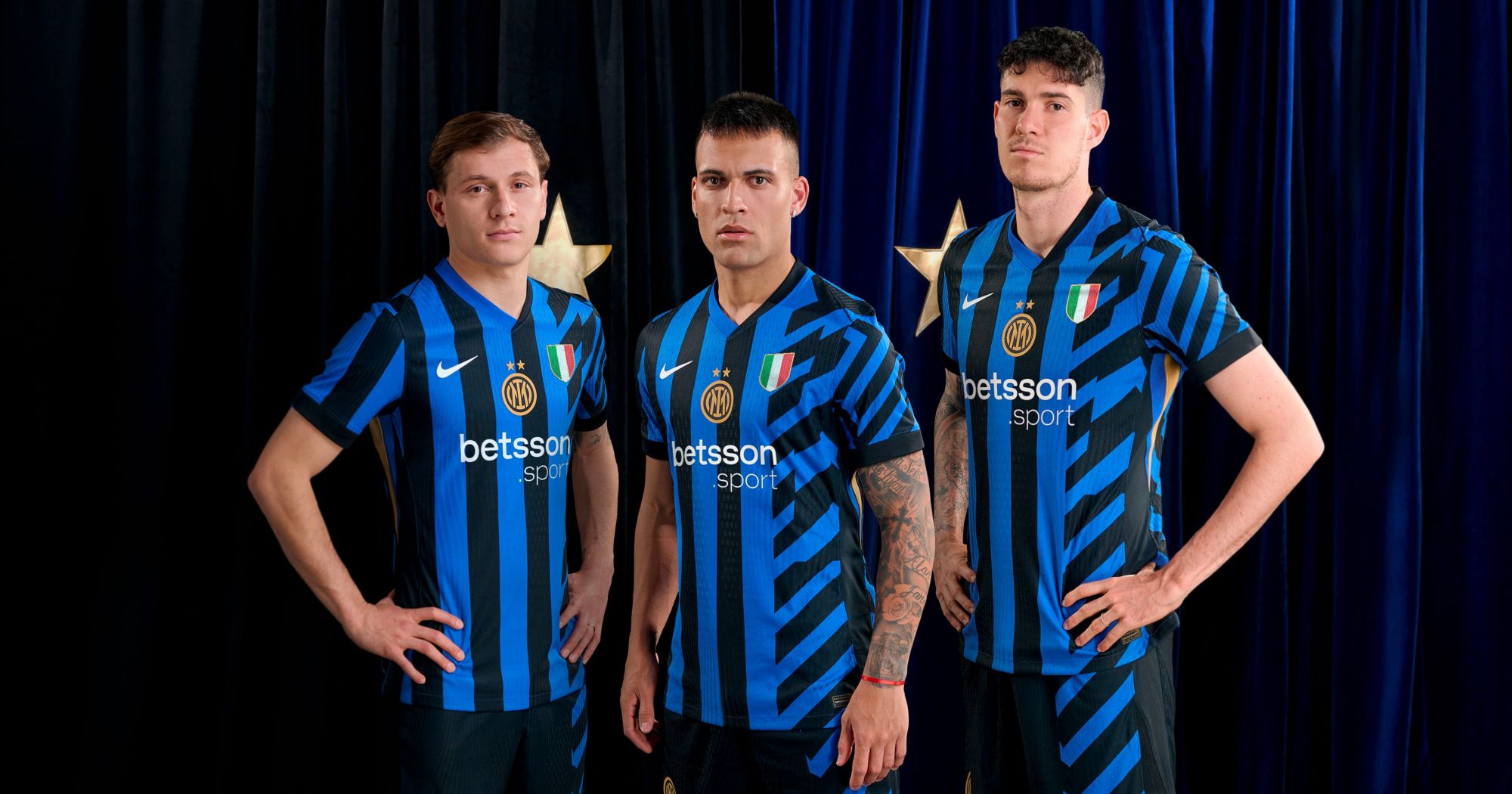
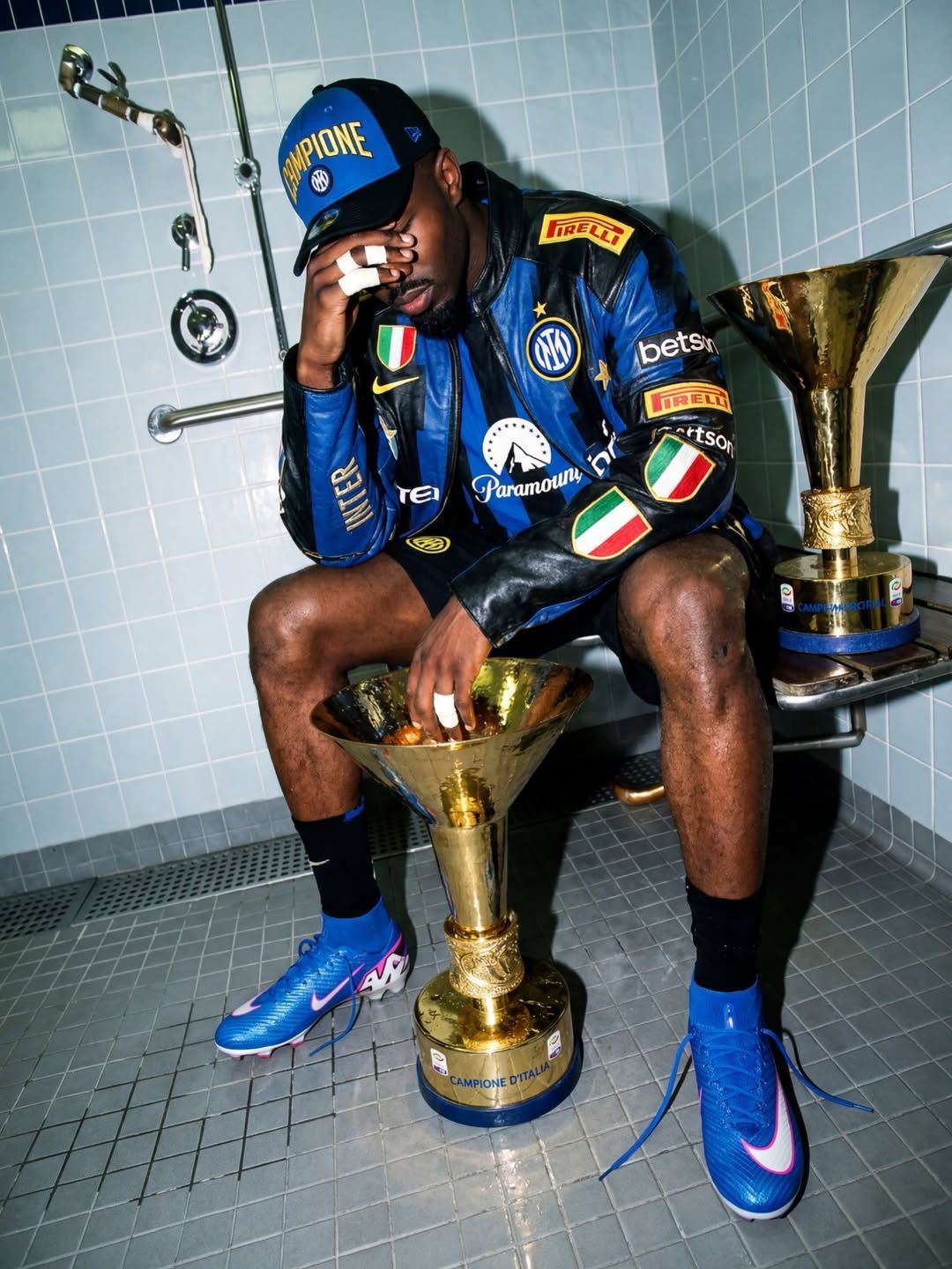
Nike has done it again. Once again, the black and blue vertical stripes on Inter’s Home jersey have changed compared to the previous season. And it’s not just a matter of tweaking a few details. This marks a true stylistic break. Conceptually different jerseys from one another. Over the past ten years, Inter’s Home jerseys have been reinterpreted, revised, adapted, and revolutionized. The latest release, unveiled just before the Club World Cup ahead of the 2025/26 season, features a design where the iconic black and blue stripes are skillfully shaped to form the word “INTER”, with Chlorine Blue details. A jersey with a bold, eye-catching design, completely different from what we saw last season, when the traditional vertical stripes on the left side of the shirt were paired with a modern, dynamic reinterpretation that also extended to the shorts.
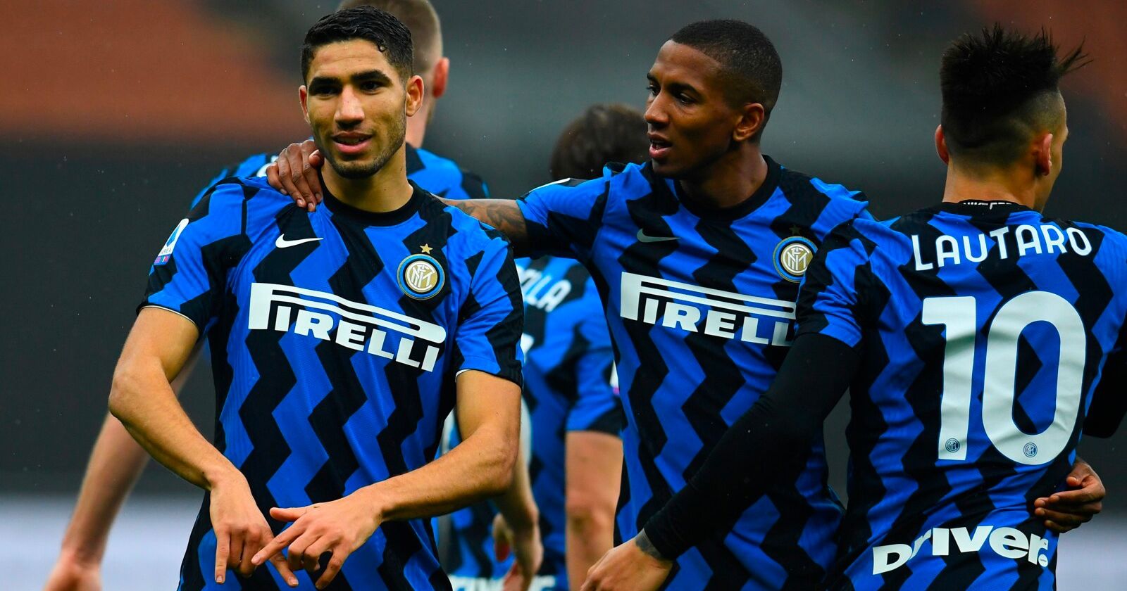
Looking back in time, we can find more examples: in the 2023/24 season, the traditional pattern with vertical stripes was abandoned in favor of a wavy pixelated design. In the 2021/22 season, the stripes disappeared entirely, replaced by a complex snakeskin pattern in two shades of blue. The 2020/21 season paid tribute to tribal pop with the introduction of a zig-zag pattern, an evolution of the previous season's design, where a band of diagonal stripes was applied around the sponsor area, breaking the traditional layout. In the 2017/18 season, Nike opted for vertical stripes in varying widths, inspired by the architecture of the city of Milan. A long list of alternative solutions, culminating in the pinstripe pattern of the 2014/15 season, when the vertical stripes were reinterpreted with thin light blue lines on a black background. These temporal leaps in the design history always coincided with a return to the classic layout of parallel vertical stripes.
Innovating a home jersey is never easy. Especially when the club’s colors are culturally recognized and represented through a predetermined concept, vertical stripes, in this case. The biggest risk is offending the fans by creating a kit that, in their eyes, doesn’t honor the club’s heritage. On the flip side, playing it safe can result in something basic, if not outright bland and boring. With Inter, Nike has chosen to move away from monotony, daring to innovate, to raise the bar, and to present the same concept each year in different shapes and patterns—always striving to revolutionize what was seen the season before. The result of this vision leads to products that don’t always receive unanimous praise, but that truly reflect a clear intent to resist nostalgia for the Home jersey, and to avoid a retro aesthetic disguised as tradition. It’s about looking ahead, taking risks with colors and forms, and the Nike-Inter partnership is the perfect example. This doesn’t mean breaking with tradition, but rather creating a new visual identity aligned with modern times.