


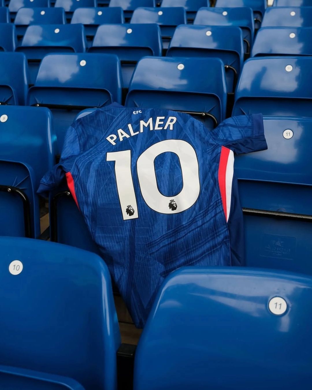
The greatest downgrade ever for a Home jersey How Nike e Chelsea have wasted an opportunity

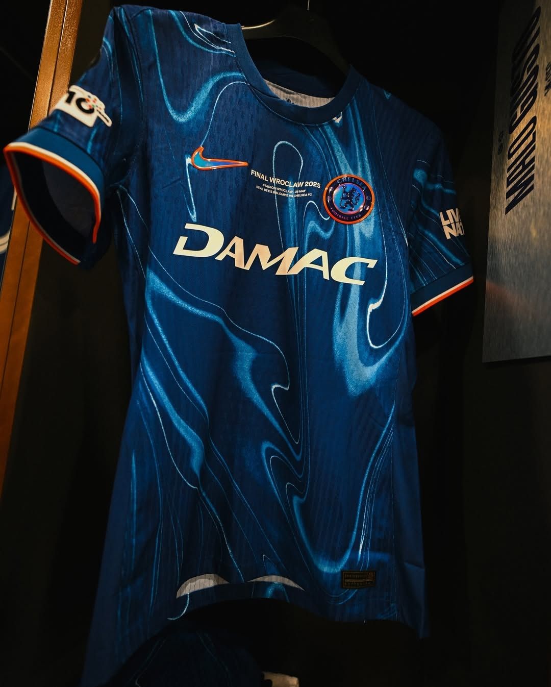

An architectural pattern inspired by the urban design of London: this is the motif that defines Chelsea’s Home jersey for the 2025/26 season. A shirt wore for the first time at the Club World Cup that, despite this unique stylistic solution, remains faithful to traditional standards and thus adheres to a basic vision. A monochromatic first shirt with white details in order to respect tradition, the club’s colors, and above all, the fans’ emotions. To put it bluntly, it’s a downgrade compared to what we saw last season. In fact: it’s the biggest downgrade ever for a Home jersey from one season to the next. The Chelsea Home jersey for the 2024/25 season had stunned everyone. Nike opted for a flame motif that ran across both the shirt and shorts, with no precise layout. The wavy design was a psychedelic pattern combining sky-blue effects with white finishes. The shirt was completed with orange details and 3D-effect logos. This design evolved from the previous season's iridescent logos on a simple blue shirt with white inserts.
It was certainly a bold move, but one that fit perfectly within the new narrative Chelsea was trying to build. The Roman Abramovich era had been marked by many titles, many stars, and massive spending in the transfer market, but the club remained trapped in an image that, Drogba aside, was never really cool. There was never a sense of freshness, every Premier League or international triumph always carried an air of old aristocracy. The arrival of Todd Boehly and Clearlake Capital shook this dogma to its core. Perception around Chelsea changed suddenly, helped by a seemingly endless stream of young signings acquired without budget concerns. Chelsea’s new corporate vision had to be accompanied by a new identity. Fresher, more modern. A break was necessary, and the 2024/25 Home jersey fulfilled that need perfectly. A kit that not only distanced itself from the club’s history but projected Chelsea into a completely different realm compared to other European clubs. “Tradition is a successful innovation”, and Nike’s creation for Chelsea was much more than a successful innovation, it was a stroke of genius turned cult thanks to the rise of Cold Palmer.
Home jerseys are the football garment where experimentation happens the least, as clubs and brands understandably fear fans' reactions, the guardians of tradition and their first customers. Against this backdrop, Nike has dared to go in the opposite direction with its ideas, as a brand aiming to lead the market should. The decision to create a flame-patterned home kit was Nike’s best in recent years, and success stems from bold intuition. The 2024/25 home jersey is a design that will feature time and again in discussions about the greatest home jersey of all time. However, that conversation will never include the 2025/26 kit, which, although well-crafted and supported by a beautiful campaign celebrating Chelsea’s connection to London and its fans, is ultimately forgettable. However, the addition of the 'Our House' tagline, borrowed from Madness, adds hype to a jersey that is destined to be forgotten by the end of the season. It's a shame, because Nike and Chelsea had a huge opportunity to reaffirm their avant-garde status in the world of football shirts. Excellence and innovation are never easy to achieve in any field, but in this case, it feels like they didn’t even try.