


What makes the clubs color so important How a simple choice made early-on affects the lifelong identity of a football club
Identity is the sum of the many traits that sets one person or entity apart from all the others. It’s what makes them who they are, and it’s a concept that carries a lot of weight in football. Any identity is built over time, but in the sporting world this statement rings truer for collectives than it does for individuals. A single season can be enough to trigger a certain perception of a player or manager’s character, for better or worse. But for a club, we generally need to see decades worth of successes, failures, actions and decisions before forming an understanding of what they’re all about.
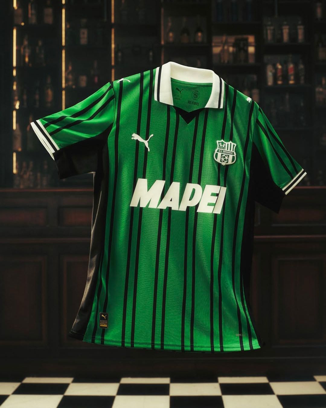
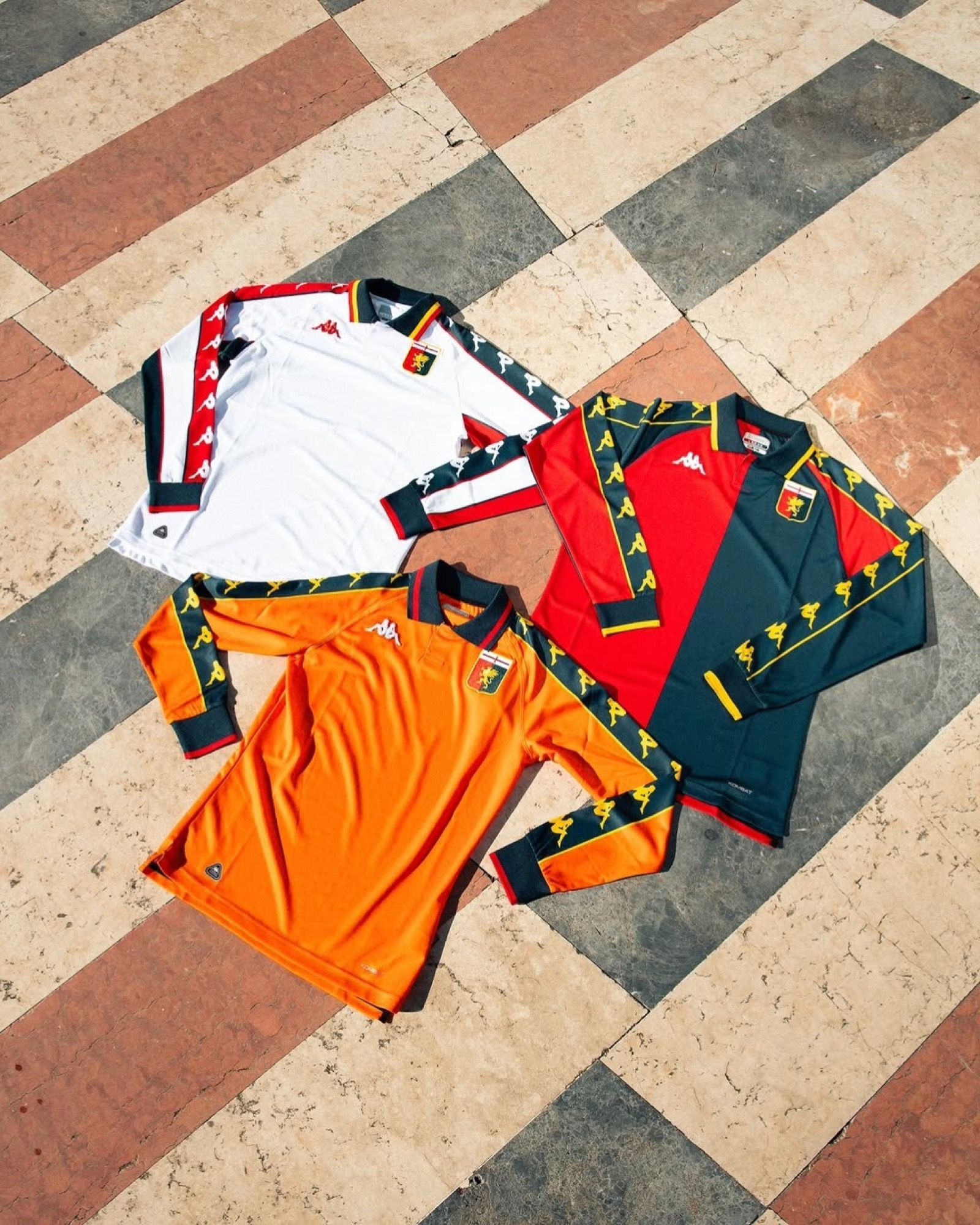
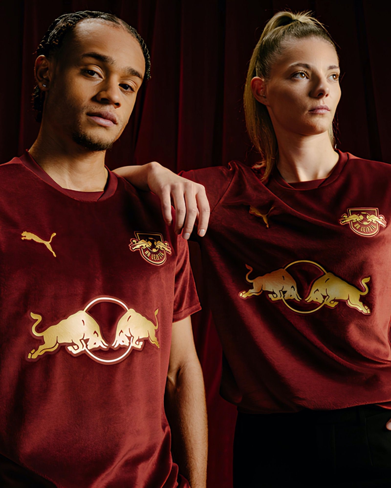
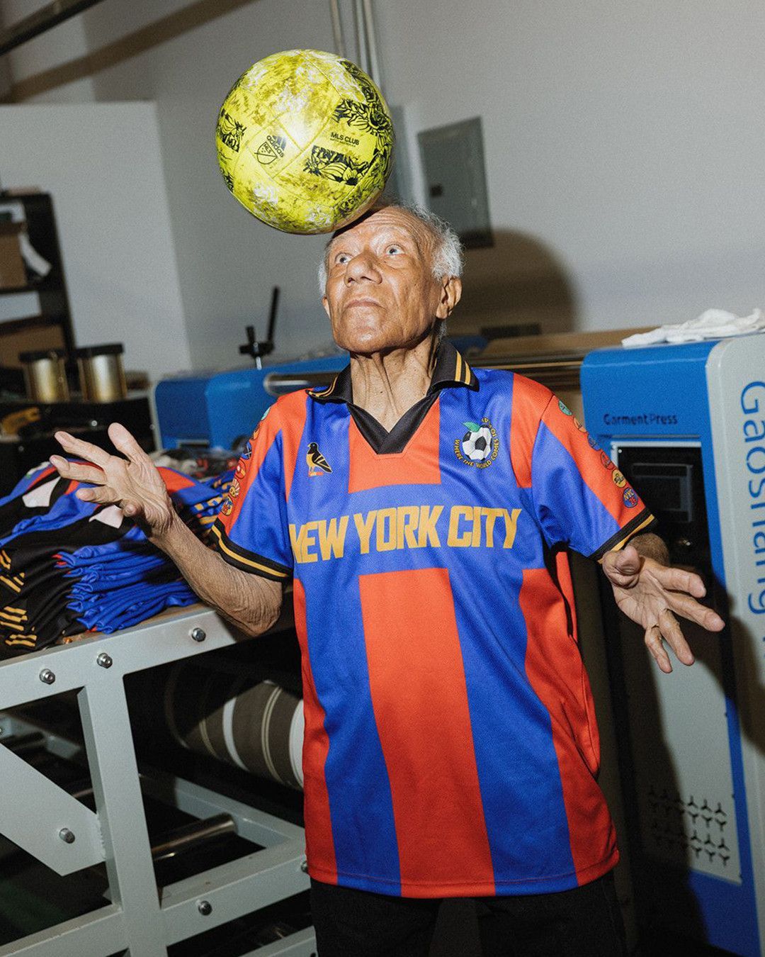
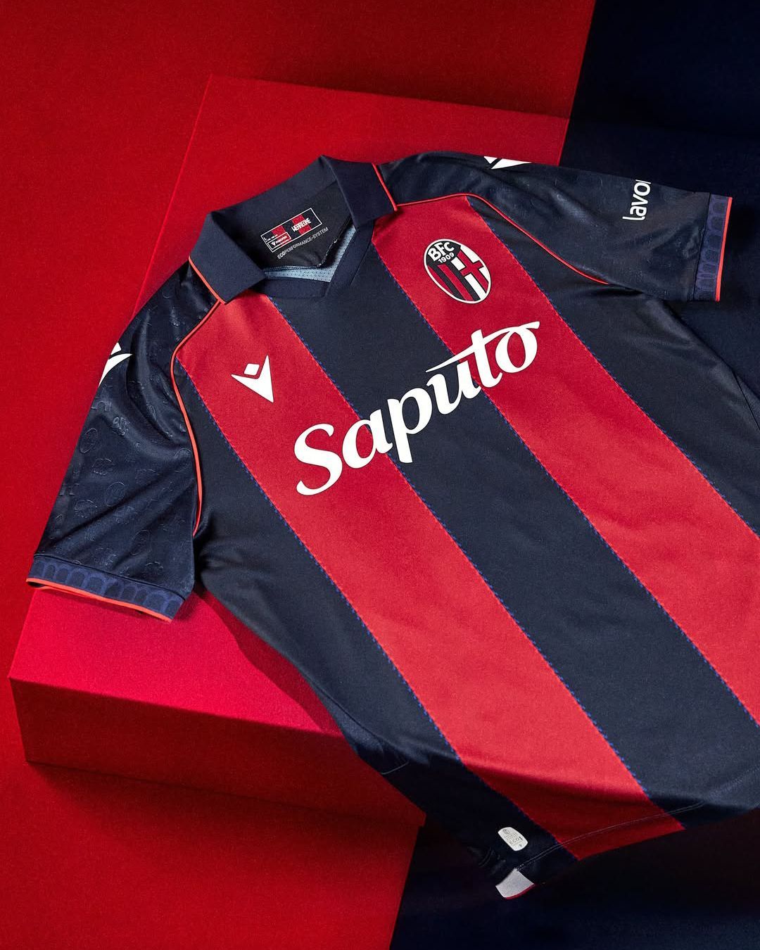
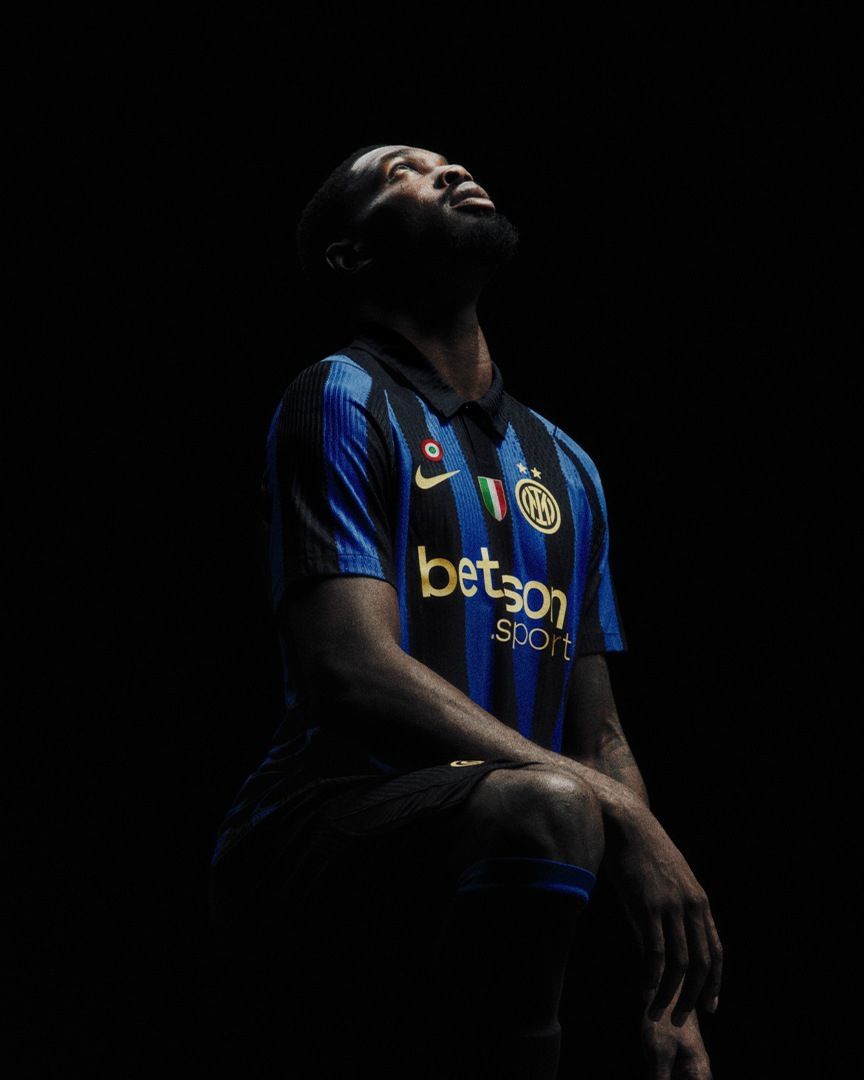
There is, however, one single decision that plays a major role in forming a club’s identity; their choice of colours. They are the number one identifier of a team. At the mere mention of Inter, you think of black and blue stripes. Celtic. Arsenal. Chelsea. Fiorentina. Despite their being no cue in these team names, just hearing them is enough for your brain to make that chromatic connection, to go straight to the shirts you’ve seen them wear. La Blaugrana. Die Roten. I Rossoneri. The Sky Blues. Across languages, colours are used as nicknames for football teams, and more often than not appear prominently in the names of ultras groups.
Now obviously, colours existed long before any sports team decided to claim them as their own. They’re present in nature, where they often convey warnings. As a society, we noticed the effects they have on us and attributed certain meanings to them. Furthermore, cities, empires, monarchies and nations tapped into the symbolism of colours and chose their own accordingly, adding an additional layer of cultural context to an already potent mix.
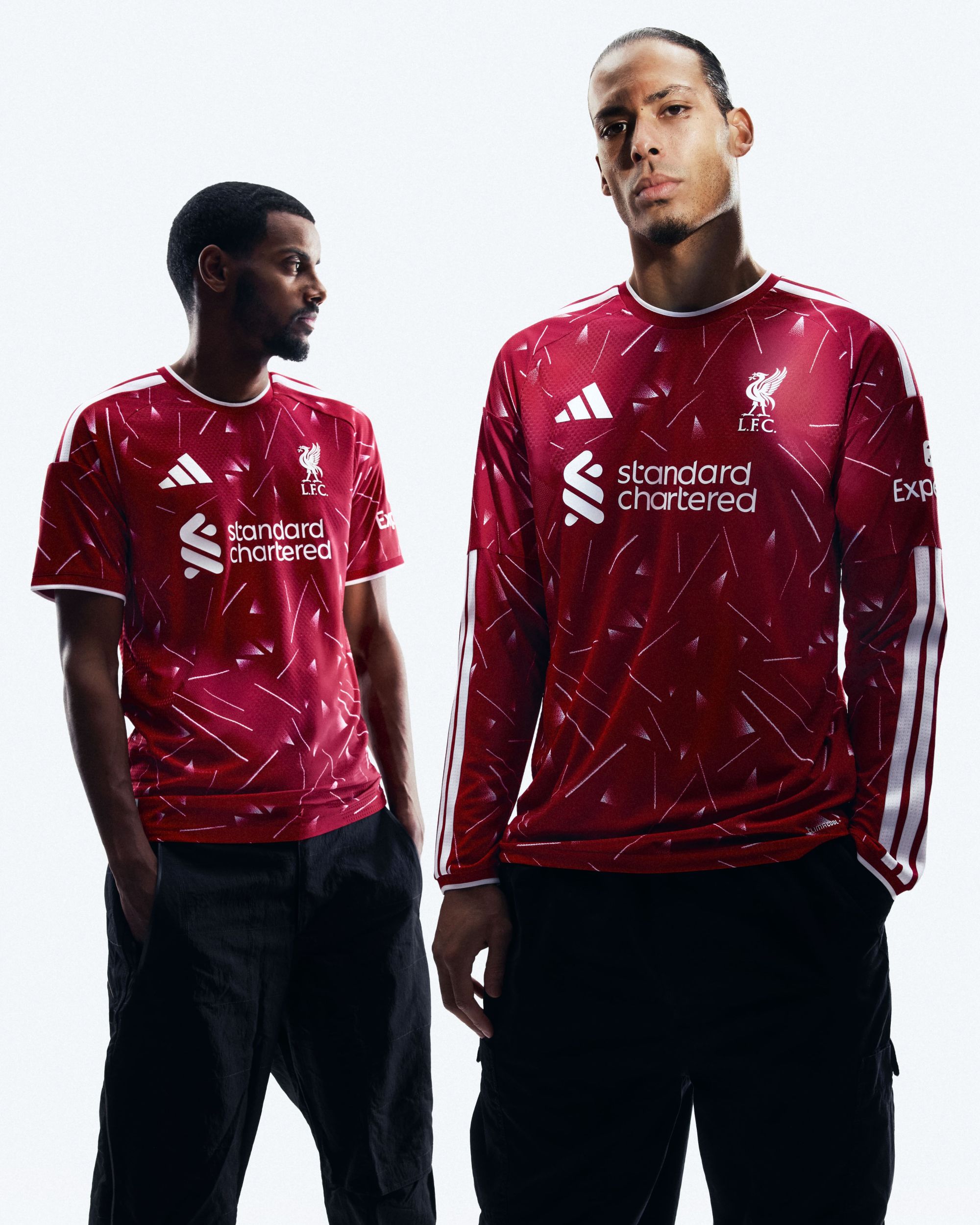
As they are a highly effective vehicle for symbolism, colours have an instant, subconscious impact on how we view the entity that has decided to adopt them. The threatening, aggressive connotations of red once corresponded perfectly to the all-conquering Manchester United, and more recently, Liverpool. The elegant, pure and regal qualities of white are a perfect match for Real Madrid and their historical superiority. Ajax combined these two colours in a simple but unique manner that matches their equally unique identity; a club that’s almost unmatched at recognising potential early on, giving young talent the chance to flourish while encouraging an attacking style of play.
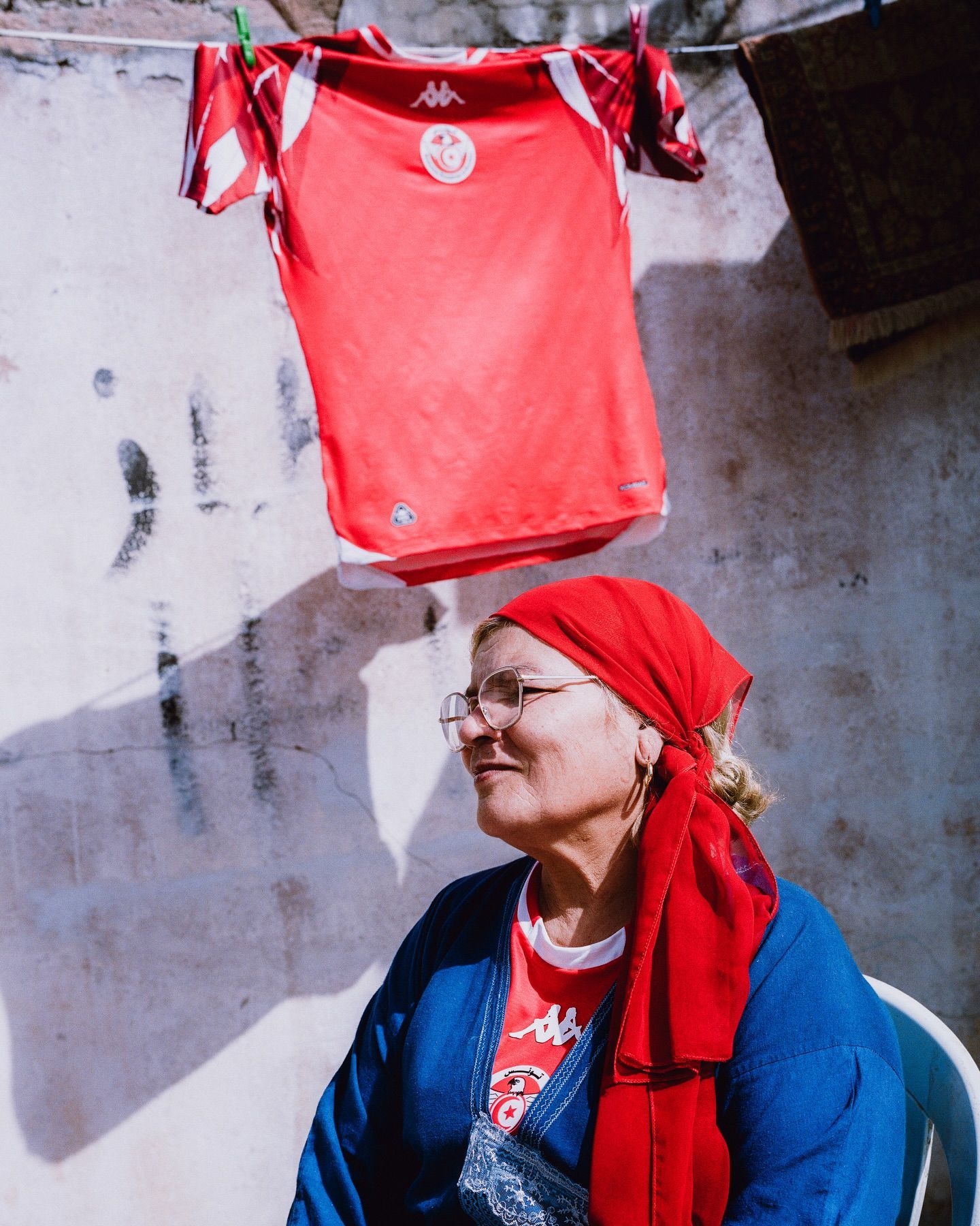
For fans who consider their support of their club as part of their own identity, by default, their team’s colours are sacred. Even to the extent that some base their entire wardrobes around them, get them permanently etched on their skin, and avoid those of their rivals like the plague.
Tottenham’s home shirts have featured a red sponsor logo for several seasons now, something that still irks some sections of the Spurs fanbase to this day because of its association with their North London rivals. At the beginning of the 22-23 season, Milan ultras group Banditi Curva Sud criticised the decision of their club to launch a black pre-match collection that featured a shade of blue very similar to that of Inter. In their Instagram post, they labelled it “disrespectful and intolerable”, and called on all milanisti to boycott the range. The result? Milan stopped the sale of all items bearing the black and blue of Inter.
In a recent visual rebrand, Borussia Dortmund officially reintroduced neon yellow to their colour palette, a shade that itself was a deviation from their established identity in the 1990s. As those vivid shirts coincided with Dortmund winning the Champions League in 1996, the electric hue managed to weave itself into the folklore and identity of the club, which is no mean feat for something that would often be considered a betrayal of tradition.
Exposure to something over time breeds fondness, acceptance and attachment. This is how colours become central to a club’s identity, through lifelong association, and why it is so hard to imagine an established team wearing anything else – and why those “colour swap” posts that do the rounds every so often on social media can be so jarring. Because Real Madrid are white, Napoli are blue and Fiorentina are purple. That’s the way things are. That’s the way we’ve always known them.
What we see today as an untouchable element of the culture, aesthetic and identity of these teams, however, did not always have so much gravitas. Some kind of visual identifier was a basic necessity for the players to be able to recognise their teammates on the pitch. Founding members chose a set of colours without the knowledge that their clubs would grow into institutions followed by millions of people worldwide. In some cases, they didn’t necessarily put a huge amount of thought into the decision.
Over the next few weeks, we’ll take a detailed look at how and why some of the most iconic clubs in the world came to be recognised as they are today, inseparable from their colours. Some took inspiration from their environment or local history, others used whatever shirts they could get their hands on, or even made the call on a whim. No matter how much deliberation was involved, these decisions set a legacy in motion that would be felt by far more people than they ever could have imagined.