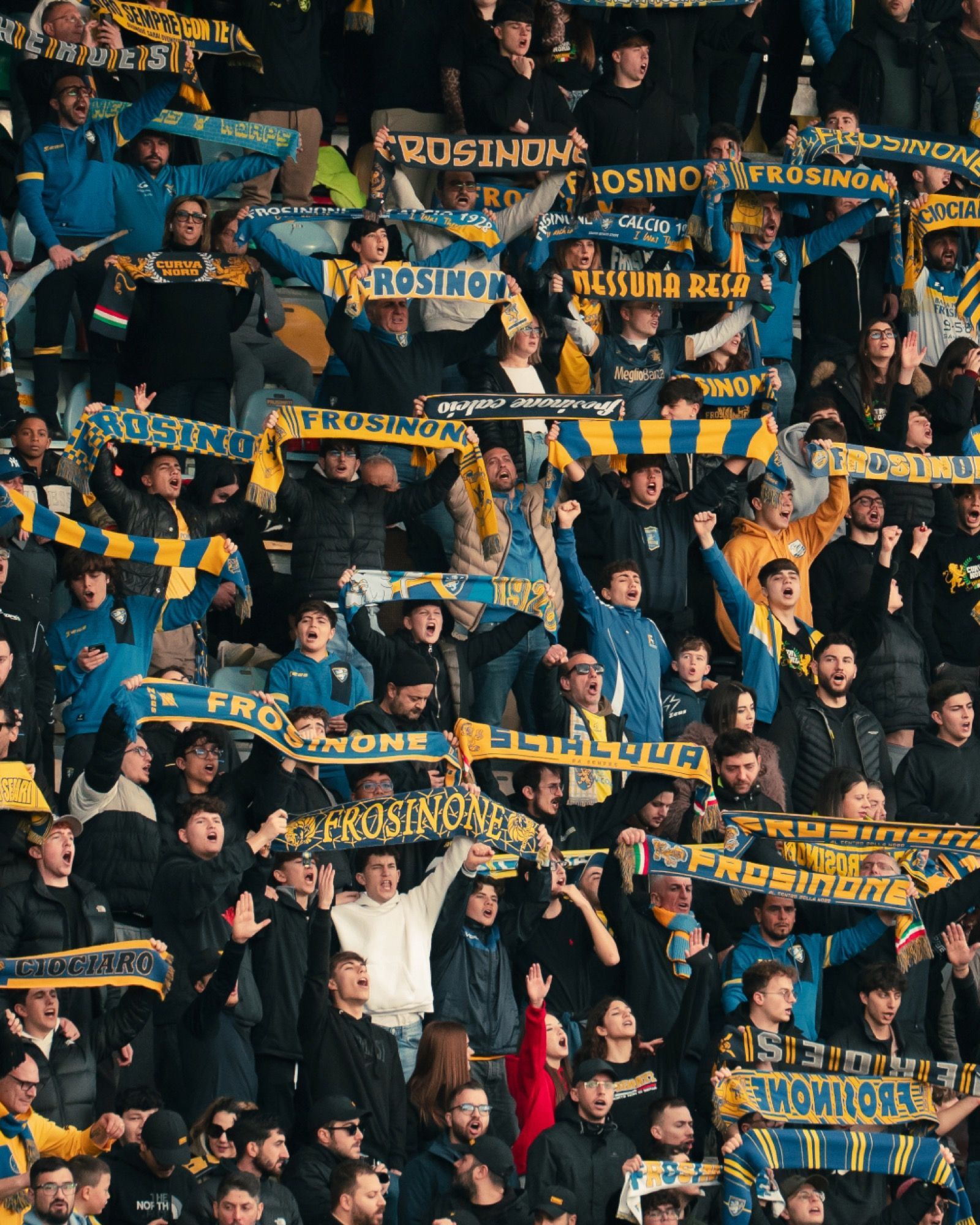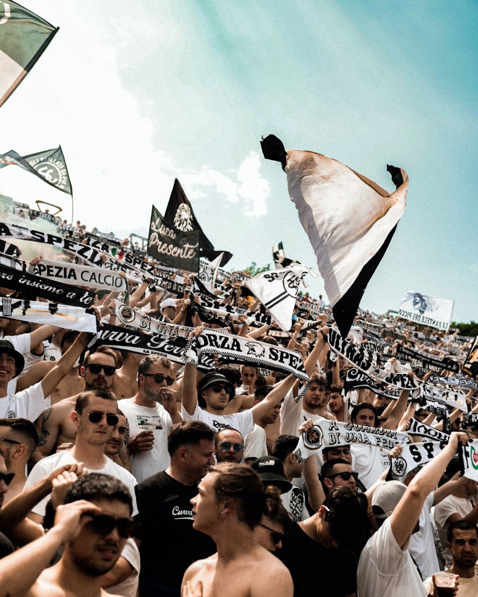


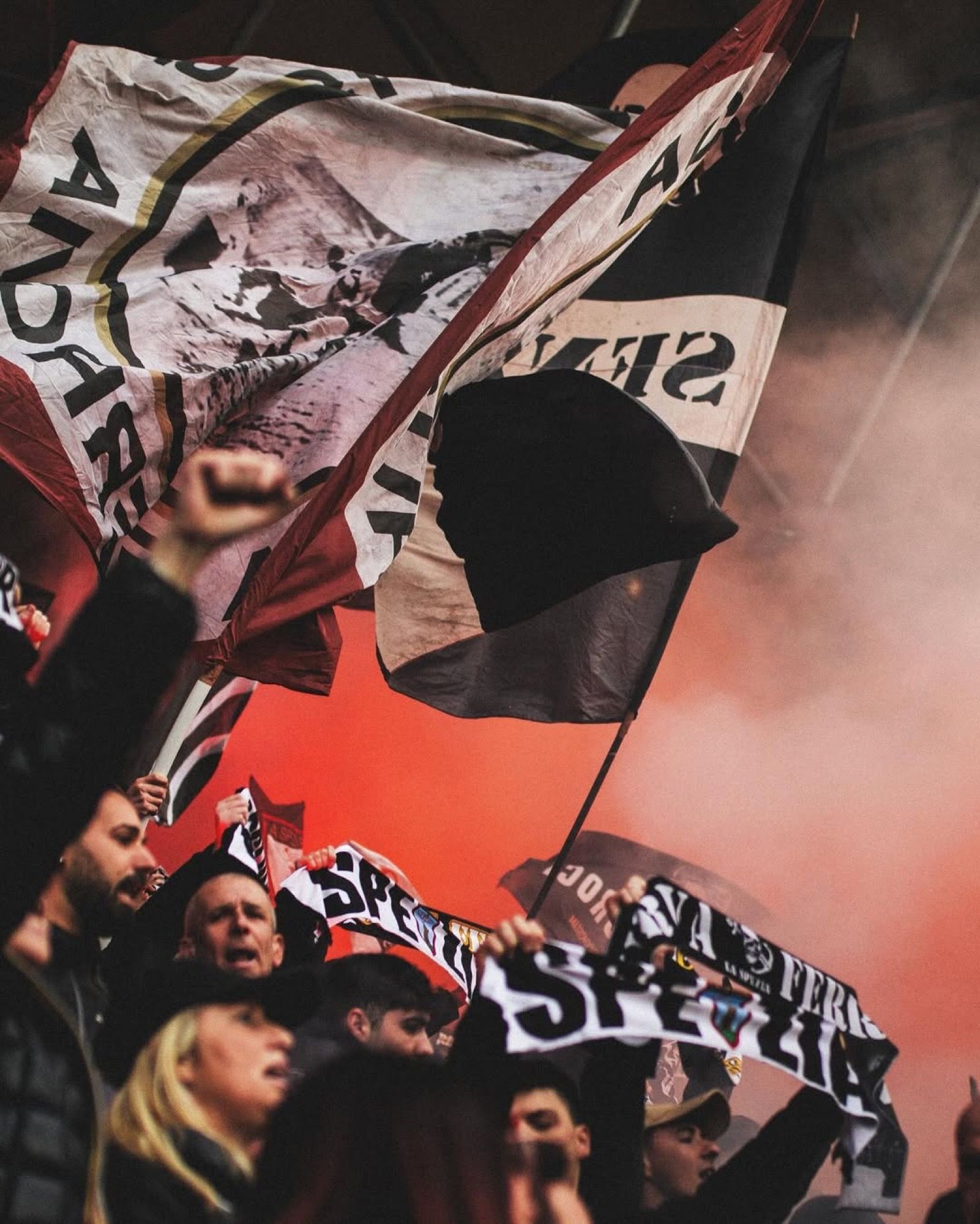
The Spezia has a new logo, chosen by the fans It will replace the current one starting from the next season
It is a time of great changes for Spezia. On April 23rd, the club announced a new ownership with the transition to RAM Spezia Holdings LP, a company based in the USA and owned by Thomas Roberts, an investor in the private equity sector. Just before the playoffs, in which the team coached by Luca D'Angelo will try to obtain promotion to Serie A, there is also the launch of the new logo. It was chosen by the fans, as announced by the club in October 2024, in order to put an end to all the controversies surrounding the previous logo, a stylized black eagle, which many considered a reference to Nazi iconography.
The basis of the new logo is represented by the choice to include the letters S and C, as a reference to Spezia Calcio, enclosed in a circle. This pattern was the basis for the four logos among which the fans could choose their favorite. The winning logo, with 62% of the votes, is characterized by the shield used in 1944, the year in which Spezia won the Scudetto. The proportions have been recalibrated to align with modern graphic standards, while preserving the historical identity. A single black and white color version has been chosen, emphasizing the essentiality, sobriety, and strong visual identity of the club.
The social launch of the logo was accompanied by the slogan "The future is in our roots", a metaphorical journey to rediscover the roots of the club and the love that fans have for it, in order to develop the identity that will accompany Spezia in its future. As confirmed by the club, the current logo will be used on official jerseys until the end of the current season. The debut of the new logo is scheduled for next season with fans, management, and ownership hoping that it will coincide with the return to Serie A.