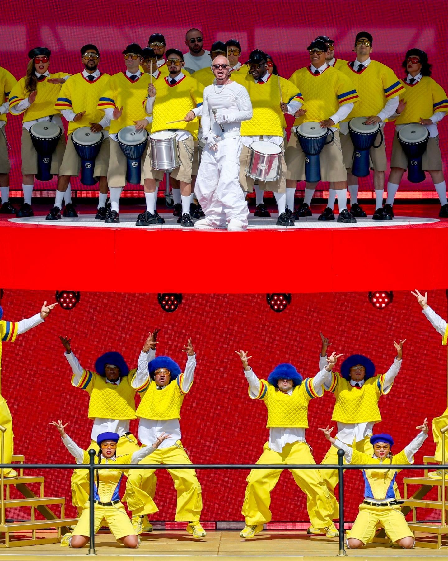


The best pre-match jerseys at the Club World Cup Geometric patterns, soft lines and bright colours
The Club World Cup is in full swing, offering us a series of aesthetic innovations. While most of the attention is understandably focused on the match kits, even the pre-match warm-ups have become occasions for brands and teams to unveil new collections. While warm-ups used to be done in the same shirts worn for training, today's pre-match jerseys have become an integral part of a club's visual identity.
Thus, the Club World Cup has become a catwalk where brands debut their new lines, showcasing to fans and enthusiasts shirts with geometric patterns or softer lines, jerseys dominated by black and others led by vibrant colors.
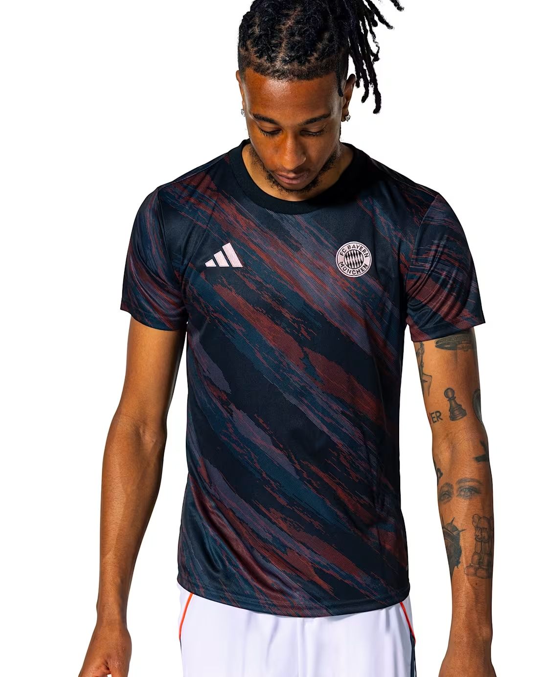
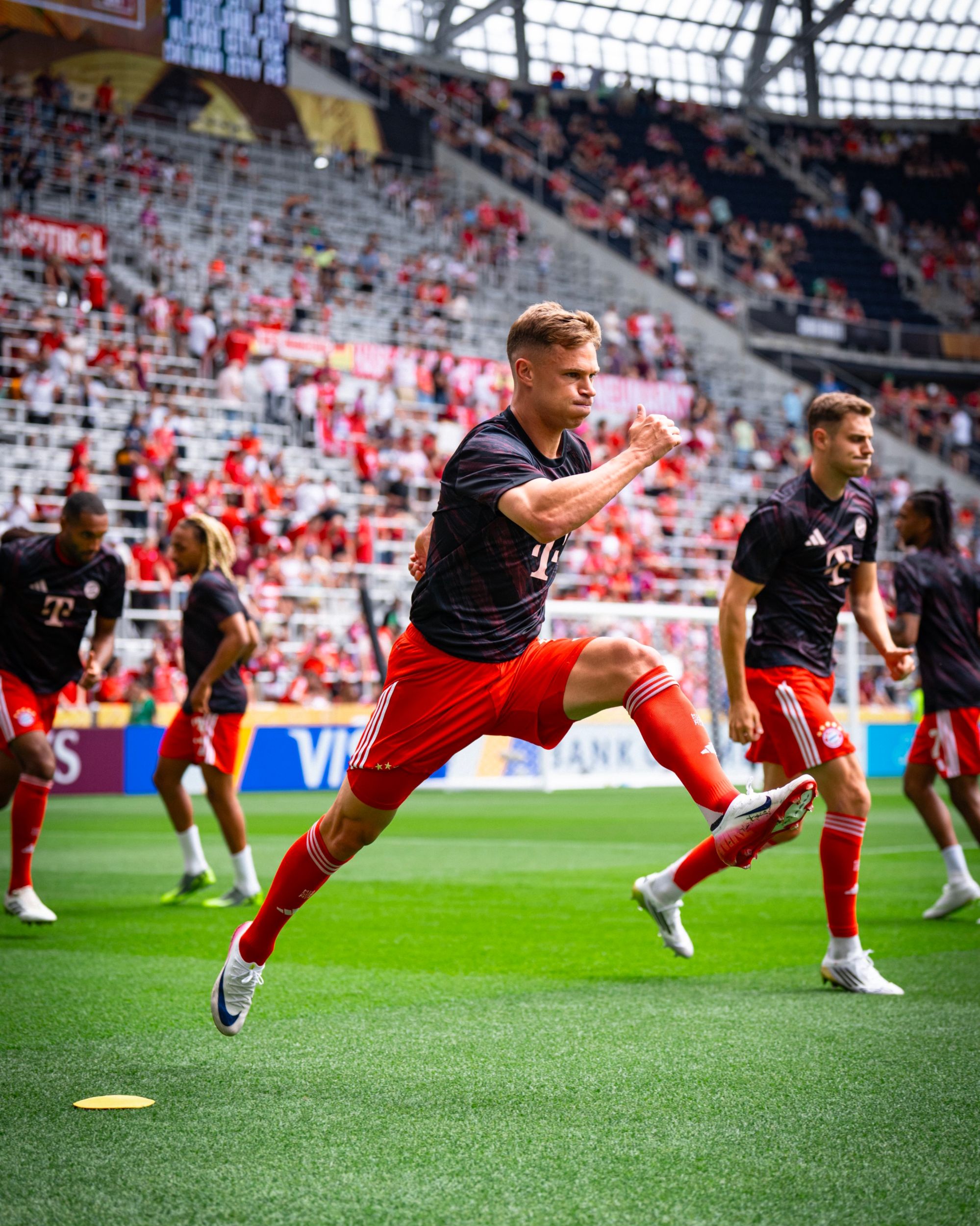
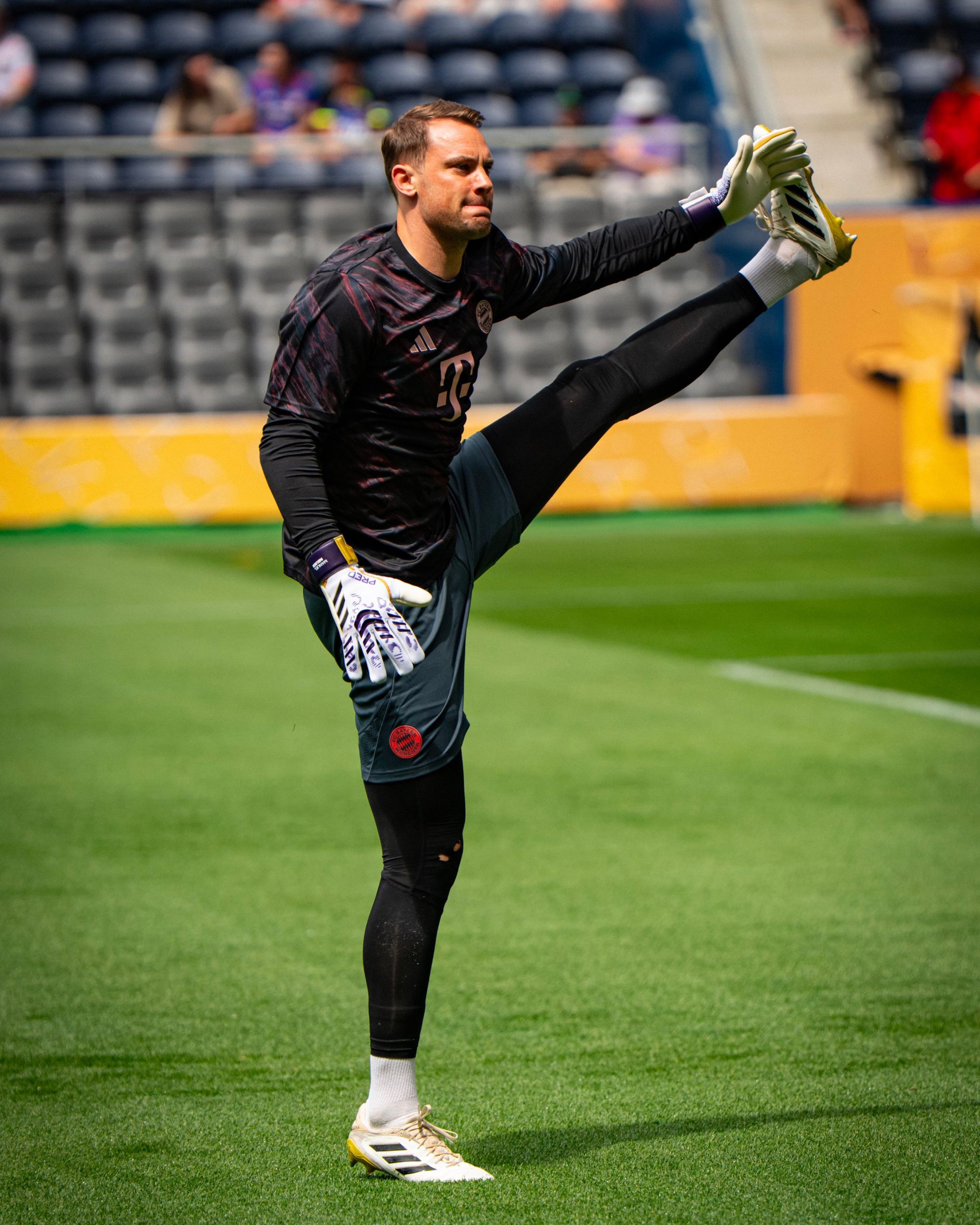
Bayern Munich - adidas
Bayern Munich is undoubtedly one of adidas’s flagship clubs, and the Bavarian team is always featured in major three stripes campaigns. For the 2025/26 season, this special partnership has resulted in the production of an Away jersey with a Teamgeist pattern and a baseball core-inspired apparel line.
This extra attention has led, in the case of the pre-match jersey, to a stunning shirt featuring an abstract pattern in which different shades of red, black, and blue overlap. The result is an irregular pattern made up of brushstrokes with small horizontal lines inside to add a contemporary touch. The logos of the technical sponsor and the club are embroidered.
Botafogo - Reebok
Aura 90 is the name Reebok chose for the fourth jersey that Botafogo is using this season. It's a shirt that revisits the club's colors, black and white, remodeling them in graffiti style to celebrate the urban culture of Rio de Janeiro and the art found on the city’s walls.
Part of that design has been carried over to the pre-match jersey, a solid black shirt except for a stripe running along both sleeves featuring the same Aura 90 graffiti. To make room for these stripes, all the shirt's logos are vertically aligned along a single axis, using a consistent color.
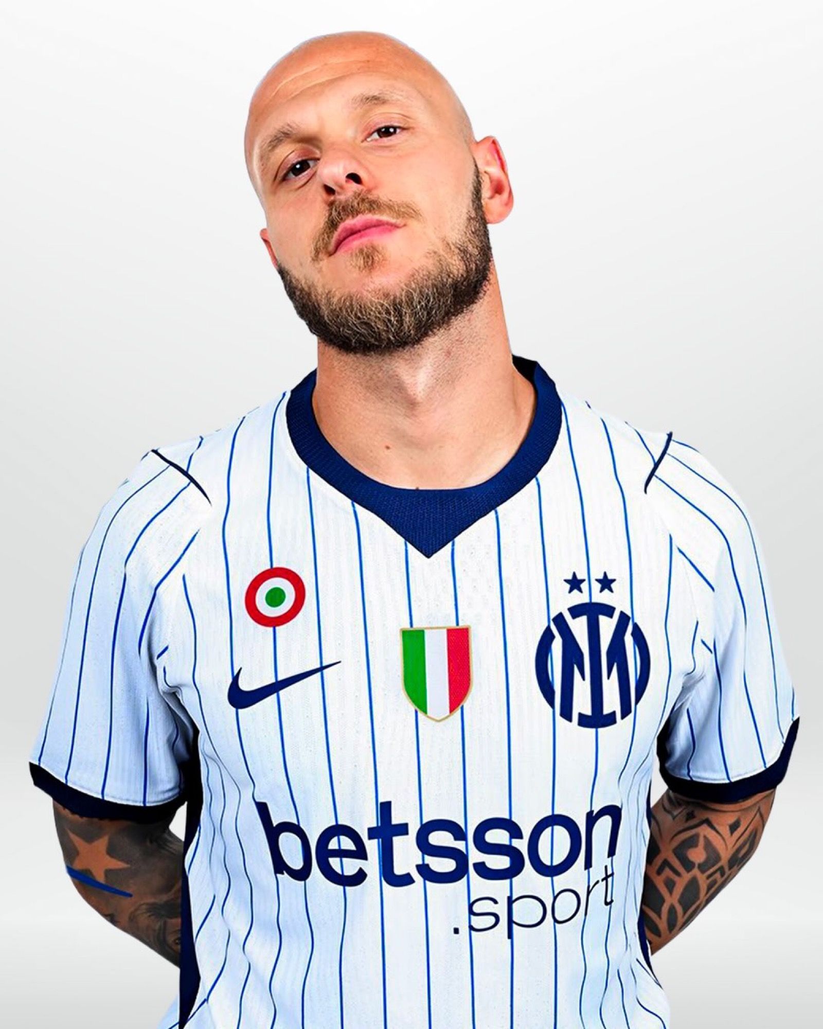
Inter - Nike
For the Club World Cup, Inter unveiled Nike’s full collection for the 2025/26 season: the Away jersey in Acqua Ghost, the new Home jersey where the iconic black and blue vertical stripes have been reinterpreted once again, and above all the new pre-match shirt featuring a sci-fi-inspired pattern.
It’s a black jersey adorned with glowing blue lines and dots forming a constellation. The main sponsor appears in white while, as a classy touch, the Swoosh and the club crest are rendered in the same shade as the constellations. A curious feature is the collar, Nike’s field of experimentation: here it's a classic crew neck interrupted by a fabric band running shoulder to shoulder, forming the back part of the collar.
Nike has extended this space-inspired design to other teams at the Club World Cup: Chelsea, Al Ain, Atletico Madrid, and Urawa Red Diamonds all wore their version of the jersey before their opening matches in the competition.
PSG - Nike
Nike also designed a space-themed pre-match jersey for PSG, but for the Club World Cup, Luis Enrique’s team wore a shirt based on the home jersey's design, although flipping its concept.
This red shirt with blue details features the Hechter stripe, one of PSG’s most iconic design elements, while around it develops a pattern that reinterprets the metallic geometry of the Eiffel Tower. The pattern also extends across the back, where it alternates with the red background to form the club logo across the entire back.
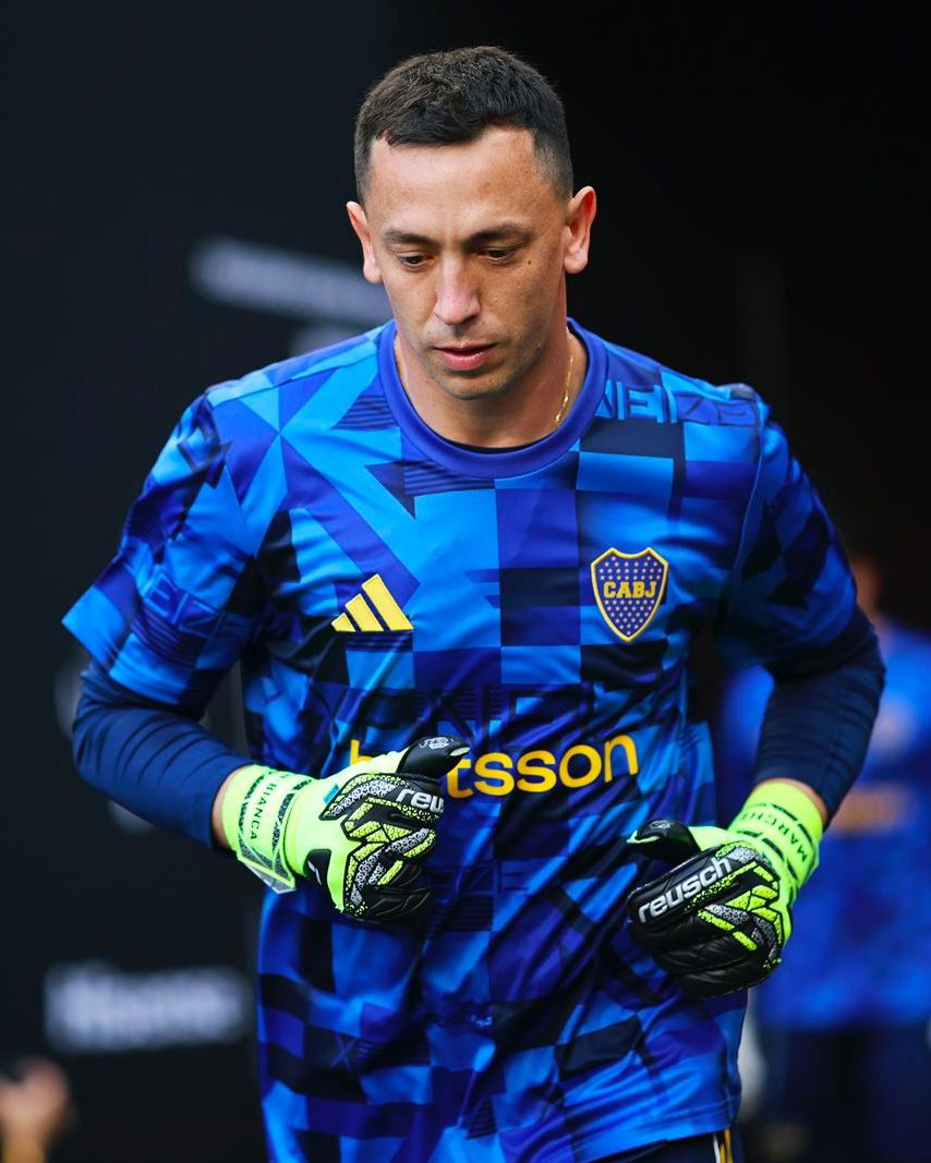
Boca Juniors - adidas
A geometric pattern featuring a mix of diamonds, triangles, squares, and arrows alternating both on the front and back. adidas opted for this design for Boca Juniors’ pre-match jersey, a shirt with various shades of blue that never overlap but always create a sense of disruption consistent with the rigid shape layout.
Yellow, Boca’s other club color, is used for the sponsors and for a small stripe inside the crew neck collar. Completing the look is the word xeneize, the term Boca fans use to identify themselves, adapted from the Italian word for Genovese as a reference the large Ligurian community in Buenos Aires, particularly in the working-class neighborhood of La Boca, key to the club’s founding.
The word appears in various forms across the shirt: in large navy blue letters across the center stripe, in smaller format on the left shoulder and right sleeve, in contrasting navy letters on light squares and lighter blue letters on navy squares, as a small word near the bottom, and finally as a giant single X on the left side.
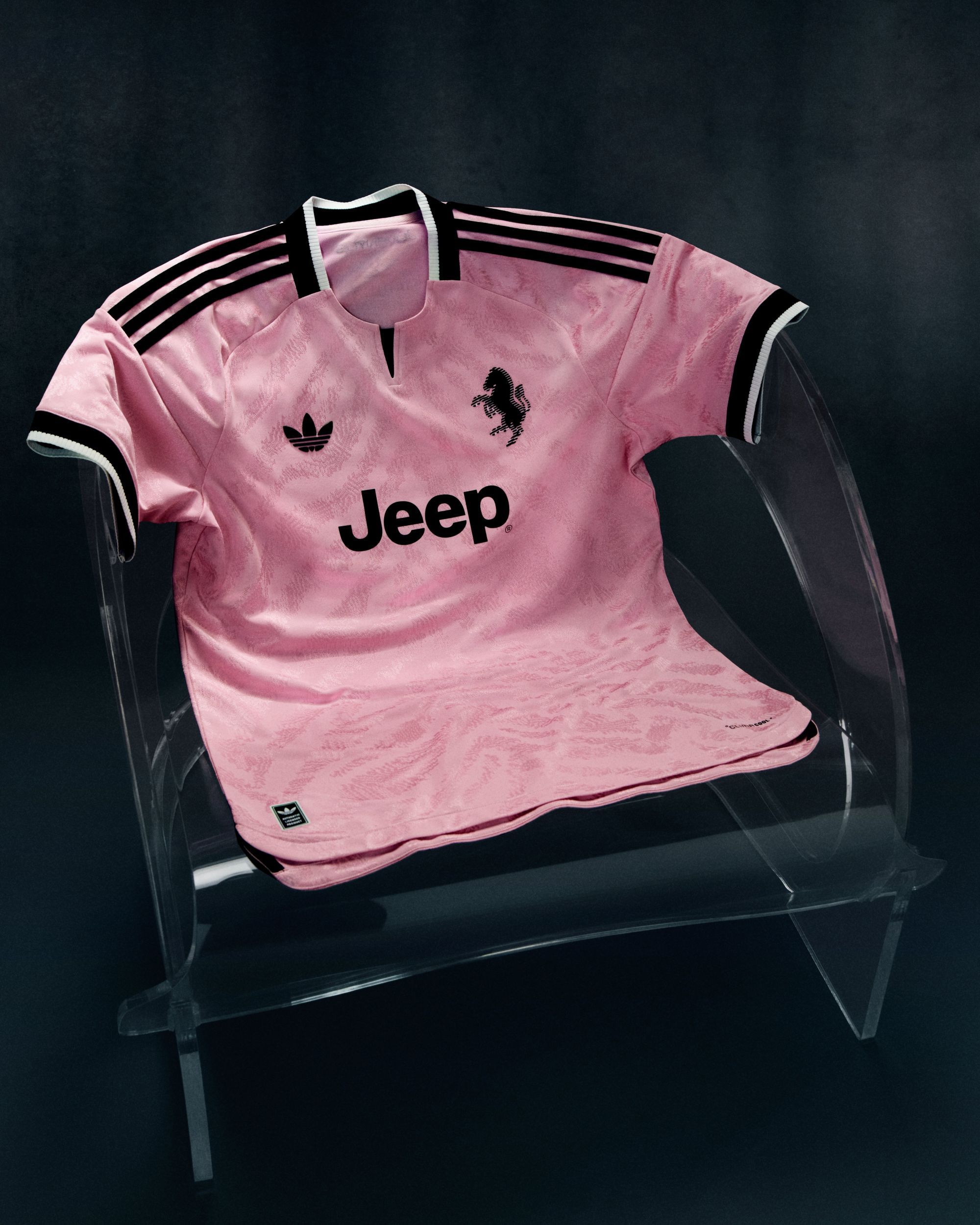
Juventus - adidas
As it happened at the and of the latest Serie A campaign, Juventus brought to the U.S. the adidas pre-match jersey inspired by the iconic color palette of the Italian fashion house Emilio Pucci. A shirt that in the league was paired with the new Home jersey while at the Club World Cup it accompanied the debut of the new Away jersey.
This aesthetic pairing of two conceptually different jerseys still results in a stylistically consistent match: with the Home jersey, the pink vertical bars interact with the shorts' detailing, while with the Away jersey, the aquamarine tone of the entire kit perfectly complements the dominant hue of the pre-match shirt.
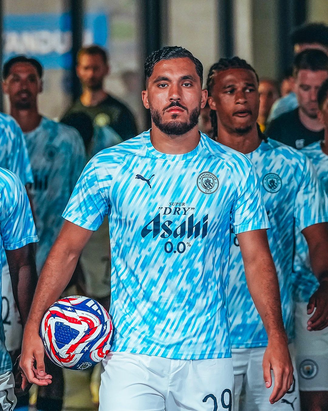
Manchester City - PUMA
A common trend among the Club World Cup pre-match jerseys is that club logos are not always displayed in their official colors. In most cases, the shapes follow tradition, but the colors match the jersey’s chromatic palette. The jersey PUMA created for Manchester City follows this approach.
It's a jersey that takes the classic sky blue of the Citizens and breaks it up into a design that at first glance seems pixelated. On closer inspection, it features light blue tiles that sometimes alternate with white tiles and other times fade into white. As mentioned, the logo isn’t in its official colors but is a monochromatic version with navy blue detailing on a sky blue background.