
The best pre-match jerseys for the 2025/26 season From Ligue 1 to Serie A


Sports
August 26th, 2025
August 26th, 2025
Football is back. Or perhaps it’s better to say it never really left, between the Club World Cup that dragged the European season until mid-July and the now classic transfer market saga that followed. What’s certain is that the leagues have resumed, with the top European teams officially kicking off the 2025/26 season.
Once again, it’s time for goals, penalties, fouls, controversies but also moments of anticipation. Like those before a match, when players spend their time doing their warm-up. Often wearing prematch shirts designed to catch the eye and the desires of the fans.
Ligue 1
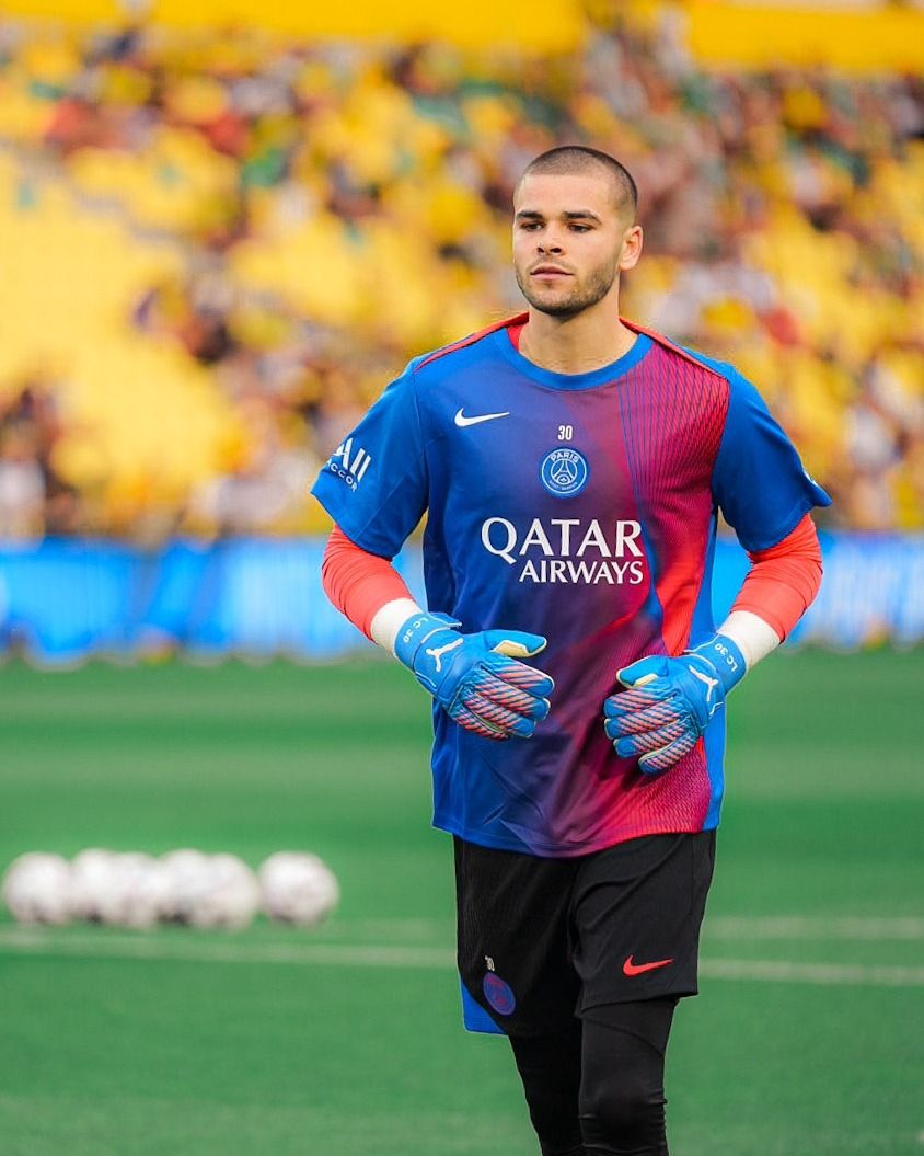
All eyes were obviously on PSG, who in Nantes, in addition to debuting the new Total 90 shirt, showcased a prematch featuring a play of red-blue shades along with the surprising collar that has become something of a trademark for Nike this season, with a crewneck intersected by a fabric strip running from shoulder to shoulder.
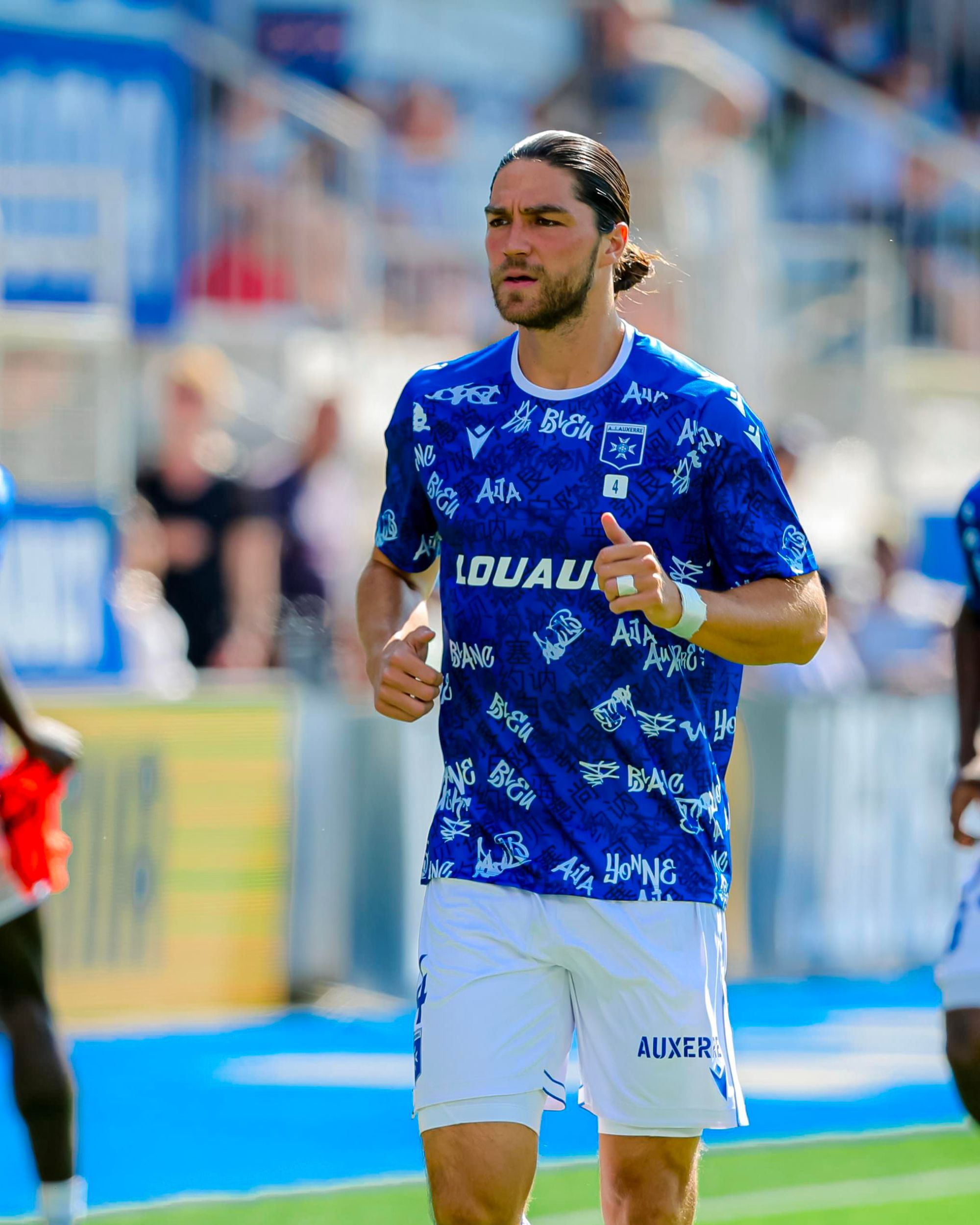
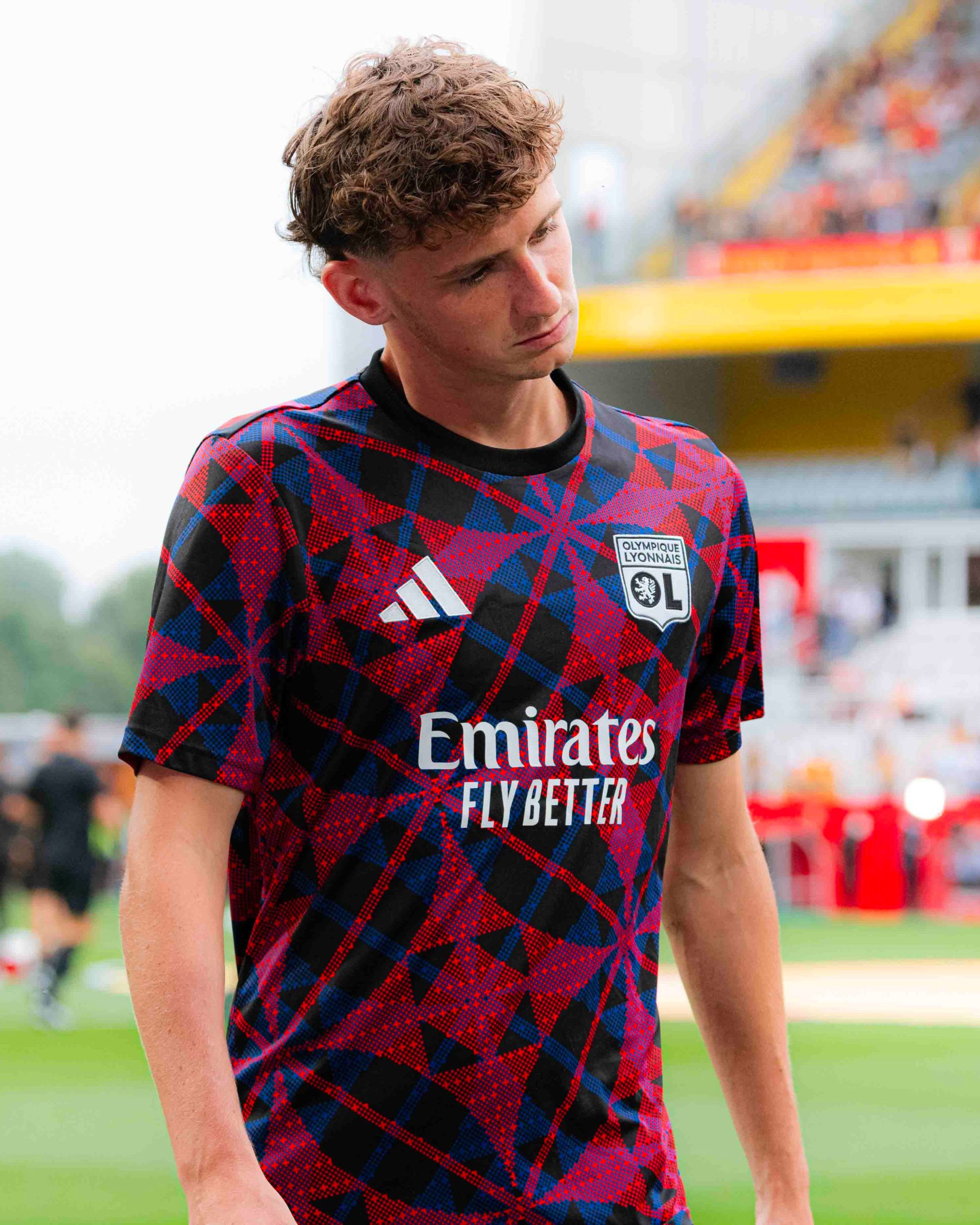
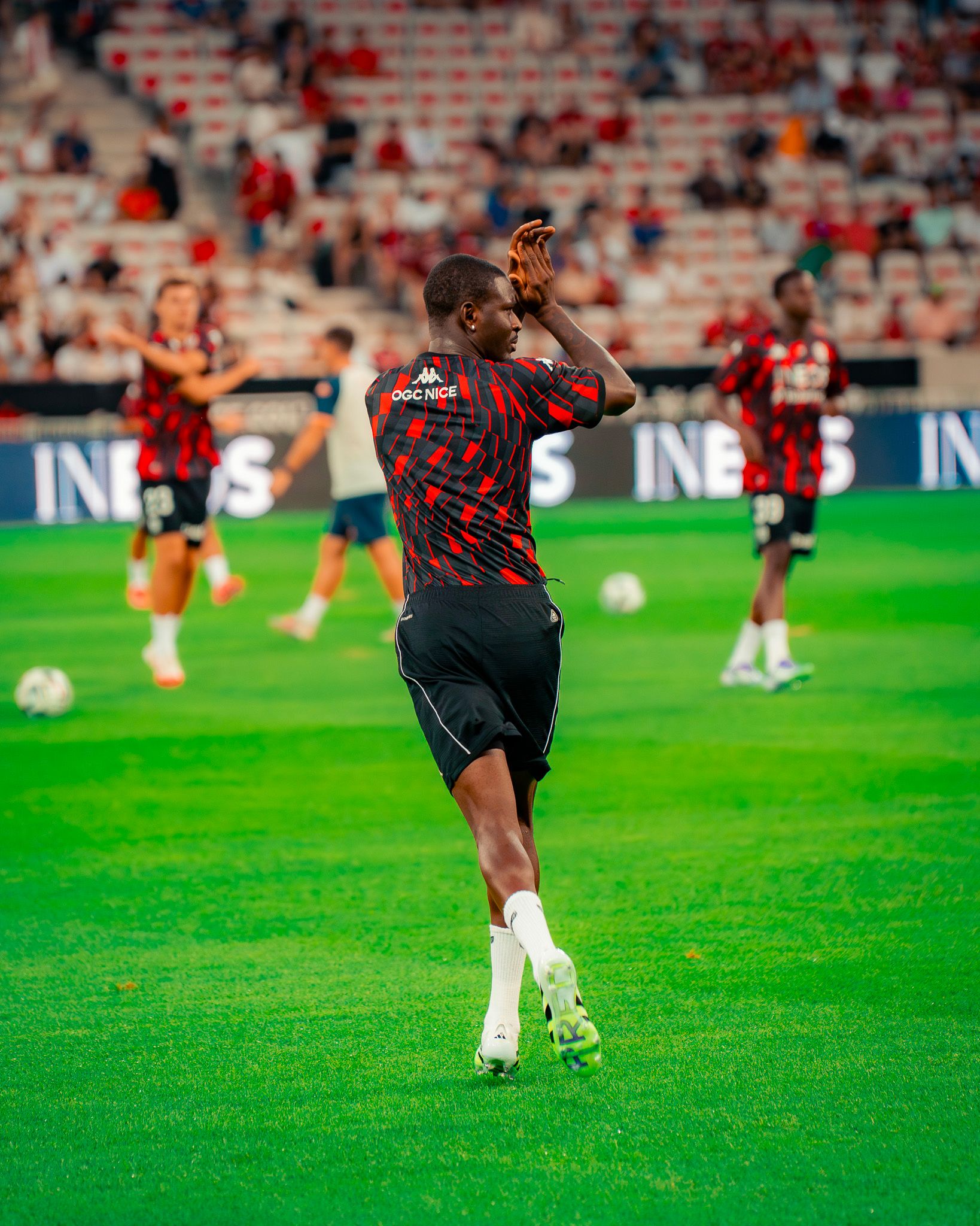
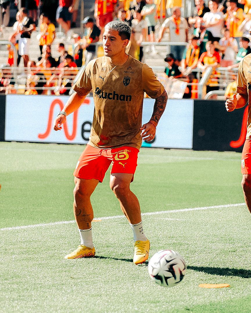
More artistic is adidas’ work for Lyon, with fluorescent red dots further decorating a hypnotic pattern made of soft curves alternating with straight lines. Kappa for Nice created a red-and-black confetti design arranged in a curved scheme. Honorable mentions go to PUMA’s golden shirt for RC Lens and the marker-style lettering decorating the shirt designed by Macron for Auxerre.
La Liga
Striped patterns color the prematch shirts of Real Madrid and Barcelona. In the first case, adidas played with optical effects where different shades of blue are decorated with alternating vertical stripes, diagonal stripes, dots, or psychedelic effects. Nike for Barcelona opted for a design with soft, vibrant-colored lines running across the shirt without ever intersecting.
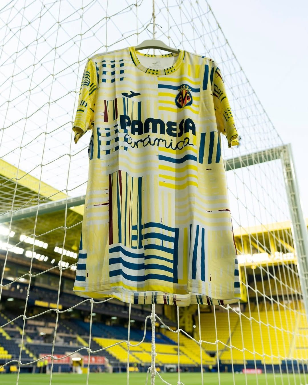
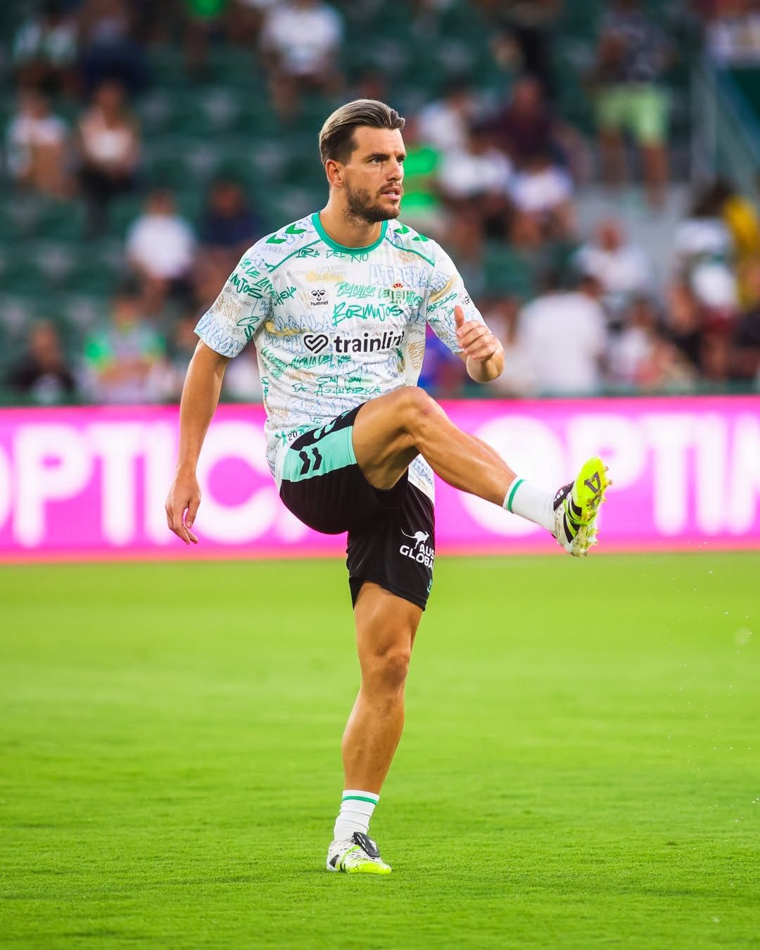
"Surprising" is the word that best describes Joma’s work for Villarreal, a shirt that takes the club’s team colors into a continuous mix of vertical and horizontal stripes. And even in La Liga we find a shirt decorated with marker-style lettering, namely Hummel’s design for Betis.
Serie A
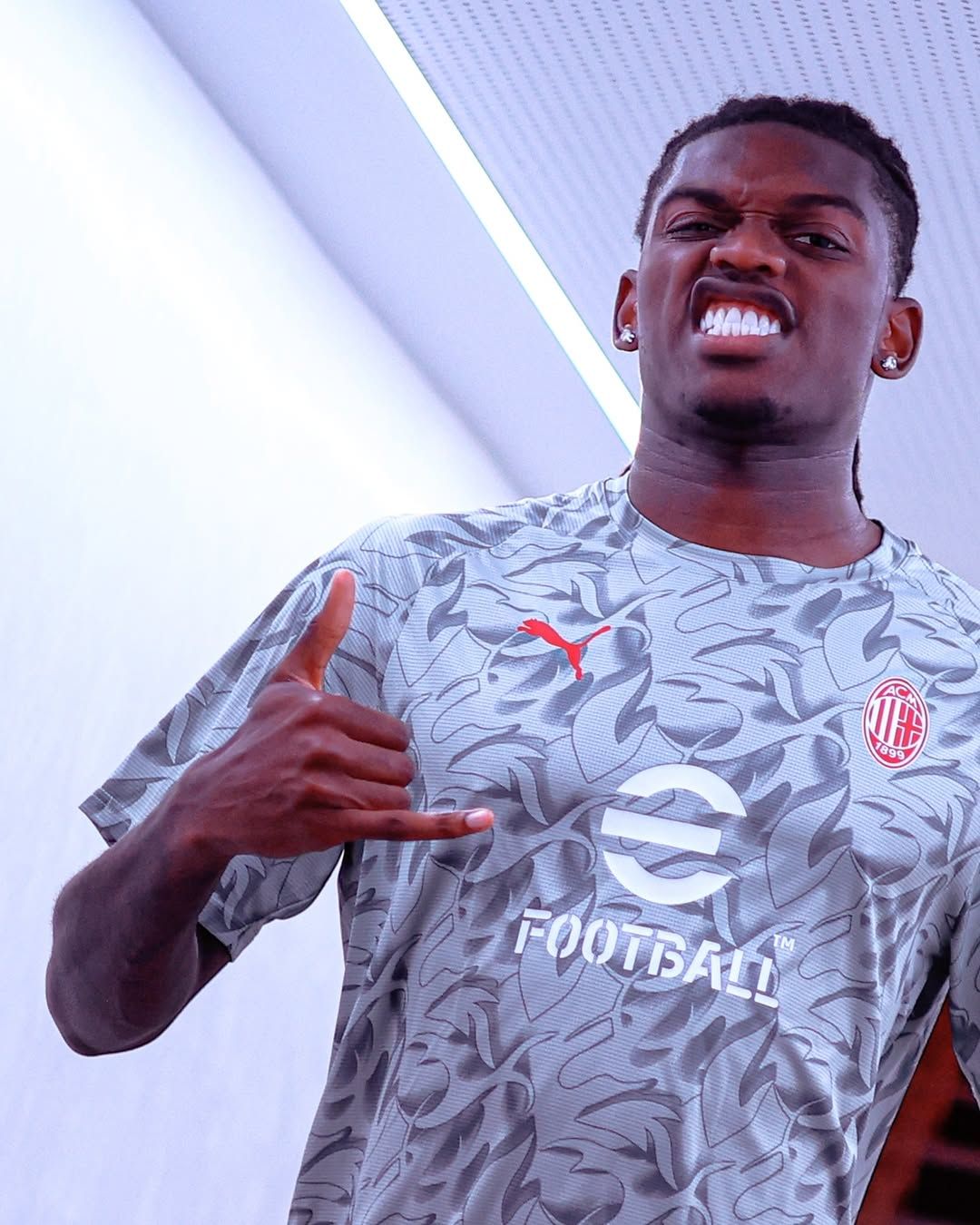
Inter has abandoned the starry pattern seen during the Club World Cup, but Nike’s new collection still catches the eye thanks to the snake-skin effect replicated across the entire shirt, using a shade of blue perfectly combined with the Chlorine Blue shade seen on the Home jersey, which this season will characterize the club’s entire communication. Abstract instead is AC Milan’s shirt, with PUMA reusing the flame pattern of the Home jersey to design the grey shirt accompanying the players when they wear the classic red-and-black jersey.
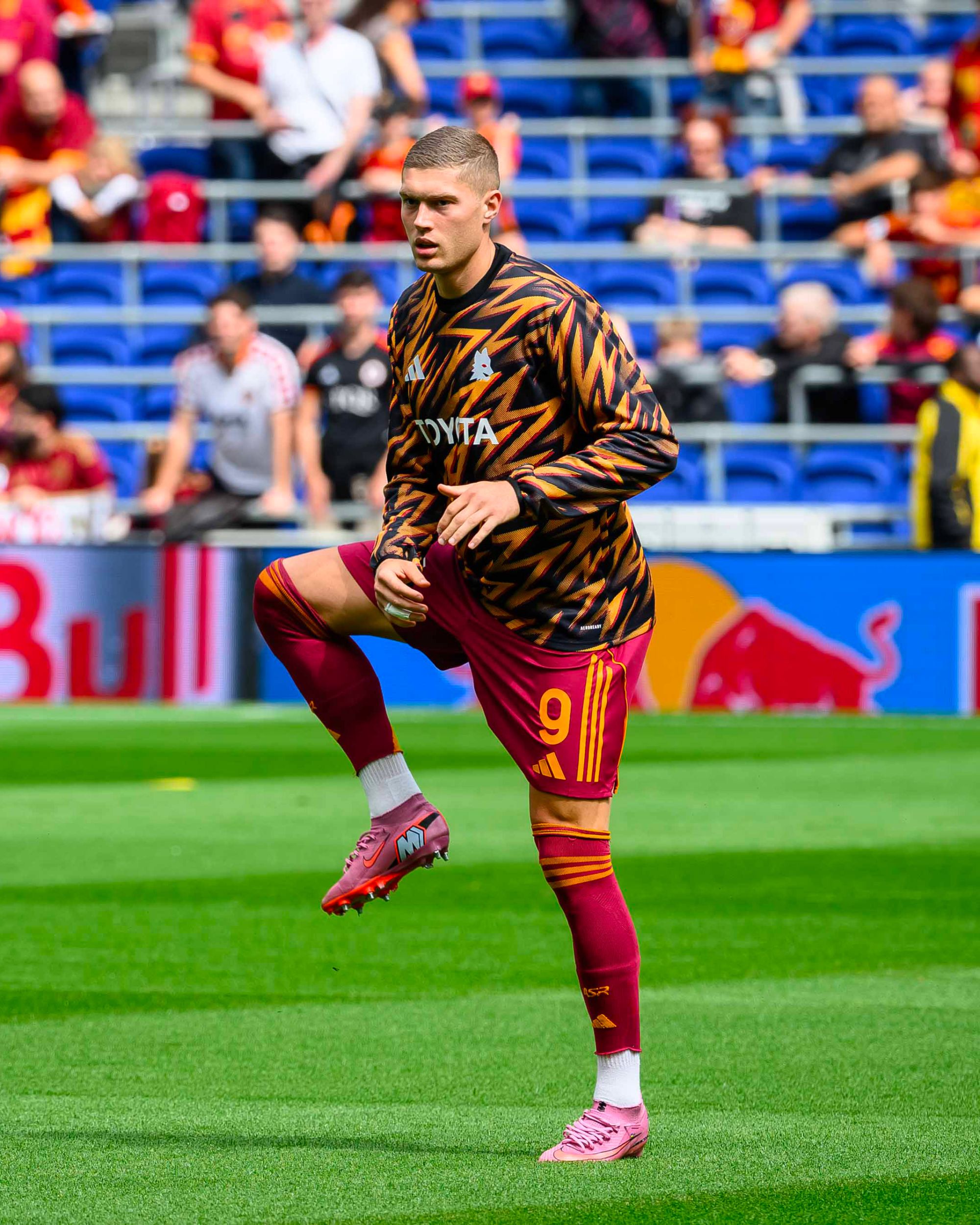
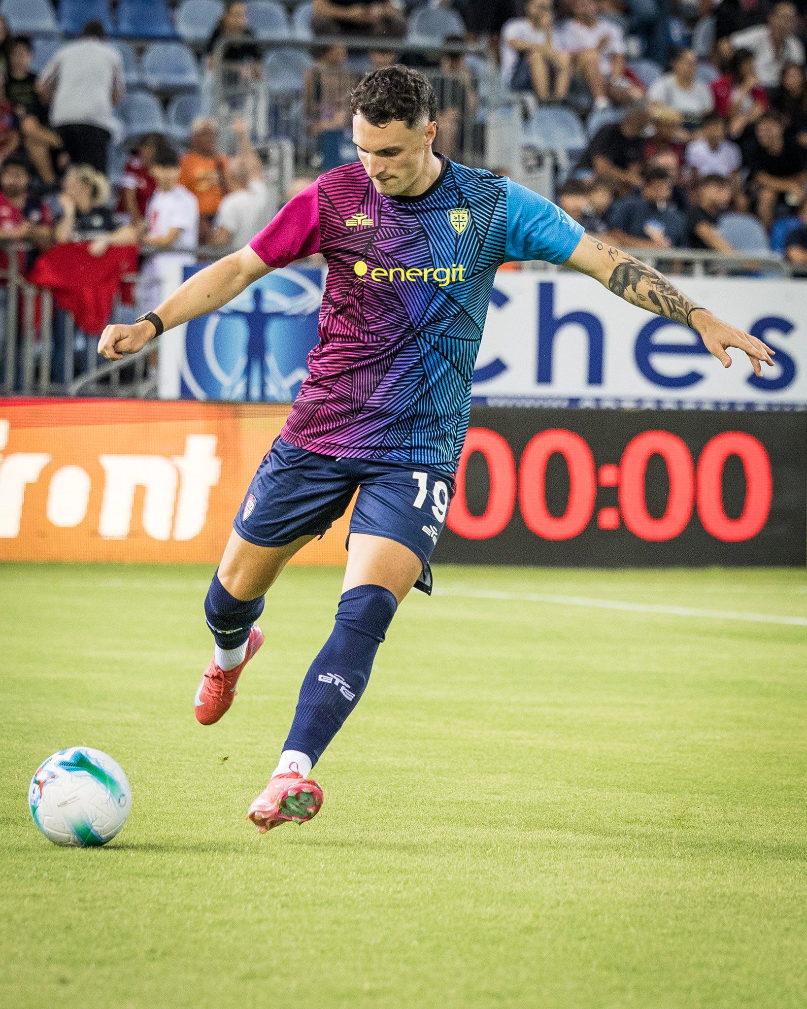
Of course, Serie A doesn’t shy away from the geometric pattern trend, with two examples: one expected and one surprising. The expected one is the black shirt with orange lightning bolts that adidas created for Roma. The surprising one is EYE Sport’s work for Cagliari, a spiderweb of black triangles filled with vertical or horizontal black bars covering a two-tone shirt where the red of the right side gradually fades into the blue of the left side.
Premier League
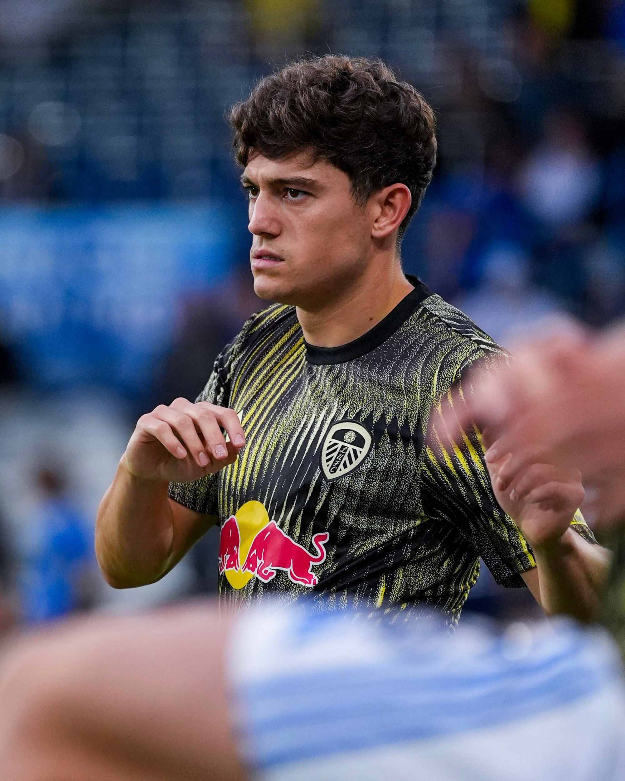
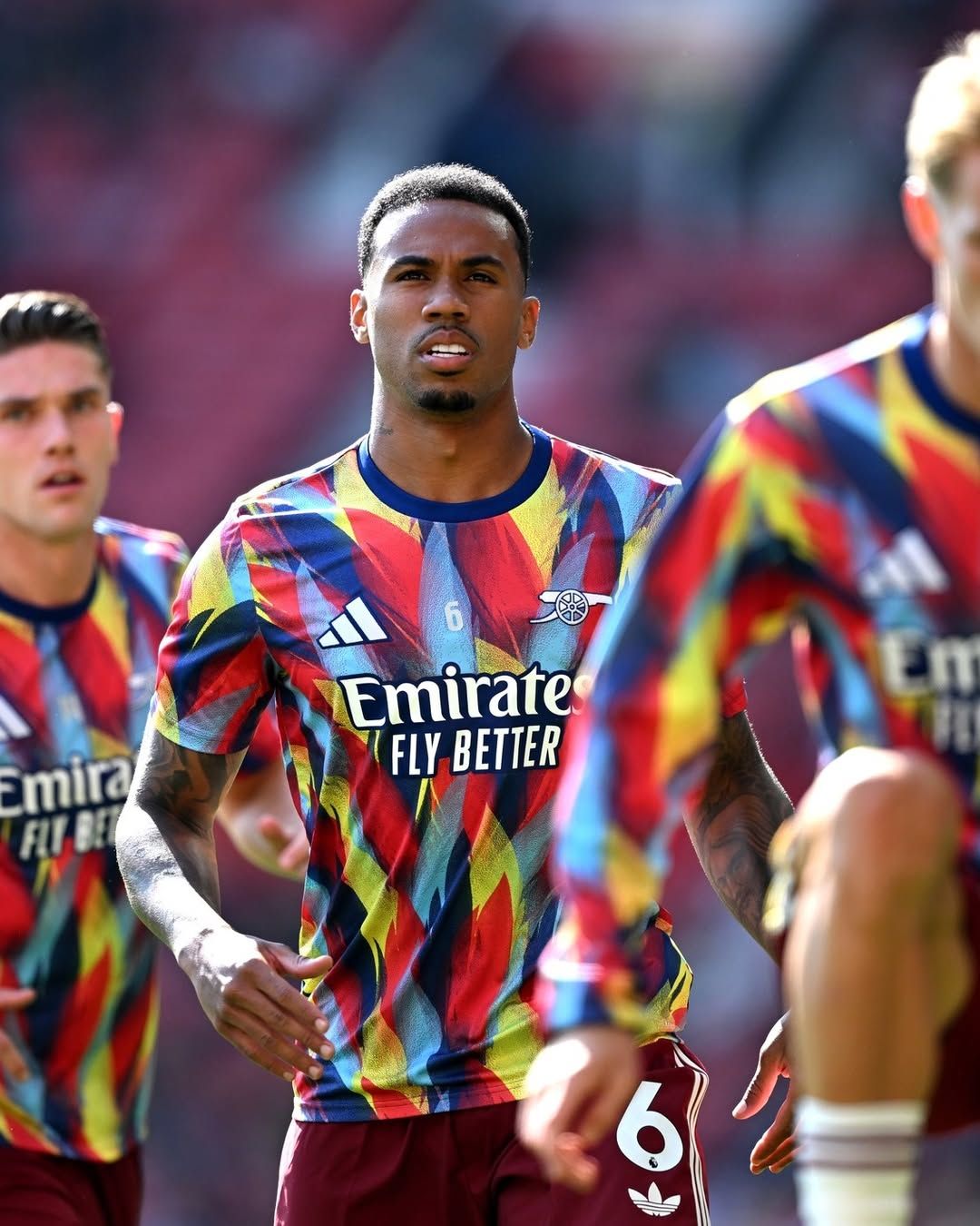
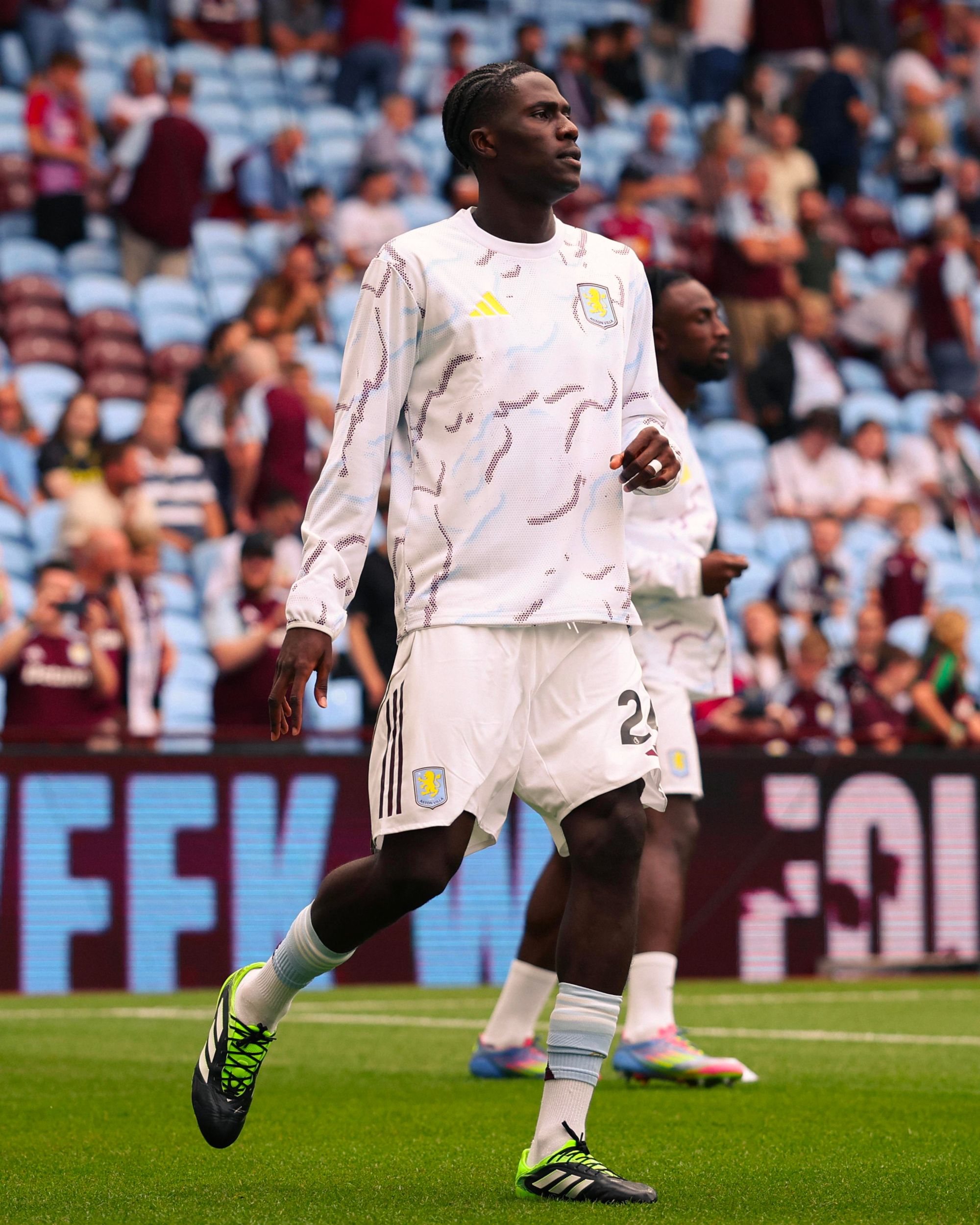
Here the winner is undoubtedly adidas: from the bright color palette running across Arsenal’s jersey with a repeated flame design to the Anfield gates depicted on Liverpool’s shirt, from the geometric pattern created for Manchester United to the wavy effect made with alternating black and yellow for Leeds, not to mention the claret-and-blue dotted pattern recalling marble veins designed on Aston Villa’s white shirt.
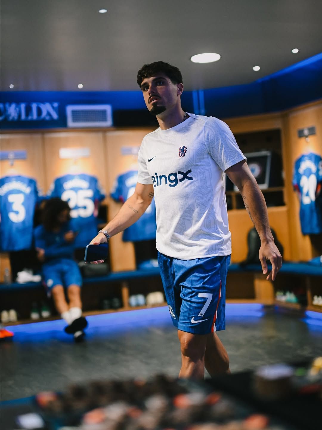
Nike takes the stage with Chelsea and Tottenham. The former has a white shirt with tone-on-tone writing and large block letters in light grey, creating an almost monochrome effect. The latter features a blue shirt with yellow-and-blue patterns on the left side and the THFC lettering on the back enclosed in a circle, symbolizing the Total 90 design. Finally, special mention goes to SUDU’s excellent work with Wolverhampton. The English brand created three different versions, one to match each jersey, with a geometric pattern of sharp lines running wildly across the front, catching the eye through the contrast of their bright colors against a darker base.
Bundesliga
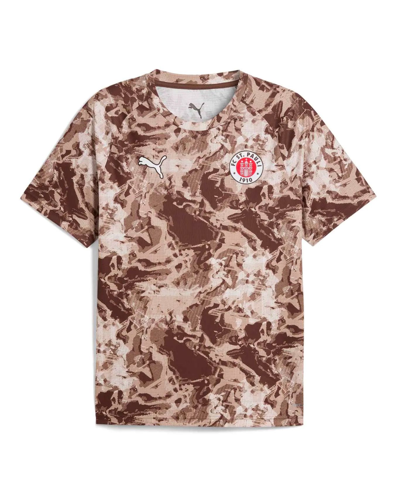
Small black tiles repeated regularly across the entire front: that’s the pattern designed by PUMA for Borussia Dortmund, while for St. Pauli the German brand chose a different solution, focusing on a camouflage effect with different shades of brown. These are the two best prematch shirts of the German league along with adidas’ shirt for Bayern Munich: an abstract pattern where various shades of red, black, and blue overlap. The result is an irregular design featuring brush strokes filled with tiny horizontal lines for a contemporary touch.
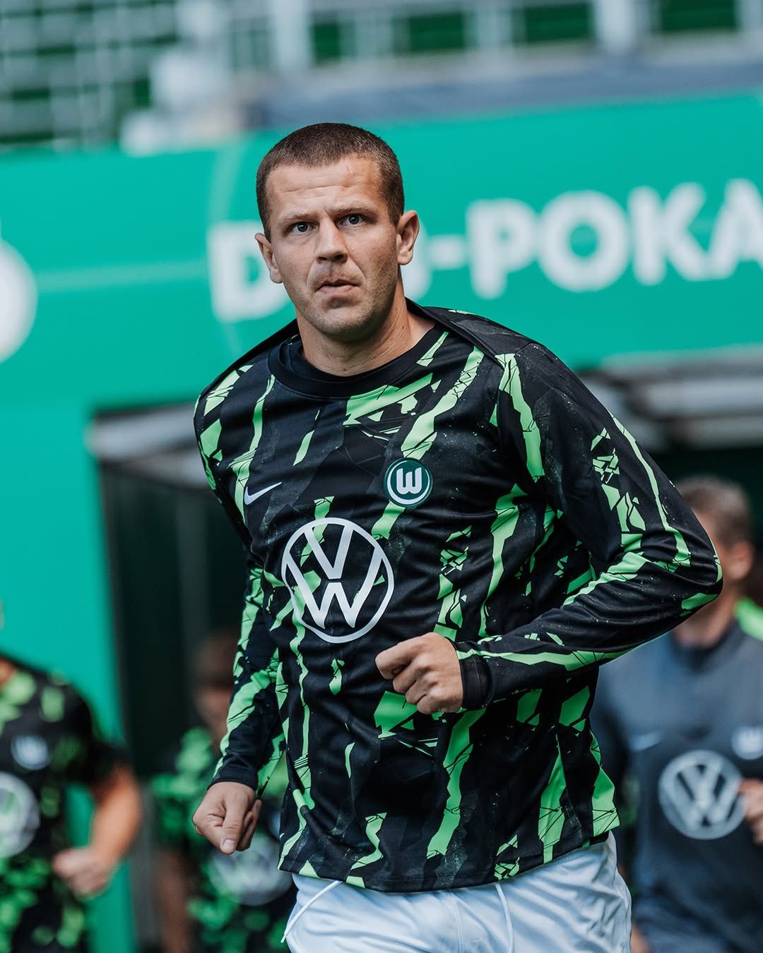
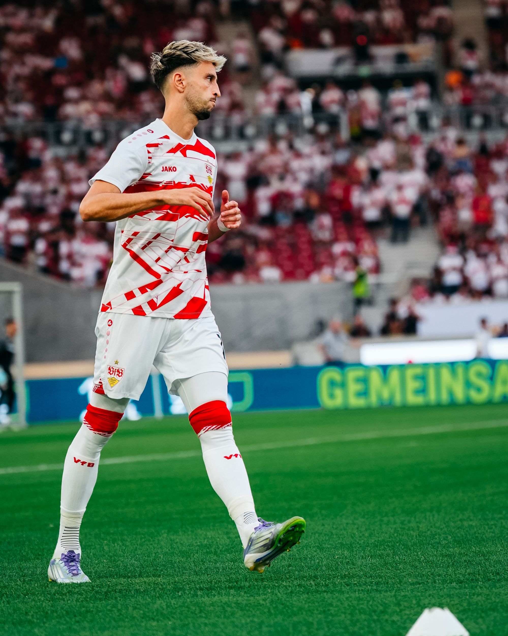
Irregular green inserts alternating with black and grey blocks make up the prematch created by Nike for Wolfsburg, and following the geometric pattern trend, we also find Jako’s shirt for Stuttgart with red and white blocks alternating irregularly across the front.