


Anderlecht's visual communication is unrivalled And the credit also goes to Stromae
Two benches placed in the center of the pitch. On the first one a group of players sits down. On the second, another group of players stands upright, towering over the scene. In between, a third row of players, also standing and in this case mixed with the coaching staff. Does this set sound familiar? That's because official photos of football teams are identical. Same location, the training pitch, and the same arrangement of players, coaches and staff. At most what the subjects are wearing changes: in most cases the players wear the Home Jersey and the coaches the official tracksuit, but there are also situations where the whole squad poses in formalwear. In this cellophane-wrapped context, there is a team that — thanks to the insights of the studio entrusted with its creative direction — is breaking these paradigms, proving that impactful visual communication is possible even in the world of football.
The Anderlecht case
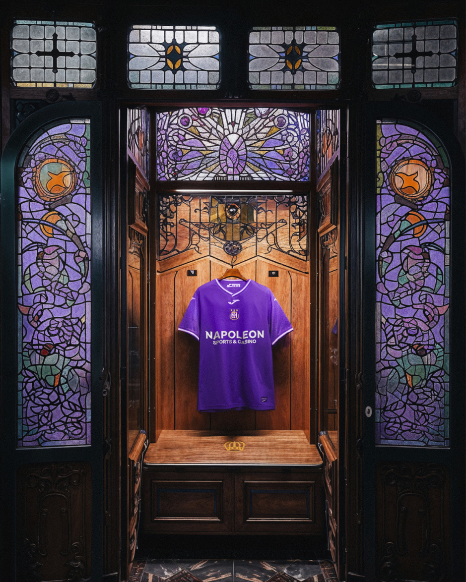
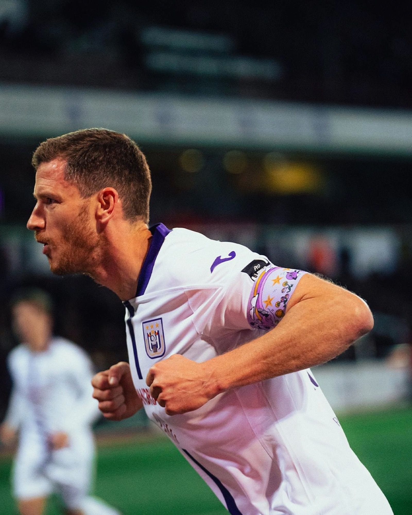
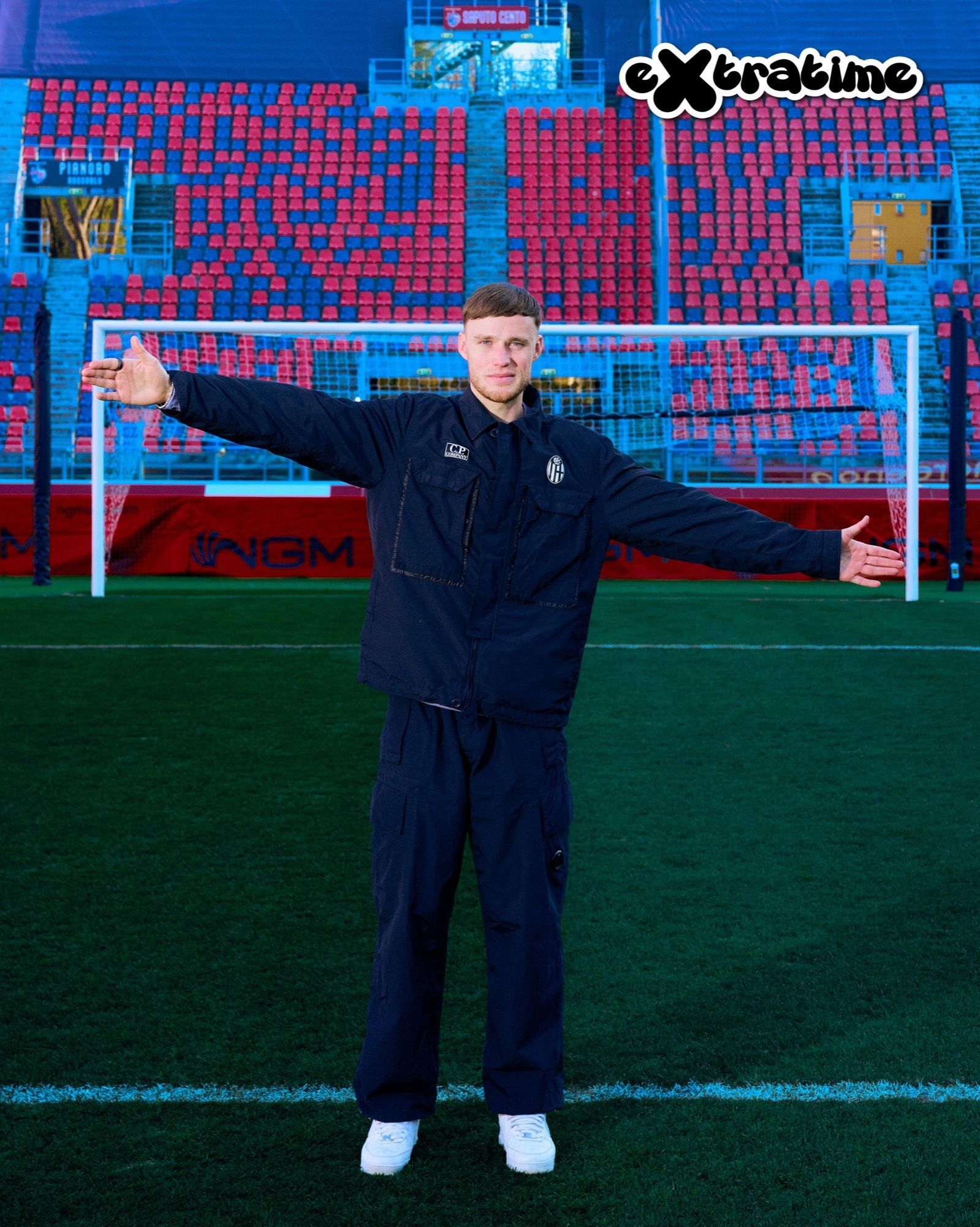
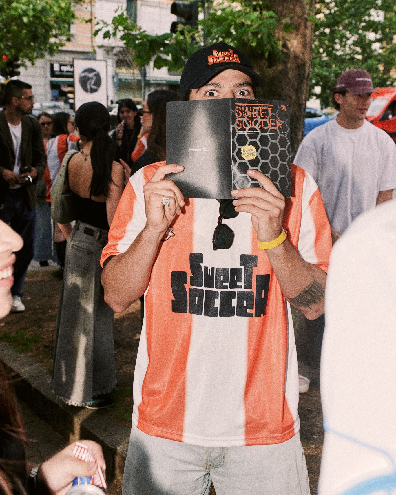
The team in question is Anderlecht, which for the 2025/26 season entrusted creative direction to Mosaert, the creative house founded by Paul Van Haver, better known as Stromae. In a few months this partnership has already produced a series of products and campaigns characterized by a total opposition to football's aesthetic paradigms and features never seen before. Starting with the white-mauve jerseys, which have been reinterpreted for example by adding a horizontal gradient on the Home jersey, a jacquard pattern for the Away jersey, or black details like futuristic touches on the silver Third kit. One of the best kit sets in all of Europe for the 2025/26 season, completed by a special black and mauve jersey, again embellished with a gradient, which celebrates "Anderlecht Champion" — the song performed by Grand Jojo in 1985 that became the club's official anthem and was remixed by Stromae in 2025.
This move is also part of the collaboration between Anderlecht and Mosaert, a relationship whose mission is to blend fashion, football, music and Belgian identity. The result was achieved in full with the production of these jerseys in collaboration with kit supplier Joma but above all with the launch campaign, distinguished by a series of visuals that had never before been integrated into football communication. Not the usual launch. Players arranged in a pyramid to draw the letter A or sitting on a bench to highlight the color palette. An exceptional product that was surpassed by the quality of the social team photo campaign.
The impact of Stromae
Since the 2020/21 season Anderlecht has paid great attention to official photos, creating striking images, for example using the majesty of the Atomium as a backdrop or the industrial setting of the Abattoirs d'Anderlecht. The collaboration with Mosaert, however, marked a step forward with the recreation of the Grand Jojo single cover, in which the players on the pitch, for the classic pre-match photo, lined up with their backs to the photographer. Mosaert drew inspiration from that iconic image and, as with the kits, reinterpreted it in a contemporary key.
The final result is a purple A formed by a group of players wearing the Home jersey and members of the coaching staff, which breaks through a white carpet made up of players wearing the Away kit with their backs to the photographer. A striking scene shot from above so that its evocative power could be amplified. A work of visual engineering so carefully detailed that it was also reproduced in reverse: the purple A composed of people with their backs to the camera while the group dressed in white looks straight at the lens.
The visual identity
The work with Mosaert is part of a broader project in which Anderlecht, following the example of other European clubs, has revolutionized its visual identity. In this case the project is signed by Base Design, a communications company with an office in Brussels that, working closely with the club, developed a series of assets that projected Anderlecht into an avant-garde aesthetic dimension. New fonts to be used both on the playing jerseys and in official communications or social graphics. A catalog of layouts that can be easily implemented in any context, working in detail to exploit white, mauve, gold and black.
A revised color palette designed to differentiate Anderlecht from any other club while at the same time serving as a trait d'union for all sections of the club: from the first team to the esports squad, from the youth sector to futsal, not forgetting marketing campaigns and business activities. Because results on the pitch are only part of the goals a club must achieve. Certainly the most important, but not the only one. A football club must be able to create a sense of community, be attractive to sponsors and have a social presence distinct from the crowd and easily recognizable. Anderlecht understood that better than any other team.