


Why did Deportivo La Coruña change its name? A new crest was also unveiled to mark the club’s return to La Liga
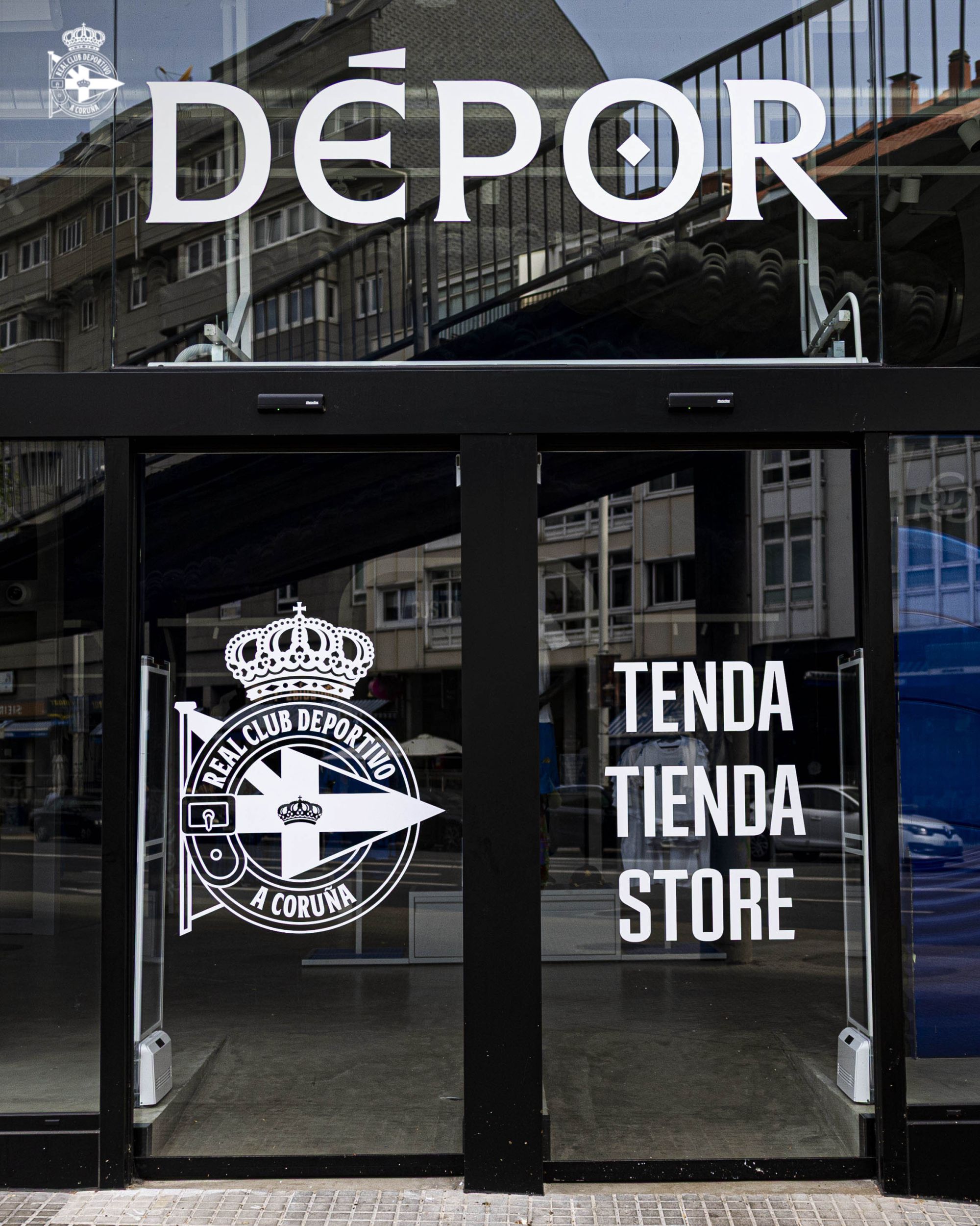
Real Club Deportivo has officially changed its name. The decision came through a vote by the club’s members, who overwhelmingly backed a proposal put forward by the board in recent days. The move represents a clear commitment to embracing the club’s Galician identity, bringing its name in line with the official name of its home city. The transformation goes beyond nomenclature: it includes a complete overhaul of the club’s visual identity, featuring refinements to the crest, an updated colour palette and bespoke typography. In many ways, Dépor has given itself a fresh new look ahead of its long-awaited return to La Liga, a stage it has been absent from since 2018 and will rejoin this August.
The Member Vote Behind Deportivo’s Name Change
The club’s board organised a vote among its members to determine whether the official name should remain unchanged or be updated. The proposal stemmed from the desire to align the club’s identity with the city’s official toponymy, as the municipality has been known as A Coruña since 1983. The change would see the club move from Real Club Deportivo de La Coruña to Real Club Deportivo de A Coruña.
Voting was conducted online through the club’s official website between 9 a.m. on Thursday 17 June and 6 p.m. on Sunday 21 June, with all members over the age of 12 eligible to participate. The result, announced on Tuesday 23 June, confirmed the change, with the A Coruña option receiving an impressive 79.41% of the vote.
At first glance, the adjustment may seem minor—or even cosmetic—to some observers. In reality, however, it carries far deeper meaning for the city, the club and its supporters. The decision reinforces the bond these three elements share with one of Spain’s two co-official languages alongside Castilian Spanish: Galician, or galego.
Located in the north-western corner of the Iberian Peninsula, Galicia is one of Spain’s 17 autonomous communities. Bordering Portugal to the south, the region’s culture and language have long been shaped by Portuguese influence. Galician identity remains one of the strongest and most distinctive in Spain, and at its heart lies a Romance language that blends characteristics of both Portuguese and Castilian.
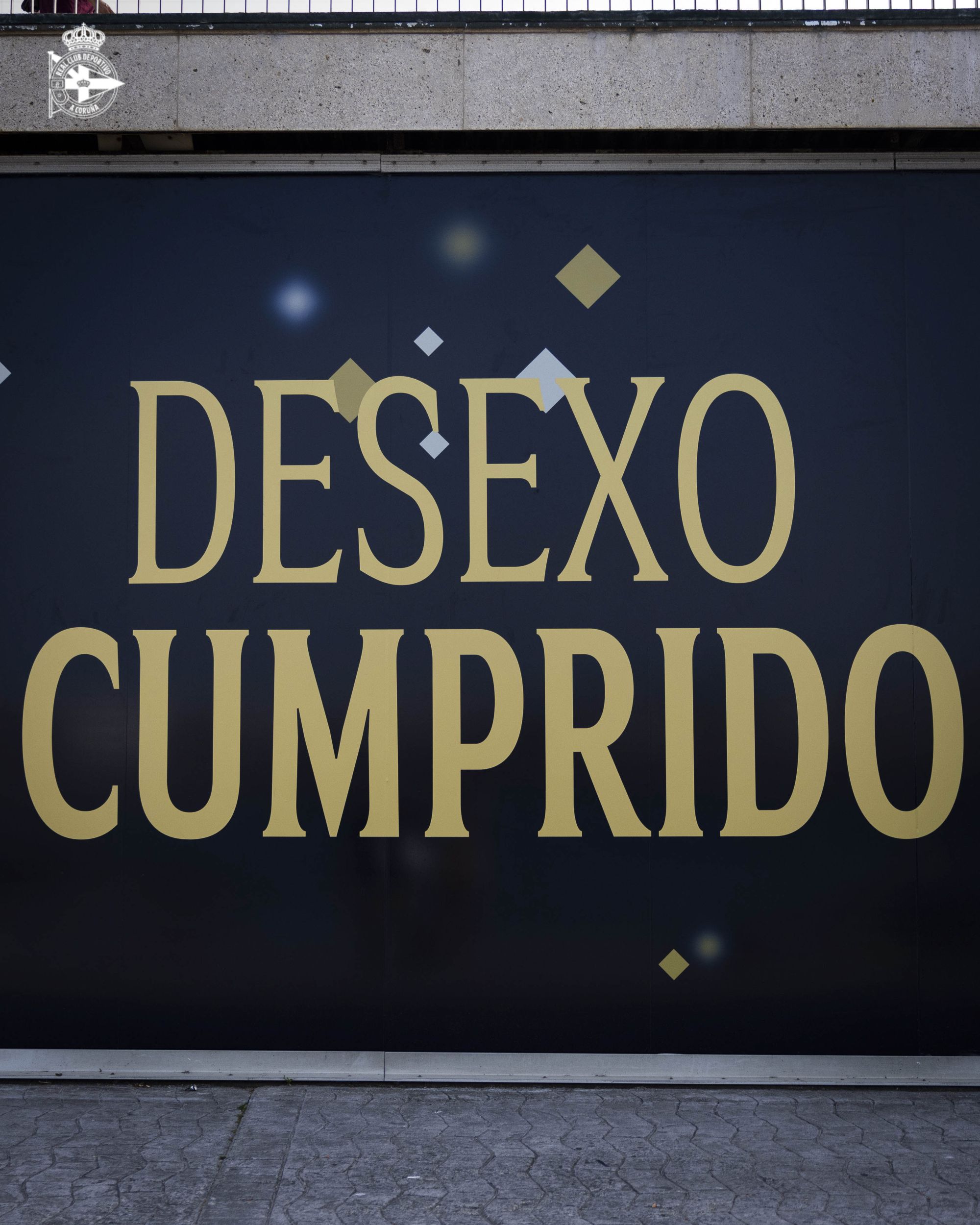
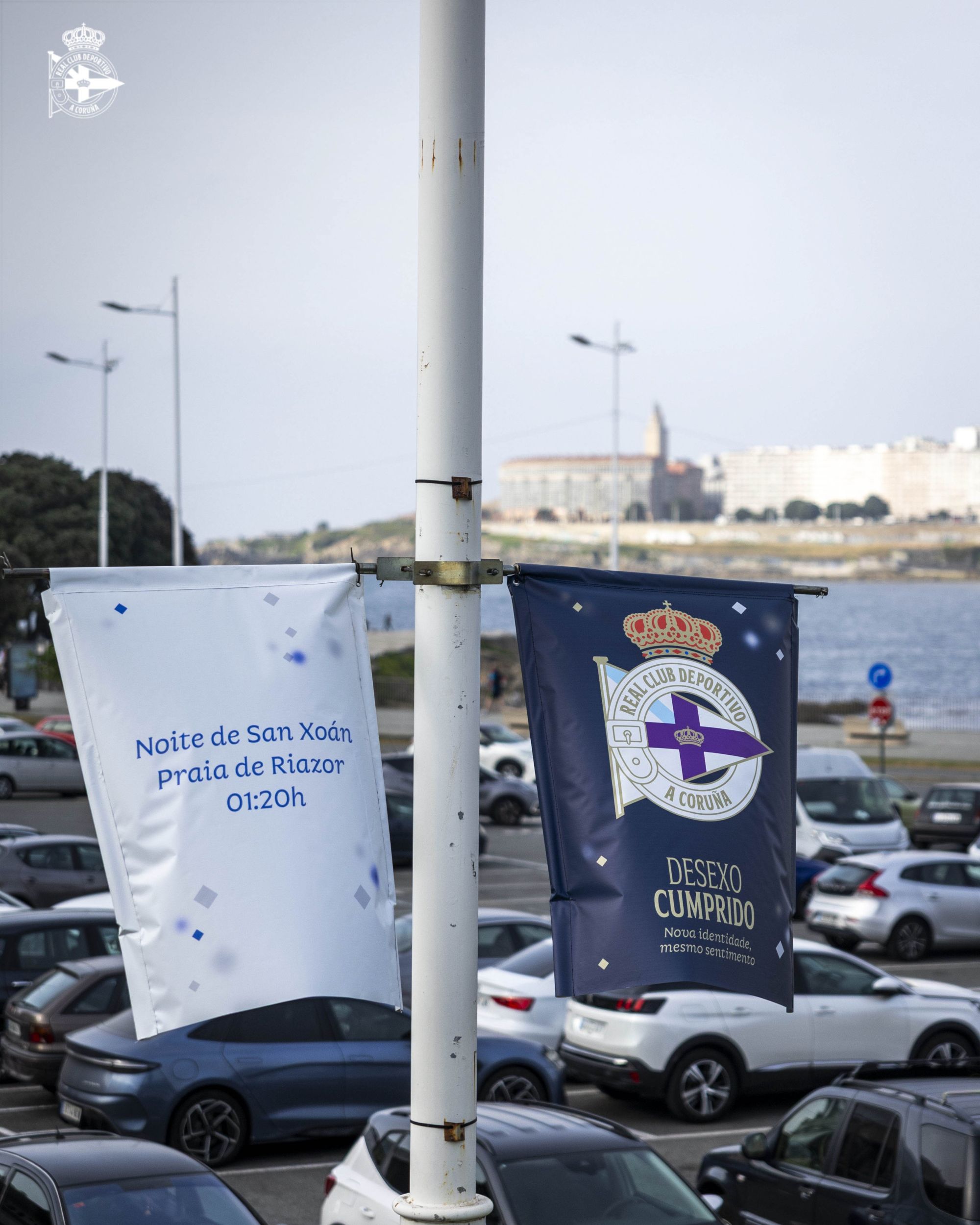
The entire voting process was carefully timed by the club. The official name change was unveiled at exactly 1:20 a.m. as a tribute to the club’s 120th anniversary, celebrated earlier this year on 2 March. The moment coincided with the night of San Xoán (Saint John’s Day in Galician), the most important annual celebration in A Coruña.
In the days leading up to the announcement, posters carrying the Galician phrase “Pide un desexo” (“Make a wish”) appeared across the city, referencing one of the traditional customs associated with the San Xoán festivities. Following the successful vote, the campaign culminated in the slogan: “Wish fulfilled: new identity, same feeling.”
The celebrations took place beneath the arcades overlooking Riazor Beach, home to the nearby stadium that bears the same name, while more than 200,000 people gathered along the waterfront to celebrate San Xoán.
The initiative is another example of the unique relationship between football clubs and their communities. Small but meaningful gestures like this strengthen supporters’ emotional connection with their team, fostering a sense of shared ownership and identity. Systems such as Spain’s member-owned club structure and Germany’s supporter-influenced ownership models encourage this relationship, whereas in many other countries—including Italy—fans increasingly find themselves treated more as consumers than stakeholders.
Inside Deportivo’s New Visual Identity
Alongside the name change, Deportivo unveiled a broad redesign of its visual identity. The new system is built around bold blocks of colour and distinctive graphic elements inspired by symbols closely associated with the club.
The most prominent of these is a diagonal motif derived from the Tower of Hercules, A Coruña’s most iconic landmark, and specifically from the nine-degree inclination visible on its façade. The result is a clean, disciplined and highly adaptable design language, particularly suited to digital platforms.
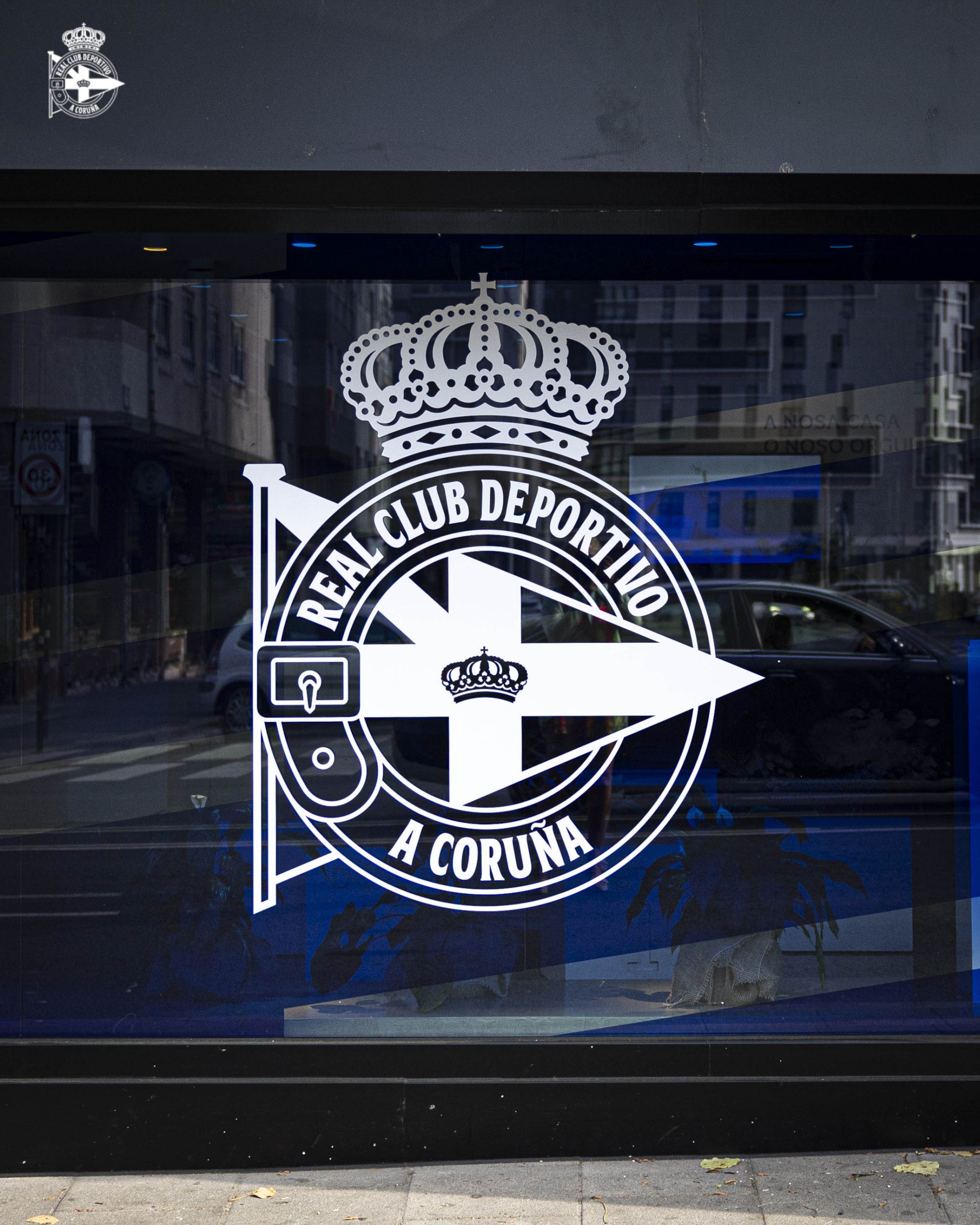
The Dépor crest remains one of the most recognisable and distinctive emblems in Spanish football. A white sash surrounds the purple banner of the Sala Calvet—the club’s birthplace—as well as the Galician flag, while a golden royal crown sits prominently above. The redesign modernises several details while preserving the emblem’s defining characteristics.
The golden lettering featured on the sash will now read Real Club Deportivo A Coruña, with the wording repositioned and centred along the vertical axis. The typography has also been updated.
The crowns have been refined to appear cleaner, more organic and easier to reproduce at smaller sizes. Excessive gold outlining around the flags has been removed, while the colour palette has been subtly refreshed with richer and more vibrant tones.
The purple of the banner, the red of the upper crown, the sky blue of the Galician flag and the club’s signature gold have all been updated, with the latter now officially named Dorado Dépor. Like the club’s blue and white kit colours, navy blue, green and red, it has been assigned a dedicated hexadecimal colour code within the new brand system.
The typography has also undergone a significant evolution through the creation of two bespoke typefaces, following a path already explored by AIK in Sweden. Developed over the past three years, the new fonts—RCD Faro and RCD Proa—have finally been unveiled.
RCD Faro draws inspiration from an alphabet designed during the twentieth century by the Laboratorio de Formas de Sargadelos. Founded in 1963 by intellectuals Isaac Díaz Pardo and Luis Seoane during their exile in Argentina, the laboratory was conceived as an interdisciplinary and intercultural project aimed at preserving Galician identity and historical memory.
During the Franco dictatorship, efforts were made to suppress regional cultures and accelerate a process of cultural homogenisation across Spain. By drawing on this typographic heritage, Deportivo establishes a direct link with Galicia’s visual culture through highly recognisable forms and letter shapes.
RCD Proa, meanwhile, features a more geometric and squared design inspired by the texture created by the club’s traditional vertical stripes.
Ultimately, this is a rebrand deeply rooted in tradition, designed to prepare the club for its return to the Primera División after eight years away.
During that period, Deportivo endured the most difficult chapter in its history. Ownership changes, seasons spent in the Segunda División and even a relegation to Spain’s third tier saw the club spend four years outside professional football’s top two divisions.
Yet throughout those hardships, supporters never abandoned the team. Attendances remained remarkably strong, with season-ticket figures reaching levels not seen since the club’s Champions League years.
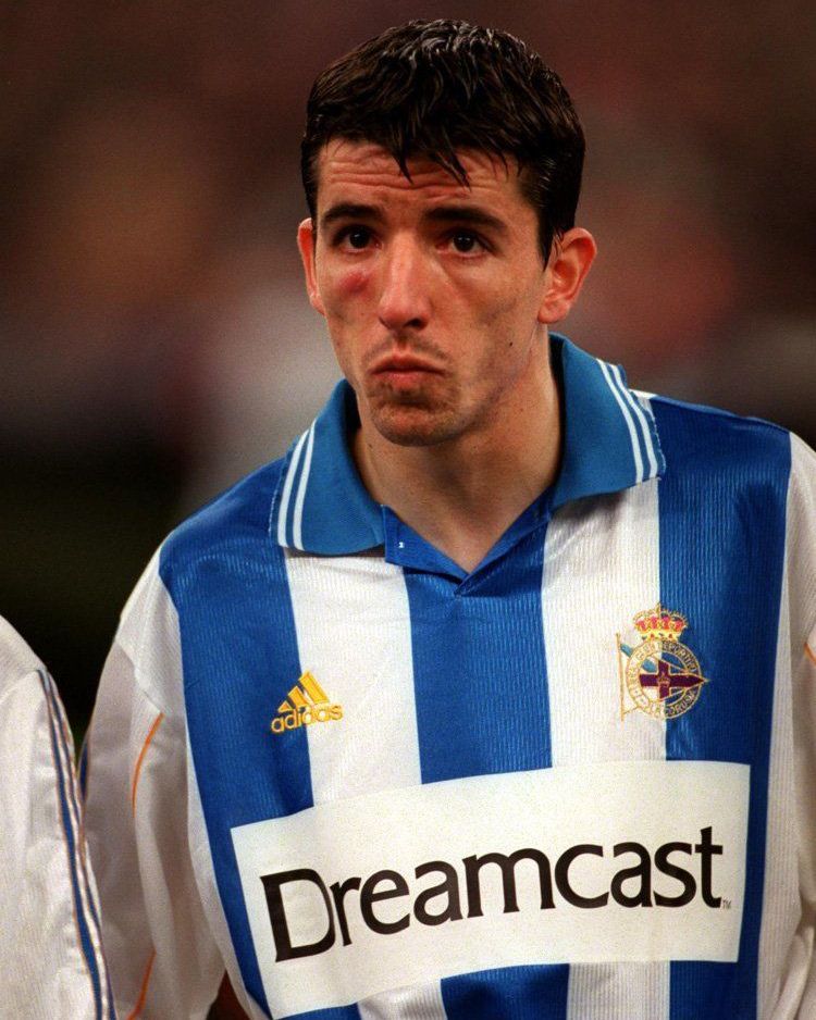
Those were the glory days of the early 2000s, when players such as Djalminha, Roy Makaay, Diego Tristán and Juan Carlos Valerón led Deportivo to unprecedented heights. It was an era defined by the famous comeback against Milan, a Champions League semi-final appearance, the club’s historic La Liga title and several domestic trophies.
Famous Football Club Name Changes Across Europe
Several clubs have attempted to alter their identity over the years, with varying degrees of success.
Between 2014 and 2015, Hull City owner Assem Allam twice attempted to rebrand the club as Hull Tigers. Despite support from the chairman of the Football Association, nearly 70% of the FA Council voted against the proposal. Supporters were never consulted, provoking widespread opposition to what many saw as a commercially motivated vanity project.
A much more creative consultation process took place in Leicester in 2003. New owner John Holmes proposed restoring the club’s original name, Leicester Fosse, in place of Leicester City. During half-time of a 4–0 home victory over Wimbledon, supporters were invited to raise cards displaying either a “C” or an “F”. The result was overwhelmingly in favour of retaining City, prompting the stadium announcer to declare at full-time that “City will remain City forever.”
In other instances, ownership changes or relocations have led to far more drastic transformations. One notable example is Austria Salzburg, which became Red Bull Salzburg in 2005 and even abandoned its traditional colours.
Another controversial case is that of MK Dons, created after Wimbledon’s relocation to Milton Keynes. In both situations, the decisions sparked fierce resistance from supporters, who responded by establishing phoenix clubs carrying forward the original identities.
Spain offers its own historic example through today’s Club Atlético de Madrid. Founded as a Madrid branch of Athletic Club under the name “Athletic Club (Sucursal de Madrid)”, it became Athletic Aviación Club in 1939 following an agreement with Club Aviación Nacional, before later adopting the name Club Atlético Aviación in response to legislation discouraging foreign-language terms. Once the link with the Spanish Air Force ended, the club finally adopted its current name in 1947.