


History of the Norwegian national team typeface The runic alphabet evokes the Norwegian heritage of the Scandinavian national team
Norway is the loudest national team at the 2026 World Cup. Literally. Thousands of Scandinavian fans first invaded U.S. spaces, from Boston to the New York City subway and Times Square, then spread globally across the internet, shouting a simple two-letter word: ro. Taken on its own, it can simply be translated as calm or rest. In context, however, å ro means to row, the simulated action performed by the crowd of supporters arranged in orderly rows, as if seated on a rowing bench inside a hull, a reference to Viking ships.
The idea is an improvisation, not based on historical evidence, and mirrors another Scandinavian tradition that has conquered the world of football, the famous Icelandic Viking Clap during Euro 2016. But it is brilliant, because it perfectly combines the historical roots of the national team with the present context. Ro!, purely in terms of wording, is communicatively ideal for English adaptation, where the act of rowing is expressed by the verb “to row.” Moreover, the reference to Norse roots is also functional, recalling the Viking colonization of American lands in the tenth century AD, almost five hundred years before the arrival of Christopher Columbus.
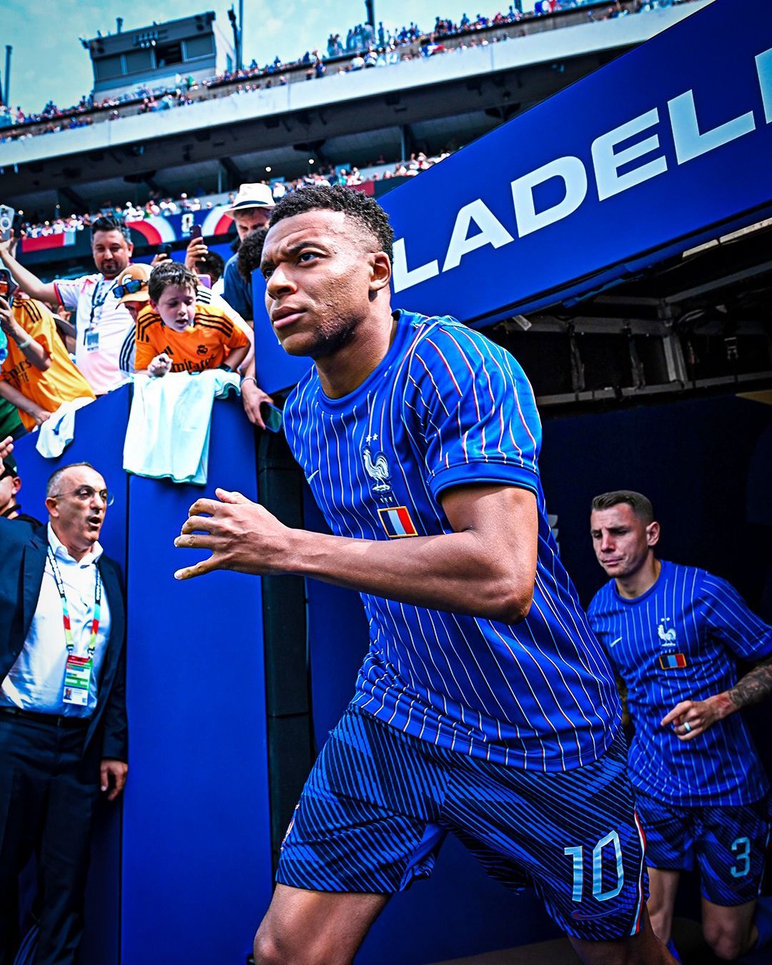
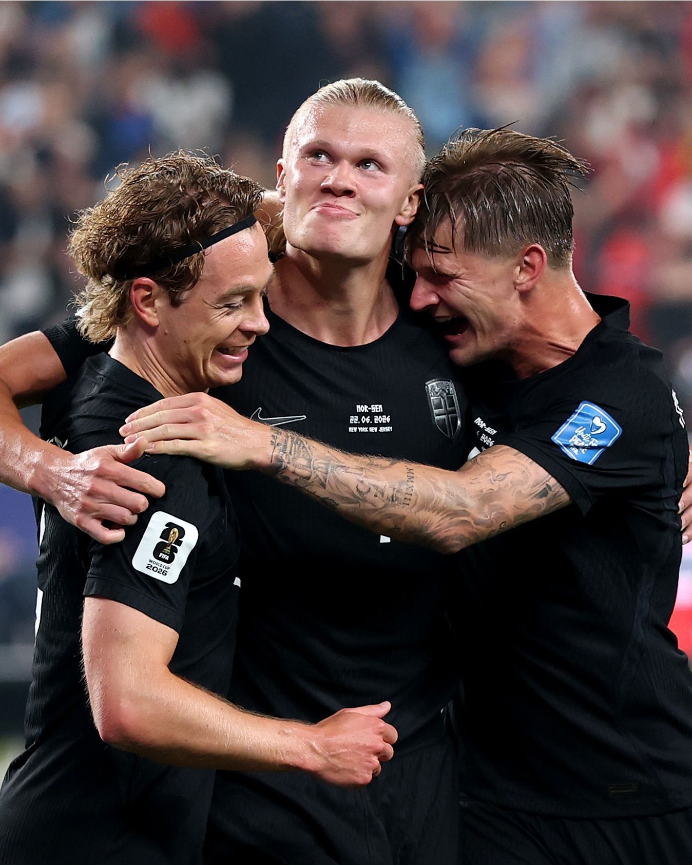
This synthesis between the concreteness of ancestral historical substrate and the demand for virality from a new globalized world—met by the players themselves, who row on the pitch facing their fans while celebrating a 3–2 victory against Senegal—has also contributed to the aesthetic success of Norway’s Nike kits at this World Cup.
The origin of the font of the Norwegian jerseys
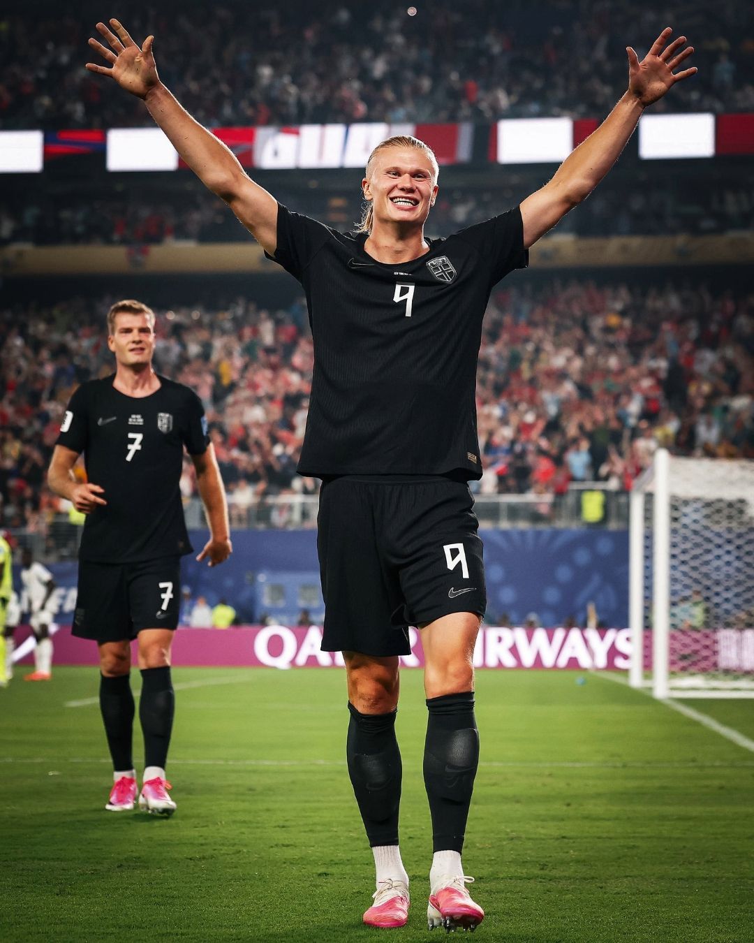
The connection with the Norse universe was used by Nike in designing the font used to write players’ names and numbers on the Norwegian kits. This draws inspiration from runic alphabets, in particular the ancient form of the Elder Futhark, a conventional writing system used between the 2nd and 8th centuries AD by Germanic peoples—including Scandinavian ones—during the Migration Period, which contributed to the fragmentation of the Western Roman Empire.
The term rune is a reconstruction from Proto-Germanic and refers to the world of secrecy, something cryptic. Linguistically, each rune corresponds to a phoneme, the smallest unit of sound in spoken language, while in writing its transcription is ideographic—each rune represents the concept from which its name derives. Futhark, finally, is an acronym formed from the first six runes in their phonetic form: /f/, /u/, /ð/, /ɑ/, /r/ and /k/.
Although various hypotheses have been formulated about the origins of the Elder Futhark and runes, the Italic hypothesis has overtaken the Greek and Latin ones. There is evidence of inscriptions and writing systems linked to the runic alphabet in the northern Etruscan area and especially in the Alpine region of Raetia, located between Switzerland, Austria, and Northern Italy: in particular, the alphabet of Bolzano-Sanzeno, which presents five of the twenty-four Elder Futhark runes, may be the precursor of the later Germanic form, the result of hybridization with Latin writing due to Roman rule over the Etruscan and Venetic regions.
The first FIFA ban
This is not the first time runic alphabets have been used for contemporary symbols or icons. The Swedish multinational Ericsson used them to create the logo of the Bluetooth technology in 1994, a figure composed of the interlacing of the runes ᚼ (hagall) and ᛒ (bjarkan), corresponding to the letters H and B—the initials of Harald Bluetooth, king of Denmark in the 10th century AD.
The font designed by Nike, created by the Creative Director of the Vancouver division, Luis Callegari, is called the Harald Typeface. An early metallic and more cartoonish version, made of sharp vertical lines and two-tone lettering and numbers with pointed angles, was launched in 2024 and debuted last summer during the Women’s European Championship and the U20 World Cup, before being banned by FIFA.
The violations of FIFA regulations regarding kit aesthetics by this Norwegian font were two, the most obvious being the two-tone design of the jersey numbers, clearly not allowed under the guidelines. The other concerned the more subjective area of readability and partially the format, as only fonts derived from the Latin alphabet are permitted. The runic one, due to its obscure origins, has a slightly borderline form that could become a point of contention, but a Nike adaptation for the World Cup ultimately satisfied all parties.
The 2026 World Cup font
Callegari and Nike retained the same geometry and inspiration from the runic alphabet, but opted for a more minimalist aesthetic. The two-tone effect of the numbers on the back has been translated into white on a red home jersey, a reference to the Umbro kit used during the 1997 World Cup qualifiers, featuring a navy blue cross like the one on the national flag on the front panel. The chromatic unity is even more evident in the silver-on-total-black away kit, a cleaner visual reference to the metallic concept of the original design.
The design preserves the sharp angles reminiscent of axes and other tools linked to the Norse world, widening the strokes to improve readability, while the runic effect is Latinized, maintaining the classic structure of letters with only horizontal or vertical lines, never diagonal—an exception allowed only within individual symbols.
In the surname Haaland, for example, the horizontal stroke of the letter L remains intact, resting fully on the baseline, whereas in the 2024 version it was a diagonal upward stroke. In the double A, the central horizontal bar instead takes a diagonal orientation, although Nike initially considered a complete aesthetic overhaul in the upper section, where the intertwining of the legs formed a closed X at the top—almost like a stylized hourglass shape.
His number nine, additionally, has maintained a geometry without circularity but has abandoned the original more pointed and upward design, which almost closed into an eight.
Haaland’s name is not mentioned randomly, both because he is the most representative face of this Norwegian national team and because he embodies this meeting between ancient and modern that Nike has reinterpreted. The Manchester City striker purchased for £134,000 what is believed to be the last existing copy of the 1594 edition of the Heimskringla, the Scandinavian epic work by Snorri Sturluson, on the eve of the competition, before donating it to the library of Bryne, the town where the World Cup top scorer grew up.