


Ascoli has revolutionised its crest A brand new visual identity
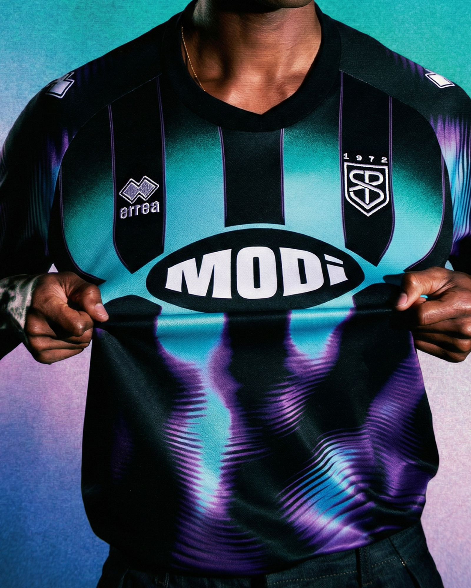
Ascoli Calcio 1898 F.C. is entering a new chapter in its history with a major rebranding project, developed in collaboration with the branding and communication agency Modì. The initiative aims to strengthen the club's identity while fully respecting its sporting and cultural heritage, celebrating its deep connection with the city and its history. The most significant element of the redesign is the return of the club crest to its historic circular shape, last seen during the club's most recent Serie A campaign and a symbol of the Costantino Rozzi era. This decision was strongly backed by the Passeri family, the club's current owners, as a tribute to the most iconic president in Ascoli's history.
The new crest also incorporates the Armilla Picena, also known as the Picene Ring, placed within the inner circle to symbolize the deep bond between the city's historical heritage and its footballing tradition, giving the crest a truly distinctive identity. The Cassero fortress has also been completely redesigned, with particular attention paid to accurately reproducing its historic architecture. Within it, a new visual system comes to life: the left tower pays tribute to Ascoli's nickname, the "City of 100 Towers," while its upper section takes the shape of a crown, referencing Ascoli Piceno's title as the "Queen of the Marche."
The rebranding also extends to the club's traditional home jersey. The iconic black-and-white vertical stripes return, enhanced by the thin yellow pinstripe that featured in some of the most beloved chapters of the club's history. The color palette has also been carefully reworked to better reflect the identity of the local area. Gold has been replaced by the yellow found in the City of Ascoli's official emblem, red recalls the historic socks worn during the Costantino Rozzi era, white gives way to the warm shade of travertine, the stone most closely associated with the city, while green officially joins the club's colors as a reference to basil, the traditional symbol of the protection of Saint Emidius.
Alongside the new visual identity, the Passeri family also announced that it has completed the legal process to regain ownership of the historic "Picchio" trademark, the symbol that has represented Ascoli since the 1980s. Alongside the original version, a modern reinterpretation of the mascot will also be introduced, designed to support merchandising initiatives and strengthen the club's connection with younger generations of supporters. Completing the project is a new custom typeface inspired by the historic inscriptions carved into the city's stone reliefs. One of its most distinctive features is the letter "I", crossed by the new Picchio, positioned above the "O" in the word "Ascoli," helping create an even more recognizable and unique visual identity. With this rebranding, Ascoli Calcio 1898 F.C. begins a new chapter in its history, seeking to balance tradition and innovation while strengthening the sense of belonging and projecting the club into the future without losing sight of its roots.