Orlando Magic goes nostalgic too A rebranding that looks to the future while flirting with the past
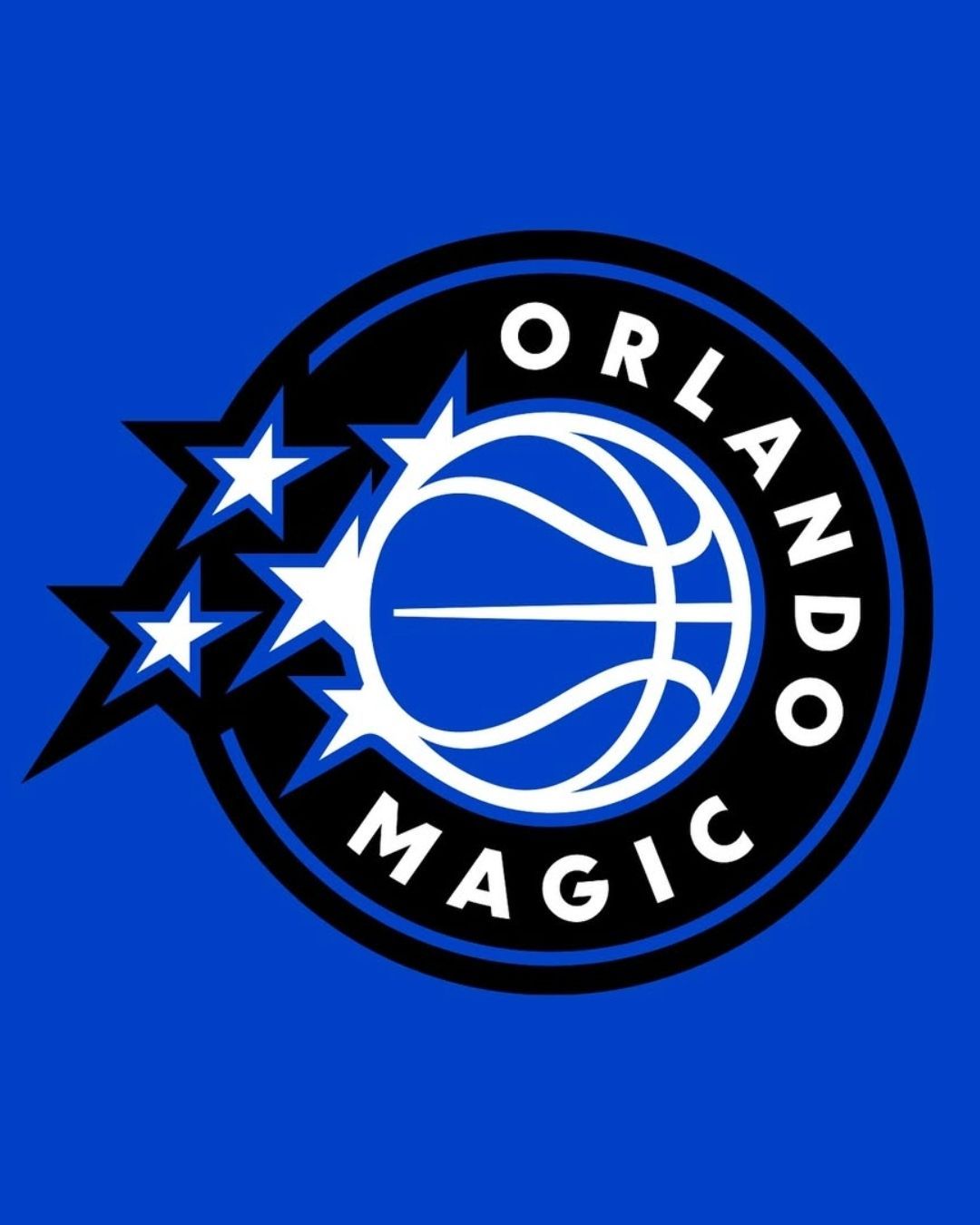
A new generation of Magic basketball, but also a tribute to tradition, in a blend described as a modern classic. These are the words chosen by the Orlando Magic to present the franchise’s new logo, the court restyling, and the 2025/26 game kits, unveiled last Monday during an event at the Kia Center in Orlando, Florida. And more than words, they represent the core ideas behind the team’s third rebranding in recent history, following the two at the start of the millennium (2000 and 2010): a visual identity update focused on modernity, but deeply rooted in the team’s genetic code, with a hint of nostalgia.
“The new logos and uniforms are a tribute to the rich history of the Orlando Magic and at the same time the beginning of a new era,” confirmed Dan DeVos, franchise chairman, and Shelly Wilkes, executive vice president of marketing. A clear direction, woven throughout the launch narrative: reimagining the past through the lens of the present, without betraying it. And it’s a goal that has been fully achieved, as evidenced by the overwhelmingly positive fan feedback and the imprimatur from design portal Canny Creative, which wrote: “This isn’t a change that screams nostalgia, but one that stylishly whispers the identity that’s always been, and it works.”
Modern Classic
The latest version features a preference for a uniform circular shape, in contrast to the earlier edition, along with a significant decrease in the prominence of the wordmark, which is now less dominant and more subtle. The basketball, with a much subtler motion trail, remains the standout element; while the star returns to center stage, just like in the past. It features both inside the logo, where five stars chase the ball, and on the jersey front, where it replaces the letter “A” (but not the dot on the “i”) in the words Magic and Orlando. The lettering and font prioritize readability, with proportions optimized for digital media; surrounding it all is a clearly defined geometry and a color palette that’s significantly toned down. In short, a much lighter, more modern logo.
The new uniforms were also presented at the same time, in the usual three versions: Association (white), Icon (blue), and Statement (black, by Jordan), each featuring classic elements reinterpreted in a contemporary style. The first two bring back the pinstripes (vertical pinstriping), one of the most recognizable and beloved visual hallmarks in Magic history. It’s all about the modern classic approach, with echoes of the jerseys worn thirty years ago by Shaquille O’Neal and Penny Hardaway, but interpreted through today’s sports design language and codes. The Statement edition, creatively more daring, draws inspiration from the warm-up jackets of the late ‘90s.
This isn’t just a modernization, but a way of giving something familiar back to the fanbase in a new form. “This is a new chapter, but part of the same story,” added Cole DeVos. In fact, the entire project stems from a process of listening to fans, and the communication reflects this dual track: evolution and legacy, a refreshed style and homage to the past, iconic references with a forward-looking perspective.
An Aesthetic Trend
Over the last decade, many NBA teams have revisited their visual branding. The Brooklyn Nets in 2012, the Minnesota Timberwolves in 2017, the Atlanta Hawks in 2022, the Cleveland Cavaliers and Utah Jazz in 2022, and more recently, the Detroit Pistons and Houston Rockets. Each had different processes and identities, but all followed a common direction: sans serif fonts, circular or otherwise more schematic layouts, clean and essential designs, reduced color palettes, and graphics designed to perform well in digital communication spaces. Chris Creamer of SportsLogos summed up the trend by describing it as “a league with logos designed to work at 50x50 pixels.”
This is not just about aesthetics, but a clearly identifiable trend in the NBA, and beyond, focused on scalability, versatility, and immediacy. Logos are no longer at the core of a brand’s storytelling. While in the ‘90s a logo was the beating heart of a team’s visual identity, today it is just one of many aesthetic assets: not a self-contained story, but an integrated element designed to adapt across formats and platforms. Increasingly, the storytelling is driven by other tools: uniforms, court design, capsule collections, digital campaigns, multimedia content, and so on.
Magic Background
The Florida franchise had a rich aesthetic and cultural heritage to draw from—more so than during the rebranding fifteen years ago. This is hardly surprising: the ‘90s have been a constant source of inspiration lately, as seen in the galactic 2021/22 City Edition, the retro collections by Mitchell & Ness, and the recurring return of pinstripe jerseys. After all, the Hardwood Classics collections made up about 15% of the team’s total retail sales in 2024: a clear sign of the affection the fanbase (both local and global) still holds for the “old Magic.”
Orlando’s original logo was introduced in 1989 and used until the early 2000s. It featured a more exuberant and illustrative graphic construction, in line with the visual trends of that era: slanted and unruly lettering, a comet-style ball with irregular contours, stars as dynamic typographic elements, and a structure inspired more by content than geometry. The new branding—unlike the somewhat empty and publicly unloved 2010 version—recovers an aesthetic that still resonates emotionally, and with a touch of nostalgia. All reinterpreted in a way that suits today’s commercial demands. And so we have the new, old Orlando Magic.


