


Nike fonts are the real winners of Euro 2025 Surprising shapes, attention to detail and, once again, bold choices
Euro 2025 has been a success across the board. The quality of the matches confirmed the technical growth of the entire movement. A growth matched step by step by increasing attention from brands, and it’s no coincidence that female players are now revolutionizing football fashion with cutting-edge outfits. Not to mention the packed stadiums and media attention—both on social and traditional channels—never before seen for women’s football.
Even the kits have reached an unprecedented level of aesthetic quality. Top-tier production for all the national teams in Switzerland, with one brand standing out above the rest. Nike took care of every detail of its kits: beyond the bold choices made to revolutionize collars, Euro 2025 also marked an invasion of fonts with surprising shapes.
Norway
The Norwegian national team reused the font previously adopted by the men’s team. It’s called Harald Typeface and was developed by Luis Callegari. The font features metallic vertical lines that evoke both Viking-era swords and the Runic alphabet. All curved lines have been eliminated—only sharp angles and brutalist geometry remain, conveying a warrior spirit with a touch of elegance highlighted by silver finishes.
Finland
For the Finnish national team as well, Nike reused the font adopted by the men’s squad, featuring soft shapes freely inspired by the Jugendstil movement, blending tradition with a more contemporary aesthetic. Curved lines appear as if painted with individual brushstrokes, enhanced with light gold detailing that adds a sense of depth.
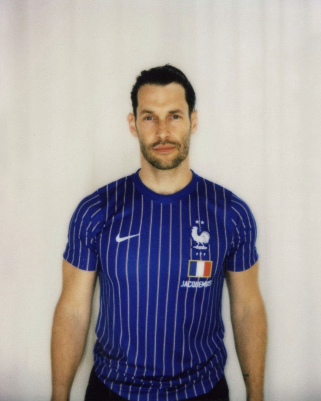
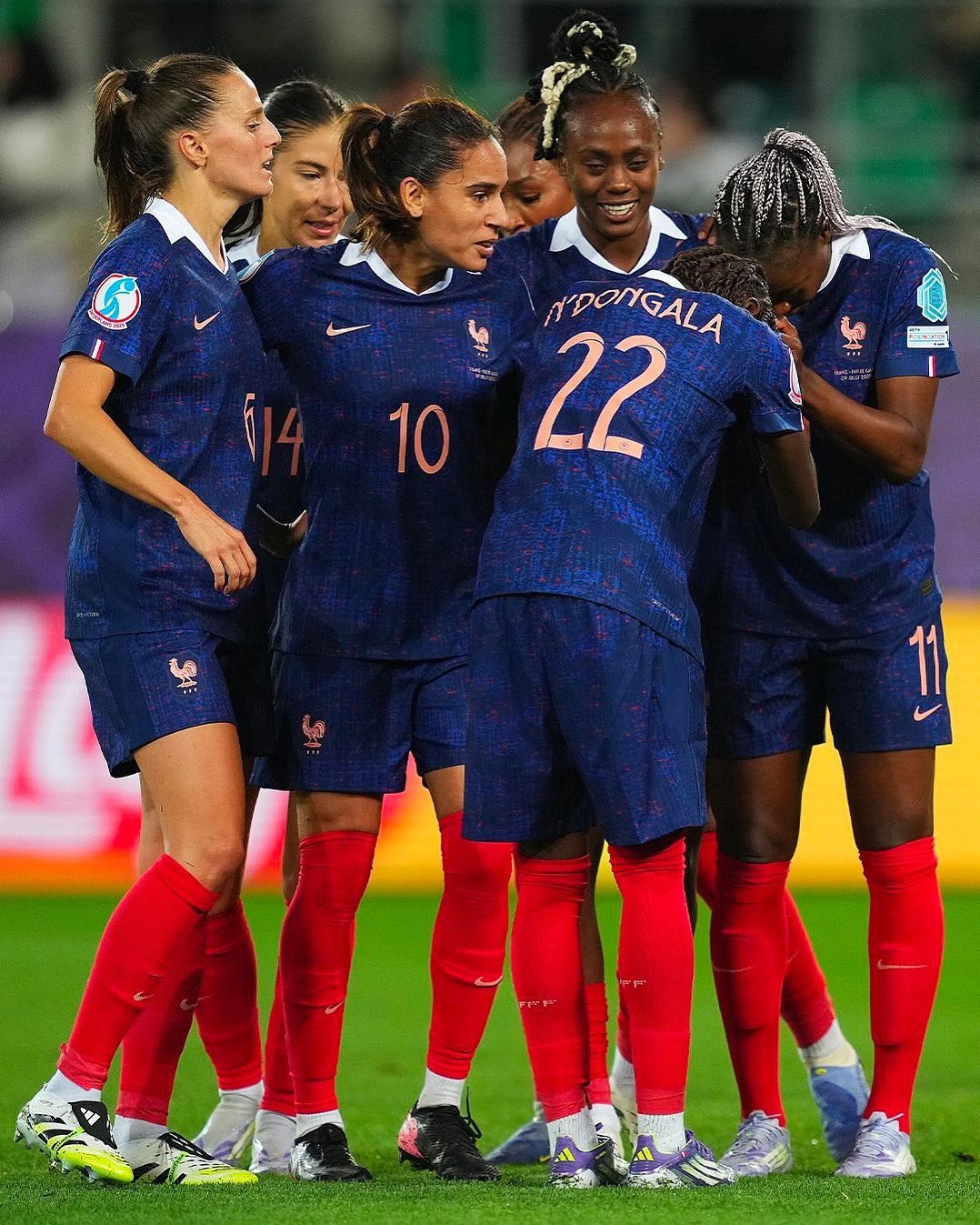
France
A dive into history for the font used by France. Designed and handcrafted by Angelo Trofa in collaboration with Nike’s creative team, it’s called Sport Nouveau and pays direct tribute to Art Nouveau, the famous artistic movement that originated in France. That’s why the names and numbers evoke an aristocratic feeling, reminiscent of a postcard from the late 19th century.
Netherlands
Clean, sharp lines with distinct edges and balanced proportions. That’s how the Dutch font unfolds—a modern graphic that looks like it came straight out of a video game and pairs perfectly with the dotted effect running across the front of the jersey. The numbers are slightly condensed, taller than they are wide, but despite the prevalence of straight lines, the shapes remain soft.
England
A more classic font for England, featuring curved and tapered shapes alternating with rigid lines and sharp cuts. Nevertheless, the final result is neither boring nor, worse, anonymous. The design is enriched by a detail that might almost go unnoticed at first glance: the inclusion of a sharp edge, often at the point where curved lines meet, creating a sort of artistic break in the natural flow.