


OM is set to register its own pantone Crests may change, signature colors are forever
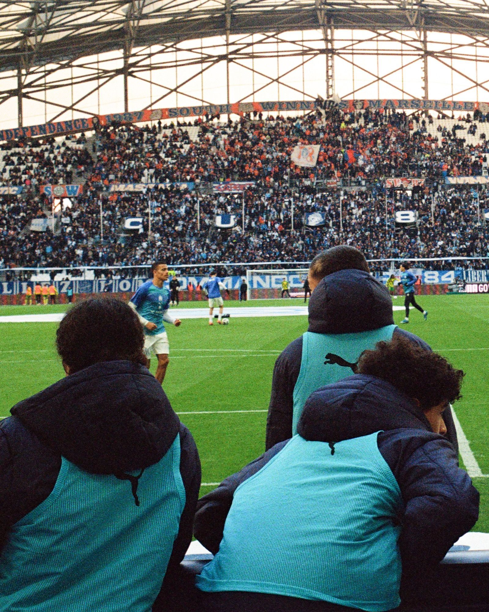
A further historic visual identity in European football is poised to vanish in the face of the usual demands for modernity, cleanliness and digital scalability that over the last decade have already claimed many victims among sports crests. This time it's Olympique de Marseille, a French club recognized worldwide precisely for its aesthetic DNA: iconic from the outside, felt as one’s own within the fanbase, and therefore to be handled with great care by a board that months ago announced the opening of the creative workshop.
"It's not an easy job, far from it", said president Pablo Longoria at a press conference in May, "we must respect the club's history and its supporters". A warning came also from former president Christophe Bouchet, who at the end of the '90s widely upset the Vélodrome public with the same process: "Here the crest is considered the very essence of the club by the fans, which makes any modification very delicate", he told Le Parisien.
A few months later, in recent days the first leaked shots of the new crest have been circulating on social media. A design that preserves the elements considered non-negotiable by the supporters (the letters O and M, the motto, the star) but sacrifices every other feature on the altar of greater simplicity and universality. Of course the club colors will remain unchanged, and there is a particular piece of news — unique in the European sporting scene — circulating about them: the possible registration of Bleu OM, which the club intends to protect with a trademark.
Bleu OM
The rumor was suggested by the magazine Le Parisien and then picked up by several specialized French outlets, although it attracted less attention than the crest redesign. This would be an unprecedented intention in Europe, where the rules for filing a color trademark are particularly restrictive, and not only in the sporting field. The bar is set quite high by the European Union Intellectual Property Office (EUIPO), which requires a precise codification and a high level of distinctiveness acquired in the public's eyes to accept applications. This was confirmed, for example, by the Red Bull case, which years ago tried to register its blue-silver, but without success. "Registration is only possible if the representation is clear, precise, self-contained, easily accessible, durable and objective", state the Sieckmann criteria.
In Marseille there is a feeling that that iconic sky-blue which is rooted in the city's culture — which has always colored the crests, kits, choreographies and the club's collective imagination, and in some way represents its soul — meets the recognizability requirements set by the EUIPO. And therefore that it could be registered, somewhat like what happened overseas with Tiffany Blue, protected since 1998, or with analogous cases such as Coca-Cola Red and UPS Brown; or in the sporting world with the Burnt Orange of the University of Texas or the Carolina Blue of the University of North Carolina. In the U.S. system, however, the legal protection of a color as a trademark — governed by the United States Patent and Trademark Office (USPTO) — is much more flexible than the European model. It is not strictly necessary that the color be unique or intrinsically distinctive; it is enough to demonstrate recognizability and that it has become identifying over time through use.
If Olympique de Marseille were to turn to the USPTO, in short, it would undoubtedly have the credentials to register Bleu OM. In the next few months — talk is of a complete rebranding at the start of 2026 — we will find out whether the club led by Frank McCourt and Pablo Longoria will succeed in the restrictive context of the old continent. In any case, trademark or not, the process continues at a measured and deliberate pace towards the announcement of the new crest.
A new era
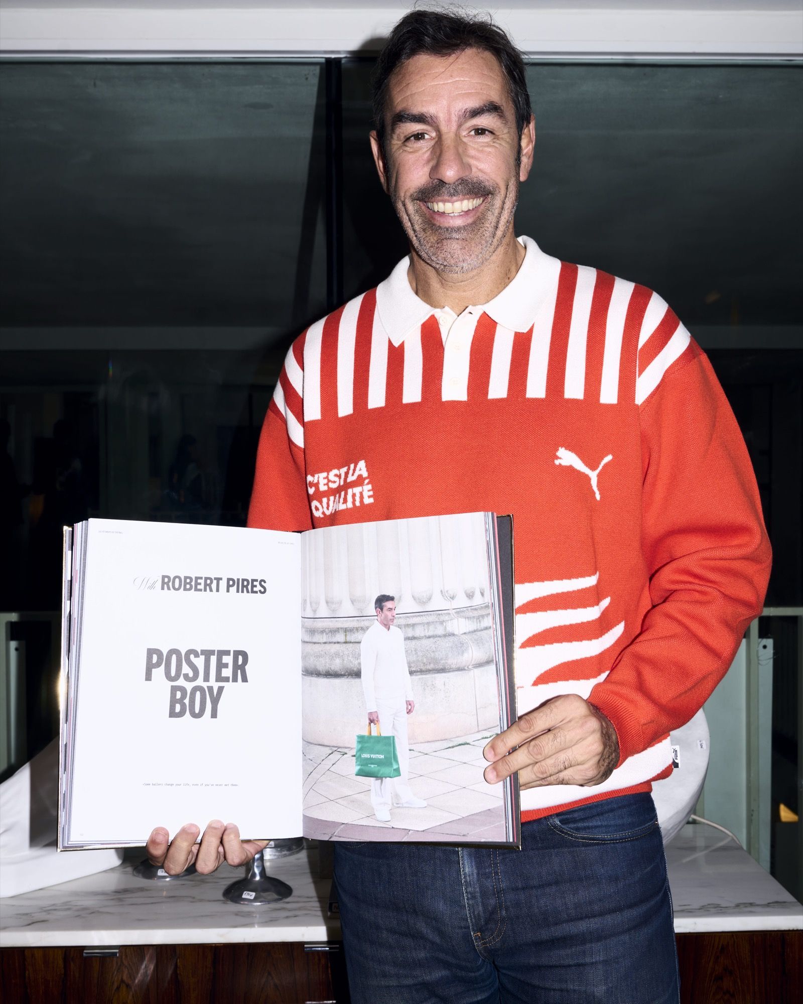
McCourt and Longoria have described the upcoming change as "the beginning of a new era and the club's adaptation to modern communication". As seen in many other places, the emblem restyling — in this case "intended for the next 15 or 20 years" — is essentially an inevitable part of the process, and so in Marseille "a cleaner, more modern crest, immediately identifiable and easily recognizable on digital media" is expected. The logo recalls the seal of Montmirail, the club's founder, and therefore the very first OM emblem dating back to 1899, inspired precisely by René Dufaure de Montmirail’s personal seal with the initials D and M adapted into O and M for the monogram. The simplification of the letters and the shape is evident, but the club has indicated it does not intend to abandon either the star or the motto Droit au but (Straight to the goal), which will be included or omitted depending on the usage and communication medium, "a bit like the case of You'll Never Walk Alone at Liverpool", Le Parisien reports.
Tunnel is the new weekly newsletter from nss sports. Click here to subscribe.
Mindful of the sensitivity of the undertaking and the implications for relationships with the fans, the board chose to involve the leaders of the ultras groups in the creative process and to listen to their opinions on the matter. Meetings in which a compromise was sought and whose content would be interesting to hear, but which nevertheless led Marseille's organized supporters to publicly approve the change, paving the way for general acceptance.
Standardization
The involvement of the ultras speaks very clearly about the caution with which McCourt, Longoria and associates have moved through this path. Likewise, the storytelling of recent months, strongly inspired by the city's culture, and the lines recently launched by OM and PUMA, markedly nostalgic in nature, suggest a clear desire to convey the message that the club's past is not destined for oblivion. A series of operations that should not surprise, given the context. The history of these supporters, including for example the widespread criticism and general rejection of the rebranding imposed under Christophe Bouchet's management, indeed testifies to all the difficulties in getting the local public to accept changes in visual identity, considered a cultural heritage to be defended with nails and teeth against commercial pressures.
The announcement of the new crest will, as always, be a polarizing topic. Between those who try to understand the reasons for this standardization, which sooner or later is affecting all clubs across the old continent, and those who hoped that OM — one of the clubs with the deepest identity component — could evade such market logics. The long list of crests restored in Ligue 1, after the earlier cases of Nantes, Reims, Metz and Saint-Étienne, is instead set to grow with another visual re-projection. Yet another change that seems to speak more the corporate language than that of football, and which generally seems to follow the same directives everywhere, so much so that OM's new crest may appear as a reinterpretation of Inter's, except for the lowercase i and the club colors.
Who knows if one day there will be a U-turn and a return to embracing tradition and the cultural heritage of clubs, especially in cases of very rich legacies like Marseille's. Maybe not — we're only at the beginning of the era of digital branding, along a road that cannot be stopped by nostalgia. What OM fans will probably never regret, however, are the colors. The traditional Bleu is forever, and on that the club's promise is supported by the facts.