The comeback of vintage logos in football All the solutions adopted by the clubs and their sponsors to promote them
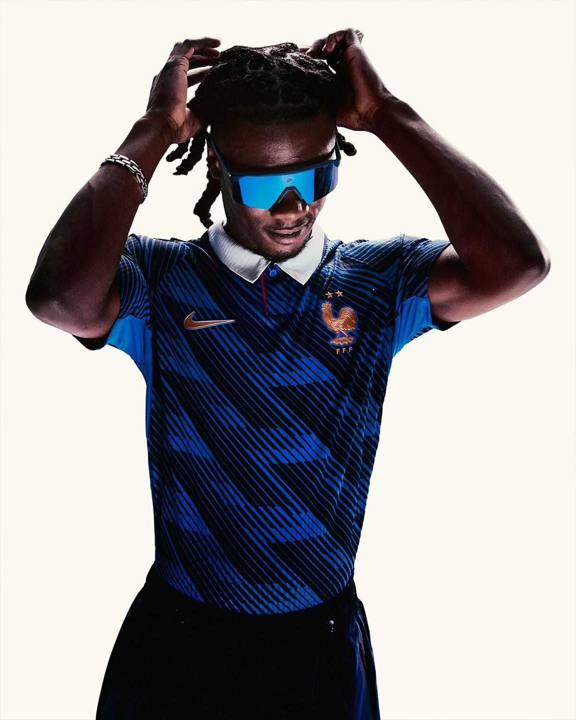
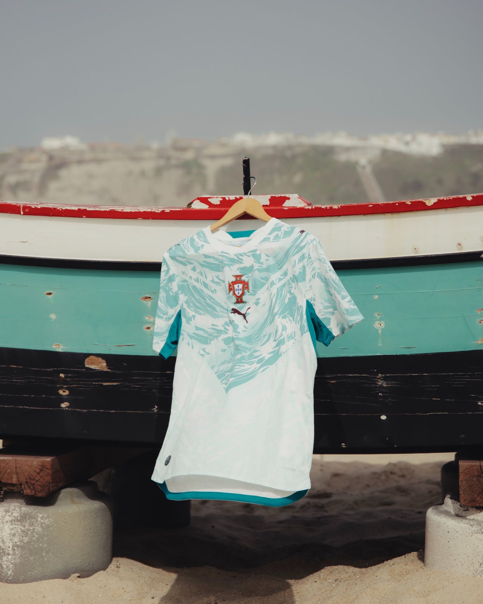
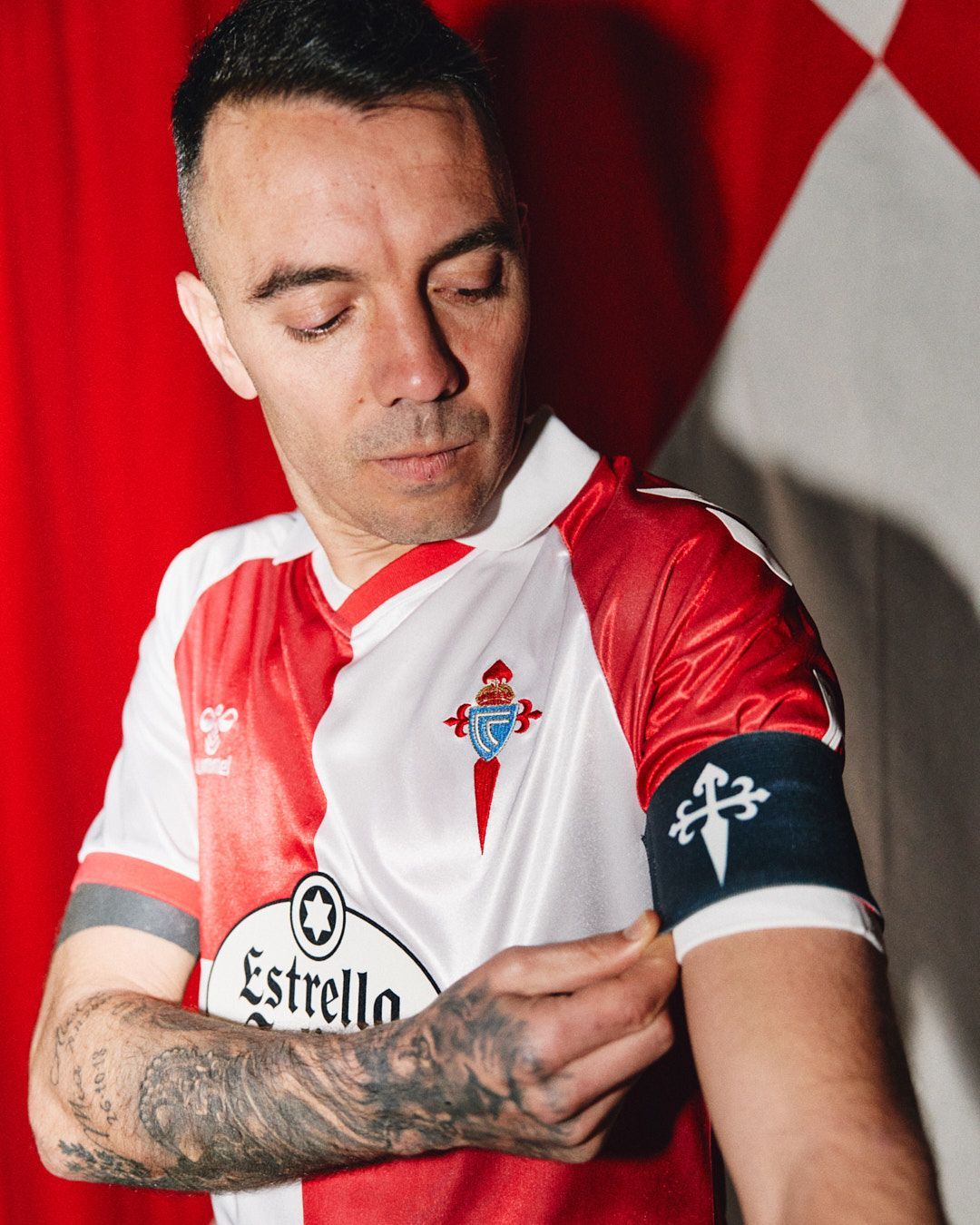
The aesthetic overhaul of football jerseys undeniably led to a significant elevation in logo design. Until a few years ago clubs and brands did not feel the need to modify the crests; now they are constantly forced to find new solutions so that the logos do not represent a discordant note in the color harmony of a kit. It started as a novelty, turned into a demand from fans and now it is an obligation. Sometimes this means changing the team colors, in other cases it means reintroducing a logo from the past and in the most extreme cases creating new ones.
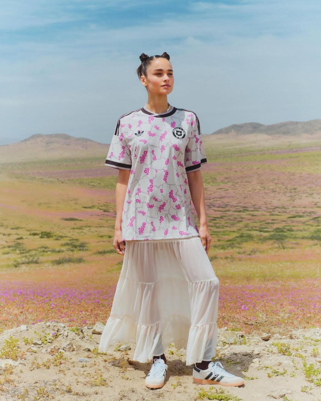
What matters is giving a touch of contemporaneity to a graphic expression that is synonymous with a club’s history as well as being its image. An image that can be modified or replaced to ensure each jersey has a clearly defined connotation. And while the biggest changes rarely affect the Home jerseys — the last bastion of tradition in the fans’ eyes — Away and Third kits lend themselves to a series of experiments that have vintage logos as the most easily recognizable trend.
The new wave
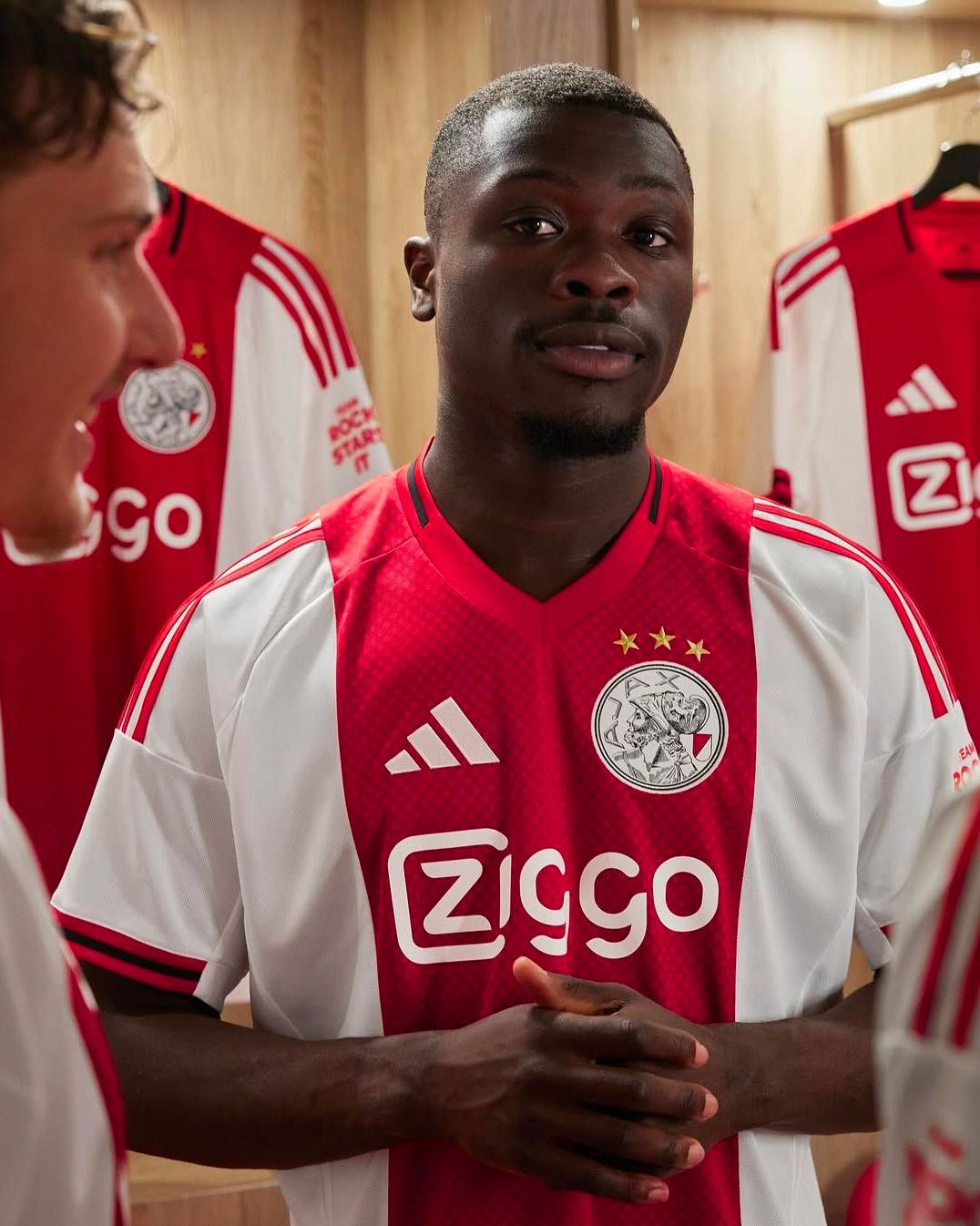
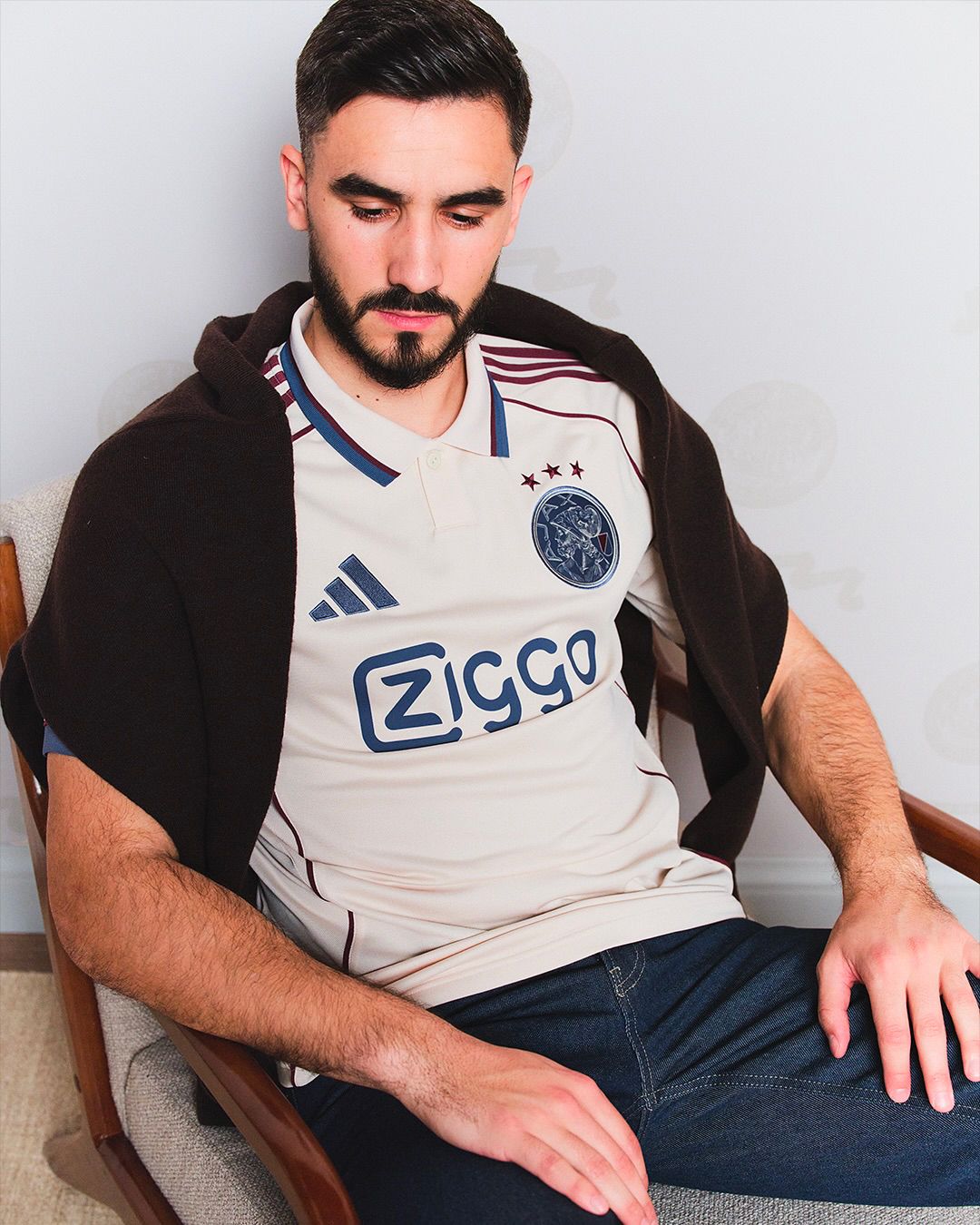
In this quest for chromatic perfection, vintage logos represent a lifeline for clubs and brands. A simple solution to caress the fans’ feelings. Of course, reintroducing old logos should never be an end in itself. Ajax, for example, as part of a complete rebranding, reintroduced a more detailed version of the face of Ajax the Great, in contrast with the minimalist policies that have characterized the global football scene. This logo appears for the 2025/26 season with the same silhouette on all three shirts signed by adidas but in three different colorways.
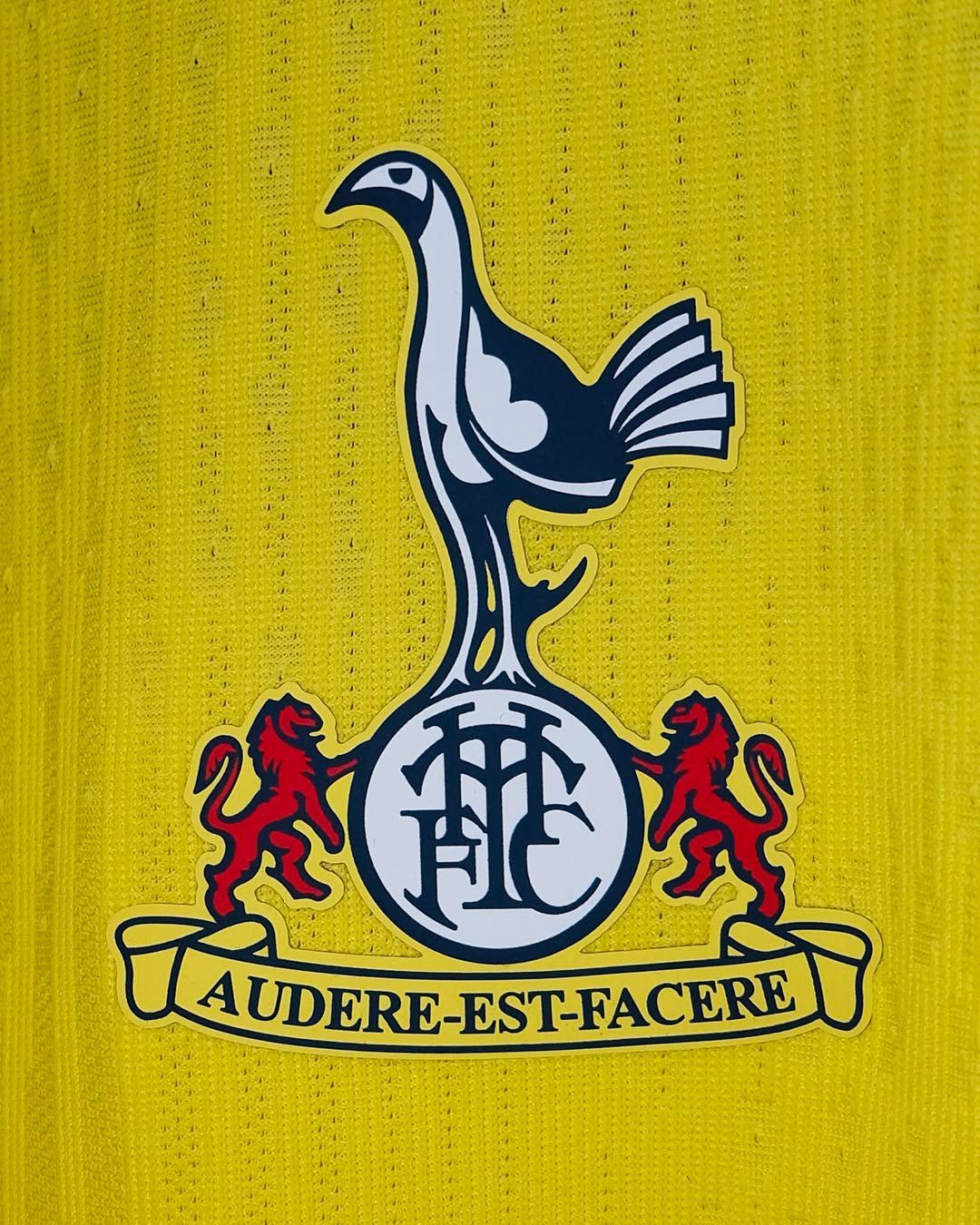
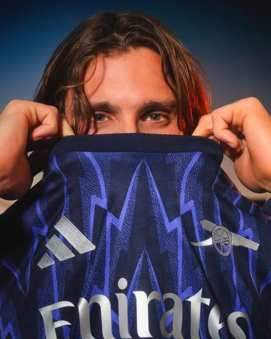
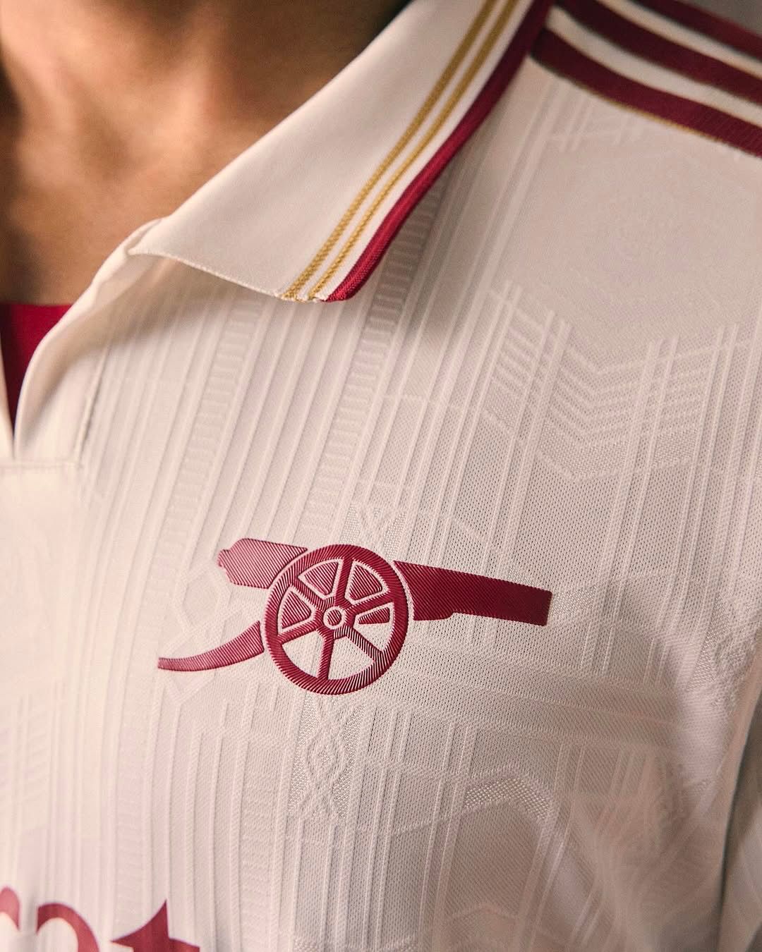
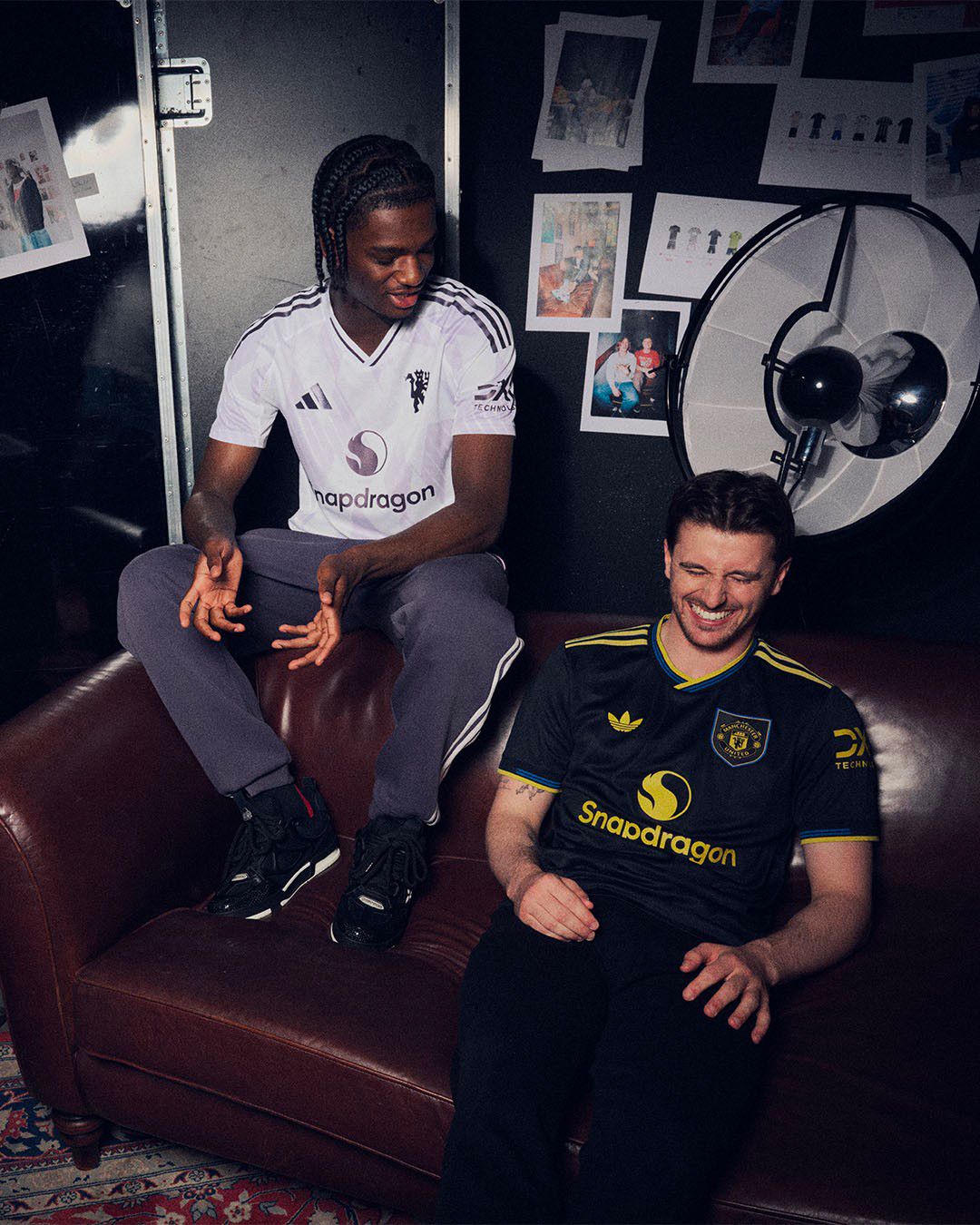
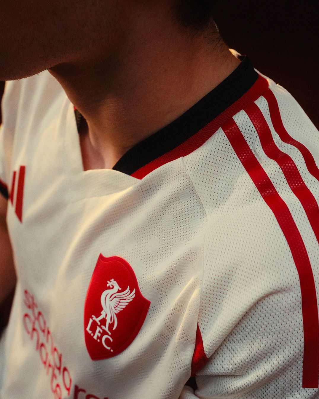
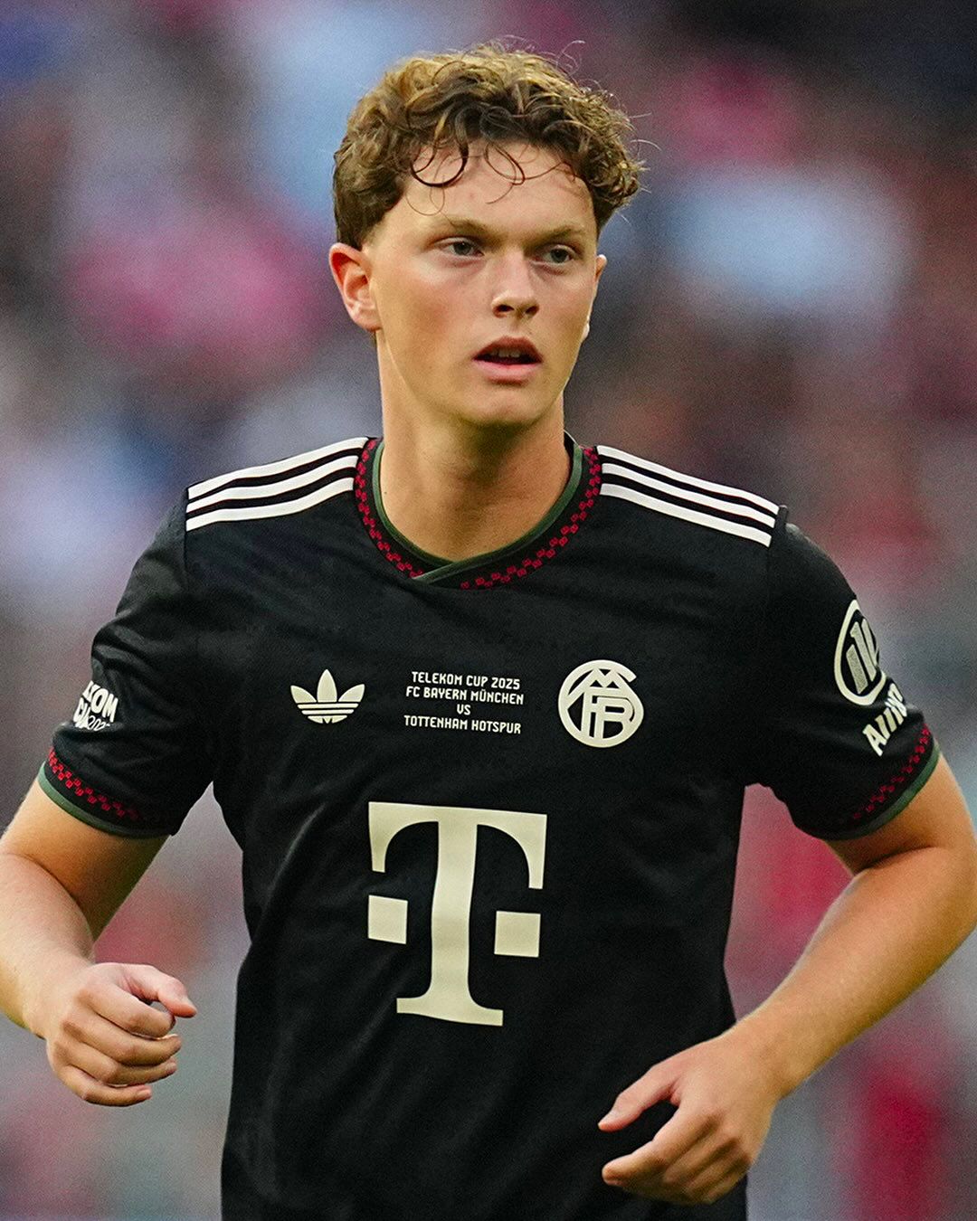
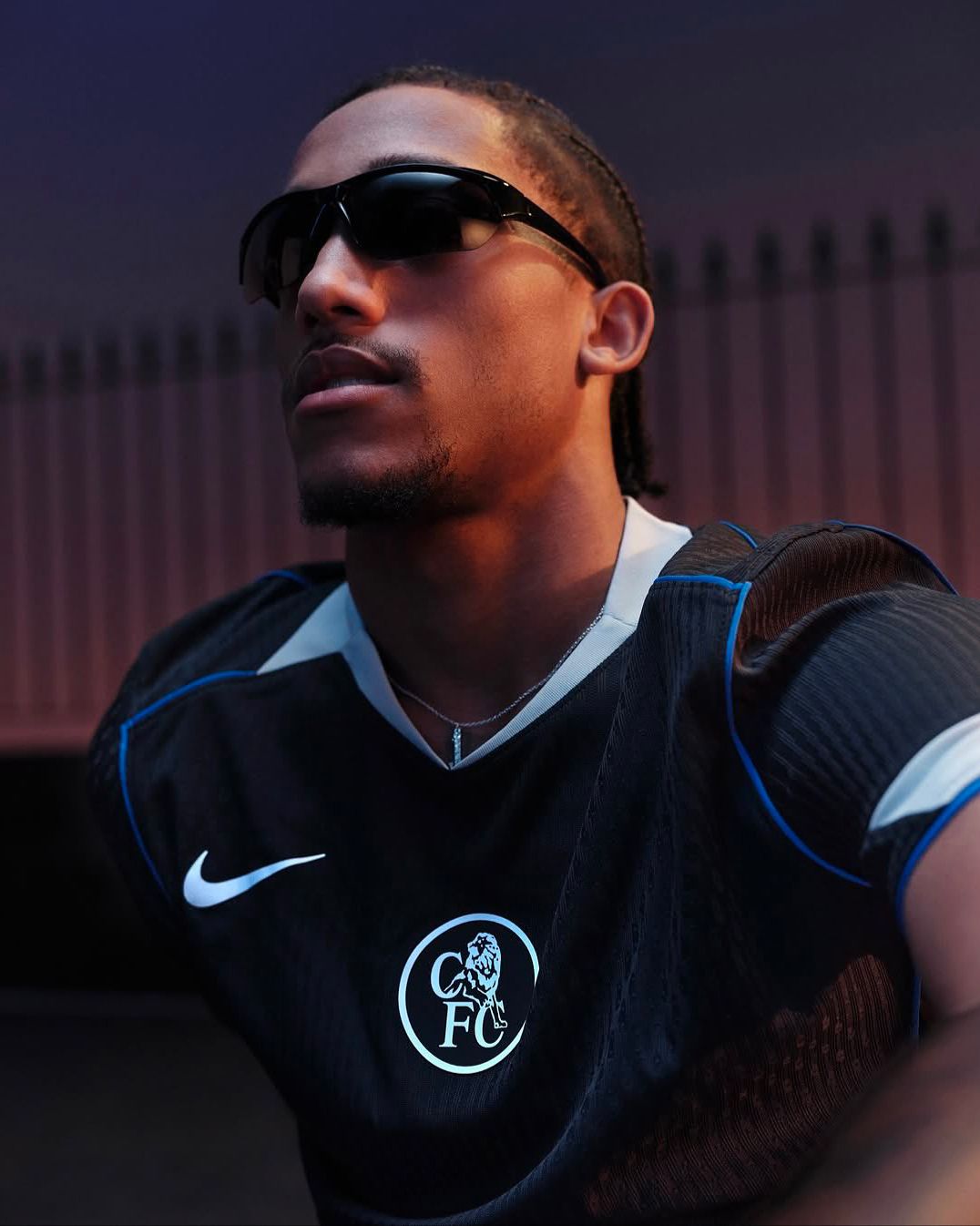
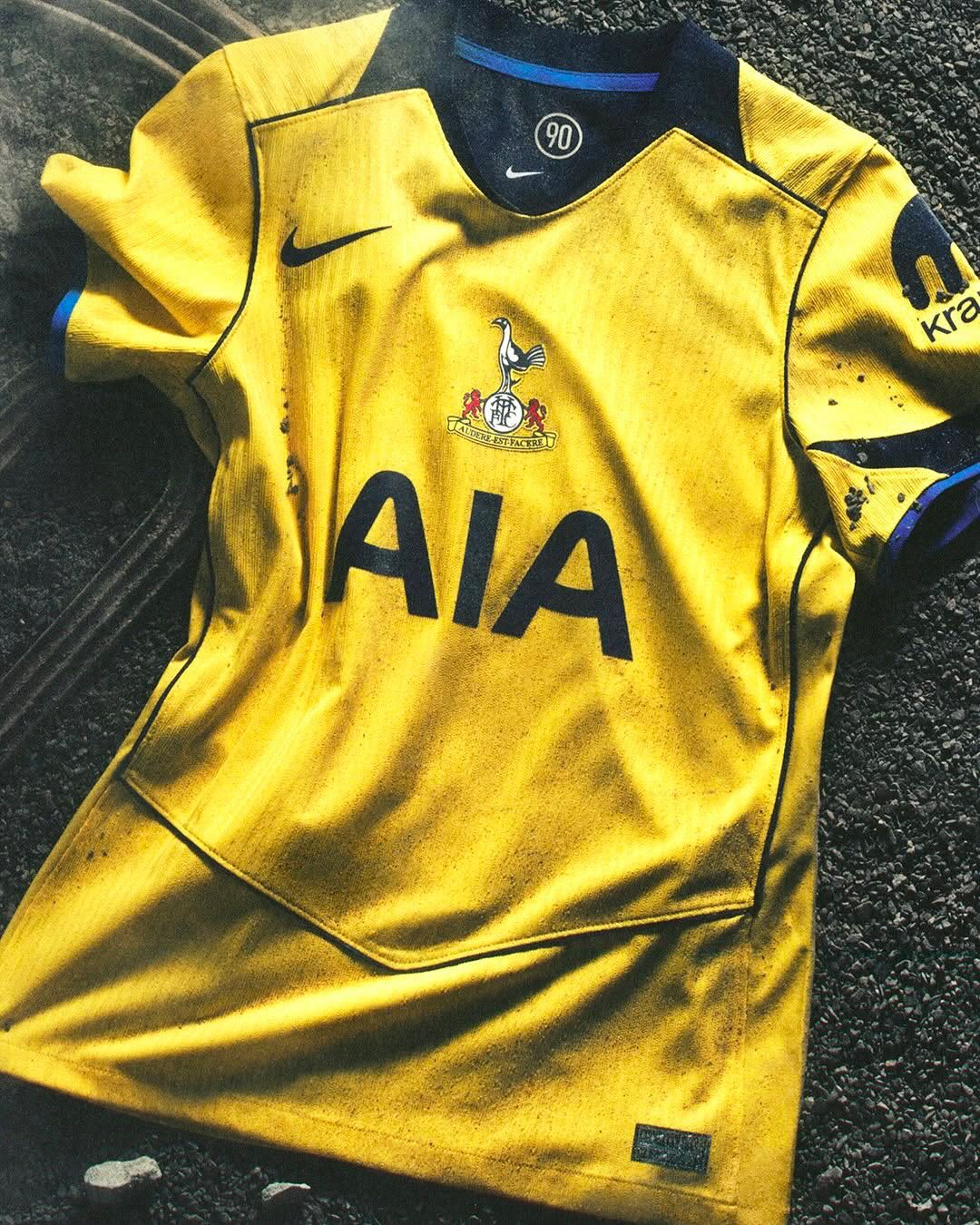
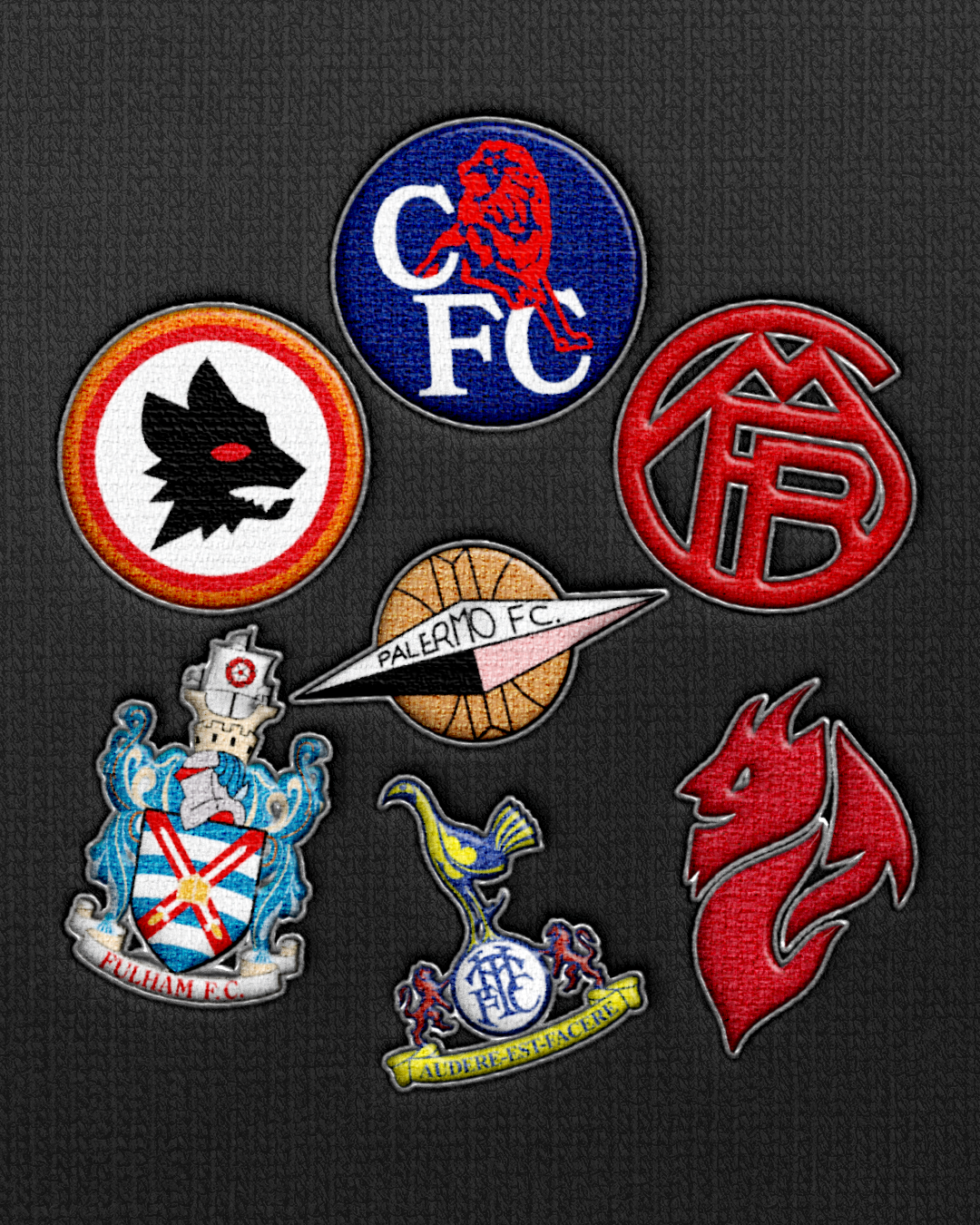
Another example of vintage logo enhancement comes from the Premier League thanks to the splendid work carried out by adidas with Arsenal. The cannon logo is among the most loved by Gunners fans and for this reason it was reintroduced in two versions for the 2025/26 season, in silver on the Away shirt and in Highbury red on the Third. The examples do not end there. adidas also used vintage logos for Manchester United and Liverpool, while Bayern Munich dusted off a design from the 1920s. Nike, for the Total 90 model made for Chelsea and Tottenham, used two historic logos: the "CFC" lettering used between 1986 and 2005 for the Blues, and the cockerel accompanied by the phrase Audere est facere for the Spurs.
Serie A is not immune to this trend: New Balance used a logo first seen in 1963 for Atalanta’s Away shirt, PUMA worked carefully to emphasize the return of the Diavoletto on an official Milan shirt, Mizuno reproduced the historic crest with the stylized eagle adopted at the end of the 1970s for Lazio, Kappa opted for the "gallinaccio" for Genoa, Joma reintroduced the badge that appeared on Verona’s shirts in the season 1984/85, and Acerbis went back to the 1970s for the logo to be applied to the Cremonese's Away jersey.
Three shirts, three different logos
As mentioned, logos represent the club’s history. A cultural heritage that renews itself decade after decade, creating an aesthetic archive to draw from during the creative process. One consequence of this search is the use of three different logos on three different shirts. Not out of vanity, but because history is the greatest asset clubs can spend with their fans. A detail that comes from the past always smells like good taste and refinement and is able to give a shirt an elegant dimension whether it is a jersey designed for tradition or for innovation. It guarantees personality, turning it into a unique collector’s item.
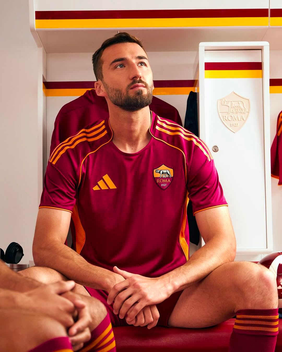
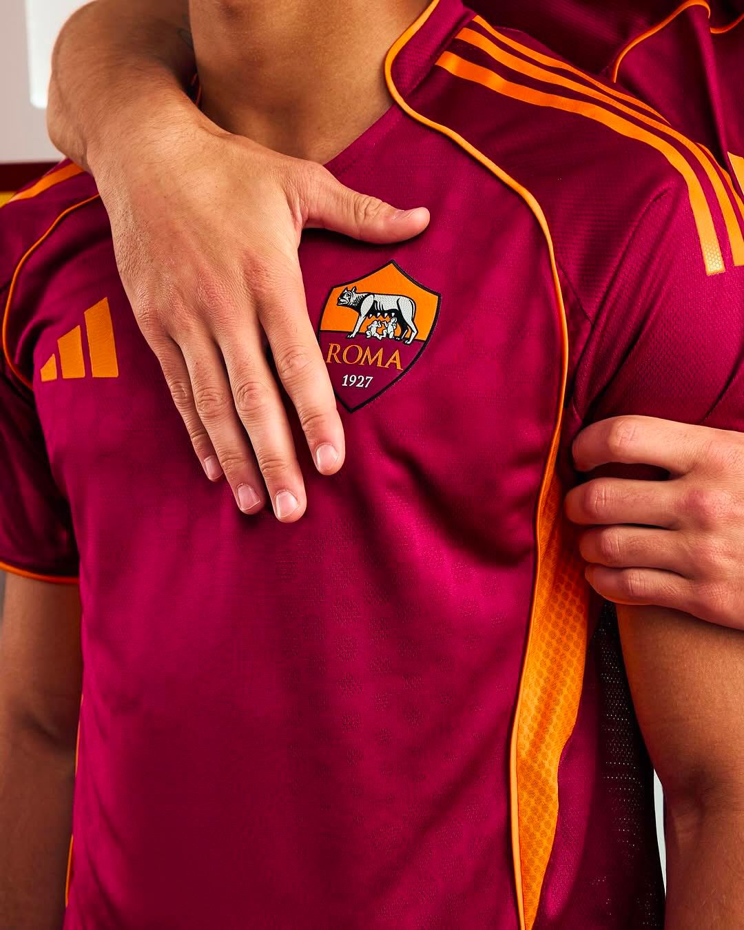
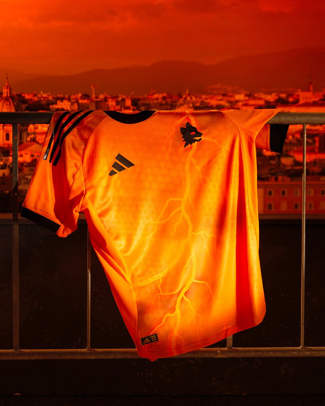
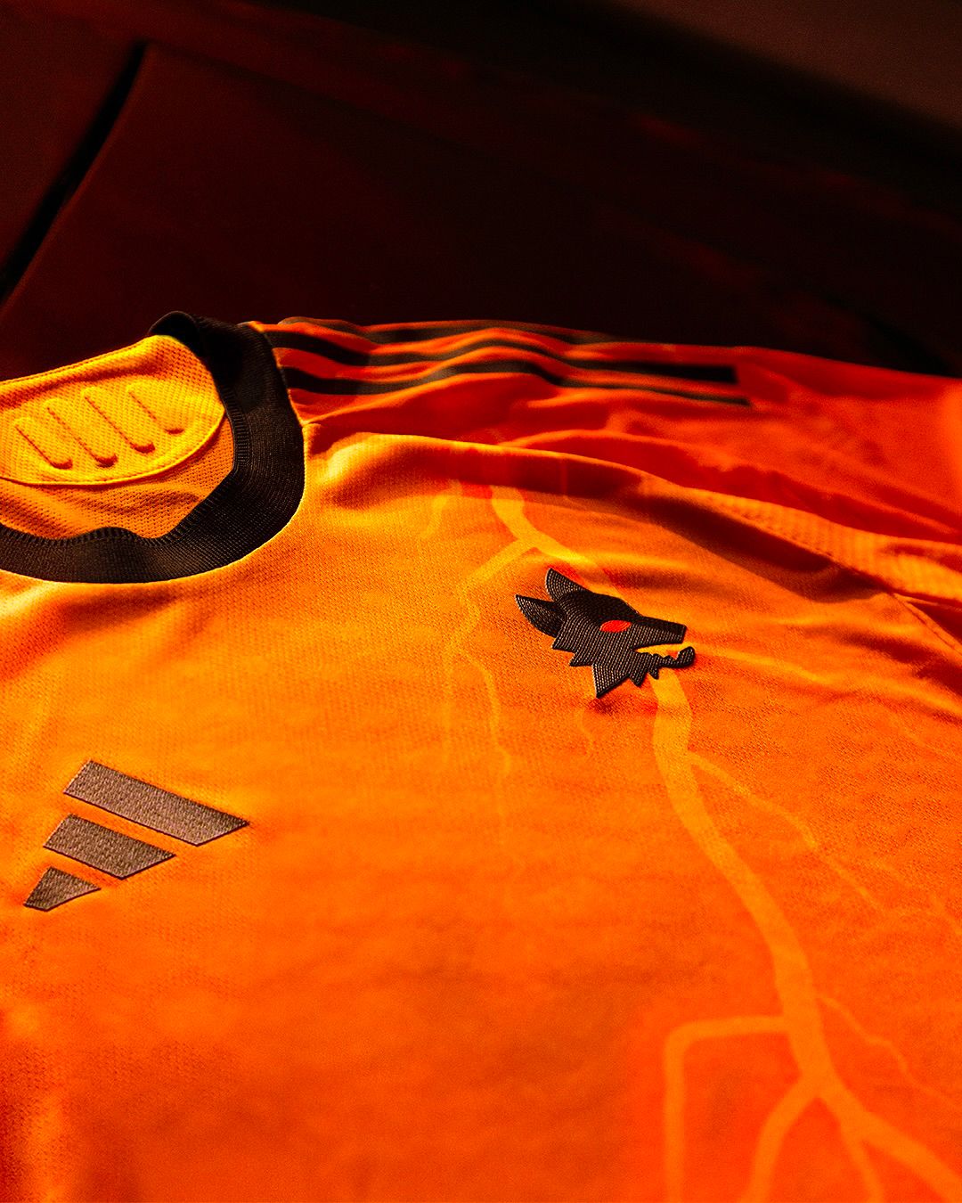
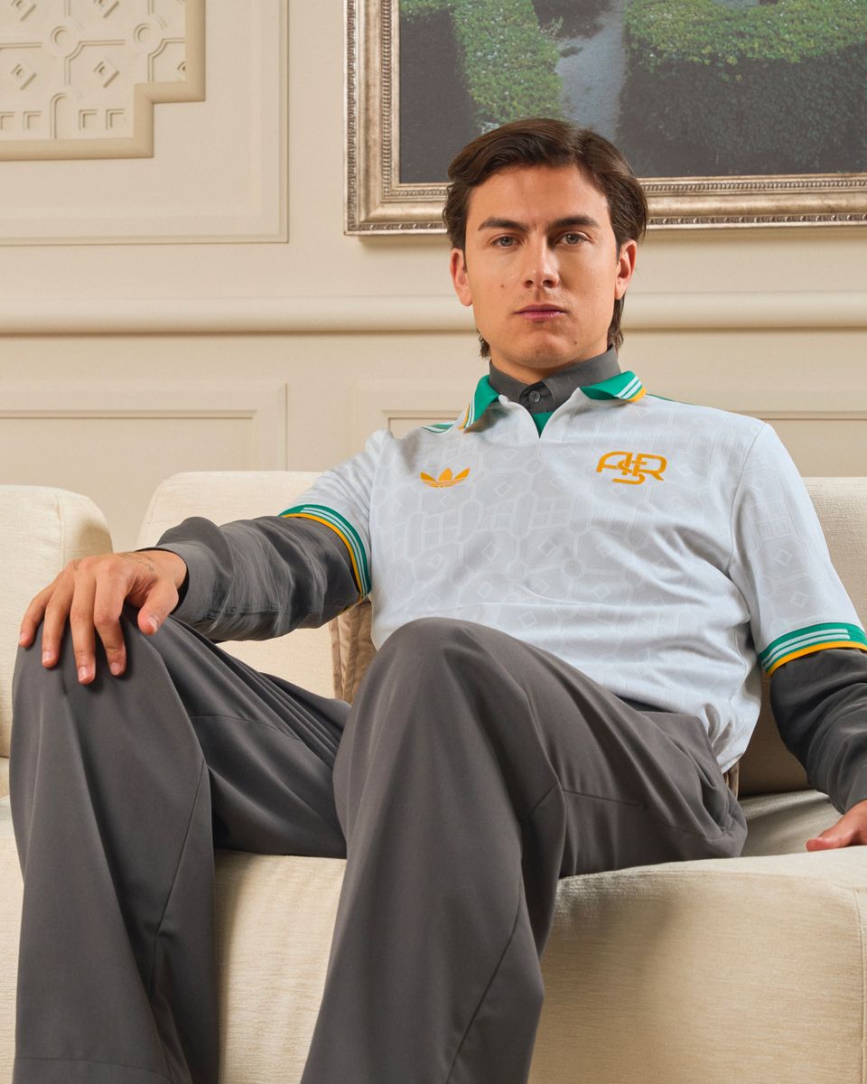
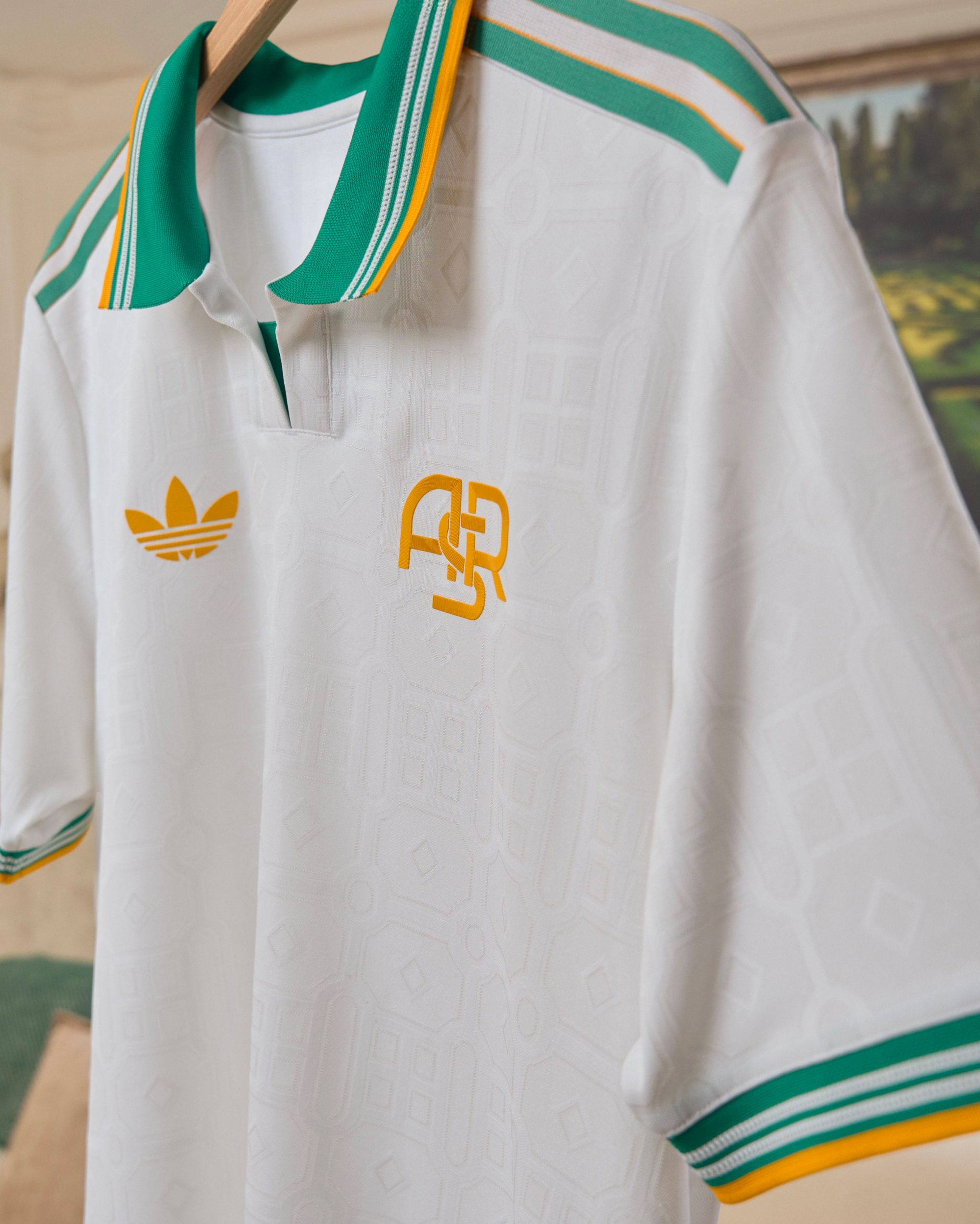
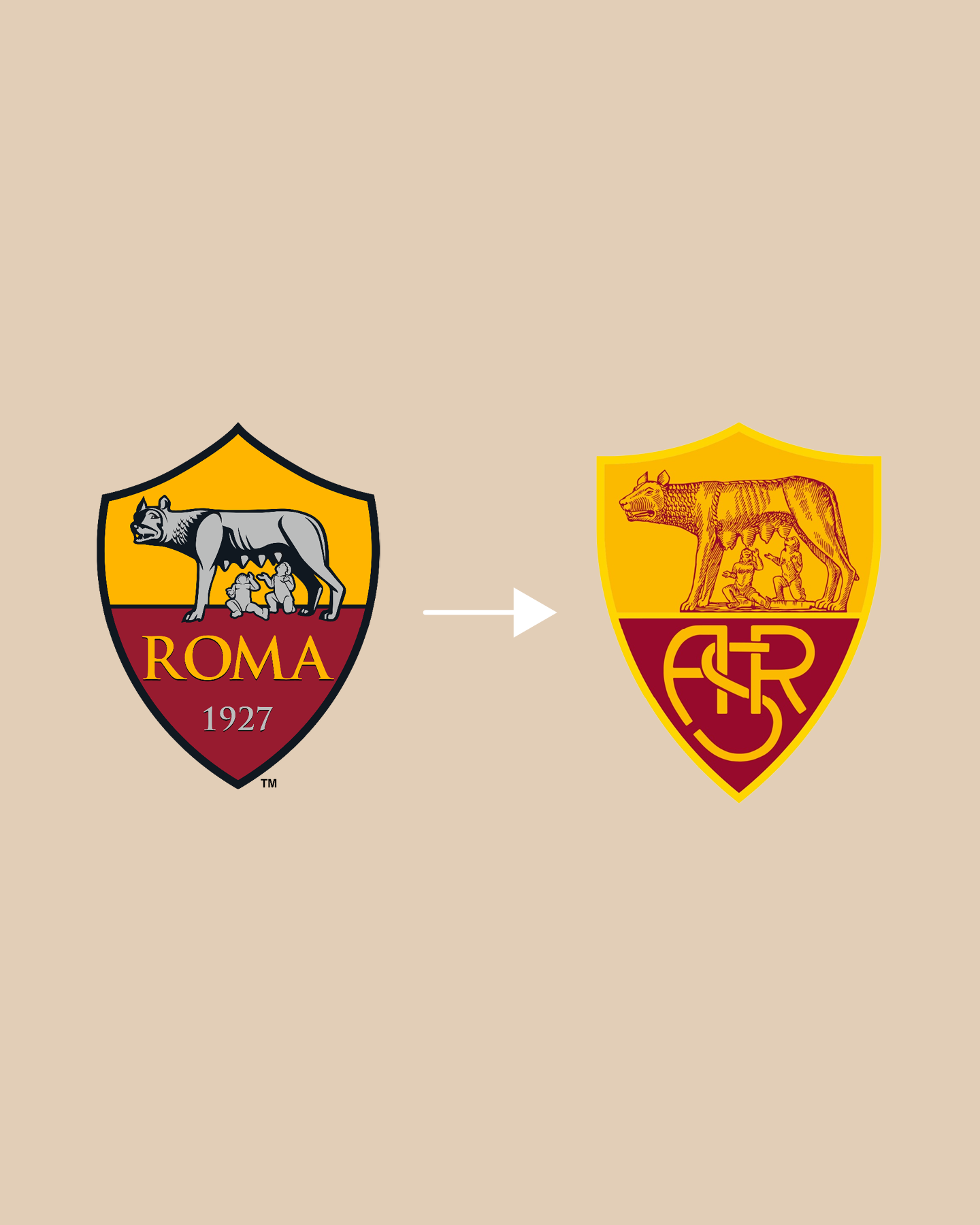
It is the case, for example, of AS Roma. On the home yellow-red shirt appears the Capitoline she-wolf suckling Romulus and Remus inside a shield, probably for the last time accompanied by the inscription ROMA 1927 since the club has announced its intention to change its logo ahead of the club’s centenary celebrations. On the Away shirt you can see the little wolf drawn by Piero Gratton, the symbol Roma fans are most attached to, while for the Third kit adidas opted for the traditional trigram ASR.
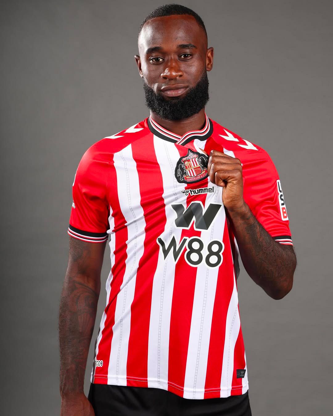
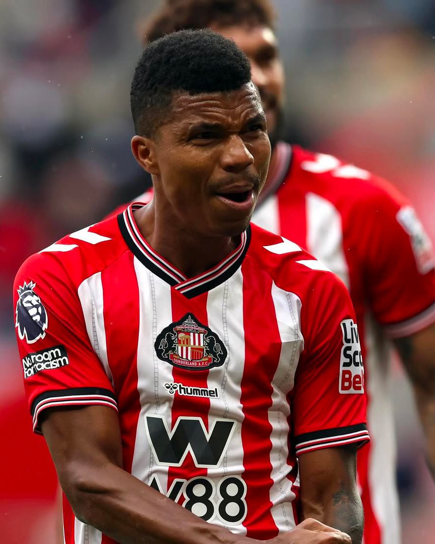
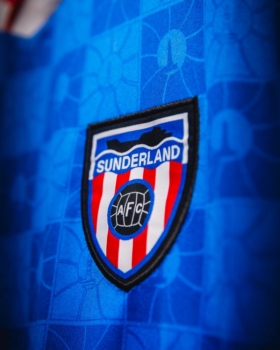
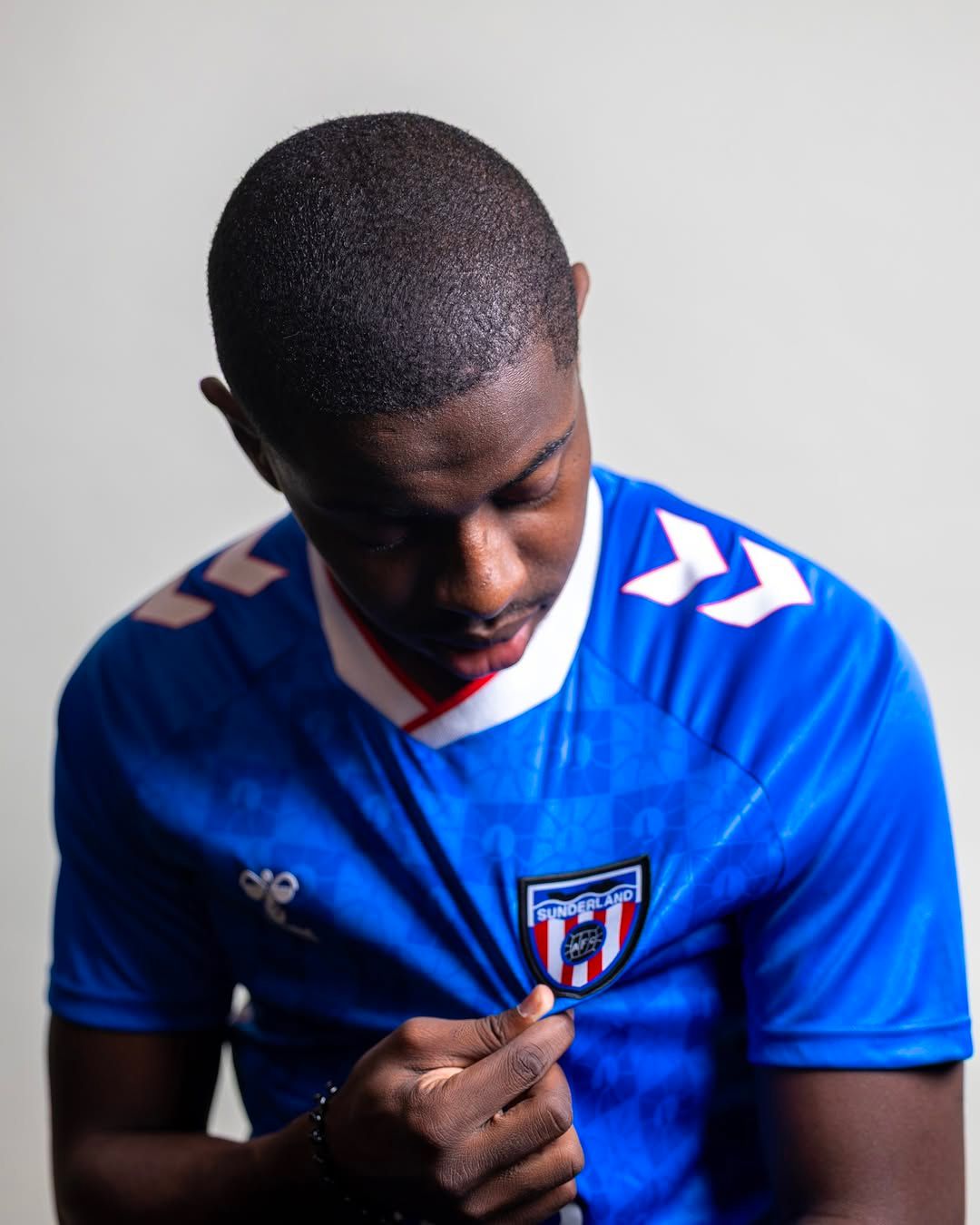
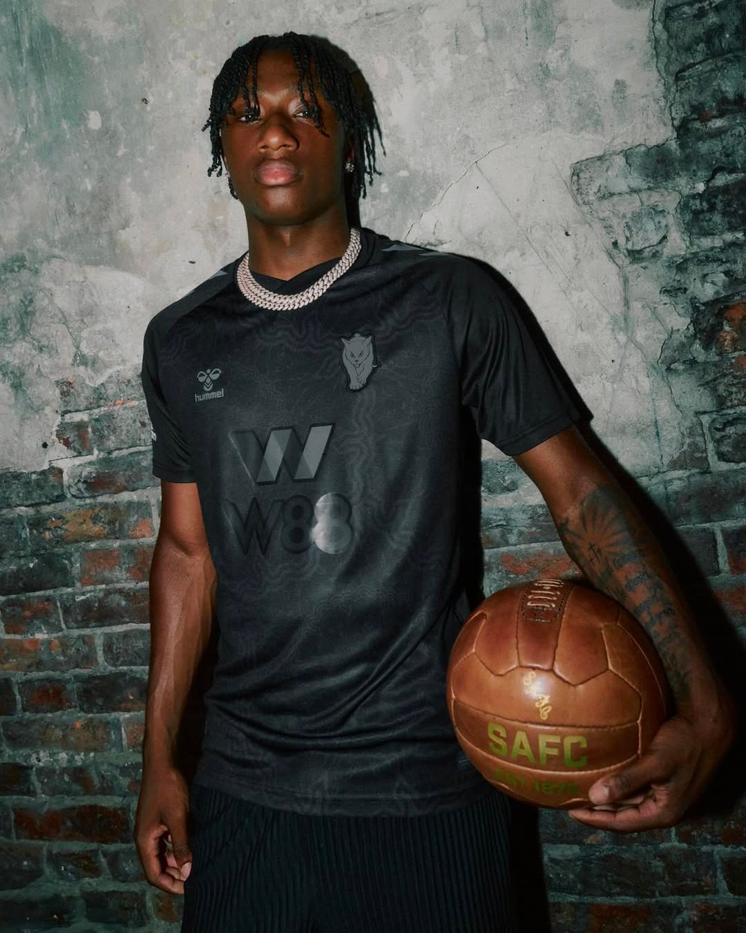
Three logos for three shirts is also the solution adopted by hummel for Sunderland. On the Home jersey with red-and-white vertical stripes appears the official logo the club has used since 1997, the year they began playing their home matches at the Stadium of Light. Previously, starting in 1972, Sunderland used a classic shield featuring a boat at sea which, revisited so that the blue of the shirt replaces the black of the original drawing, appears on the Away shirt. Finally, the black third shirt displays a new tone-on-tone logo, a feline in tribute to the nickname Black cats.
Same logo but different colors
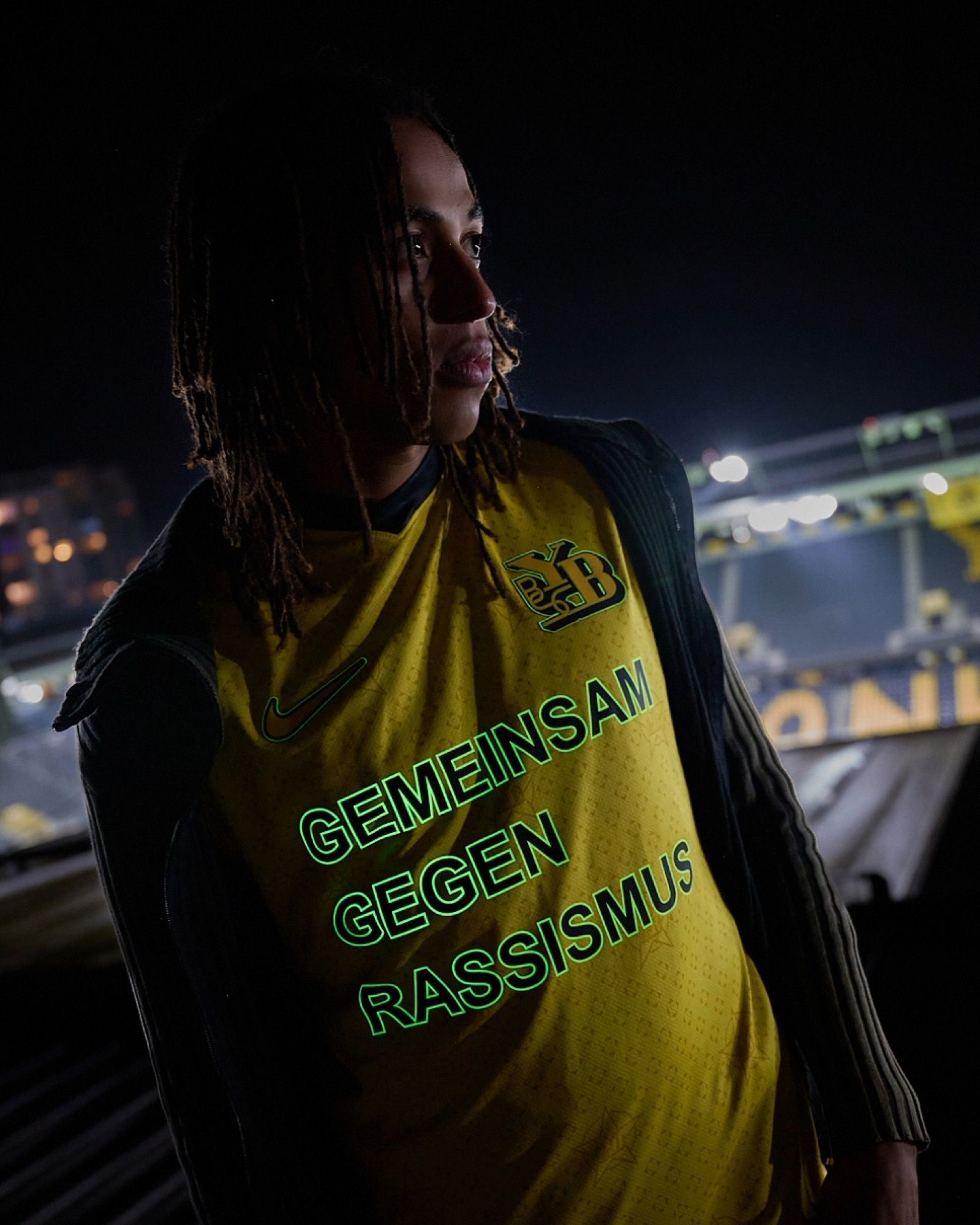
Another major aesthetic trend is one where logos maintain their original silhouette but change colors, applied on the jersey in monochrome mode. This is the case, for example, of PUMA with Milan and Sassuolo for their respective Home jerseys as well as for the Manchester City Third jersey. Nike has also opted for this solution with Inter’s Home jersey, officially introducing the Chlorine Blue shade, and with Barcelona’s Third jersey, while for the Away kit dedicated to Kobe Bryant a surprising snake skin effect was used. Napoli, for its Away jersey, chose gold finishes.
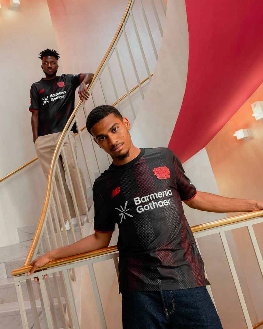
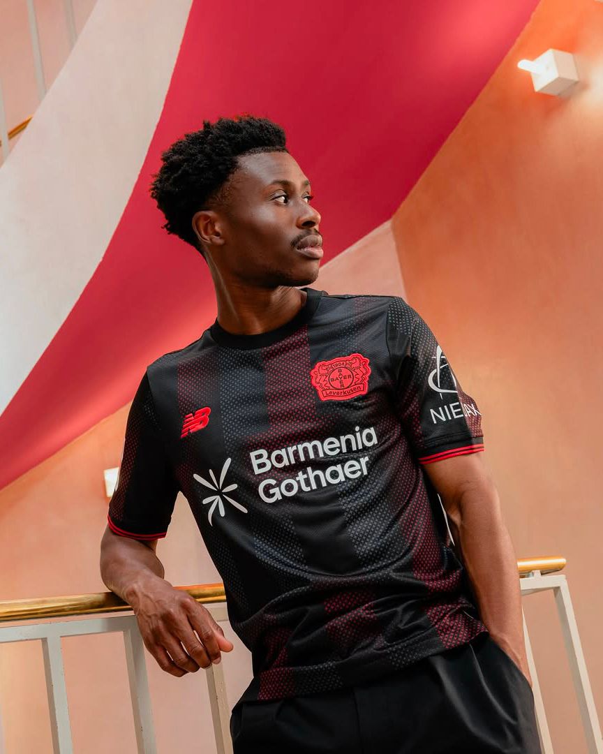
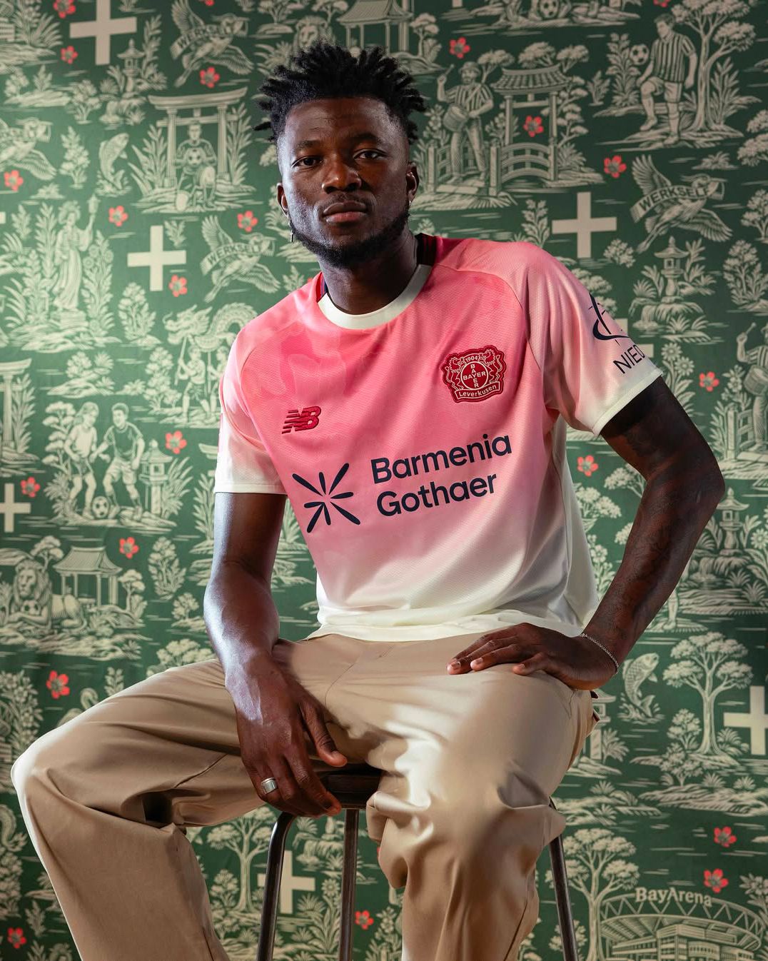
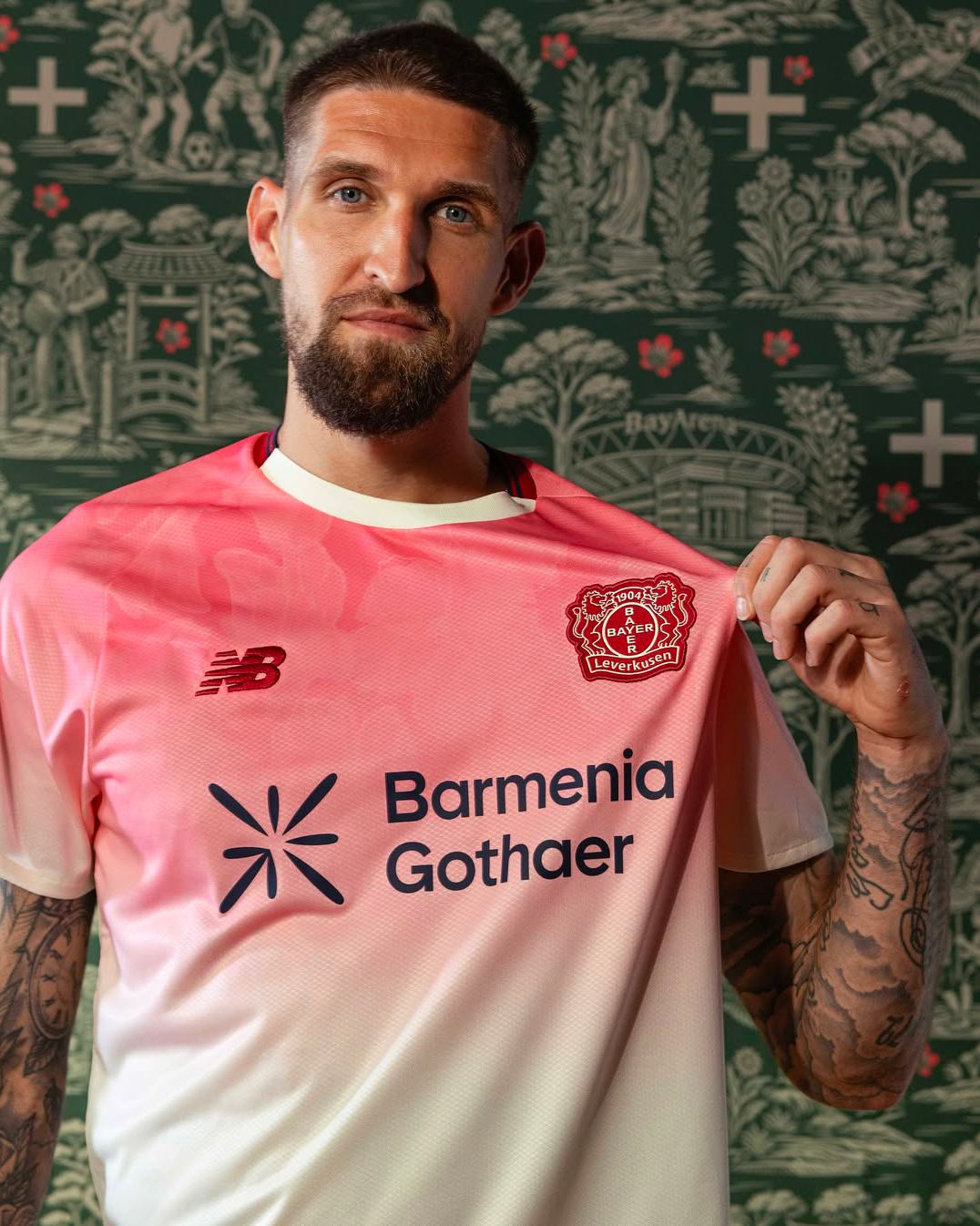
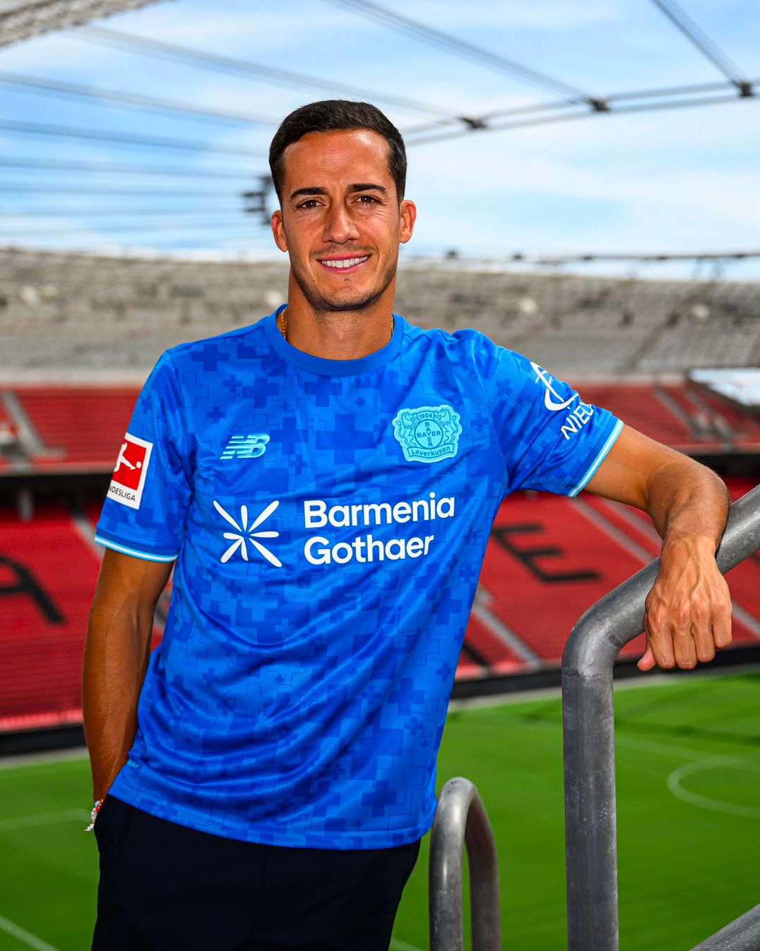
The brand that best applied the theory of monochrome logo versions was undoubtedly New Balance with Bayer Leverkusen. In the first season of this new partnership with the German club, three identical logos were presented for three jerseys, each made with a different color combination: a red logo with black finishes for the Home, a red logo with white finishes for the Away, and a blue logo with navy details for the Third jersey.
New logos
Banking on vintage logos is one solution, but it’s certainly not the only choice clubs have to enhance them. Just as revisiting the original logo with different colors and variations is an option, but not necessarily the best solution. For this reason, there are also those who have decided to design and use new logos, sometimes nodding to tradition and other times aiming at a new identity.
One example of the first case is Everton, which for its Third jersey by Castore decided to abandon its classic logo and instead include a white solid pentagonal symbol recalling the Prince Rupert’s Tower, the prison house that usually appears at the center of Everton’s official crest. Belonging to the second category is Girona, which, under the influence of the City Football Group, showcased on its Third jersey a logo never before used on a football shirt. Specifically, it is a capital G standing for Orgull Gironí, the motto introduced in the 2017/18 season, officially unveiled by the club last year but never until now used in place of the official crest.
Because in the end, a logo is not just a symbol — it is the image of the club. Like any other brand, football teams have fully understood how important it is to adapt it to the context to increase its communicative power, strengthen their identity, and create a sense of community among fans. A concept also embraced by technical sponsors, who have recognized the potential of vintage, revisited, and new logos, and now design kits that can guarantee them the right exposure. We may have called it a trend, but it is more accurate to say we are facing a new era in which logos can no longer be overlooked.


