


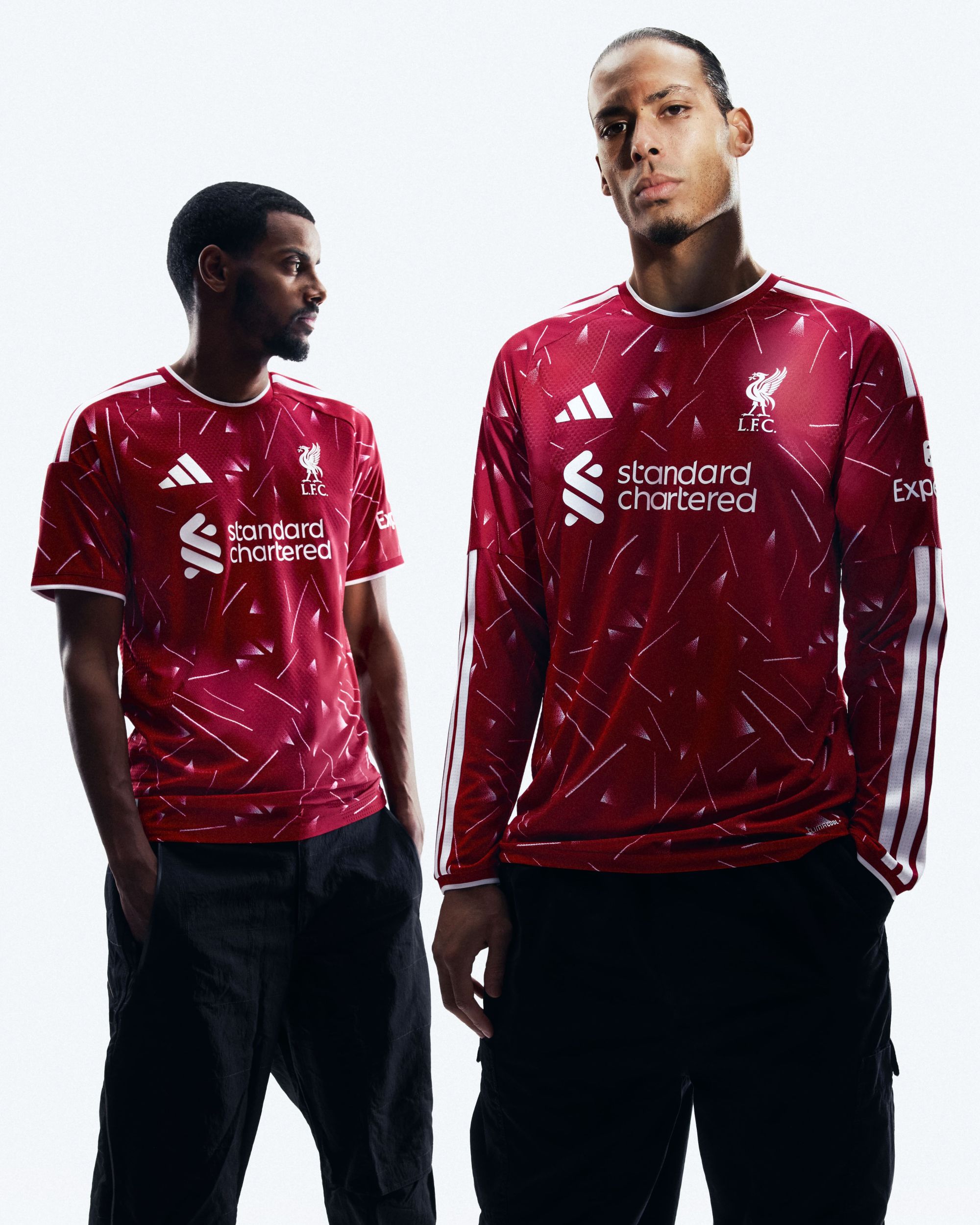


The reason why Nike's last jerseys for Liverpool have been awesome With pre-season tours, Premier League's special fonts are back

The friendly match played by Liverpool against Yokohama Marinos on July 30th was the Reds’ last game before switching to adidas as their new technical sponsor. During these early preseason weeks, Liverpool continued to wear Nike both in training and matches, reusing the 2024/25 Home jersey in all appearances, while for formalwear they brought back a cream-colored jersey paired with a tracksuit. After all, there was no reason for the Swoosh to create special collections for just three weeks of collaboration within the 2025/26 season, yet Liverpool still managed to surprise everyone by making Nike’s final jerseys collector’s items thanks to the use of special fonts.
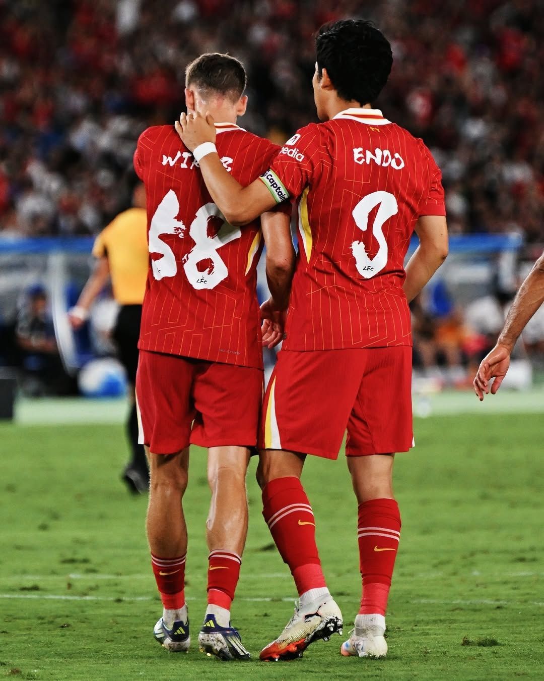
During the friendly match against AC Milan, in addition to debuting the patch with the number 20 in memory of Diogo Jota, who died in a car accident just days before returning to England for the start of the season, the Reds showcased a tone-on-tone font with gold finishes and details inspired by floral patterns and the cultural heritage of Hong Kong, where the match against the Rossoneri took place. For the match against Yokohama Marinos, however, the Reds used a font created by Japanese publishing house Kodansha: named Shodō, the font is a clear reference to Japanese ideograms, being a graphic translation of numbers and letters hand-drawn in a single motion with a pen.
The use of special fonts is one of the main features of summer friendlies, especially during Asian tours by Premier League clubs, which are bound by regulations to use a single official font in the league. The absence of Manchester City and Chelsea, busy with the Club World Cup and thus forced to postpone preparations for the new season, reduced the aesthetic offering. Moreover, many teams participated in the 2025 edition of the Summer Series, the Premier League-branded friendlies held in the United States, which bring their own official look and feel.
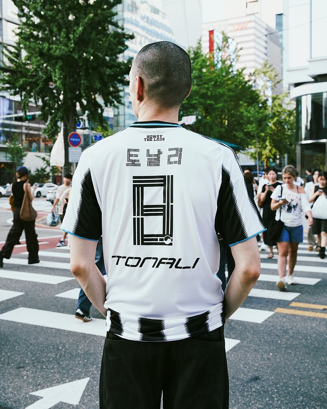
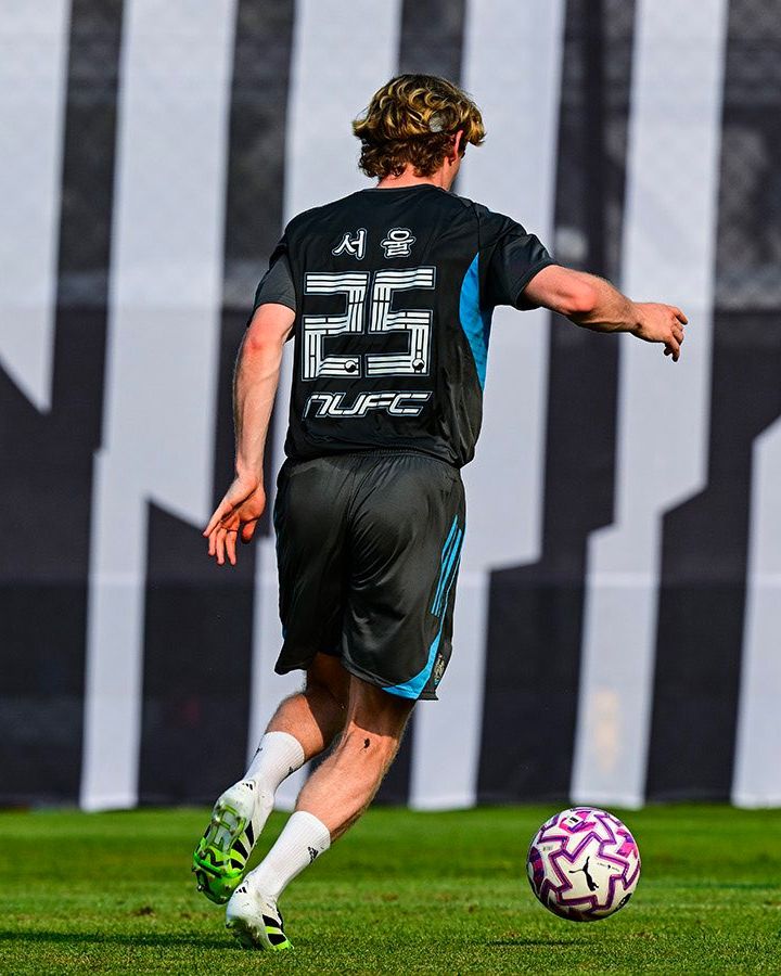
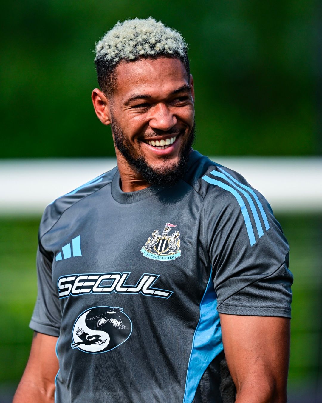
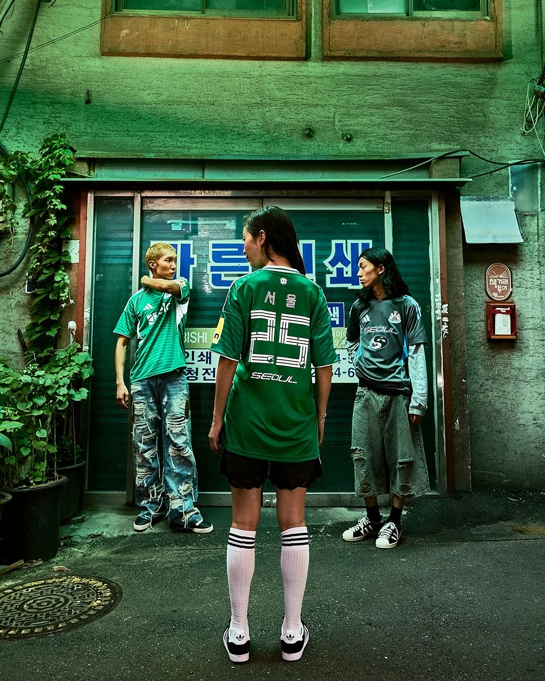
Nonetheless, there were some notable cases. For example, Newcastle, during their tour in South Korea, developed a font inspired by the trigrams found on the national flag, although it was not used in the friendly against K League XI, a selection of the best players from the South Korean championship. The Magpies still used an original font — a reworking of last season’s design — with the Home jersey featuring thin white lines forming the shape of the numbers from within. The font dedicated to South Korea, however, was used in training, paired with a surprising logo: a reinterpretation of the yin-yang.
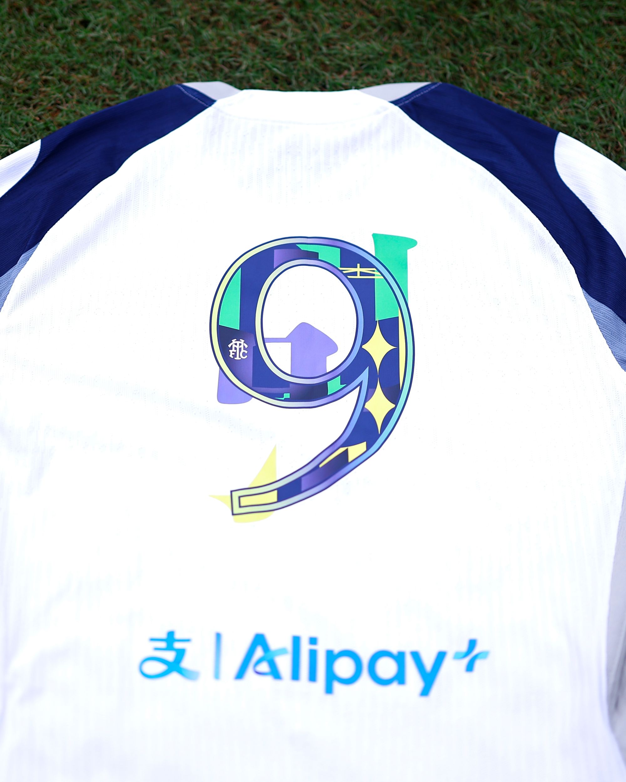
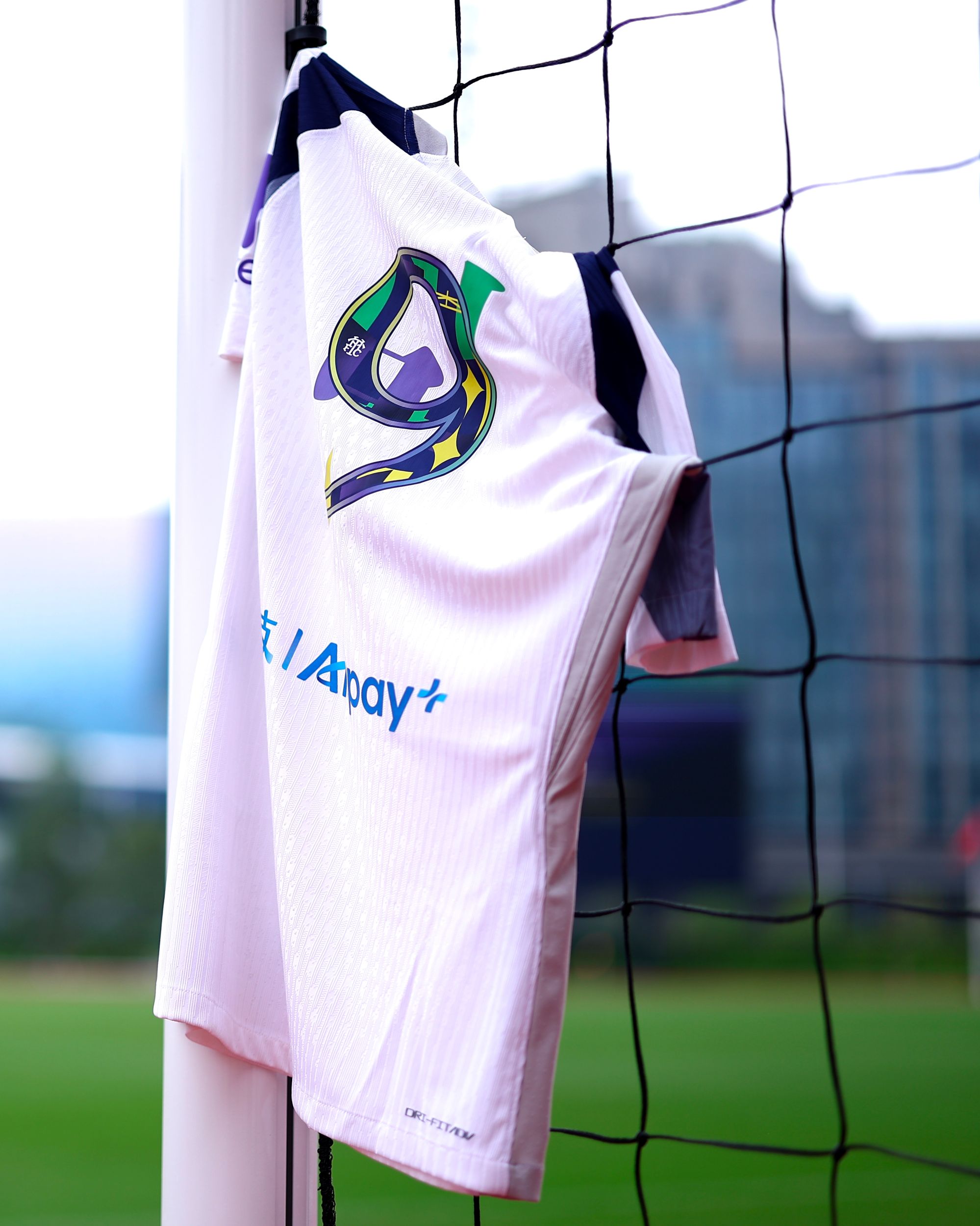
Tottenham Hotspur also featured a special font during the friendly match against Arsenal at Hong Kong’s Kai Tak Stadium. It was created by "ParentsParents", a collective of artists who aimed to capture the unique urban charm of Hong Kong using vibrant colors for a fusion of Eastern and Western aesthetics. Other clubs that used fonts different from the Premier League’s official one included Arsenal and Wolverhampton, though with more classic solutions that we may also see in official competitions like the FA Cup and League Cup.