


The History of Hockey Jerseys Sport, Design and Fashion


Ice hockey is a peculiar sport. Fast, chaotic, violent. It’s not always easy to follow the flow of play unless a player is slammed into the boards. The players on the ice constantly rotate because substitutions don’t require a stoppage in play and happen, on average, every 60 seconds. The small size of the puck makes it difficult to read its trajectory, and often we only realize a shot has gone in by the sound of the siren announcing the goal. And yet, this complex sport is defined by an aesthetic of oversized, colorful jerseys that has captured the attention even of those who aren’t fans.
Why hockey jerseys were once called sweaters?
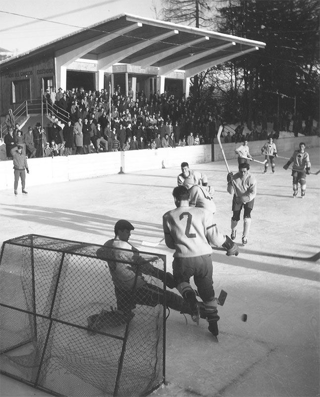
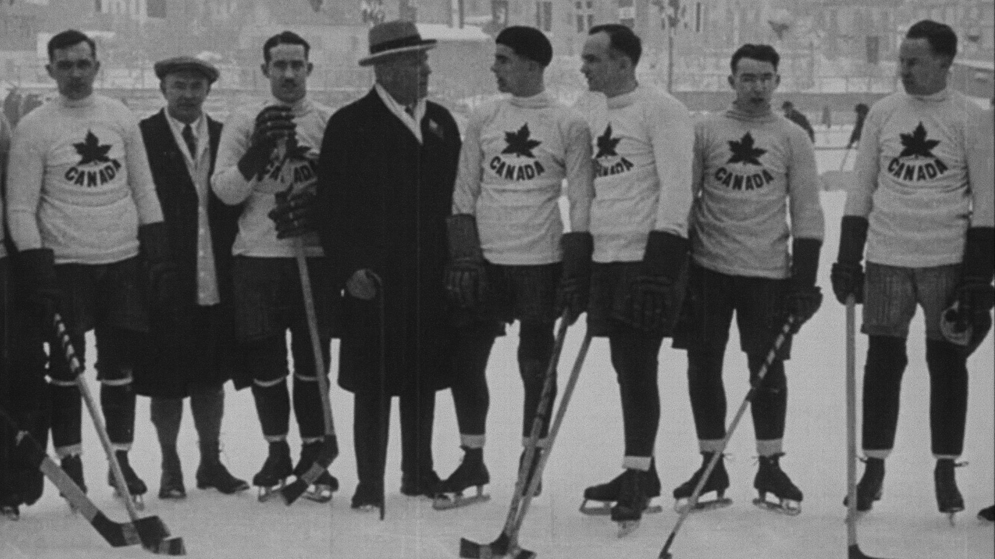
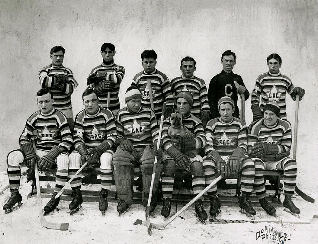
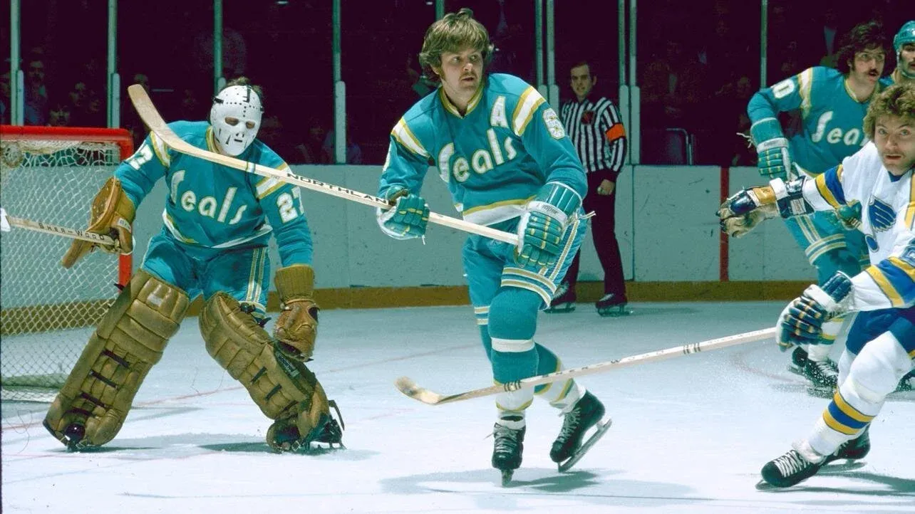
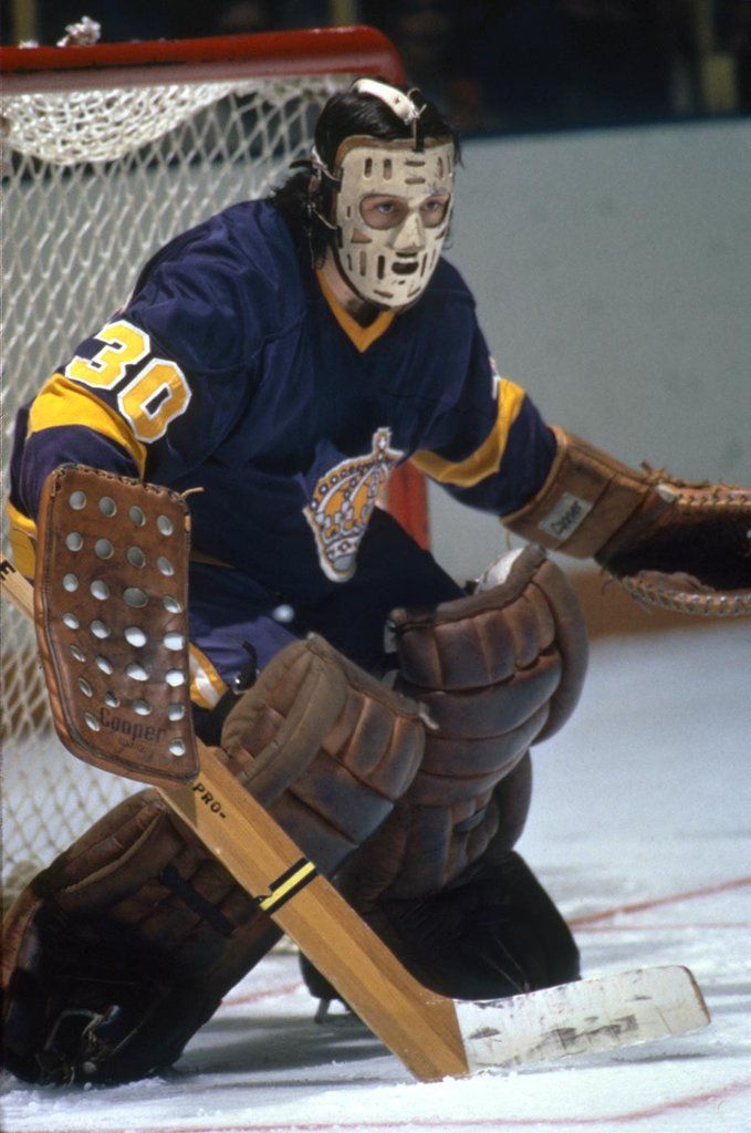
The earliest ice hockey uniforms weren’t jerseys at all, but actual sweaters. The reason is simple: hockey was originally played outdoors, exposing players to cold temperatures and harsh weather conditions, which were necessary to preserve the ice surface. As a result, players wore wool garments, often in solid colors or with very simple patterns, designed primarily to keep them warm. This historical legacy has created a lasting divide: purists insist on calling them sweaters, while those who acknowledge the stylistic and technological evolution—driven by new materials and designs—refer to them as jerseys, aligning them with uniforms from other sports.
The shift indoors and material innovation
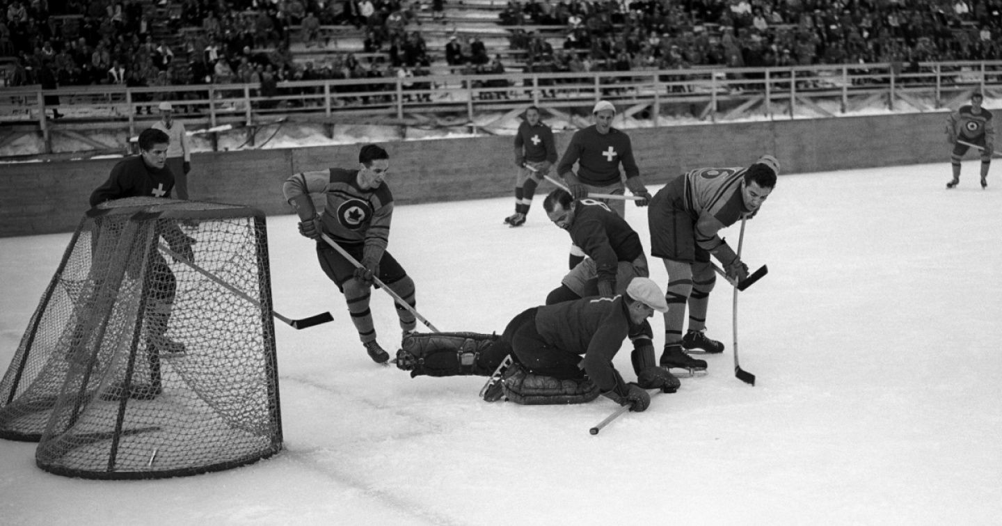
The transition to indoor arenas inevitably coincided with an evolution in materials, making uniforms lighter and more performance-driven. Wool was abandoned in favor of cotton, and later polyester, which offered improved breathability—still the standard for professional teams today. As materials evolved, so did the fit of the jerseys. This was a direct consequence of players’ equipment, particularly shoulder and elbow pads, which bulked up their silhouettes and forced designers to create much roomier cuts to ensure maximum functionality.
Nike, Reebok and adidas reshaping hockey aesthetics
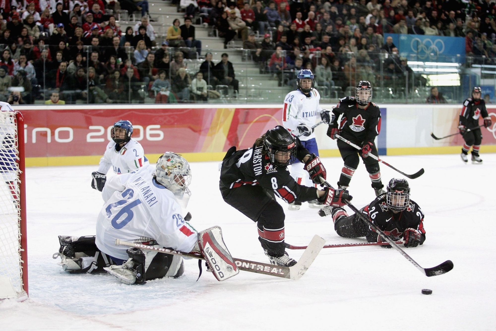
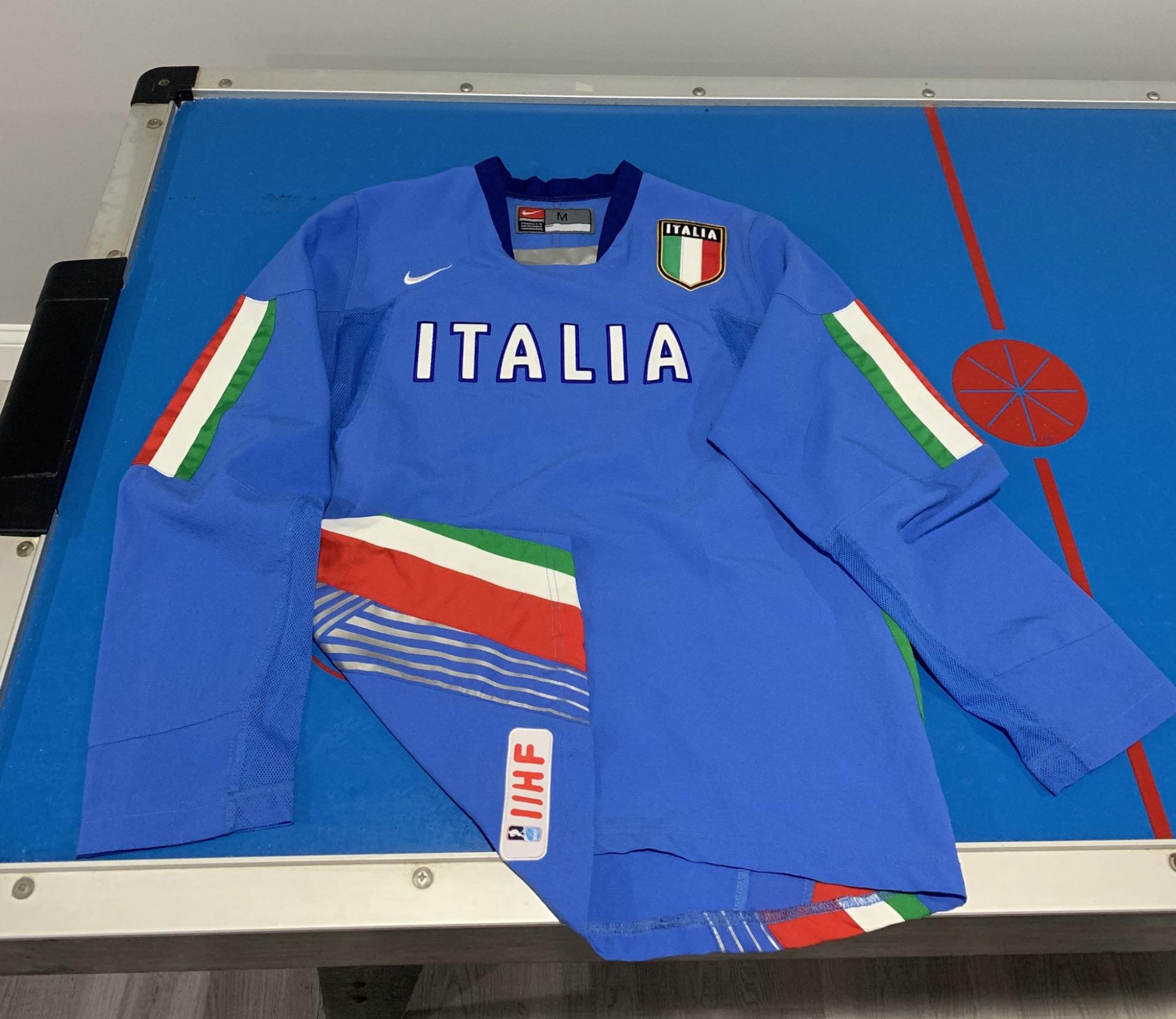
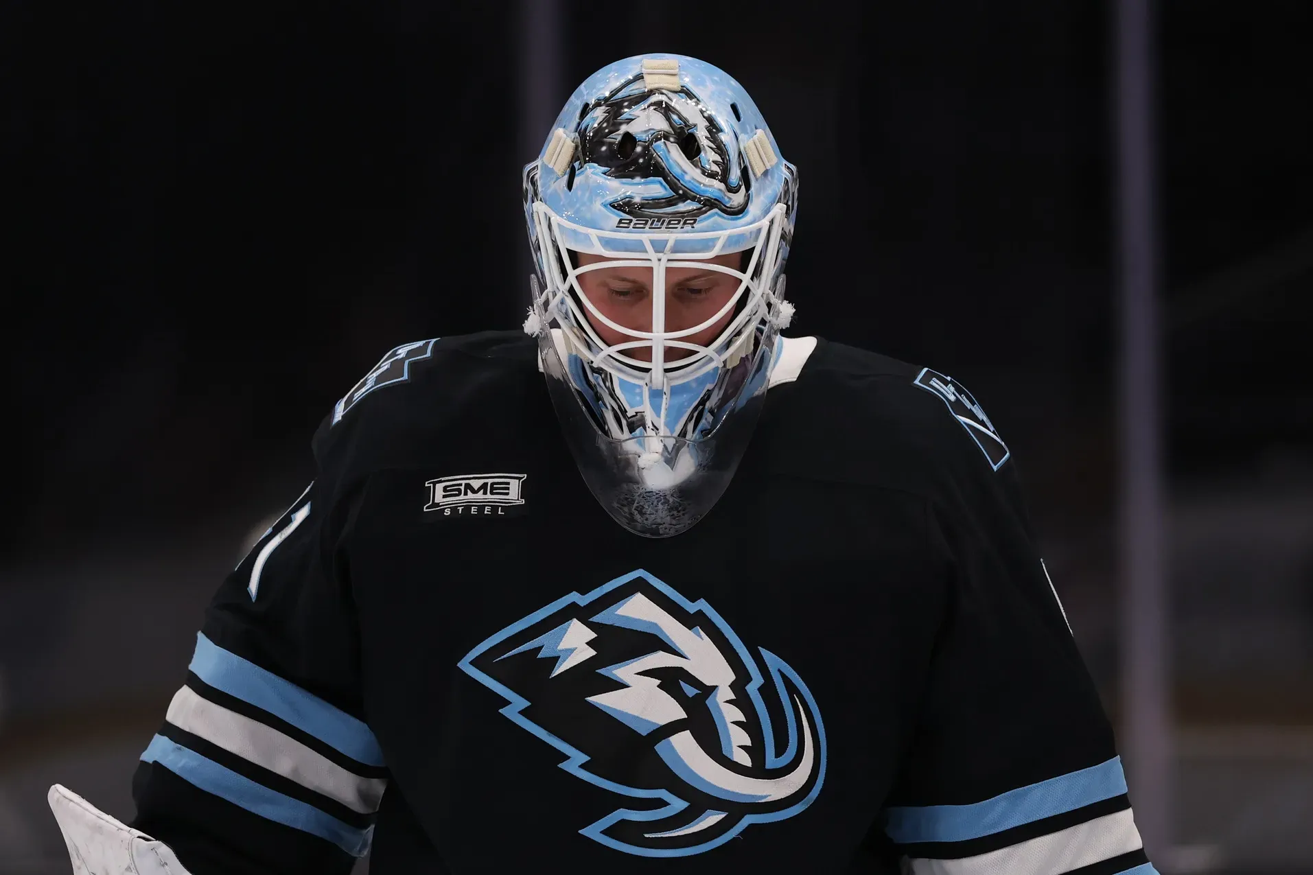
The design language we see today is the result of natural competition between brands. The first major aesthetic shift came from Nike with the introduction of the Nike Swift Hockey Jersey and Sock, a technological solution developed for the 2006 Winter Olympics in Turin. In addition to reducing the overall weight of the uniforms—improving mobility and speed—it was the first to seriously address thermoregulation, thanks to a system that directed airflow toward the body. Taken to an extreme, it can be seen as an early prototype of today’s holey t-shirts.
The second brand to redefine the look of hockey jerseys was Reebok, appointed by the NHL to design new uniforms tailored to the league’s evolving needs. Years of research and testing led, in 2007, to the launch of the Rbk Edge Uniform System, a layout that completely eliminated the baggy jerseys that had become widespread due to increasingly bulky protective gear. The new uniforms offered a more streamlined fit and, once again, introduced a ventilation system. The last brand to shape the modern hockey jersey is adidas, which replaced Reebok as the NHL’s official outfitter in 2017. Adizero is the model developed by the German brand, refining several elements introduced with the Edge Uniform System—most notably a new collar and, above all, a next-generation fabric that offered improved air permeability.
Color, expansion and the NHL visual identity
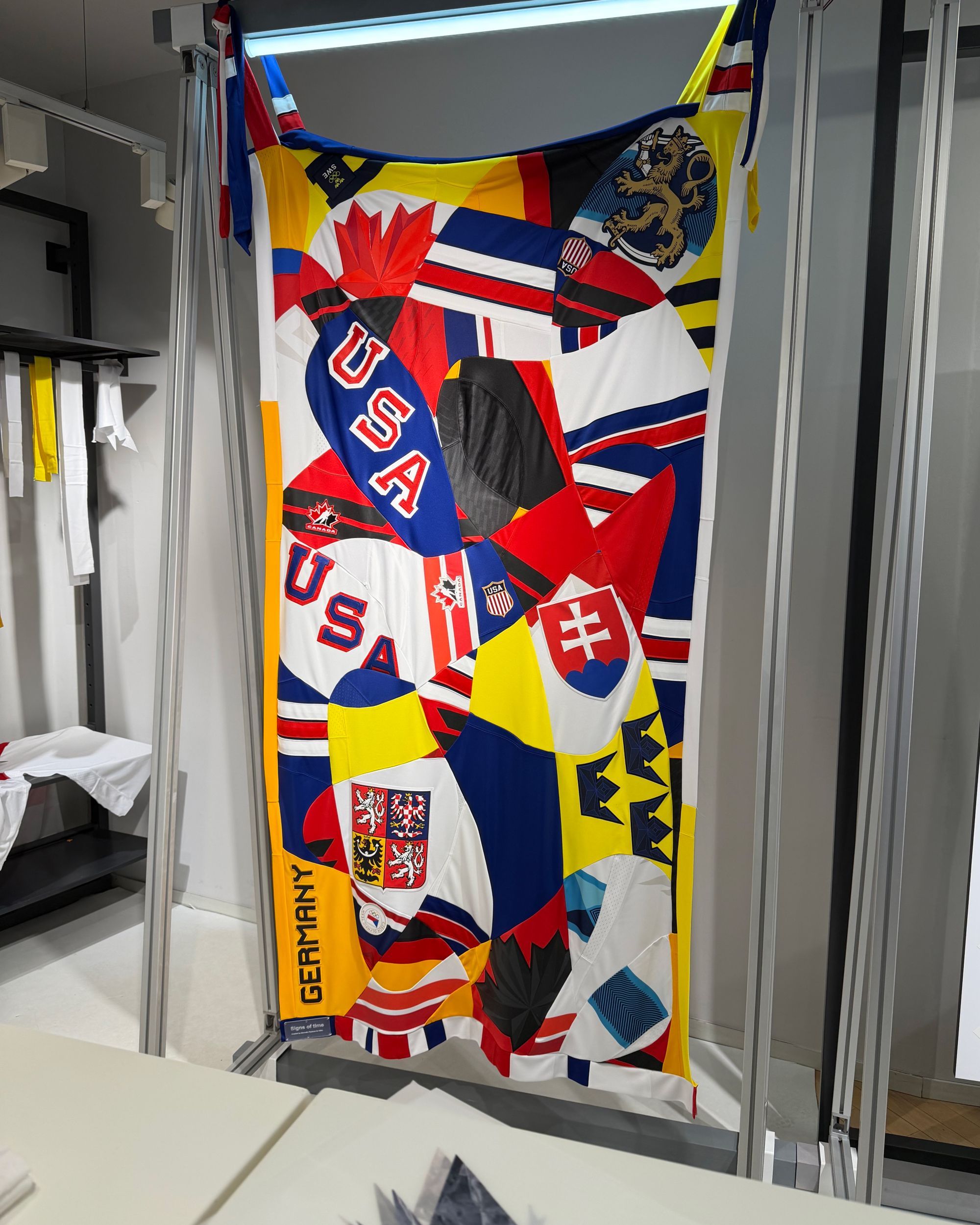
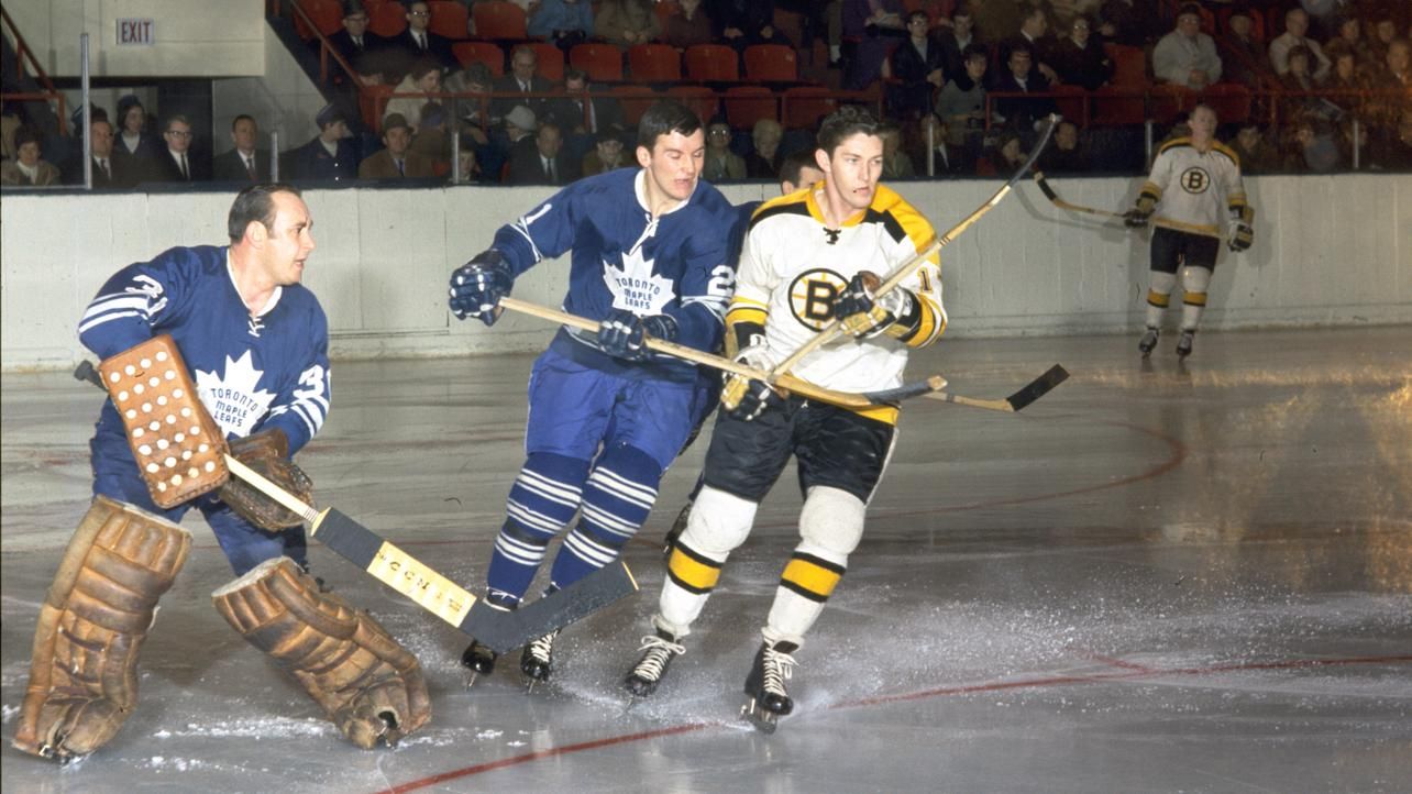
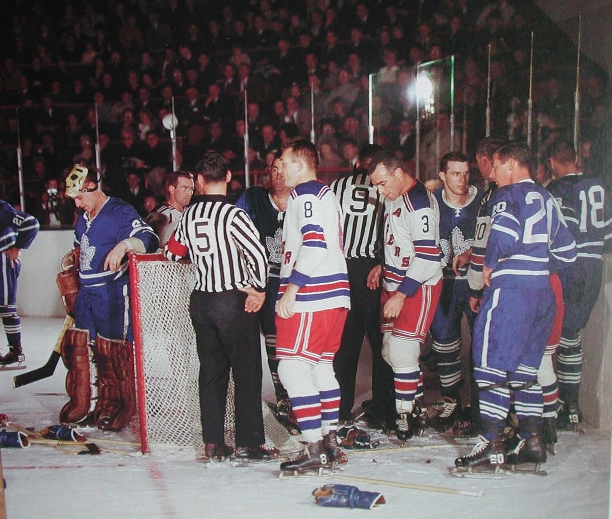
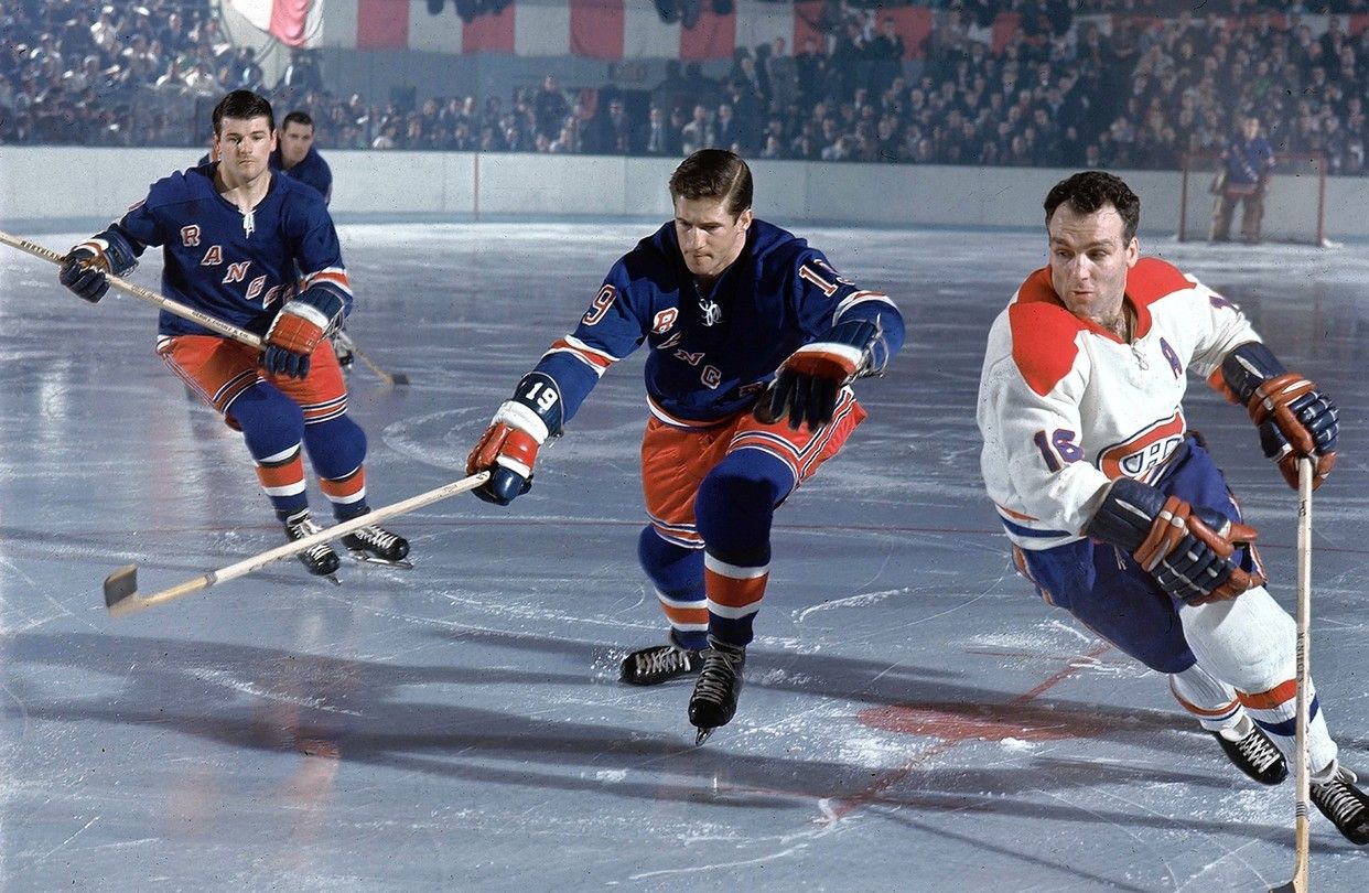
From an aesthetic standpoint, hockey jerseys—particularly those of the NHL, the most recognizable worldwide—have gone through major transformations starting in 1967, when the league moved beyond the Original Six era and entered a long phase of expansion that lasted until 1991. This period marked a true explosion of color, introducing shades like purple, orange, and green that had never been seen in hockey before. With few exceptions, team colors and layouts have remained largely unchanged ever since, both to protect tradition and because NHL regulations are extremely strict when it comes to uniform changes. Any proposed modifications must be approved by the league and submitted well in advance.
The 2025/26 season, however, is ushering in a new chromatic shift: the return of so-called color vs. color games, matchups in which both teams take the ice wearing solid-color jerseys. For practical reasons, most NHL franchises still develop a white away jersey in order to comply with Rulebook section 9.1, which states that “each member Club shall design and wear distinctive and contrasting uniforms for their home and road games.” The direct consequence of this rule is that, in the vast majority of NHL games, one team wears a colored jersey while the other skates in white. This setup allows the team in color to alternate between its Home or Third jersey. Now, however, taking inspiration from the New York Rangers—who on several occasions this season have worn their blue Home jersey even on the road—the NHL is considering increasing the number of color vs. color games. As reported to ESPN by Brian Jennings, the NHL’s chief branding officer and senior executive vice president, 57% of the regular-season games scheduled for this season would not have resulted in a kit clash, meaning that both teams could have worn a colored uniform.
Hockey jerseys as streetwear and vintage icons
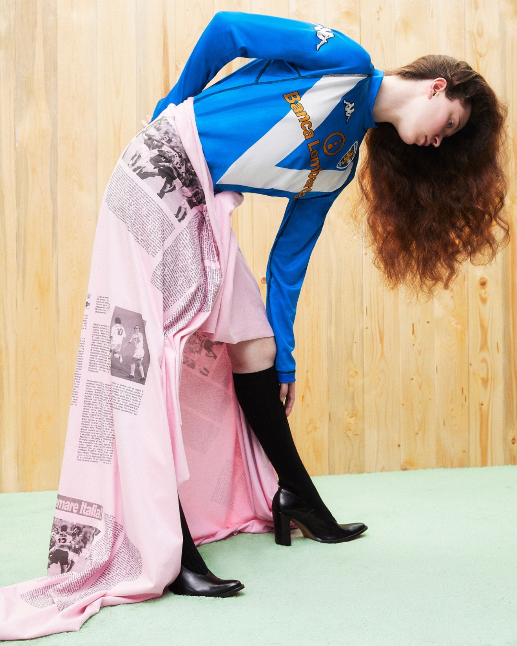
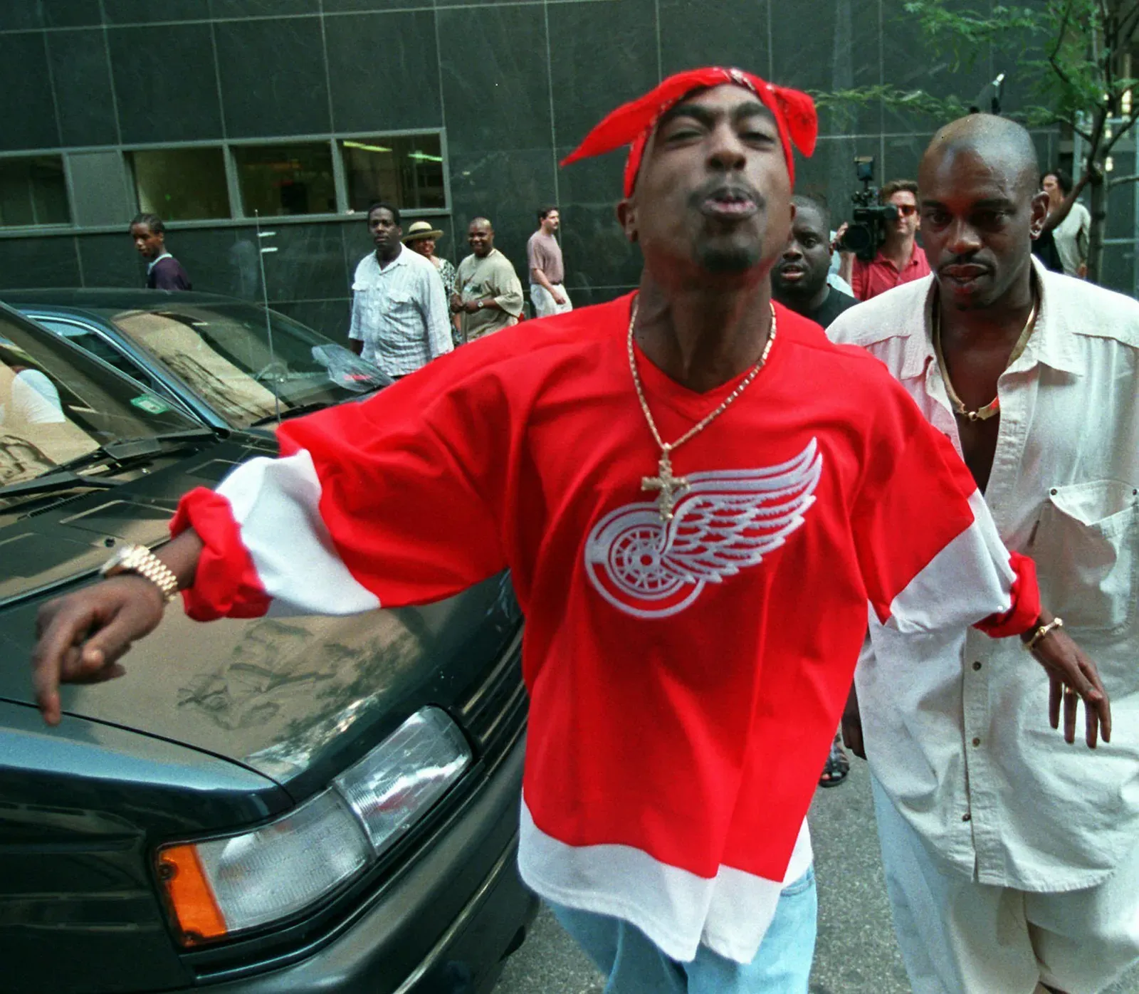
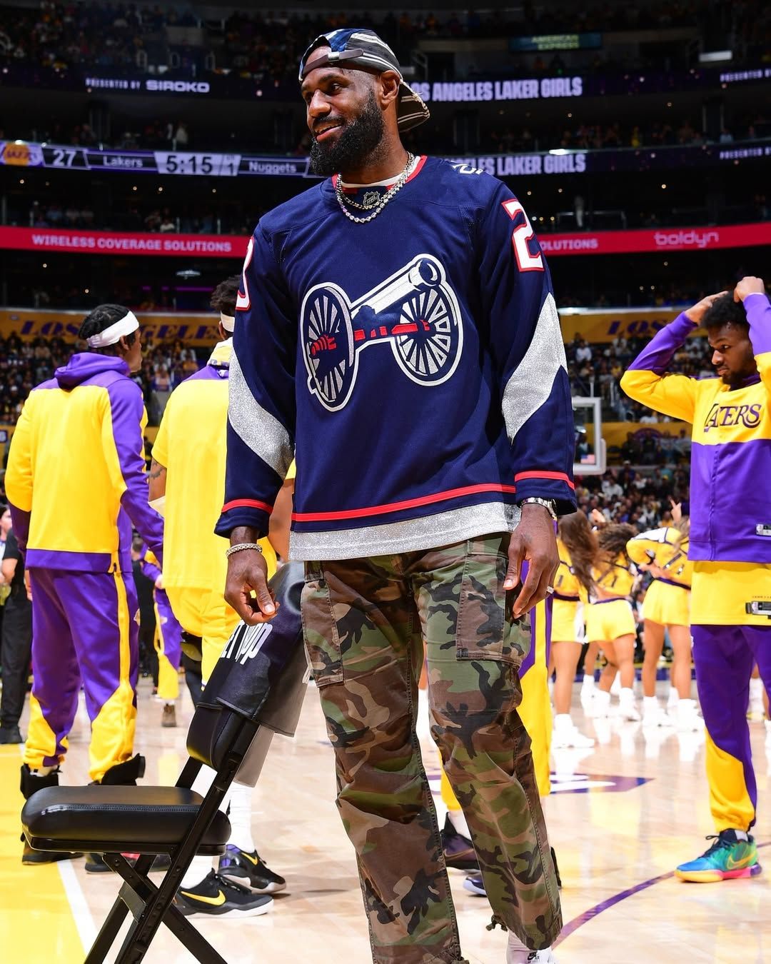
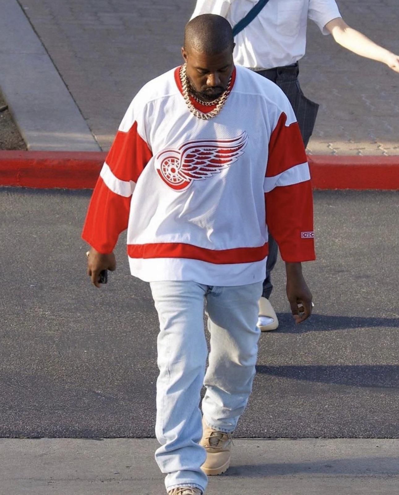
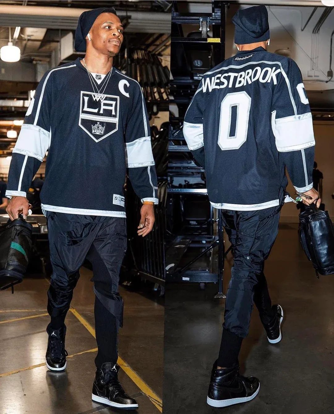
Within the fashion world, hockey jerseys have never truly been a staple or a dominant trend. And yet, they’ve always been there. Initially rooted in street culture and closely linked to hip-hop, they were worn by Tupac Shakur, who appeared at Manhattan District Court on July 5, 1994 wearing a Detroit Red Wings jersey. Snoop Dogg famously wore Pittsburgh Penguins and Springfield Indians jerseys in the music video for Gin and Juice. Today, those same jerseys appear in very different contexts—from concerts to tunnel fits—and star in countless TikTok videos explaining how to style them with the right shoes and pants.
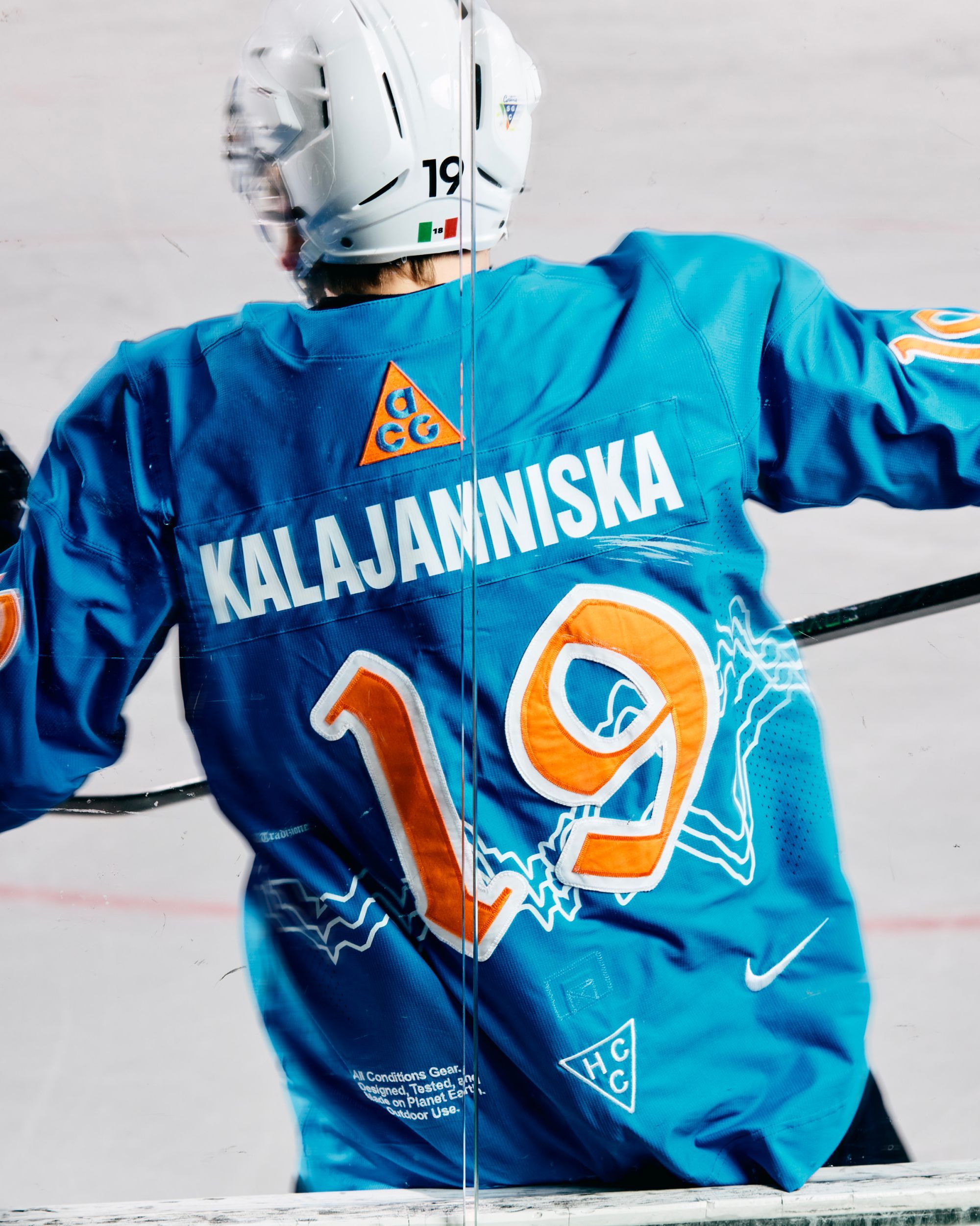
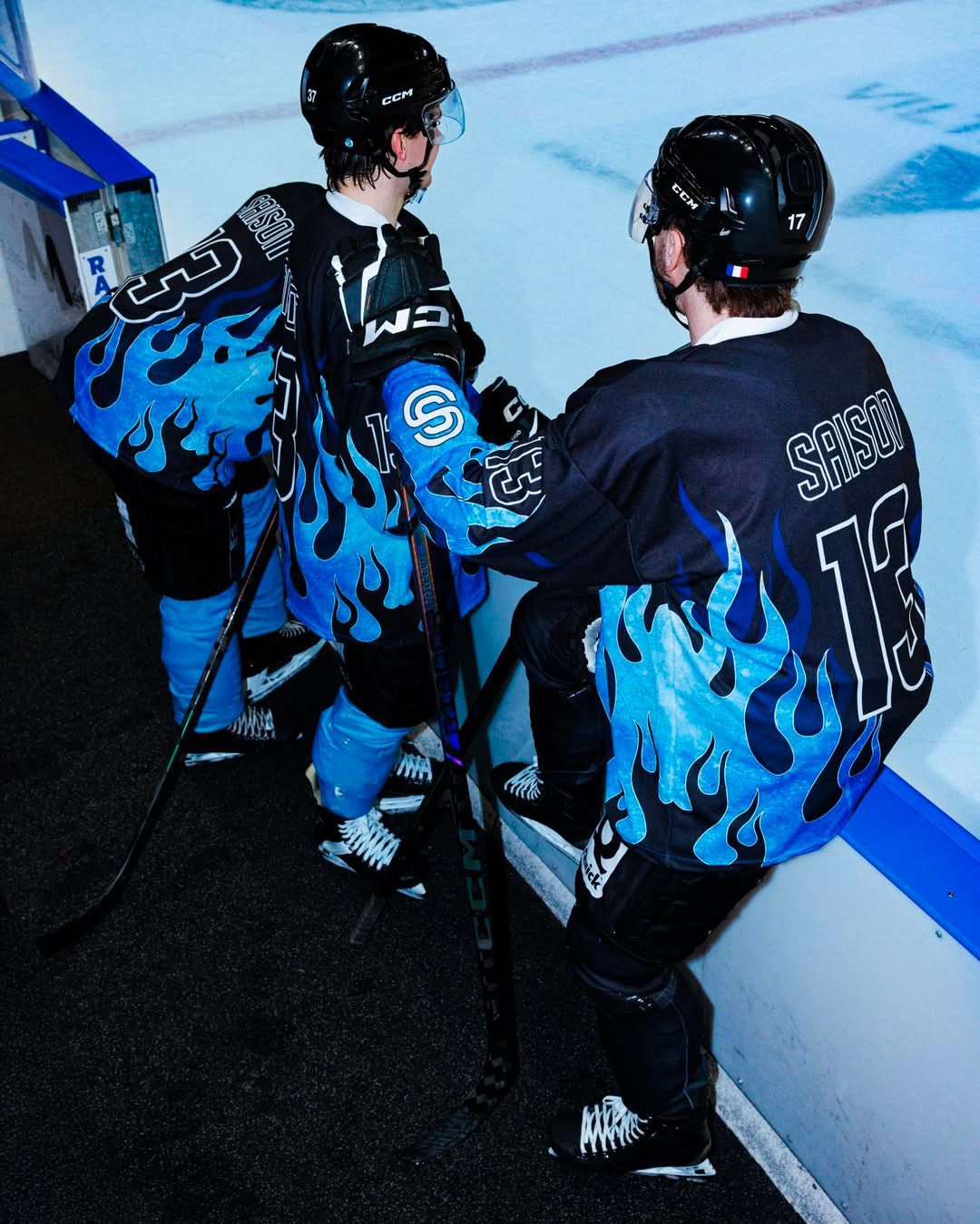
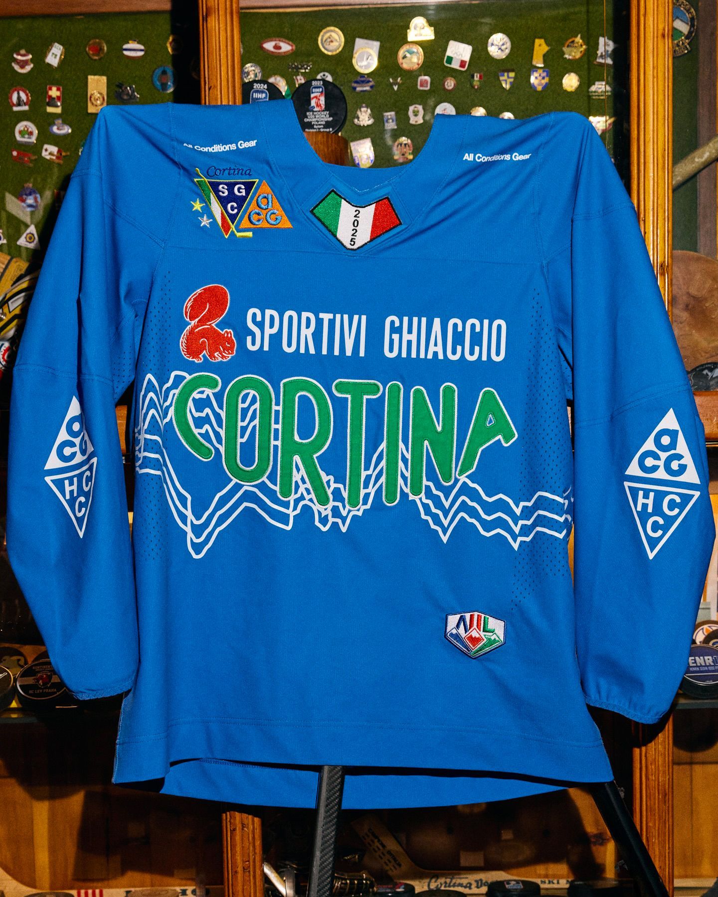
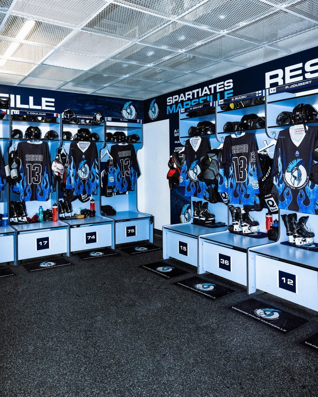
Their growing popularity is undoubtedly tied to their vintage appeal. As mentioned earlier, team designs and color schemes have remained almost unchanged since their debut. An aesthetic enhanced by a subtle detail: on some jerseys, a capital C or A appears on the chest. This convention is used by each team to designate its captain (C) and its alternate captains (A). Another distinctive feature is that the franchise logo dominates the front of the jersey. This doesn’t happen in the NFL, where the player’s number takes center stage, nor in the NBA or MLB, where the team name is featured. It doesn’t happen in football either, where the defining element is the club colors. The logo-first approach is the key touch of coolness that makes hockey jerseys so unique. And with the upcoming Winter Olympics, even more brands are set to follow the lead of ACG with Hafro Cortina Hockey and Saison with the Spartiates de Marseille, creating special jerseys that will further redefine hockey’s aesthetic.