The best jerseys of the 2025/26 Premier League season Elegance, tradition and some surprising innovations
The announcement of Liverpool switching from Nike to adidas was without a doubt the most important Premier League news when it comes to kits. The Reds are back wearing Teamgeist, and curiosity was so high that in the days following the official launch of the new Home and Away kits, all records were broken for the number of Google searches.
In fact, Liverpool were the last team in the English top flight to unveil their kits on the eve of the new season, following shirts that immediately became forbidden desires for collectors and others that instead left a bitter taste. We’ve selected the best, in strict alphabetical order.
Arsenal - Third
The season debut at Old Trafford against Manchester United allowed Arsenal to immediately showcase their Third kit on one of the league’s most prestigious stages. A shirt with special meaning as it pays homage to Highbury, the historic home of the Gunners, twenty years after Arsenal’s last game at their old stadium.
An elegant white shirt with burgundy details, the distinctive color of the historic Highbury shirt, the jersey worn by Thierry Henry and his teammates on the day of the last match played at Highbury on 7 May 2006 against Wigan. The trefoil and the cannon representing the club’s logo are the final classy touches.
Crystal Palace - Away
2025 is the year Crystal Palace won two trophies within a few months after never having won any in 119 years of history. From here came the idea of creating a celebratory kit that materialized in the new Away jersey in solid gold because, as the launch claim reads: “Gold is for winners”.
Here too elegance is the watchword, a concept expressed through the buttoned collar closure as well as the thin black lines that decorate the armholes and the collar itself.
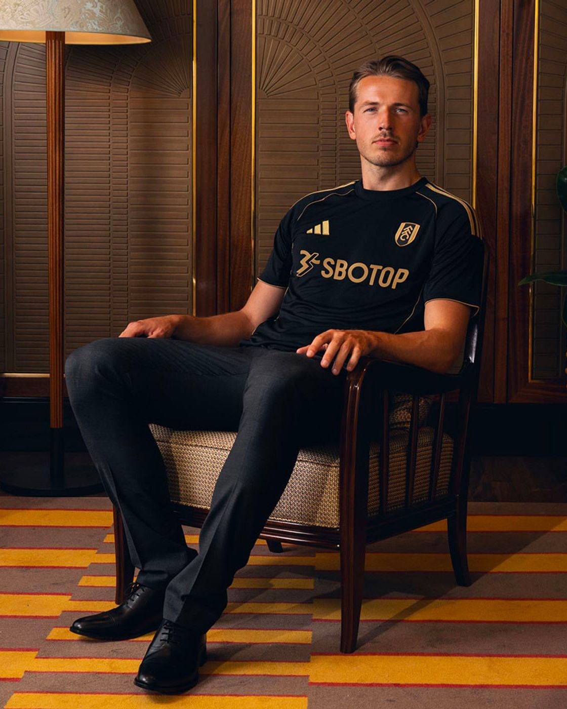
Fulham - Third
Speaking of gold. Fulham and adidas decided to lean on this tone to enrich the Third jersey with accents that break up an all-black shirt. A clean jersey but not a boring one, elegant yet perfect for every occasion. The finishing touch is the club crest embroidered on the left side, matching the shirt’s tones instead of the original colors.
This Third kit is not the only visual novelty for Fulham in the 2025/26 season. In fact, the Cottagers, for the first time since the 2011/12 season, will wear white shorts with their Home jersey and not black shorts, one of the club’s distinctive features.
Nottingham Forest - Home
Like all adidas-sponsored clubs, Nottingham Forest wear a shirt characterized by the Teamgeist motif which, on the Home jersey, blends in with the rest of the kit due to the shade of red used to draw the curve that starts at the collar, runs down the shirt, and connects to the shorts.
Thanks to this device, other details take center stage. For example, the pinstripe effect created by the use of thin white vertical lines that break up the solid color, alternating with other thin vertical lines in a slightly darker red than the shirt’s main tone. A clean kit completed by a polo collar with a button closure.
Manchester City - Home
The debut of the sash on the Home jersey was certainly a bold choice by PUMA, but the end result is one of the best home shirts in Manchester City’s recent history. A break from the sky-blue shirts which, barring slight variations on the theme, have always been a fixture.
The new version of the Home jersey pairs City’s sky-blue base with a white sash, creating a link between past and future, a bridge between generations of City fans. The difference from other versions of the sash is that it’s not a single diagonal bar that cuts sharply across the shirt but resembles almost a brushstroke that, along the sides of the main line, fades and washes into the blue.
Manchester United - Third
In the history of Manchester United, the black shirt has for almost thirty years been indissolubly associated with Eric Cantona, as the Red Devils were wearing that kit the day the Frenchman struck a fan with a kung-fu kick at Selhurst Park. Now that shirt is back.
Black is without doubt the most popular color among Premier League teams for away and third kits, and Manchester United have joined this trend: adidas has decided to reissue a new version of the black shirt with yellow and blue accents that the Red Devils wore for two consecutive seasons between 1993 and 1995.
Newcastle - Third
The line between paying a sincere homage to tradition and slipping into a poor tribute to nostalgia is thin. adidas and Newcastle walked that tightrope and came out on top by presenting a reworked version of the shirt worn by the Magpies in the 1997/98 season.
In this specific case, the navy blue base has been faithfully revived, while the orange and green details have been reinterpreted and used on this jersey for the three stripes and to embellish the collar and armholes. The shirt also features the club crest stitched on the front, while the collar and cuffs are made of flat knit.
Sunderland - Goalkeeper
Goalkeeper kits are a slippery subject for brands, often forced to roll out the exact same design for all their teams, resulting in fewer and fewer patterns on the pitch. Hummel has instead decided to tackle the issue head-on by creating surprising patterns for Sunderland’s return to the Premier League.
While the Home kit is characterized by a series of graphic elements repeated along a checkerboard laid over a solid green shirt, the black away shirt stands out thanks to a shocking pink collar and light blue inserts on the shoulders representing the brand’s iconic chevrons. On the front is a mosaic pattern repeated identically and regularly along a series of diagonal stripes in which the light blue field flows into pink and vice versa.
Tottenham - Home
So far elegance and tradition have ruled the day, but there’s room for some successful attempts at innovation too. That’s the case with the Tottenham Hotspur Home jersey, a shirt in which all the key elements of the club’s aesthetic have been redistributed to create a new image, more contemporary and aligned with the ownership’s global vision.
At first glance it’s the usual classic white Spurs shirt, but as always the details make the difference: the centered placement of the two logos, a reworking of the navy blue sleeves, and a crewneck collar with two different fabric bands. Alternative solutions to refresh the shirt’s look without necessarily breaking with tradition.
Wolverhampton - Away
The partnership between Wolverhampton and SUDU continues for the 2025/26 season, the sportswear brand that entered professional football thanks to its collaboration with the Wolves. The partnership with the Wolves is exclusive in the sense that SUDU does not sponsor any other club besides the English team, which has led to the creation of customized kits.
While the Home jersey couldn’t stray from the classic solid orange with black details, the Away jersey grabs attention thanks to a turquoise shade over which a jacquard pattern unfolds, echoing the architectural geometry of Molineux Stadium to form a wolf’s head.