













The aesthetic evolution of substitution boards How sponsors gradually transformed substitution boards
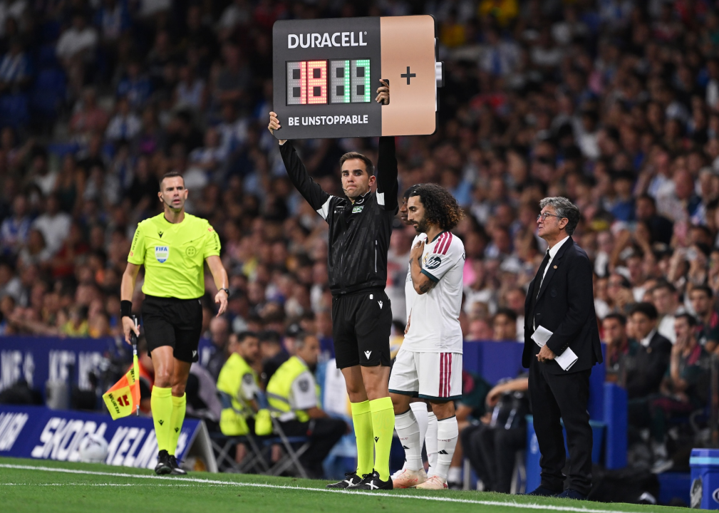
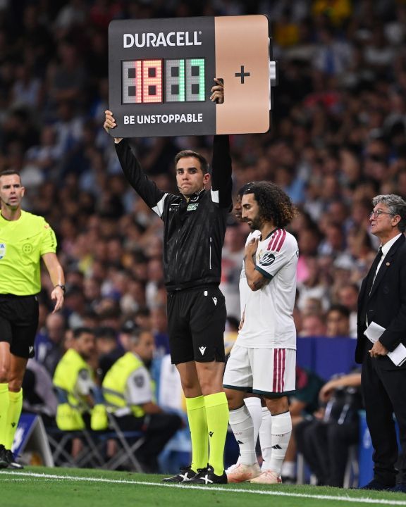
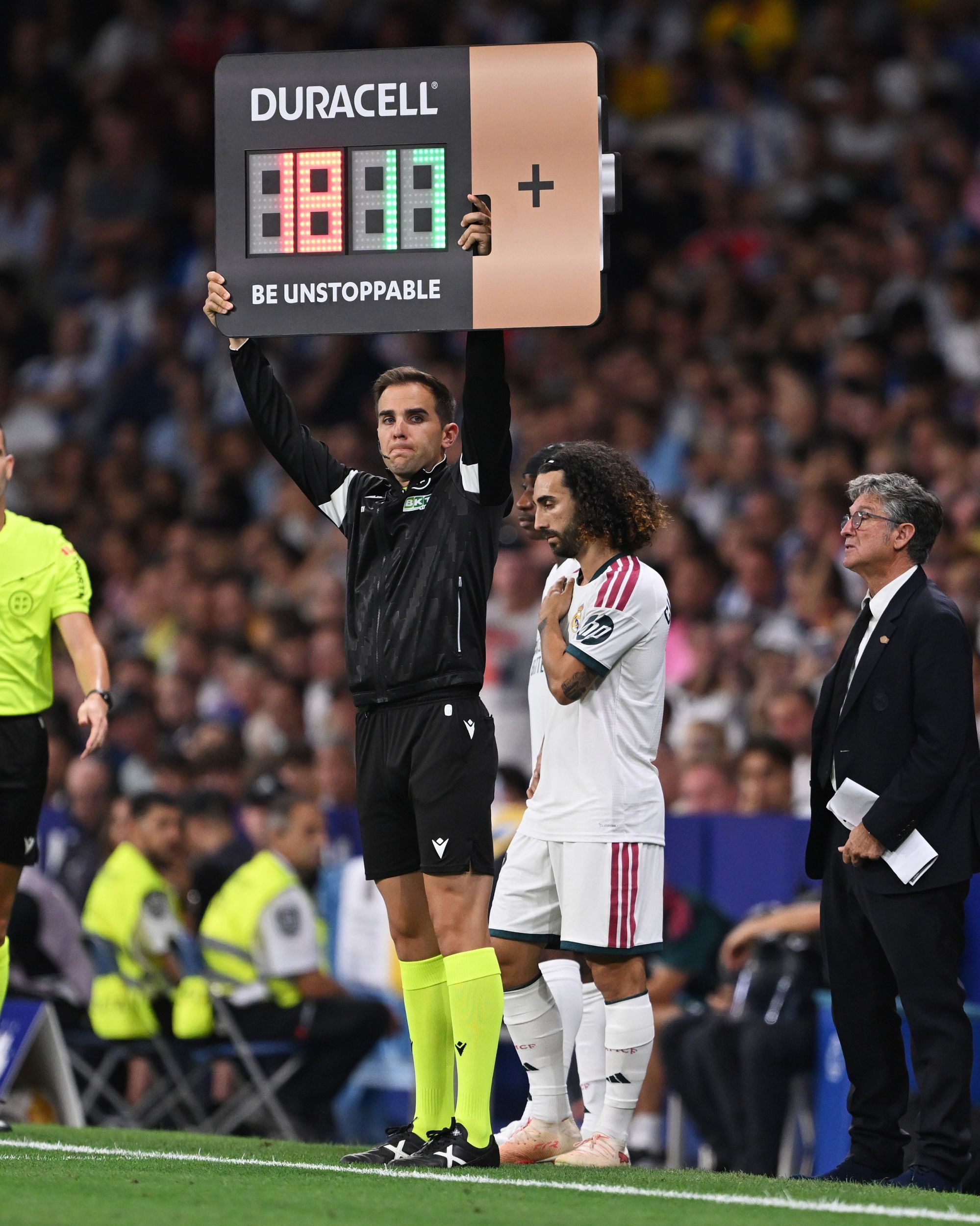
During the opening rounds of LaLiga 2026/27, something new appeared in the fourth official’s hands during substitutions and added-time announcements: a substitution board shaped like a Duracell battery. Not the standard rectangular substitution board with a sponsor’s logo attached, but an object designed entirely to resemble a battery, complete with the words “BE UNSTOPPABLE”.
The initiative stems from the agreement that, from this season and for the next two, has made Duracell the Spanish league’s Official Partner of Added Time, for an estimated total fee of between €10 million and €15 million. The title “Partner of Added Time” largely explains the concept: associating the brand with the moment when the ninety minutes are over and more energy is still needed. It is a message consistent with the products sold by the American brand and with a communication strategy increasingly focused on partnerships within sport.
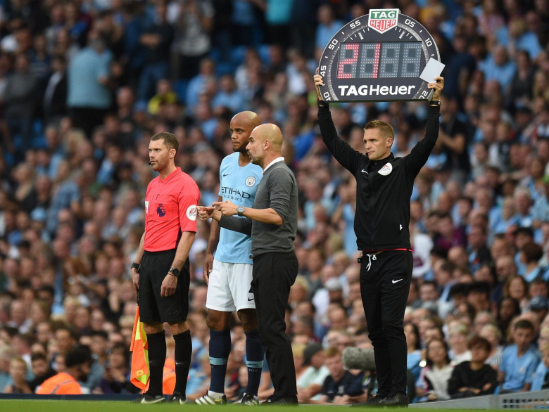
The new board, impossible to overlook either inside the stadium or during television broadcasts, has attracted the public’s curiosity, even though audiences have long been accustomed to seeing commercial logos on substitution boards. The sponsors that had the greatest impact on their design almost always came from the world of watchmaking, such as Hublot and TAG Heuer, which have transformed the aesthetics of this tool over the past two decades. Before becoming sellable advertising space and taking on unconventional shapes, however, the board underwent a long evolution alongside football, its rules and even the way we watch matches.
Before the substitution board
Before a tool could be created to signal substitutions, substitutions themselves first had to be introduced into football. For much of the game’s history, official competitions did not generally allow a player to be replaced: anyone forced off through injury left their team with fewer players.
In 1958, the IFAB codified the possibility of replacing injured players in the Laws of the Game, although its implementation remained subject to the approval of individual federations and competitions. Substitutions made their World Cup debut at Mexico 1970, when two were permitted. Over the following decades, the rule evolved from covering injuries alone to allowing tactical changes, while the limit increased from one substitution to two, then three and finally the current five. Added time, meanwhile, already existed, but its management and duration remained on the referee’s watch, without an official number being shown to players, benches or spectators.
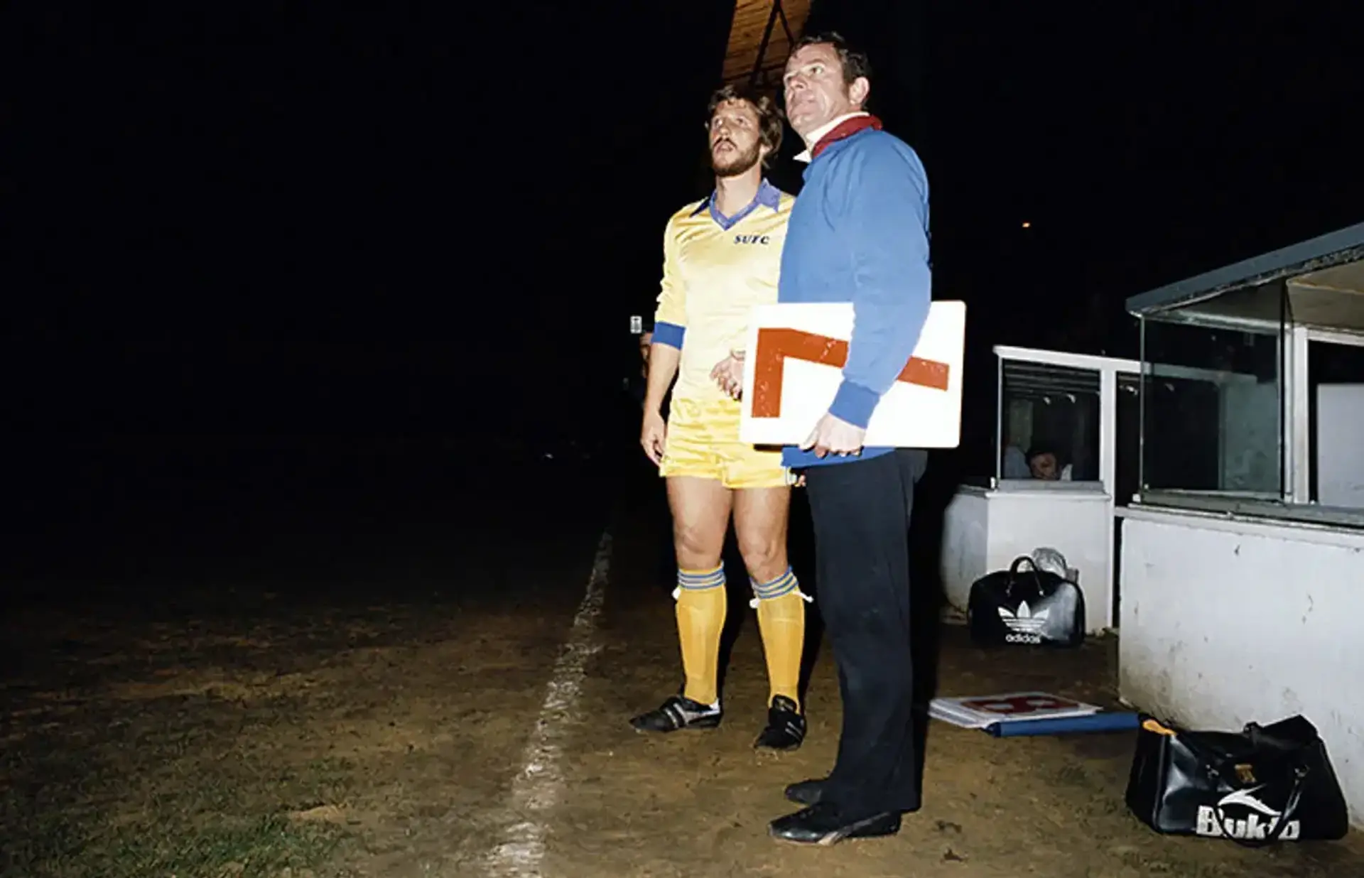
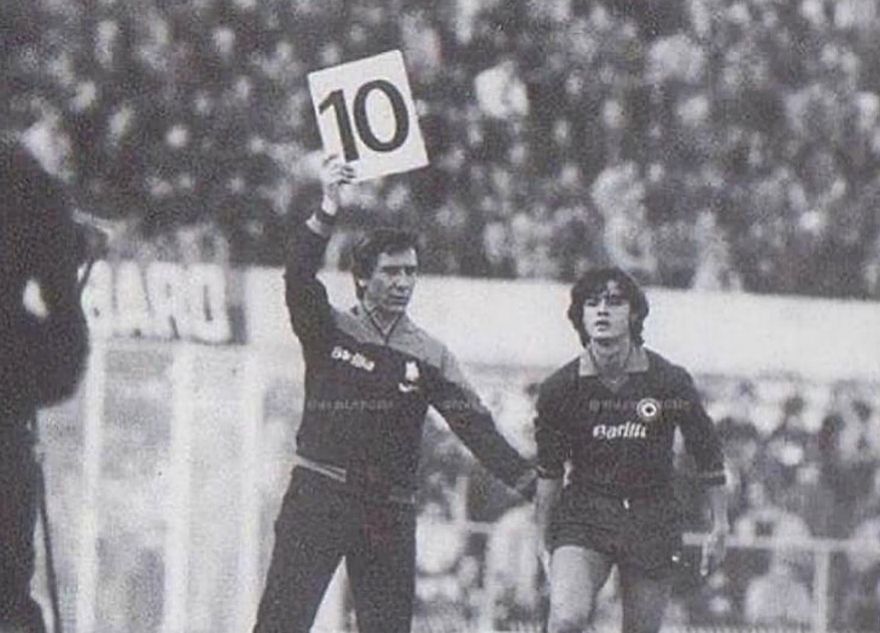
The first recognisable ancestor of the substitution board appeared in the mid-1970s. The idea came from Ken Aston, the English referee and FIFA refereeing official who had also devised yellow and red cards. Once again, the original aim was to replace the referee’s words with a sign that everyone could understand immediately: a number indicating which player had to leave the pitch.
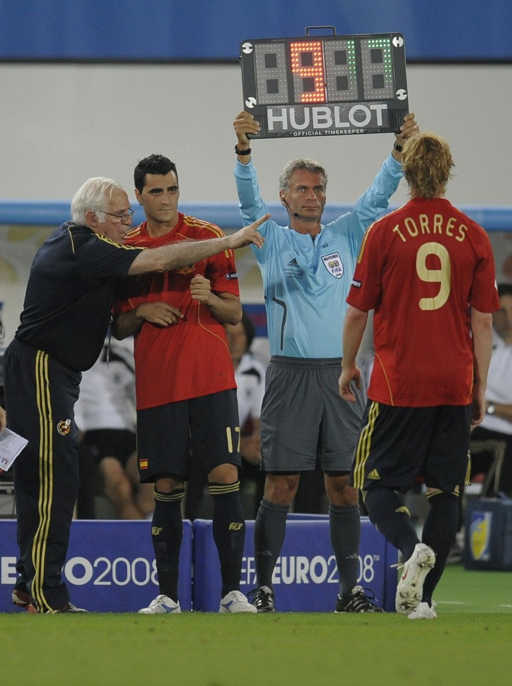
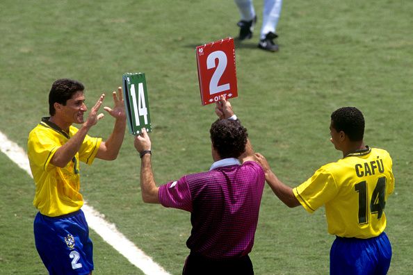
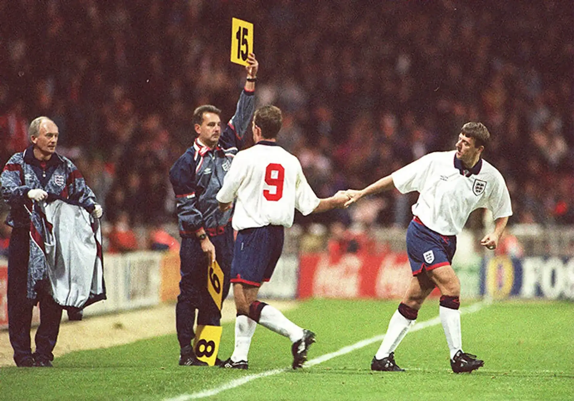
The first boards therefore began to appear, although they had no standardised shape: rigid boards, interchangeable panels, flip books and two separate supports were all used. Only in their later evolution would they also display the number of the incoming player, introducing a precise colour code - red for the player leaving and green for the player entering - although its practical implementation was often left to individual competitions or clubs.
Television conventions were also very different from those we know today. While we are now familiar with the shot of a player approaching the touchline, at the time the board primarily communicated information to those on the pitch and in the stands rather than serving as an object designed for the screen. It was pure signage: large numbers, high contrast and no unnecessary elements. The fourth official, or fourth man, did not yet exist as we understand the role today, meaning there was no designated person responsible for using these tools. Aston himself had introduced the practice of appointing a reserve referee in 1966, but the role would only be formally incorporated into the rules in 1991.
The first electronic substitution boards
In 1994, in Adria, Veneto, the group that would later become AMB Elettronic developed and patented the Delta F, considered the first electronic board specifically designed to signal substitutions in football. A double-sided illuminated display, buttons for selecting the numbers, rechargeable batteries and integrated handles solved many of the limitations of manual boards, laying the foundations for the rise of modern substitution boards.
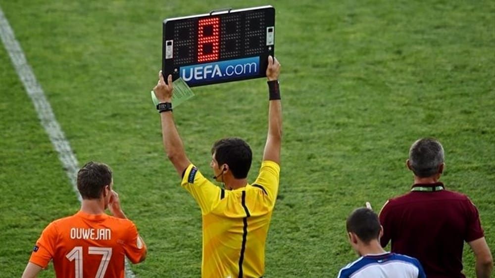
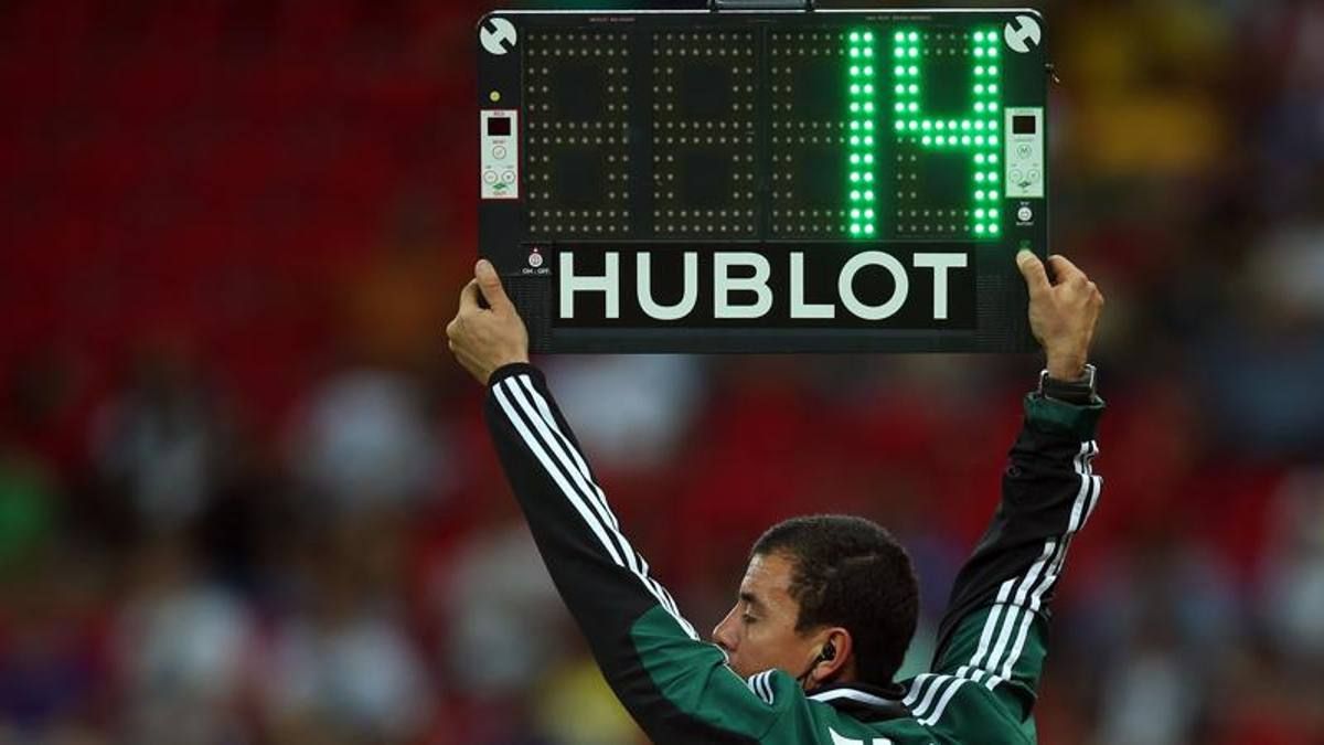
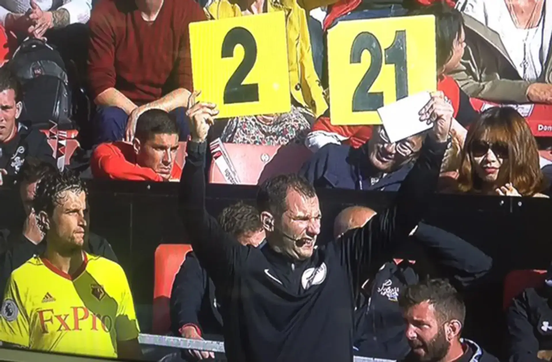
Its official debut came in May 1995 during the Cup Winners’ Cup final between Real Zaragoza and Arsenal. Over the following two weeks, UEFA also used it in Juventus-Parma and Ajax-Milan, the UEFA Cup and Champions League finals respectively. Euro 1996 confirmed its international adoption, while the 1998 World Cup was the first major global event organised by FIFA to use it. During those three years, the board acquired the appearance we now consider standard: a black rectangular body, segmented numbers on both sides, red and green LEDs and a handle at the top centre. Meanwhile, the display also began to show added time, as first specified by IFAB regulations at France ’98.
The information therefore ceased to belong exclusively to the match officials, giving rise to a small visual and gestural ritual in the seconds leading up to the 45th and 90th minutes. The fourth official sets the number, grasps the board, raises it above their head and turns it around, while the broadcast cuts away from the pitch and focuses on the object, just as it already did for substitutions. It is a short, codified and repetitive gesture, precisely the qualities that suggested a new commercial opportunity. After all, the audience has to look at the display to understand how much time has been added.
The impact of sponsors
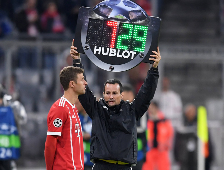
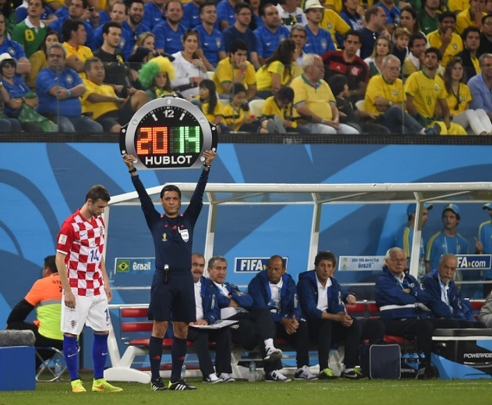
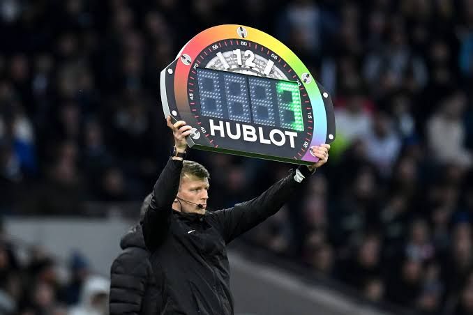
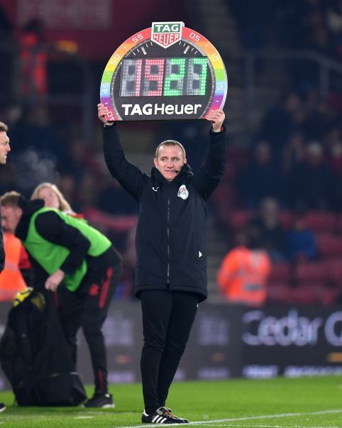
The first sponsors on substitution boards would appear shortly afterwards, initially as simple logos placed across the unused sections of the frame. The real transformation began with Hublot, the Nyon-based watchmaker that made this space its own on the international stage, transforming its aesthetics and shaping its future evolution. At Euro 2008, the Swiss brand simply placed its name on boards that were still rectangular, but in 2014 it introduced the most impactful redesign yet: a new shape.
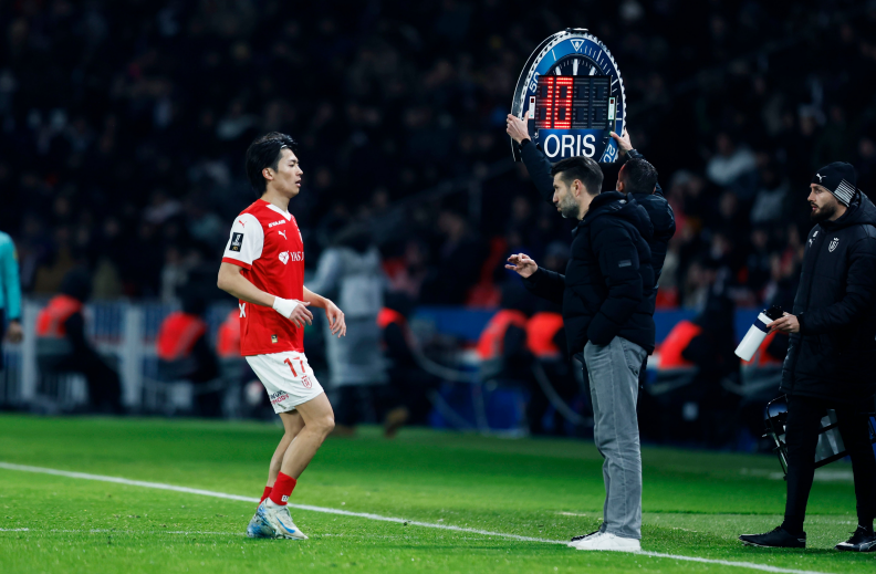
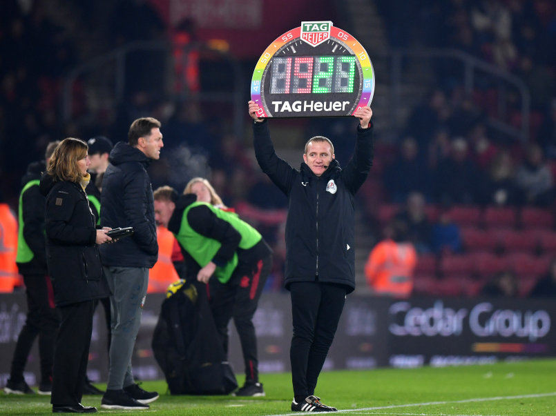
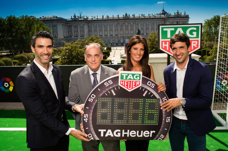
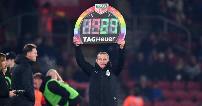
In its first version, the frame was redesigned to resemble a Big Bang, with a circular profile, a bezel and an immediate visual resemblance to a wristwatch. In 2016, the Premier League introduced a TAG Heuer board shaped like a Carrera, complete with a tachymeter scale, while LaLiga adopted a model inspired by another watch, the Connected. Before audiences had even grown accustomed to it, the watch-shaped substitution board had become a standard, with other luxury watchmaking brands - including Oris - following the trend.
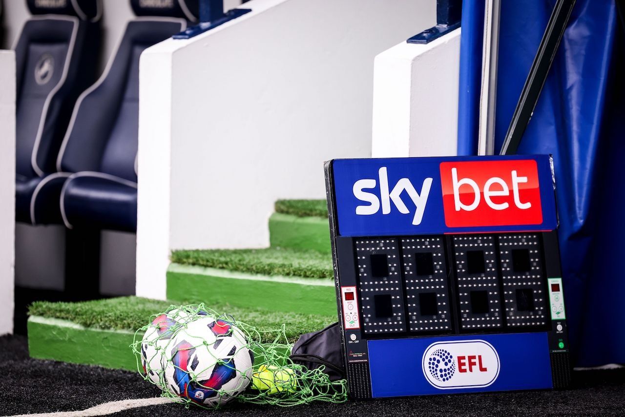
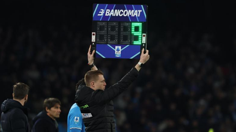
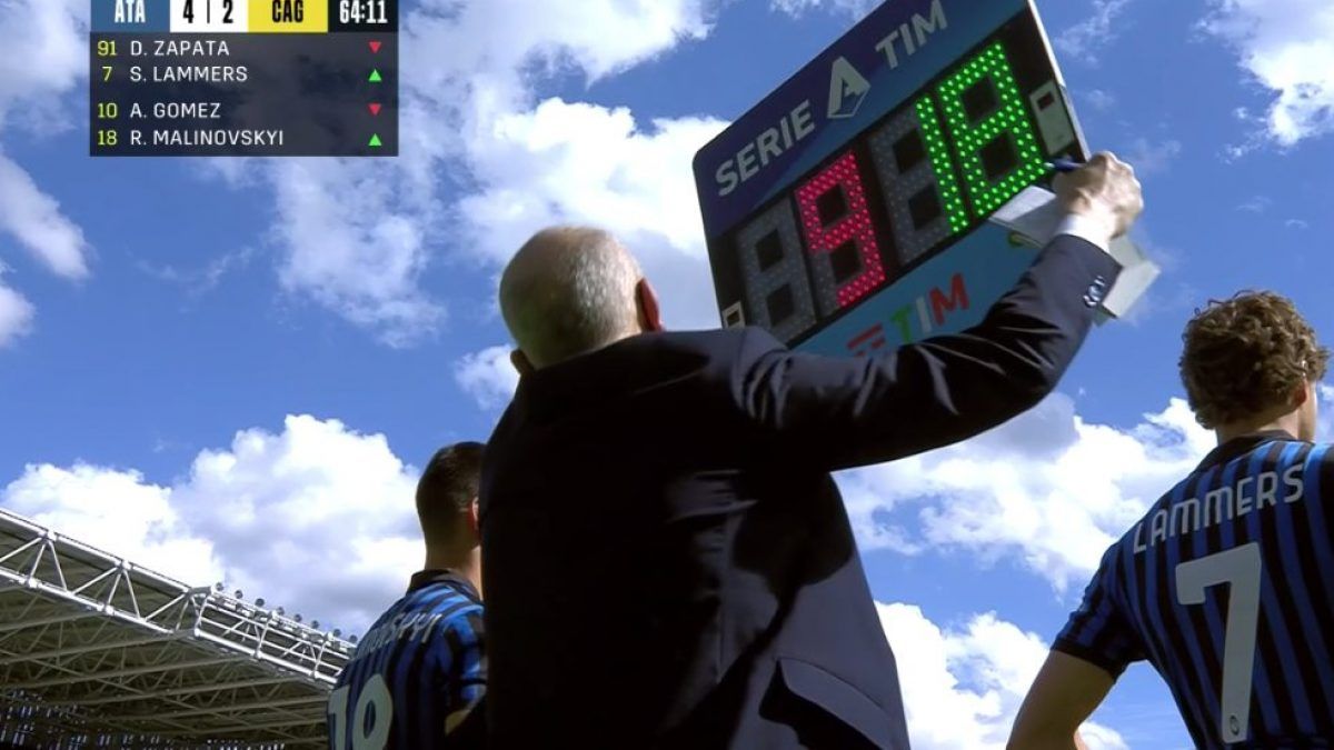
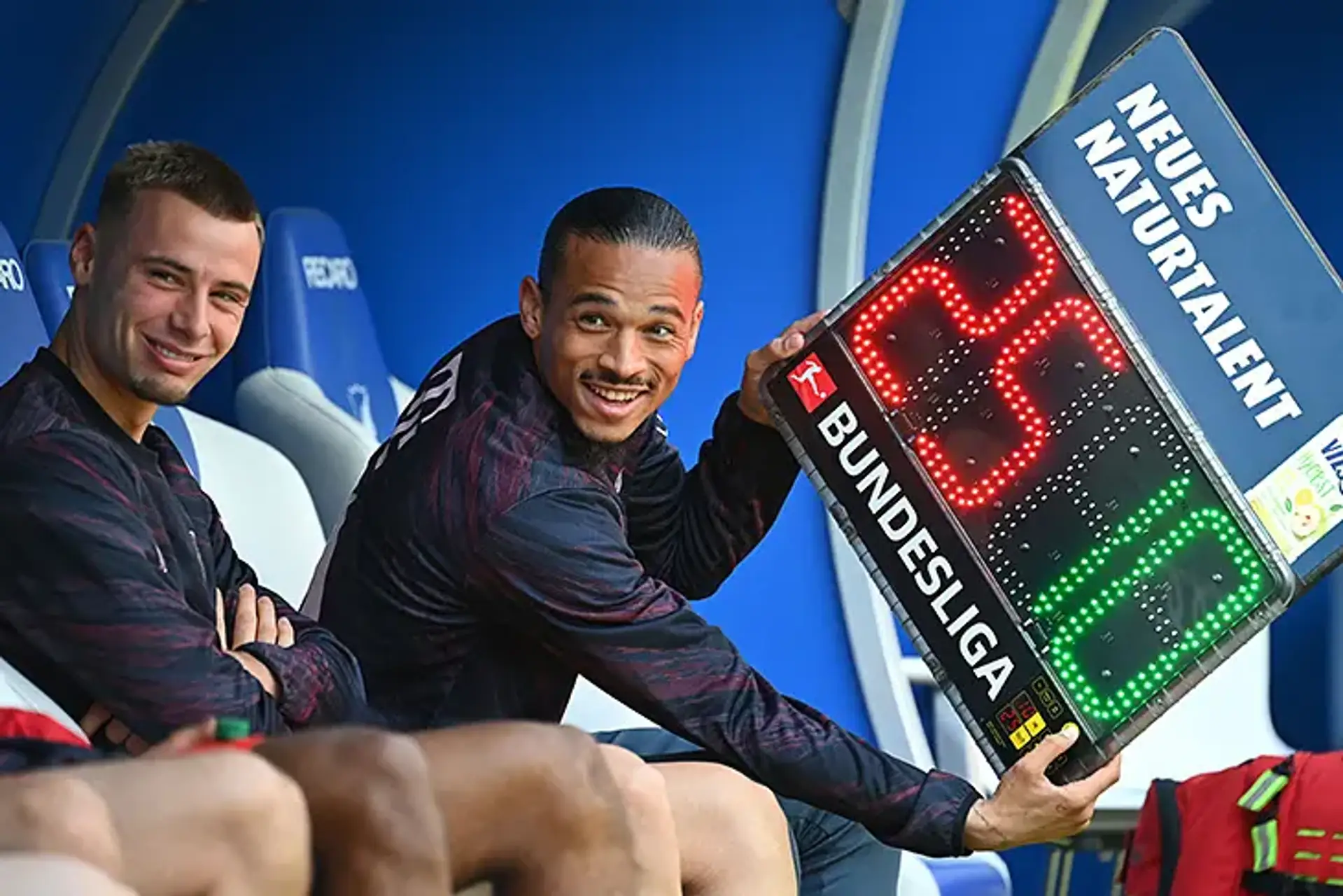
Meanwhile, the introduction of five substitutions multiplied the board’s appearances and moved the space beyond the watchmaking industry’s monopoly. In Serie A, the board carried the TIM logo for years and, since 2025, that of BANCOMAT; across EFL competitions, it has featured the branding of title sponsor Sky Bet. From the 2026/27 season, Adobe Express instead appears on the boards at every Premier League match, with a frame graphically inspired by the brand’s “A”. These examples are naturally joined by customisations used in other leagues and, where regulations allow them, by individual clubs and their sponsors.
At times, the space has instead been used to communicate messages and promote campaigns, as seen with the Premier League’s Rainbow Laces boards or slogans such as “No Room For Racism” and “More Than a Game”. At recent World Cups, meanwhile, the sponsor has been Rexona, marketed as Sure or Degree depending on the country.
Duracell has taken this evolution one step further, transforming the substitution board in a similar way to Hublot just over a decade earlier. It is not the first brand from outside the watchmaking industry to occupy this space, but it is the one that has reimagined its shape in the most creative way.