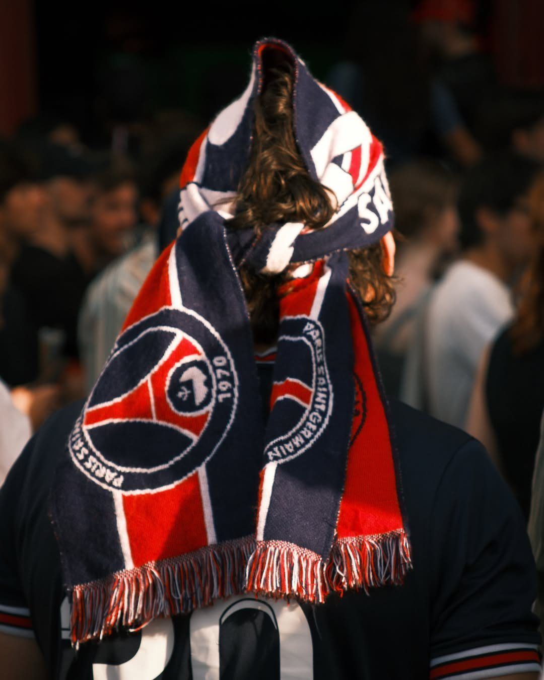


Serie A teams have given up on using special fonts in Champions League A missed chance


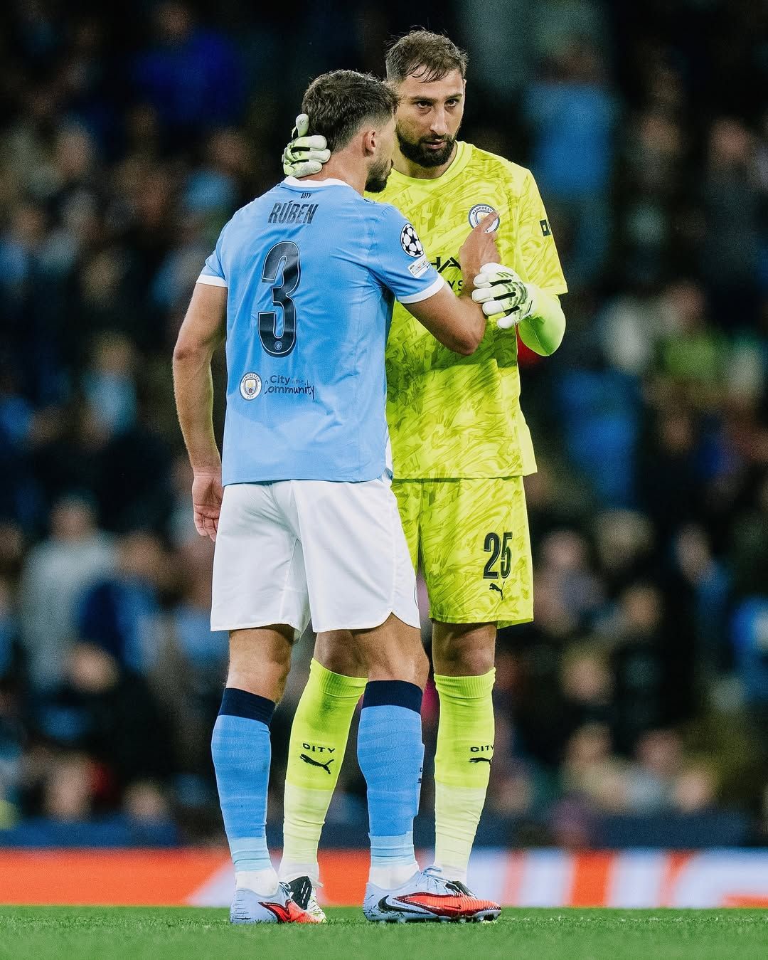


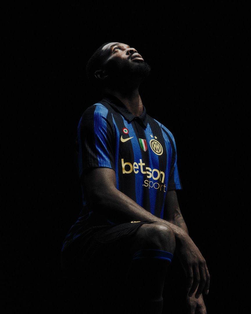
The Champions League has begun and once again Serie A teams have chosen to rely on Moustaches. This is the font developed by Stillscreen, the Italian company that since the 2020/21 season has produced the single font for all teams in the Italian championship. Numbers and letters were created following very specific UEFA parameters which, by regulation, Serie A teams must wear in the league and in the Coppa Italia. As for European cups there is no rule that requires its use. Yet almost all Italian teams that since the 2020/21 season to today have participated in the Champions League, Europa League and Conference League have not changed their font, continuing to wear the one used in the league.
Tunnel is nss sports' new weekly newsletter. Click here to subscribe.
An exception is Milan, which in both the 2023/24 and 2024/25 seasons fielded a font closer to its brand identity. Then there is Napoli which, for its debut at the Etihad Stadium against Manchester City, introduced a new very clean font that doesn't shy away from angular shapes while also not weighing down the shirt thanks to the presence of soft curves. A choice perfectly integrated into the club's communication strategy, a path in which visual elements are central. Fonts included — Napoli in fact decided to use the same system of letters and numbers used for its official communications.
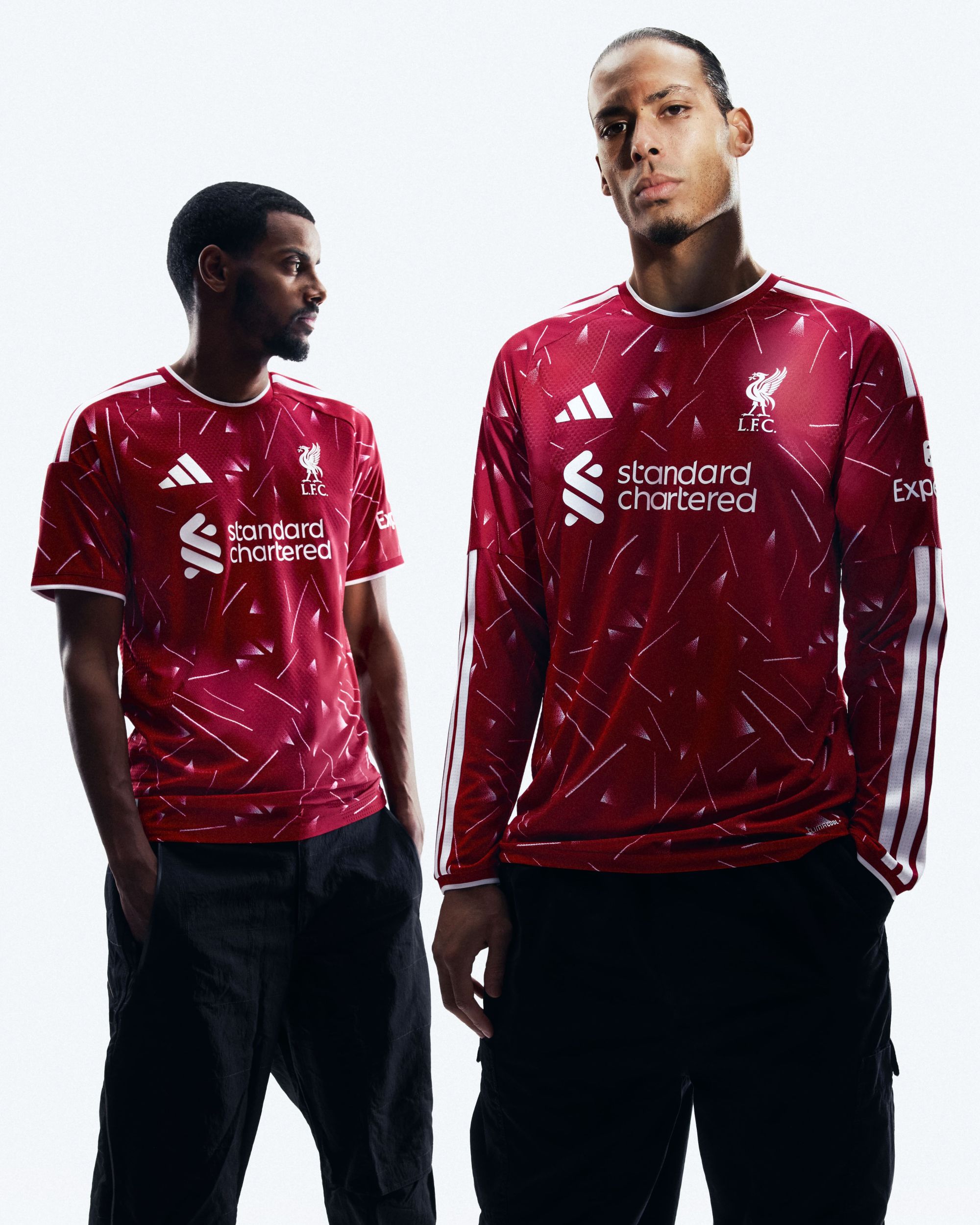
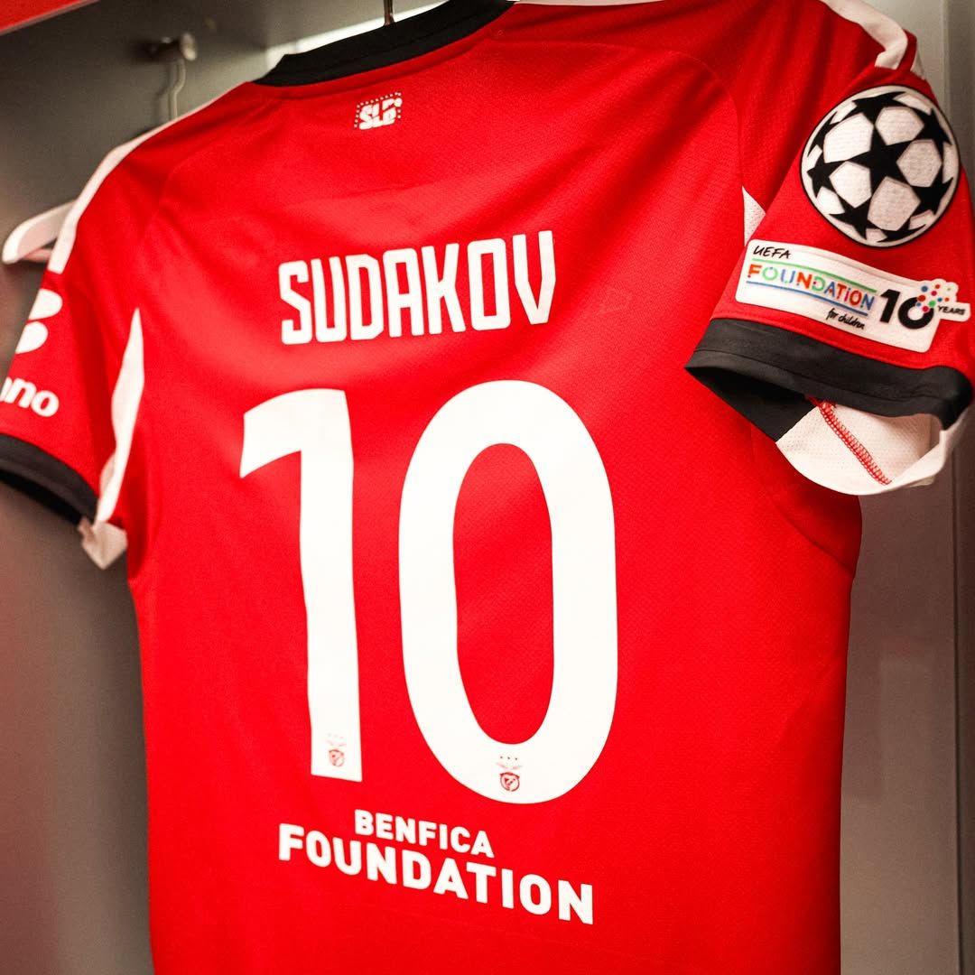
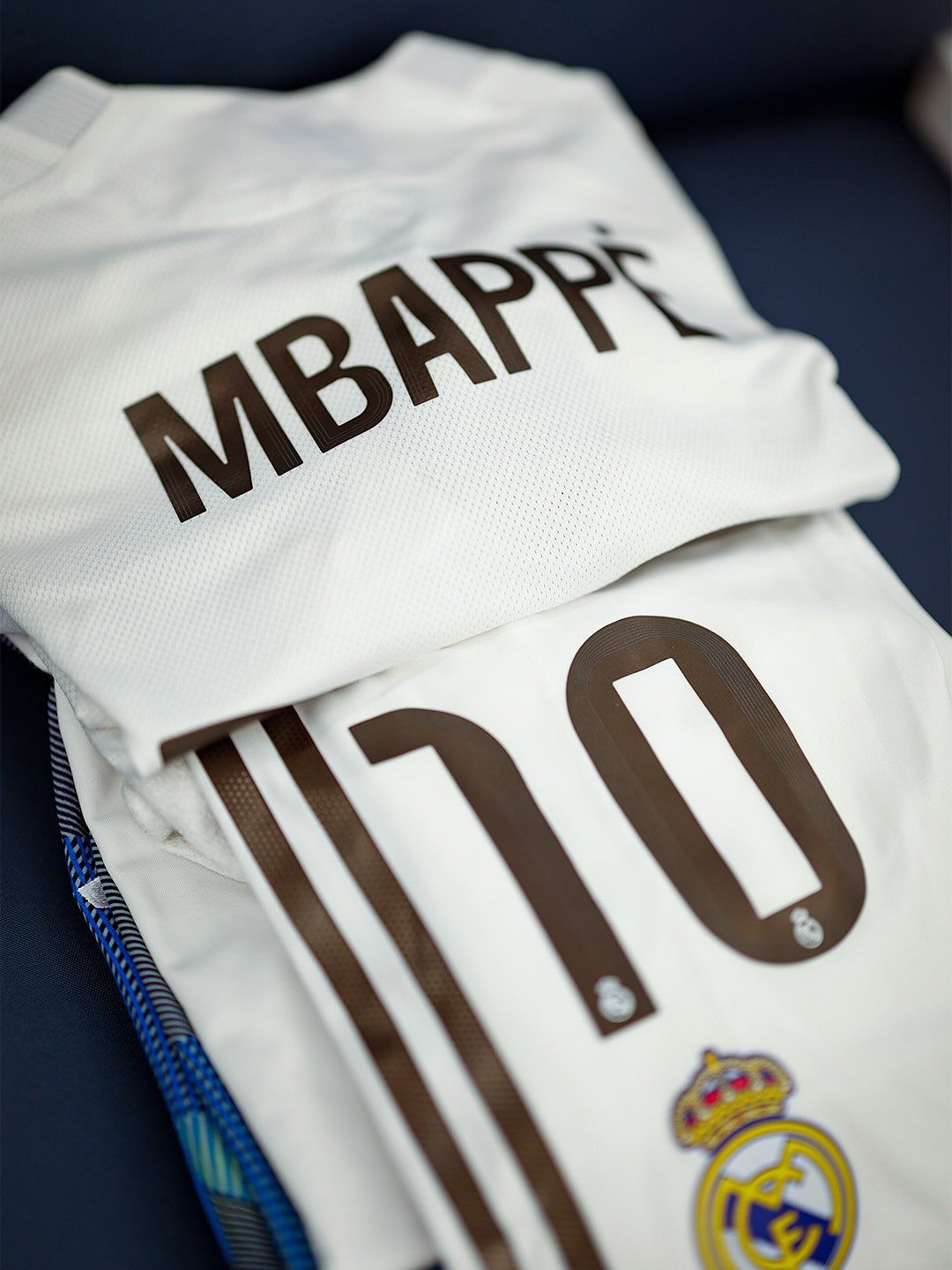
Examples from outside Italy abound. Premier League teams do not miss an opportunity to wear their respective fonts as soon as they are not playing in the league. Arsenal has proposed large, angular numbers, Tottenham instead opted for a thinner silhouette, raised numbers without curves for Liverpool, and Chelsea showed off the CFC Serif font developed by F37® Foundry. The same applies to La Liga teams, which are themselves bound by a single font in the league. Real Madrid has tried to balance curves and geometric shapes, Villarreal pushed for more rounded forms. And don’t think the discussion only involves teams from the top leagues. Benfica used a different, cleaner one than the one it is required to wear in the league.
Visual identity is the keyword. More and more European teams are renewing their image by developing unique, proprietary fonts. A need that does not involve only the big names in European football, as the Pisa case in Italy demonstrates. The decision to bring the league's unique font into Europe is a sign that teams have decided not to take care of an important part of their identity. If the teams participating in European cups consider themselves satisfied with the fonts created for the league and do not believe they need to create a special product, that is their right — but it still leaves a bitter taste. Unique fonts are a useful tool to make any championship immediately recognizable the moment you tune in to a match. The Champions League does not need a single font. It is the most watched football tournament in the world thanks also to a perfectly distinguishable aesthetic, and consequently gives 36 teams a year a stage on which to show their personality. And if more teams use the same font then that personality does not exist.