
The 5 best 2026/27 EuroLeague jerseys Our favourites, from timeless classics to new identities


The EuroLeague is European basketball’s leading competition, at least for now. On the horizon, NBA Europe continues to take shape: the project developed by the North American league in collaboration with FIBA is aiming to launch in twelve months and could redraw the map of basketball across the continent. In the meantime, the 2026/27 EuroLeague began last week, and alongside the first results on the court—disappointing for the Italian representatives, Milan and Bologna—we also witnessed the debut of twenty new visual identities. We reviewed every jersey and selected our top five—but first, a few deserved honourable mentions.
Honourable mentions
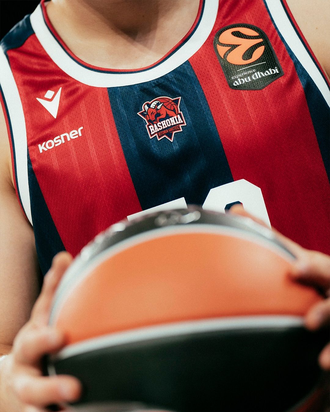
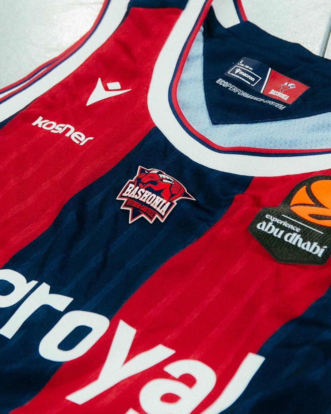
Baskonia are the first team to miss the cut. In its first season with the Basque club, Macron has done an impressive job, particularly in showcasing the team’s colours: red and blue return through the traditional vertical stripes, enriched by a subtle tonal pattern and white details. There is no graphic concept that makes the jersey truly special, which is why it falls just short of the top five—but Baskonia’s colour identity has rarely been interpreted this effectively.
The new jerseys of the two Italian teams, Olimpia Milano and Virtus Bologna, could not be overlooked either—and not because of national bias. Milan have complemented their traditional red with white and blue details running down the sides, while the Away version uses a white base with red and black graphics. Both retain the recognisable EA7 aesthetic and feature an interesting font for the numbers.
The Bologna side, meanwhile, have introduced an elegant pinstripe design across their black and white jerseys, featuring the unmistakable V on the chest and gold details along the sides and back to celebrate the club’s centenary. As Virtus explained during the unveiling, however, “the true design gem is revealed on the back, where the jersey numbers feature a pattern inspired by the floor of the Salaborsa Library.”
Olympiacos
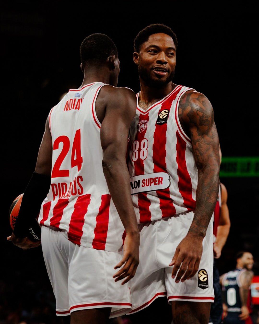
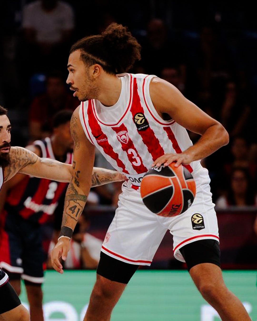
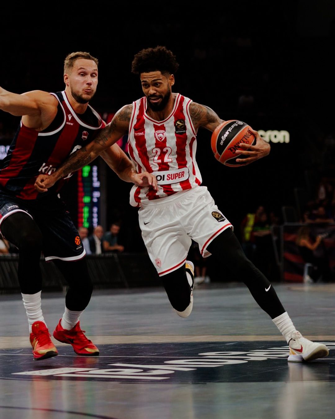
We begin with the reigning champions and one of the great classics of European basketball. Last May, Olympiacos returned to the top of Europe after thirteen years, and a few months later signed a new sponsorship agreement with Nike, which will serve as the club’s technical partner until 2031. The new jersey takes one of the most recognisable elements of the Piraeus club’s identity—the red and white vertical stripes—and reworks it through irregular bands, jagged edges and geometric effects. It is exactly the kind of update that works when starting from an iconic jersey that does not need to be reinvented.
Panathinaikos
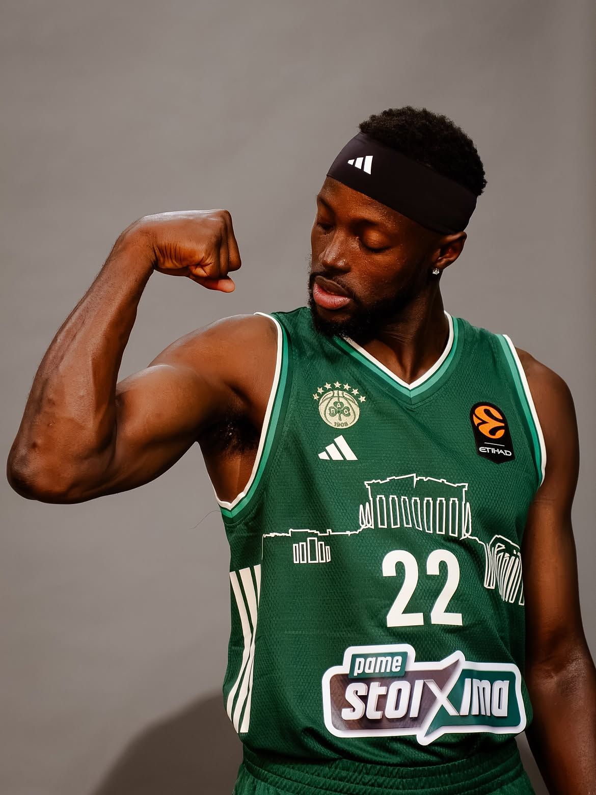
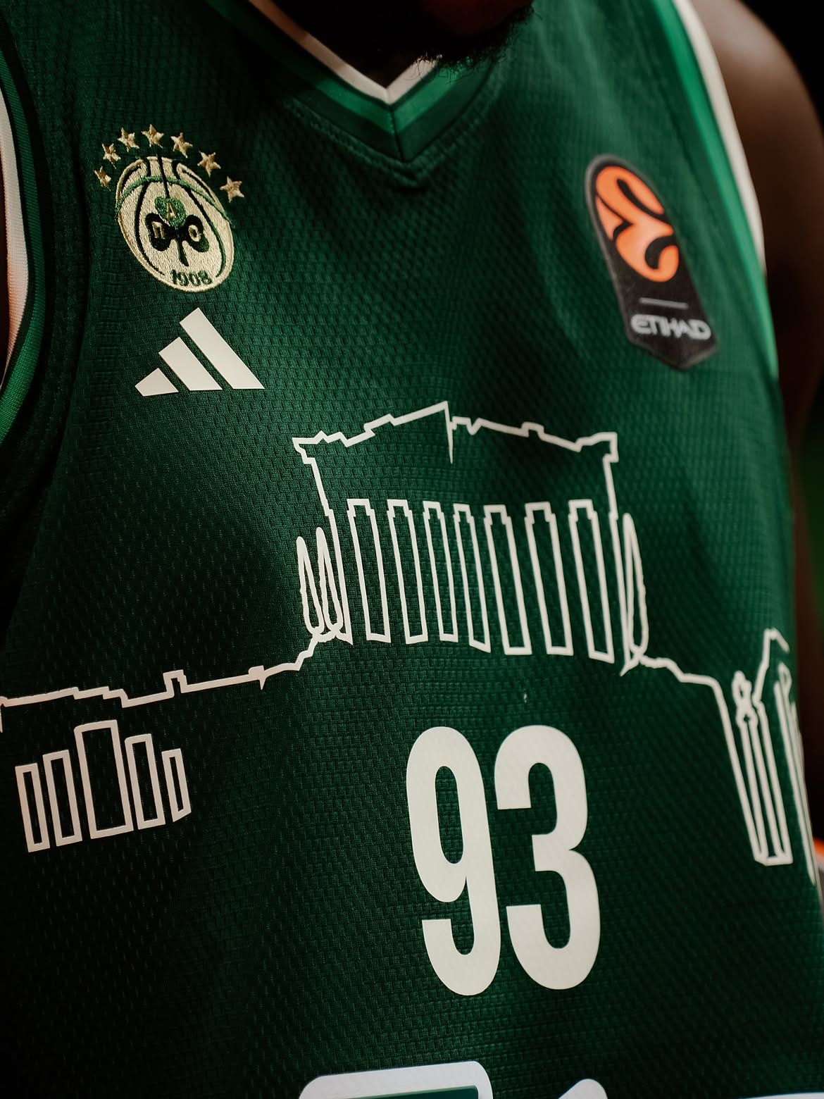
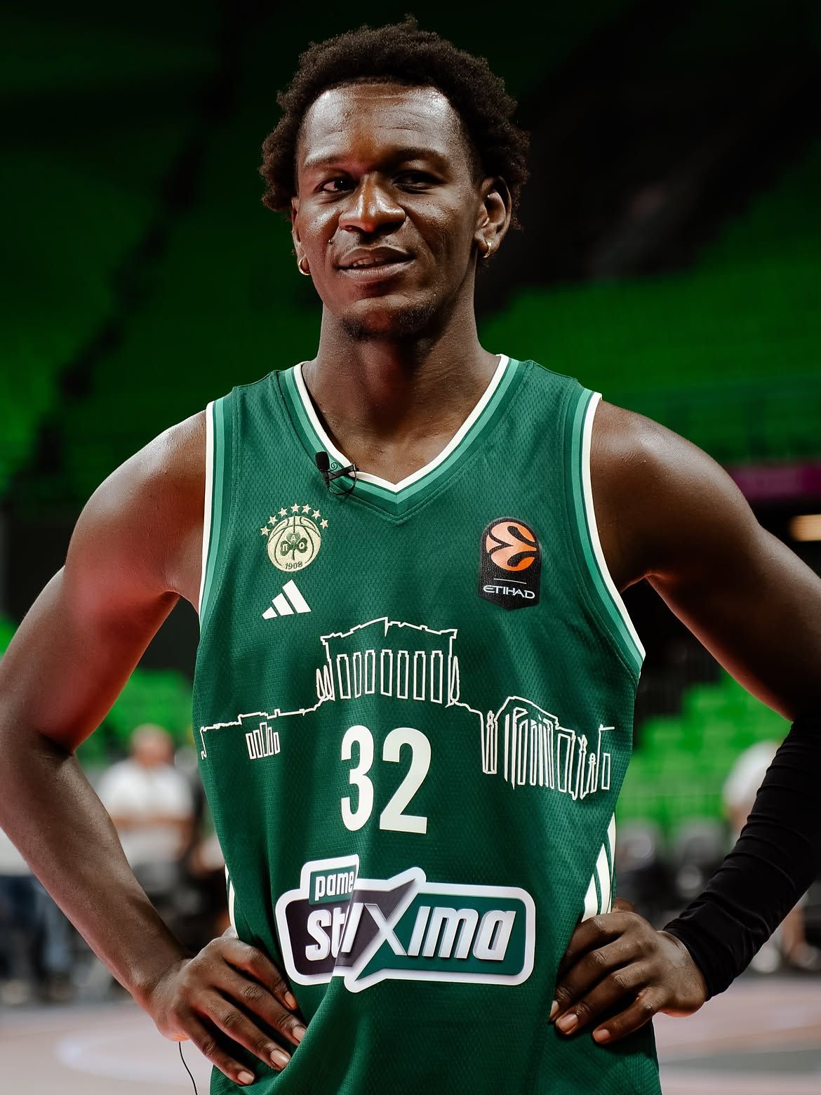
From the reigning champions to their eternal rivals. Here, everything revolves around Athens, its history and the Acropolis, whose silhouette runs delicately across the chest. The Home jersey—naturally green and featuring the adidas Three Stripes along the sides—looks as good as ever, but this time it is the cream-coloured Away version that steals the show. It is a clean jersey with enough negative space to highlight its main feature. The design is immediately connected to Athenian identity without relying on overly literal references: an upgrade on the 2023/24 version, when the Acropolis first appeared on Panathinaikos’ jerseys.
Crvena Zvezda
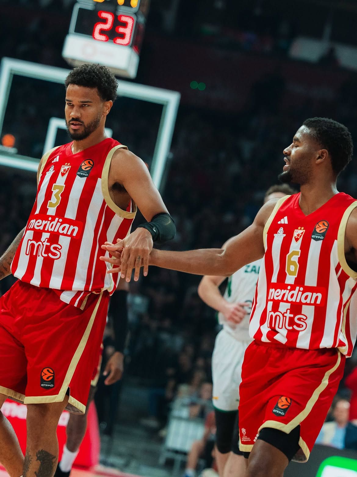
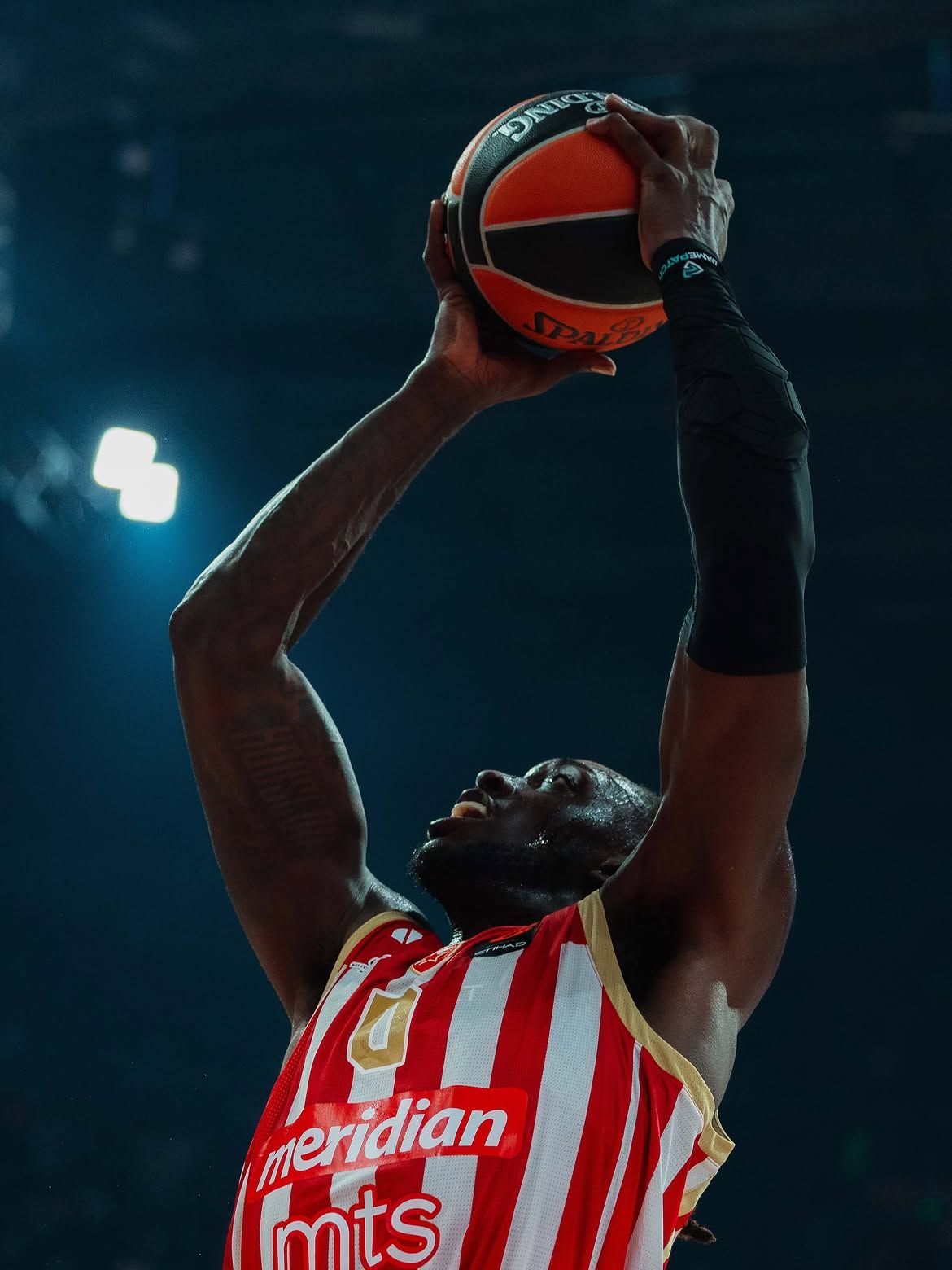
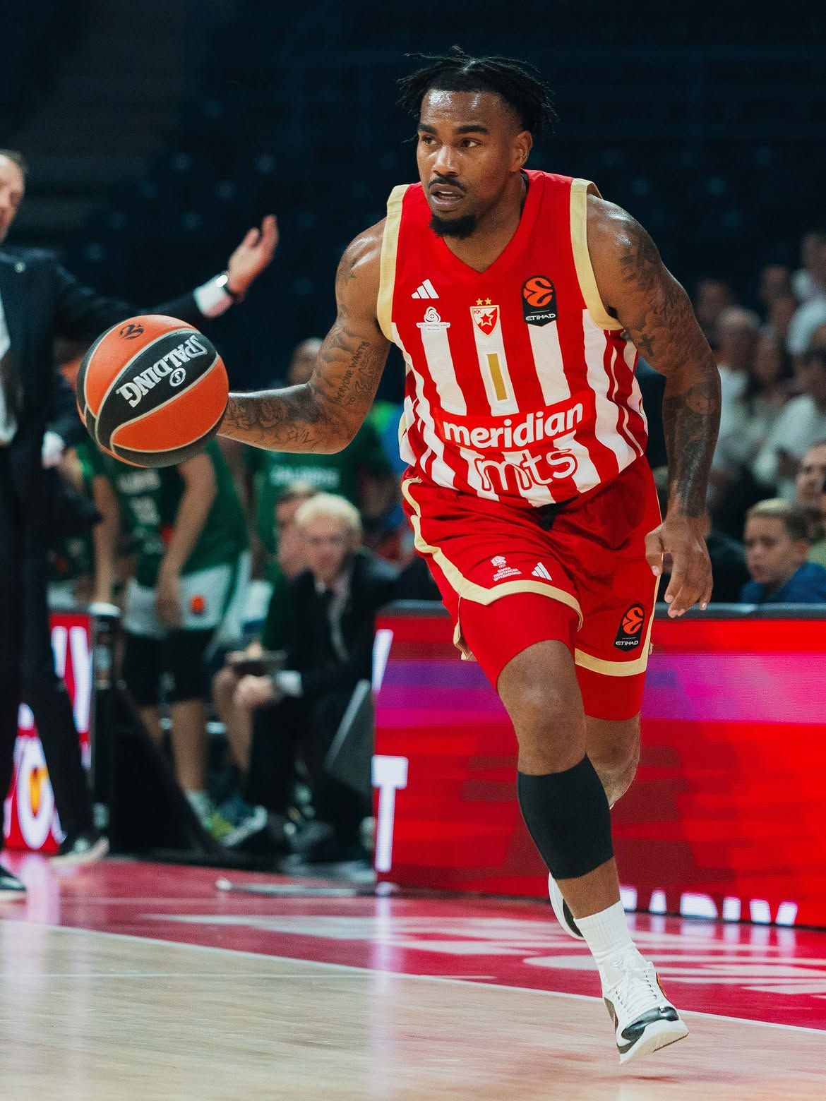
For Red Star, another instantly recognisable identity in European basketball, adidas has taken almost the opposite approach. There is no excessive reinterpretation of the club’s historic look: instead, the design returns to red and white vertical stripes on both the front and—finally—the back, thanks to the new EuroLeague rules that no longer require jerseys to have a monochrome back after twenty years. A small Serbian flag appears on the collar, while the numbers, names and “BELGRADE” lettering on the lower back are rendered in gold with wide white outlines. It is an electric combination of tradition and modernity—after all, as the club itself explained, looking towards the future first means recovering something from the past.
Barcelona
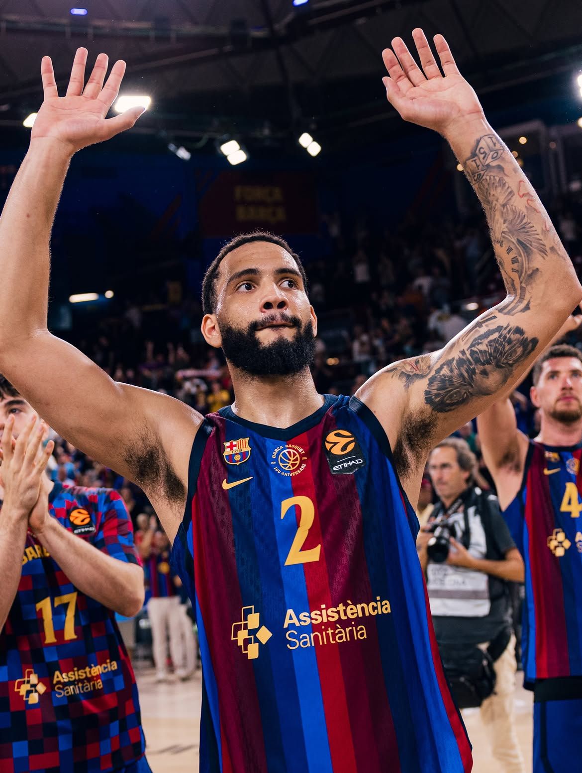
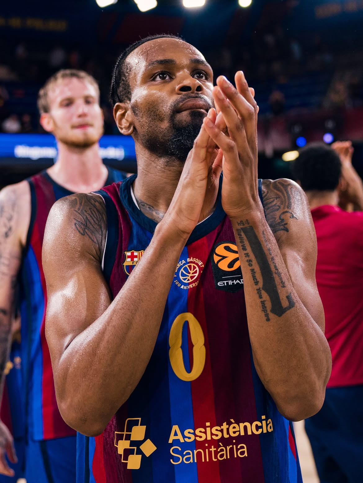
Barça are perhaps the easiest choice on this list. For this season’s Home jersey, Nike started with the iconic blaugrana colours but did not limit itself to just two shades, drawing from a broader palette to create a gradient effect. At the centre of the chest is the special centenary crest, accompanied by a gold Swoosh, while the collar features a small pattern in the colours of Catalonia and the numbers use a distinctive blocky font. It is a jersey that avoids the déjà-vu of familiar classics while still expressing Barcelona’s entire identity at first glance.
Paris Basketball
Last but not least—last only in the order of this top five. Or perhaps its grand finale, because if this were a ranking, it would be difficult not to place Paris Basketball ahead of everyone else—and we would even have to choose between the club’s two 2026/27 jerseys, so different yet equally coherent.
Our favourite 2026/27 EuroLeague jersey ?
— nss sports (@nss_sports_) September 29, 2026
The team is almost an easy pick: @ParisBasketball.
The hard part is choosing between Home and Away: completely different, equally stunning.
Chapeau, @adidasHoops. pic.twitter.com/YdVUBZYhMQ
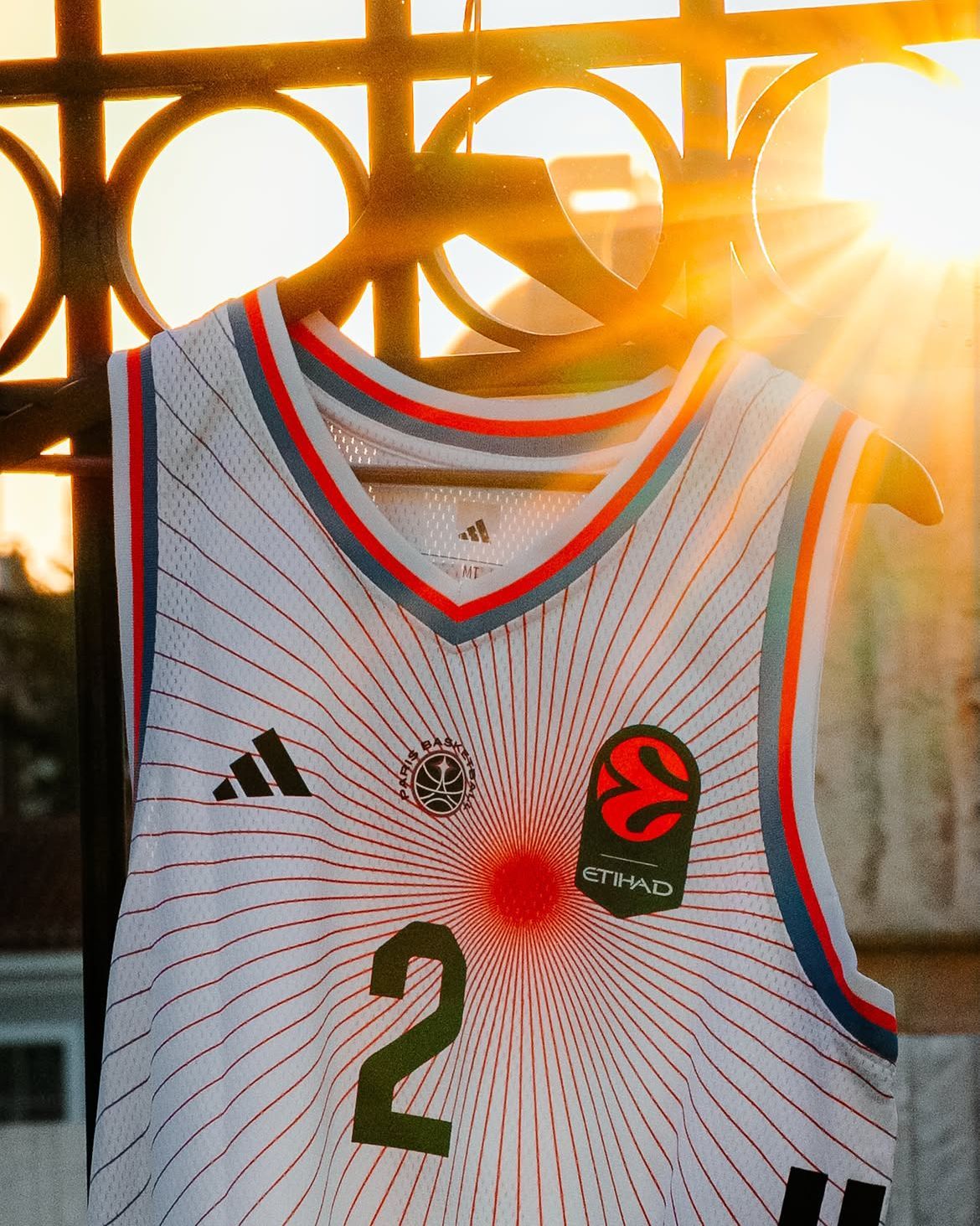
The Home jersey has a black base crossed by blue, white and red gradient bands that resemble lights projected onto its surface, while also visually evoking the energy of Grand Paris. It is one of those jerseys that continues to reveal new details wherever you look, and the same can be said of the Away version, which is also strongly inspired by Paris but follows a completely different design language. A white base, the Paris Basketball star at its centre and a series of thin red lines radiating outwards transform the Ville Lumière into a visual concept. Both jerseys are designed to be worn beyond the court, united by the same idea of Paris and developed through very different visual influences.