
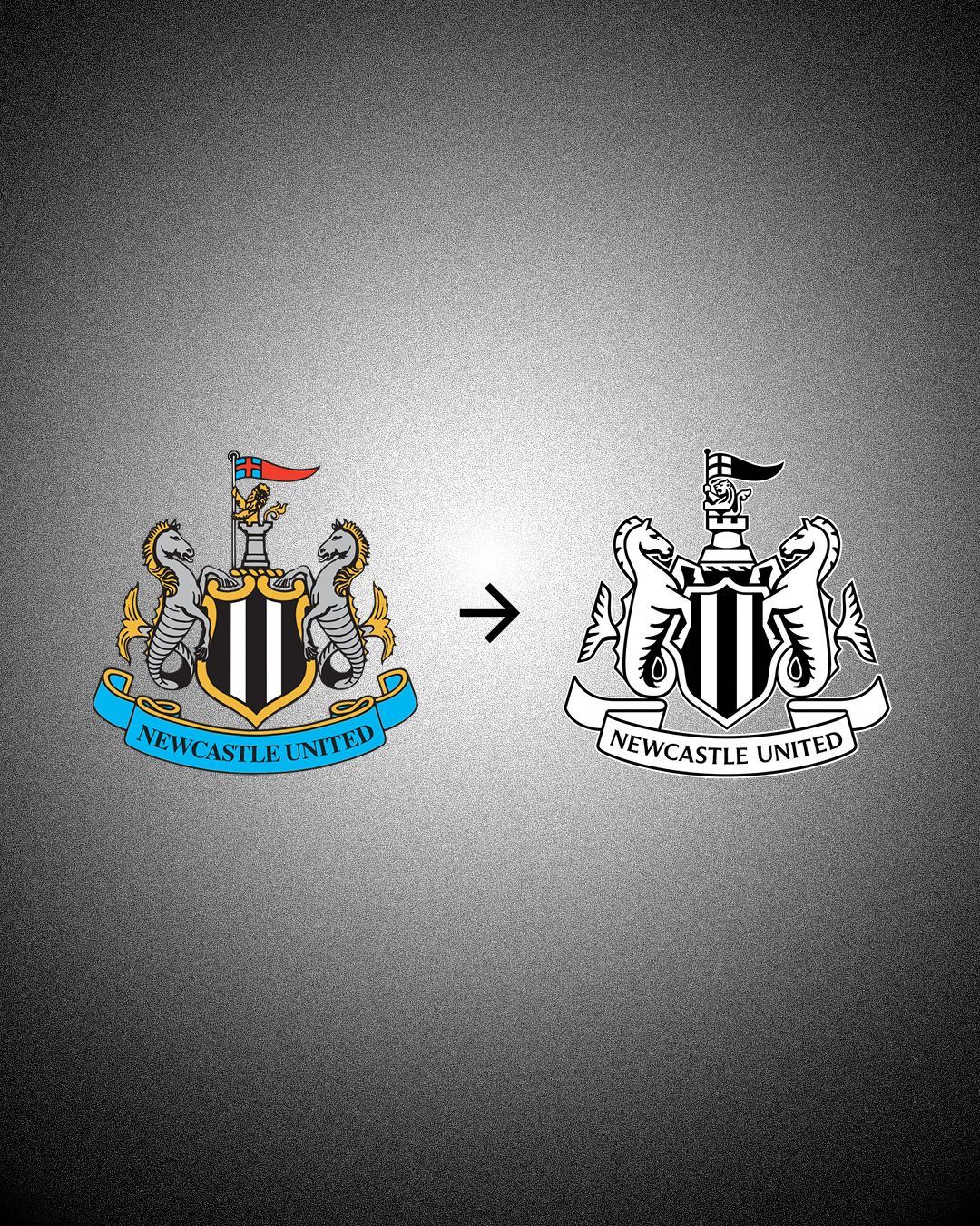
Newcastle have officially unveiled its new crest And it has been chosen by the fans
Newcastle have a new crest. The Magpies have officially unveiled their new club symbol, chosen after a two-year process in which supporters were actively involved. After an initial research phase, the selection was narrowed down to three proposals, which were put to an independent poll that received more than 27,000 votes.
The winning design secured around two-thirds of the votes. A move that marks the beginning of a new visual identity, set to be rolled out progressively across all of the club’s official channels before appearing on the kits from the 2027/28 season.
The details of Newcastle’s new crest
Newcastle’s new crest does not completely break with the past, but rather offers a reinterpretation of the crest that has represented the club since 1988. The main element, Newcastle’s castle, has been preserved, but now sits alongside a black-and-white shield with a more defined structure, flanked by hippocampi that reference Newcastle’s maritime history and its links to shipbuilding and trade. The demi-lion, pennon and ribbon bearing the club’s name have also been refined to create a new sense of balance across the composition.
Why has Newcastle changed its crest?
As explained by the club in its official statement, the decision to update its crest after almost four decades stems from a primarily visual, and consequently commercial, need. The idea is that the uneven lines and intricate details that have defined the crest over the past 38 years were increasingly lost on smartphone screens, television graphics and even on match kits. A new approach was therefore needed, with cleaner lines and formats that could preserve the club’s heritage while projecting Newcastle into a more contemporary visual landscape. A crucial step for a club looking to compete, beyond the pitch, with the biggest names in the Premier League.